COLOR THEORY
both thescience and art of using color. It explains how humans perceive color; and the visual effects
of how colors mix, match or contrast with each other. Color theory also involves the messages
colors communicate; and the methods used to replicate color.
Color is perception. Our eyes see something (the sky, for example), and data sent from our eyes to
our brains tells us it’s a certain color (blue). Objects reflect light in different combinations of
wavelengths. Our brains pick up on those wavelength combinations and translate them into the
phenomenon we call color.
3.
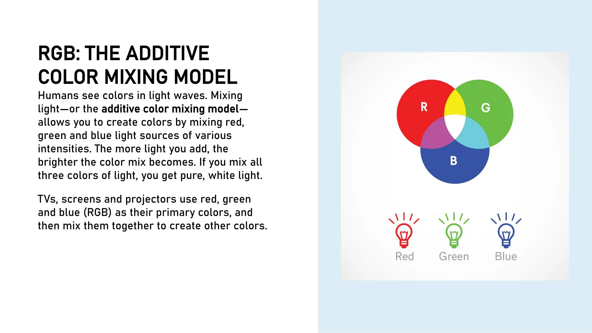
RGB: THE ADDITIVE
COLORMIXING MODEL
Humans see colors in light waves. Mixing
light—or the additive color mixing model—
allows you to create colors by mixing red,
green and blue light sources of various
intensities. The more light you add, the
brighter the color mix becomes. If you mix all
three colors of light, you get pure, white light.
TVs, screens and projectors use red, green
and blue (RGB) as their primary colors, and
then mix them together to create other colors.
5.
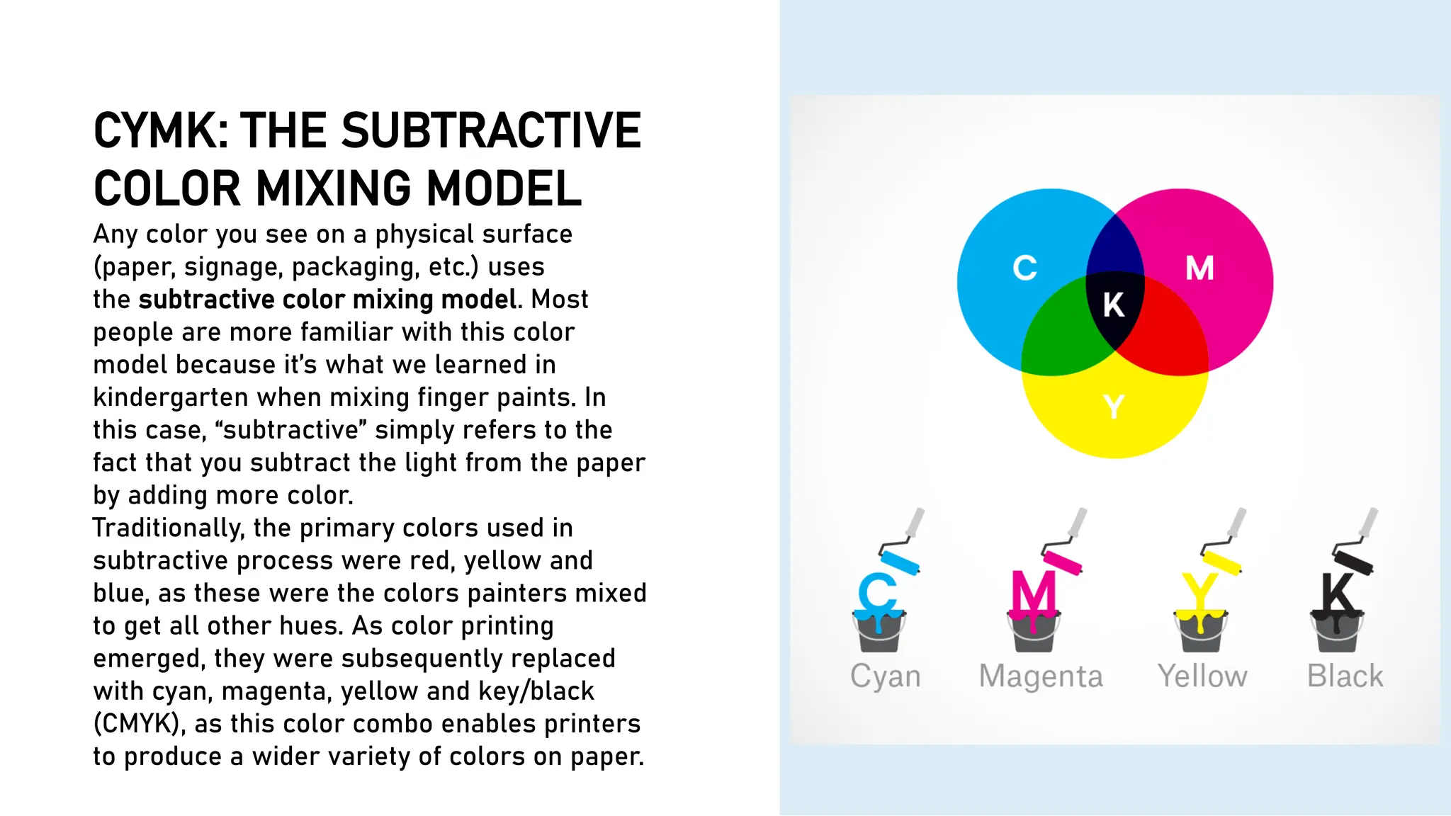
CYMK: THE SUBTRACTIVE
COLORMIXING MODEL
Any color you see on a physical surface
(paper, signage, packaging, etc.) uses
the subtractive color mixing model. Most
people are more familiar with this color
model because it’s what we learned in
kindergarten when mixing finger paints. In
this case, “subtractive” simply refers to the
fact that you subtract the light from the paper
by adding more color.
Traditionally, the primary colors used in
subtractive process were red, yellow and
blue, as these were the colors painters mixed
to get all other hues. As color printing
emerged, they were subsequently replaced
with cyan, magenta, yellow and key/black
(CMYK), as this color combo enables printers
to produce a wider variety of colors on paper.
6.
COLOR WHEEL
6
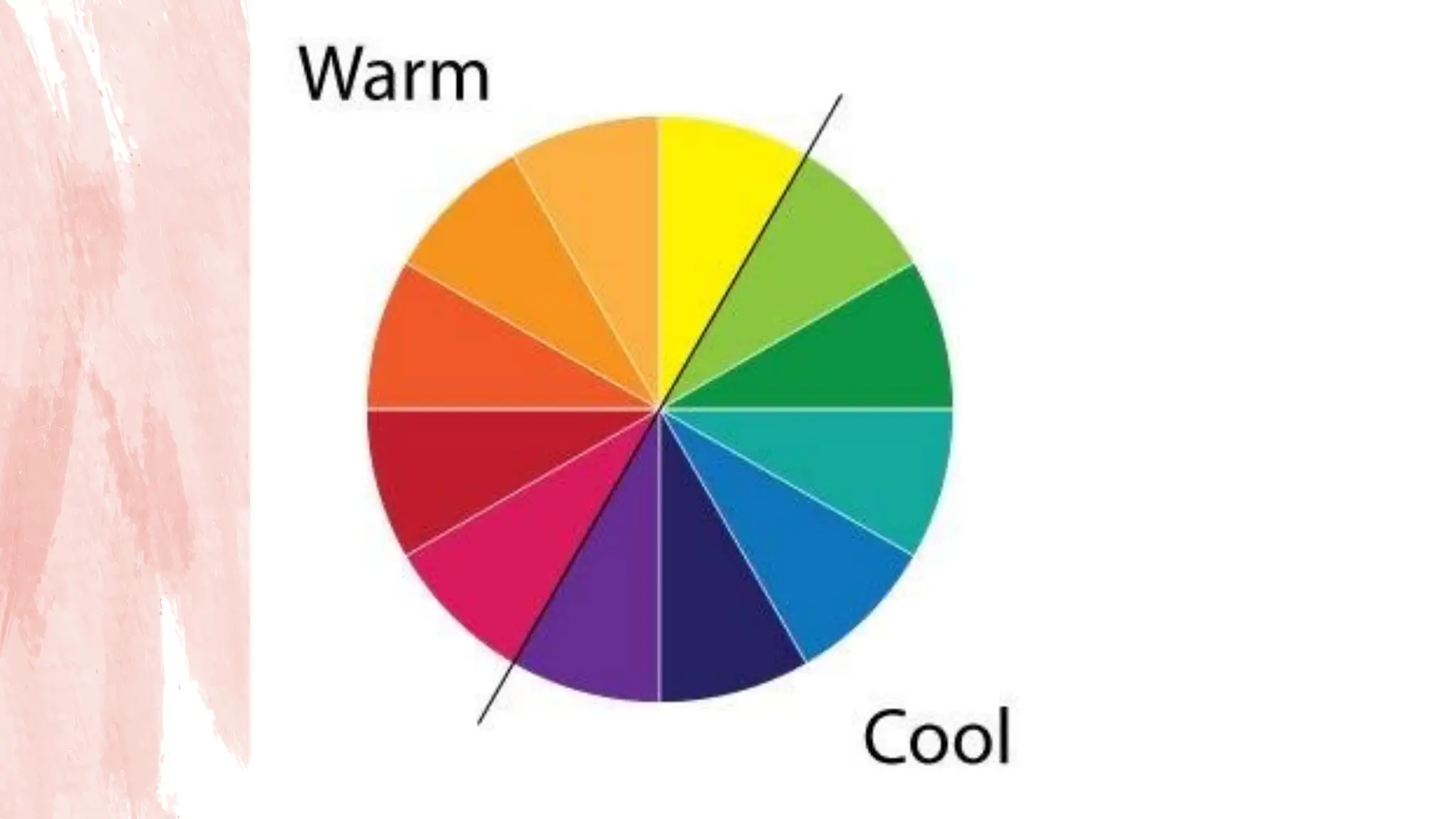
The firstcolor wheel was designed by Sir Isaac Newton
in 1666
The color wheel consists of three primary colors (red,
yellow, blue), three secondary colors (colors created
when primary colors are mixed: green, orange, purple)
and six tertiary colors (colors made from primary and
secondary colors, such as blue-green or red-violet).
Draw a line through the center of the wheel, and you’ll
separate the warm colors (reds, oranges, yellows)
from cool colors (blues, greens, purples).
7.
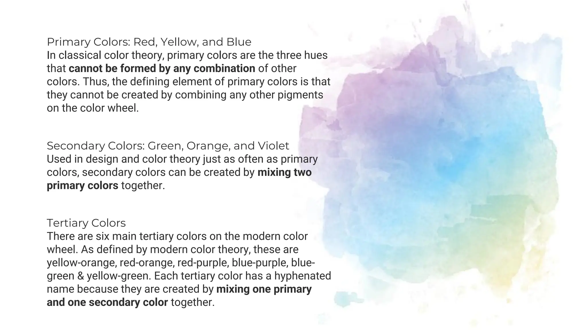
Primary Colors: Red,Yellow, and Blue
In classical color theory, primary colors are the three hues
that cannot be formed by any combination of other
colors. Thus, the defining element of primary colors is that
they cannot be created by combining any other pigments
on the color wheel.
Secondary Colors: Green, Orange, and Violet
Used in design and color theory just as often as primary
colors, secondary colors can be created by mixing two
primary colors together.
Tertiary Colors
There are six main tertiary colors on the modern color
wheel. As defined by modern color theory, these are
yellow-orange, red-orange, red-purple, blue-purple, blue-
green & yellow-green. Each tertiary color has a hyphenated
name because they are created by mixing one primary
and one secondary color together.
9.
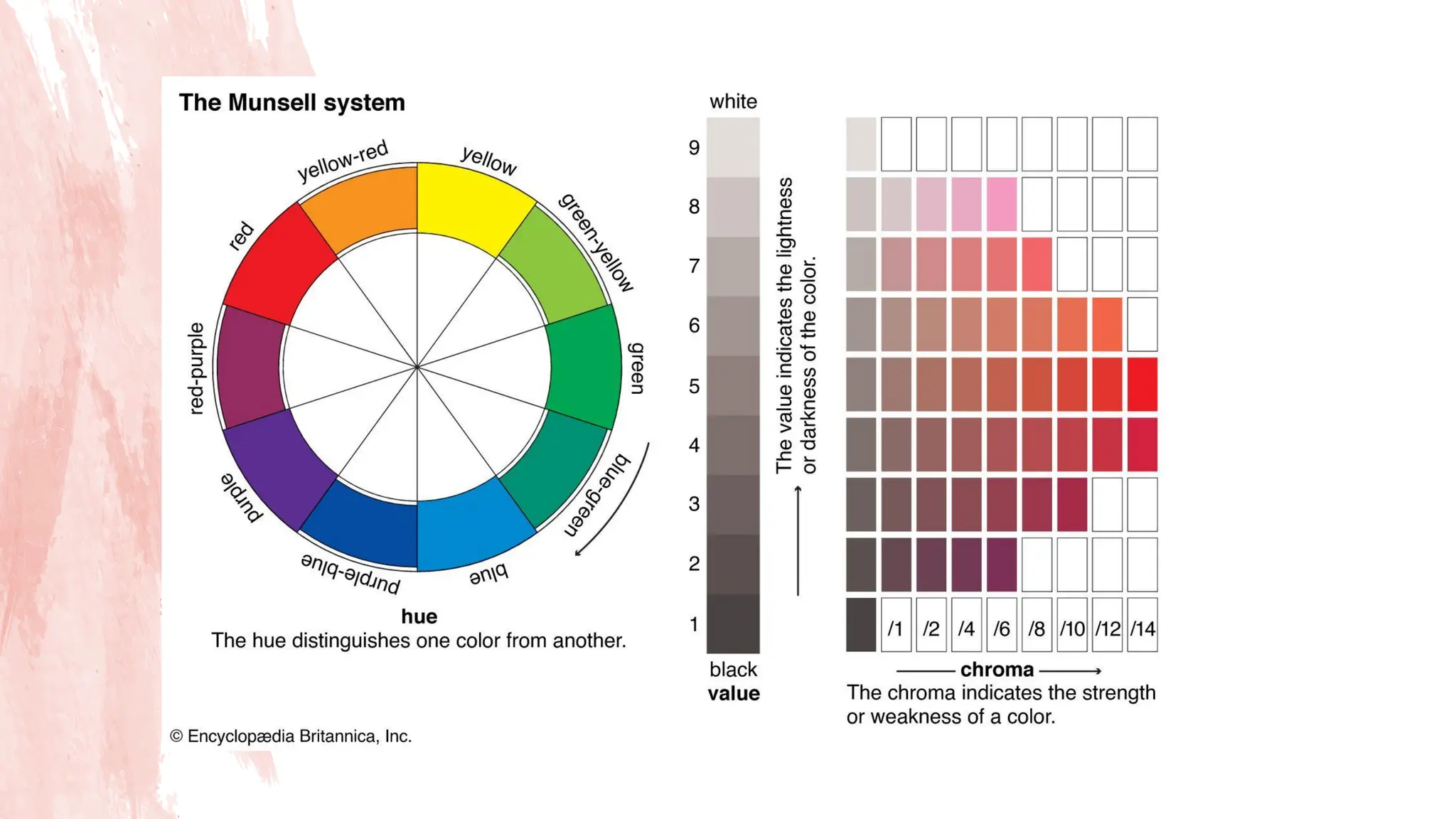
MUNSELL COLOR SYSTEM
9
TheMunsell Color System, which is a diagrammatic color
space that specifies colors based on three main
factors: hue, value, and chroma. When describing or
identifying colors, these three terms form the foundation
of understanding in the world of color theory
10.
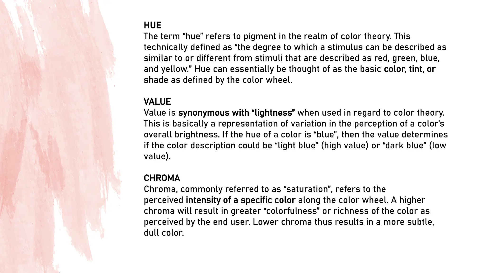
HUE
The term “hue”refers to pigment in the realm of color theory. This
technically defined as “the degree to which a stimulus can be described as
similar to or different from stimuli that are described as red, green, blue,
and yellow.” Hue can essentially be thought of as the basic color, tint, or
shade as defined by the color wheel.
VALUE
Value is synonymous with “lightness” when used in regard to color theory.
This is basically a representation of variation in the perception of a color’s
overall brightness. If the hue of a color is “blue”, then the value determines
if the color description could be “light blue” (high value) or “dark blue” (low
value).
CHROMA
Chroma, commonly referred to as “saturation”, refers to the
perceived intensity of a specific color along the color wheel. A higher
chroma will result in greater “colorfulness” or richness of the color as
perceived by the end user. Lower chroma thus results in a more subtle,
dull color.
11.
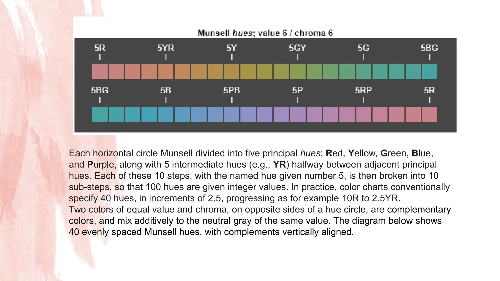
Each horizontal circleMunsell divided into five principal hues: Red, Yellow, Green, Blue,
and Purple, along with 5 intermediate hues (e.g., YR) halfway between adjacent principal
hues. Each of these 10 steps, with the named hue given number 5, is then broken into 10
sub-steps, so that 100 hues are given integer values. In practice, color charts conventionally
specify 40 hues, in increments of 2.5, progressing as for example 10R to 2.5YR.
Two colors of equal value and chroma, on opposite sides of a hue circle, are complementary
colors, and mix additively to the neutral gray of the same value. The diagram below shows
40 evenly spaced Munsell hues, with complements vertically aligned.
14.
Specifying a color
Acolor is fully specified by listing the three numbers for
hue, value, and chroma in that order. For instance, a
purple of medium lightness and fairly saturated would be
5P 5/10 with 5P meaning the color in the middle of the
purple hue band, 5/ meaning medium value (lightness),
and a chroma of 10
15.
Hue, Shade, Tint,and Tone
15
Simply put, tints, tones and shades are variations of hues, or colors, on the color
wheel. A tint is a hue to which white has been added. For example, red + white = pink.
A shade is a hue to which black has been added. For example, red + black =
burgundy. Finally, a tone is a color to which black and white (or grey) have been
added. This darkens the original hue while making the color appear more subtle and
less intense.
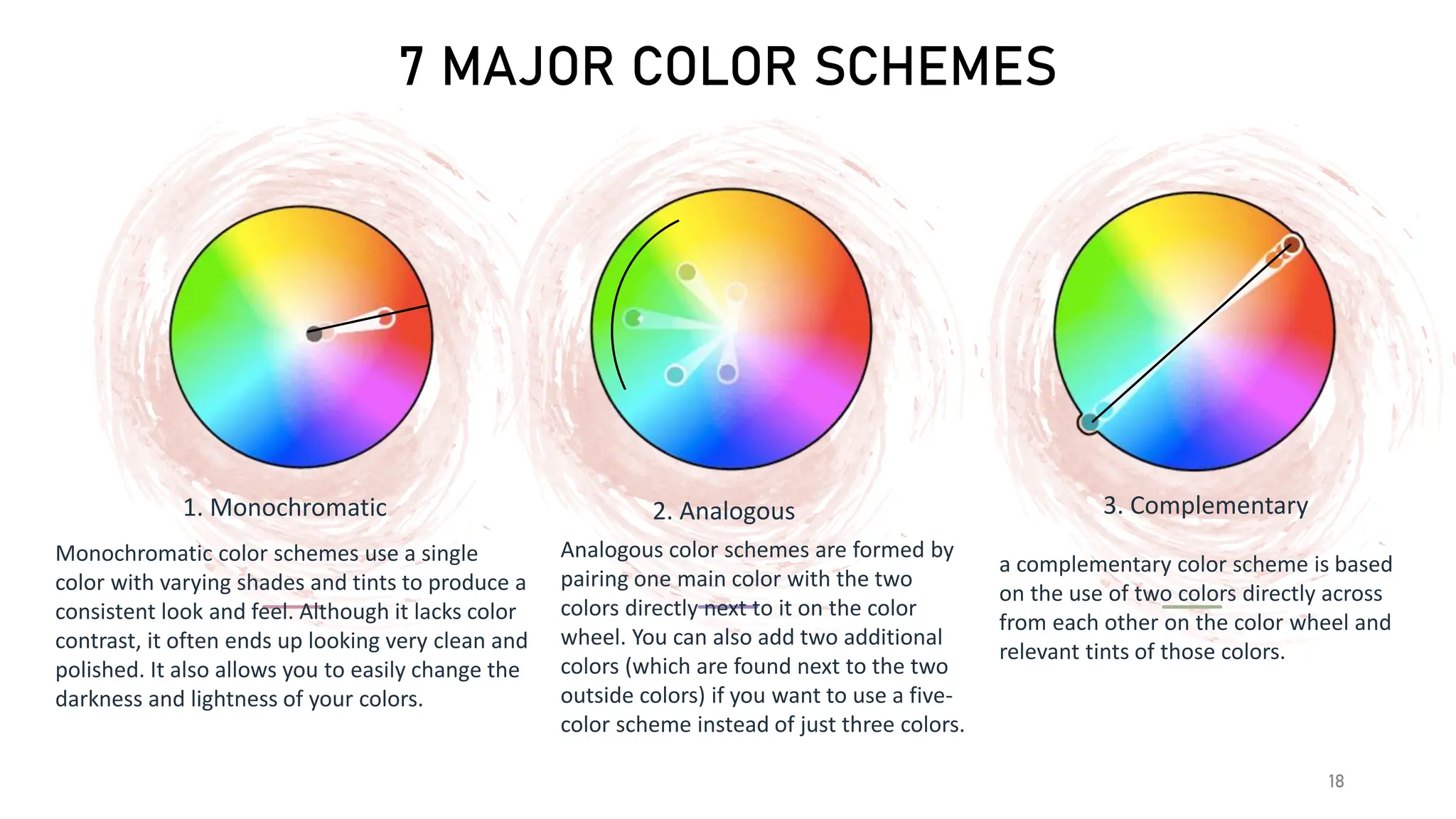
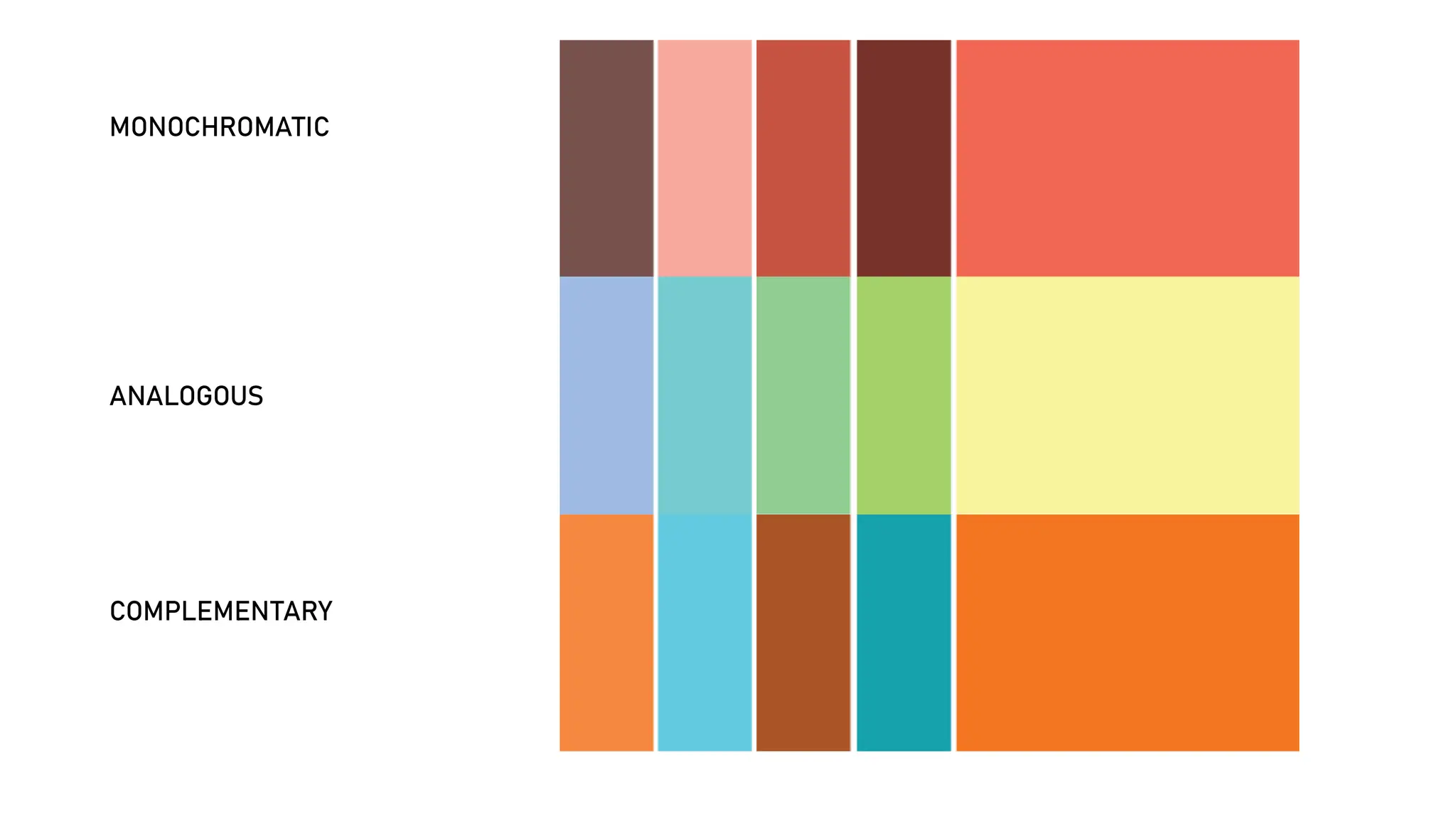
7 MAJOR COLORSCHEMES
18
1. Monochromatic
Monochromatic color schemes use a single
color with varying shades and tints to produce a
consistent look and feel. Although it lacks color
contrast, it often ends up looking very clean and
polished. It also allows you to easily change the
darkness and lightness of your colors.
2. Analogous
Analogous color schemes are formed by
pairing one main color with the two
colors directly next to it on the color
wheel. You can also add two additional
colors (which are found next to the two
outside colors) if you want to use a five-
color scheme instead of just three colors.
3. Complementary
a complementary color scheme is based
on the use of two colors directly across
from each other on the color wheel and
relevant tints of those colors.
7 MAJOR COLORSCHEMES
20
4. Split Complementary
A split complementary scheme includes one
dominant color and the two colors directly adjacent
to the dominant color's complement. This creates a
more nuanced color palette than a complementary
color scheme while still retaining the benefits of
contrasting colors.
5. Triadic
Triadic color schemes offer high
contrasting color schemes while retaining
the same tone. Triadic color schemes are
created by choosing three colors that are
equally placed in lines around the color
wheel.
6. Square
The square color scheme uses four colors
equidistant from each other on the color
wheel to create a square or diamond
shape. While this evenly-spaced color
scheme provides substantial contrast to
your design, it’s a good idea to select one
dominant color rather than trying to
balance all four.
7 MAJOR COLORSCHEMES
22
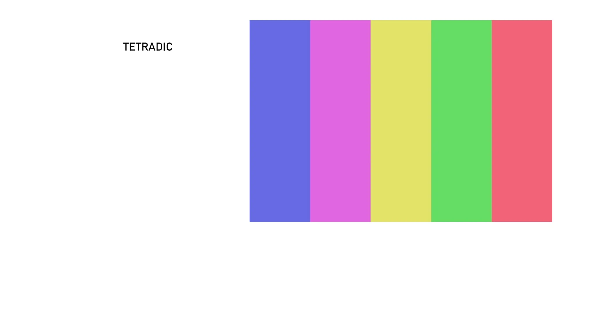
7. Rectangle/Tetradic
Also called the tetradic color scheme, the rectangle approach is
similar to its square counterpart but offers a more subtle
approach to color selection.