Downloaded 683 times
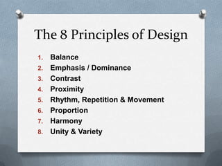


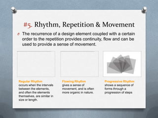


This presentation discusses the key principles of design including balance, emphasis, contrast, proximity, rhythm and movement, proportion, harmony, and unity and variety. It provides examples and explanations of each principle using illustrations from various design disciplines like graphic, web, and product design. The presentation concludes with an assignment asking students to create an artwork applying at least 5 of the principles discussed.


![The principles of design [autosaved]](https://cdn.slidesharecdn.com/ss_thumbnails/theprinciplesofdesignautosaved-200419193252-thumbnail.jpg?width=640&height=640&fit=bounds)


