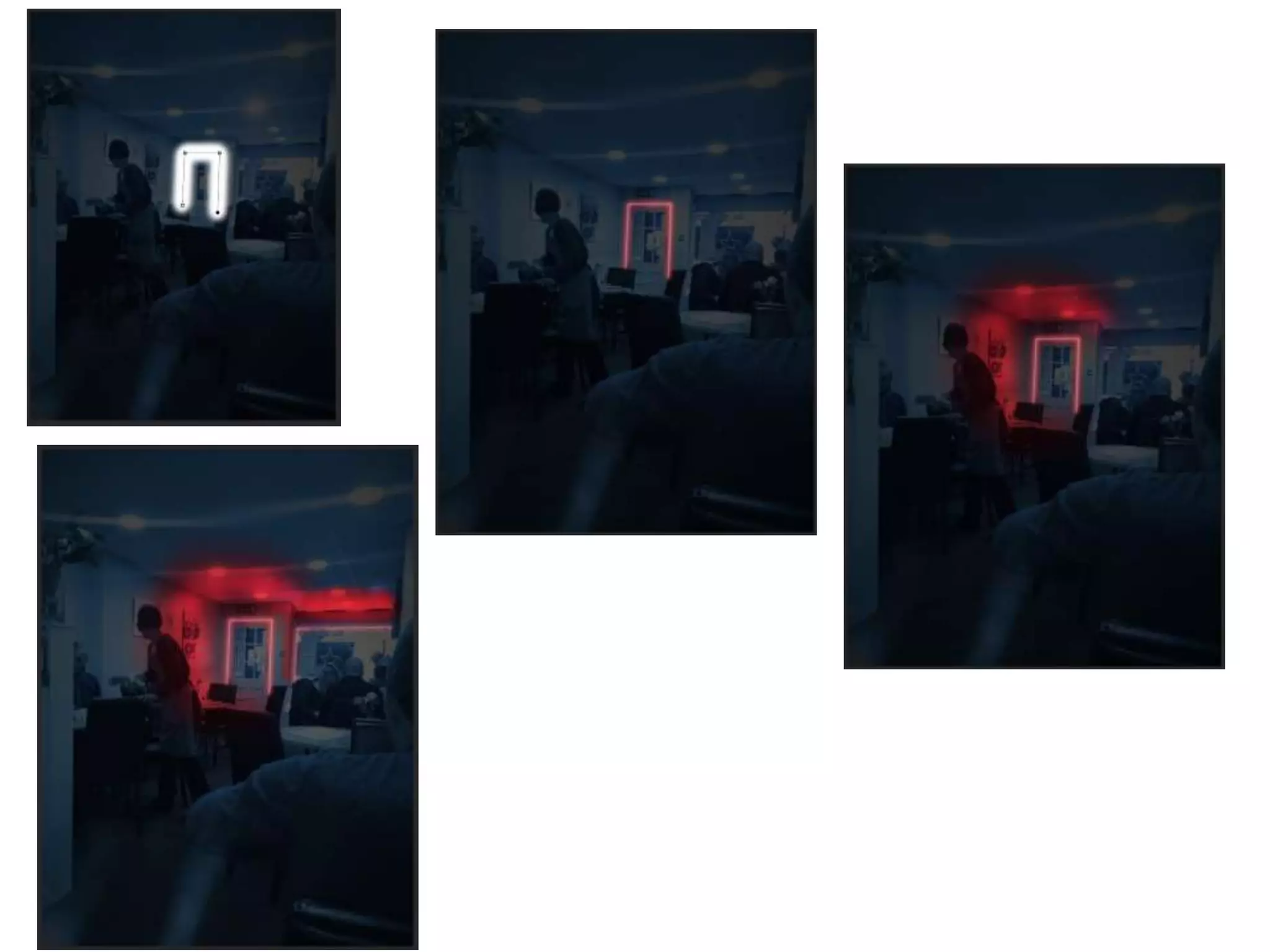
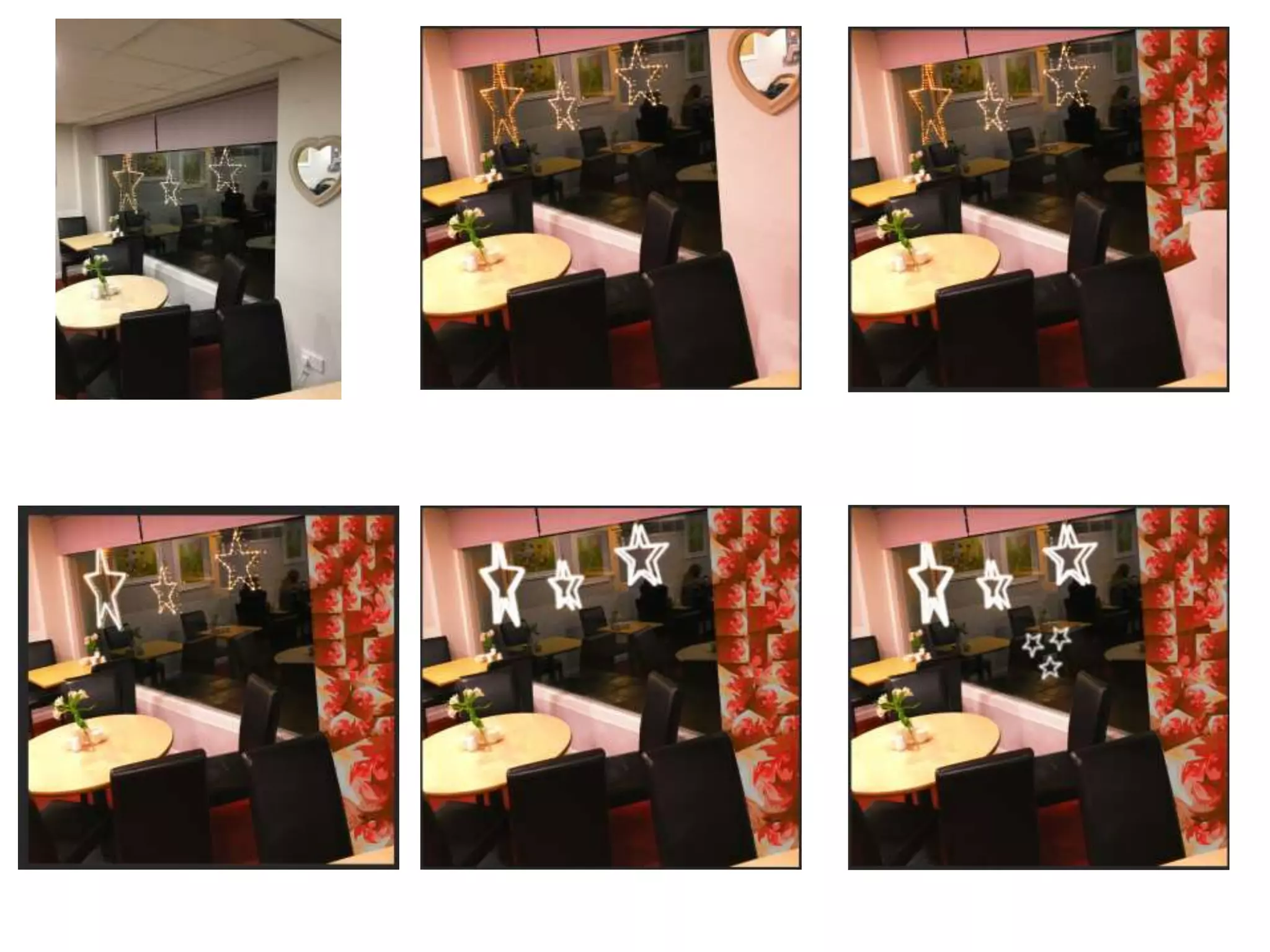
Development Diary
Tom Batty
Week 1: For week one of my client work, I was given the brief of my project and what we
had to complete over the next couple of weeks. I had already got in contact with a client
previous to the start of the project, just to be in good preparation for when I began work.
This gave me a chance to talk to my client and discuss options on what I could
design/produce for them.
The first task of was to research our target audience. This involved me using a website called
Cameo UK. What I needed to discuss and find out is who are the customers that regularly go
into my clients business. This involves me looking for age ranges, social class, house hold
income, hobbies, how often people go on holiday in the area of the business, how many
people eat out once a week and a percentage of qualifications. Just to add some more
helpful information with my research I conducted a survey asking customers of my client
where they had travelled from. All of this information gave me a good idea on how to
progress further in making some appealing work. This research took the full first week as a
gained some thorough information.
Week 2: Moving onto the second week of my client work, I had to begin some idea development. At the start I was
informed that this part of my client work I would be given two weeks to complete. This only meant one thing and that
meant that it was a good chance to get a mass amount of idea down and give my self loads and loads of options to
create some really in depth, decent work. For the first week of the two, I dedicated my time to producing three detailed
mind maps. My first mind map I created was involving colour schemes and fonts I could use for my project. With the
colour schemes, they varied from relatable colours that contrasted well or some more different ones that weren't as
relatable to my clients business or as effective. Then with the font options, I thought of three categories that to me links
in with the whole typical cafe genre. I chose ten French style fonts, ten classic fonts and ten modern fonts. By collecting
this many choice will just benefit me within the long run and give me multiple type of design options. Moving onto my
second mind map, this involved me discussing my content options. One part I expanded on was what information I could
write about my clients business. This was information such as foods, drinks, location, the boss and staff. Aspects that
would be important for advertisement. Then I expanded on a more clear level of explanation. On the other side, I
expanded on more of what I could take pictures of. The option/ideas I decided on were food, drinks, the boss and staff,
pictures of my clients business and happy customers and just like before I expanded a bit further with more specific
options of what I could actually produce. My final mind map touched upon what I could produce for my client. For
example, I mentioned social media. I listed social media platforms such as Facebook, Twitter and Instagram. To help
myself with ideas and guidance throughout my project, I expanded more on how I could use the Social media platforms
to benefit my clients business. This was mainly options such as advertisement and being able to get in touch with my
clients customers for feedback. This to me is one very good idea that could be a viable option. Then the second branch
of ideas I came up with was a logo, menu's, marketing and posters. These to me are also very viable options and could
become some effective pieces of work. Again just like before, I expanded my options further just so it helps me get a
rough idea or shape an idea of what I might be potentially creating for my client.
Week 3: All of that work concluded my first of the two weeks of idea development. Moving
onto the second week of my idea development, I gave a quick evaluation of my mind maps
then swiftly moved onto the development stage. Because of my decent work rate, I wasn't
pressured or under pressure on not finishing my idea development on time. This
development stage was just to narrow down my ideas to two final products that I might be
making. What I had to do for both is discuss a colour scheme and why I have chosen them,
moods boards and why I chose the images and finally a discretion or example of what my
products are roughly going to look like. I wanted to give a good amount of detail within my
work because it will help me get a better result of my product further down the road. The
two ideas I came up with was either an Instagram account or creating some menus or a new
fresh logo. But after keeping in contact with my client, she had mentioned how she is
looking for more of the social media side of things. So my client was pleased to hear about
my idea of the Instagram account. After completing my detailed development plans, it was
time to give my self an assessment of my final ideas. This was questions asking about the
suitability of my client, audience and the timescale. I'm fully confident with my progress and
work so far and I am in a very comfortable position. To finish my week off, I created a
production schedule to follow though-out the next four weeks. By doing this it will help me
keep on track and help me complete my task on time.
I'm really happy with my progress so far and I feel that I'm beginning to improve on my
weaker areas within my work.
Week 4: For the beginning of week four and the start of my production, I had previously taken pictures
over the weekend at my clients work place. This gave me an advantage on timing and helped me get
straight on with my production. Todays lessons I felt that I have made some good progress by completing
two different images with two different unique design to complement them. For one of the designs for a
white coffee, I messed around with the contrast to first get the colour of the background to fit in with the
rest of the layout. I created two different layers, one being the cup of coffee then the rest of the
background for the other layer. This allowed me to add a red outer glow to the cup giving off a nice effect.
I replaced the background of the second layer with a black background. This then gave me an opportunity
to add in a nice effective effect. I decided to create a flash/spotlight effect, I did this to try and get the
coffee to be the main attraction of the image. I created this effect by using a faded paint brush and a
camera flare effect. I personally feel that this has worked really well and this project has some promise
for me. After finishing that image, I moved onto my second of the day. This was of the Full English
Breakfast and I wanted to do something different but creative, something I haven't done before. So I
downloaded one of the comercial free fonts that I found and created multiple Word of Full English in the
Little Boss font. I had a vareity of three colours relating to my colour scheme and placed the words
around the background at different angles or sizes. Just like before I seperated the plate and the
background to different layers, by doing this it allowed me to fit in more words and placements for the
words. Once I covered the majority of the background and I was happy with the way it all looked, I
became a bit stuck with what I could possibly do to complete the whole image. So thought about how
food looks when advertised. I then thought about highering the brightness of each section thayt I
selected one at a time and then increased the contrast massively to give the dish a vibrant look.
I think I have begun my production at a very good level and I hope I can keep up all the good work.
Second day of week 4, I carried on with producing design to images I have previously taken. I began with
a picture of one of the staff at work behind the drinks machine. I got an instant idea of what I could
create, that was to quick select each separate roof panel and colour them in the thee different colours
part of my colour scheme. This to me gives off a really nice look to the image and it also fits in with the
café's look. I copied the same process for the front of the drinks area to again help it come together. To
me this wasn’t enough for the image, I added another lens flair to the already shining light. By doing this
it helped intensify the light and added another good feature to the image and to finish off the image all I
did was up the contrast to help bring out some of the colours. I will have to branch out how I am
designing the images and test myself more and stretch my skills further. Moving onto my second image
that I began on was two different sizes of Lattes. Much like with the white coffee image, I removed the
background and focused on the drinks themselves. I began by adding in a coloured background, keeping
along with my colour scheme. To try add in some different styles to the image, I added in a frame image
to see how well it would turn out and so far I feel that it looks decent but for the next day I will look
deeper into more detail to help elevate the image.
For my final day of my first week of production I only managed to really do a small amount of
work compared top the rest of the week. But I have to say it’s the most complicated design I
have produced yet for the production. I have to say I really like how it has turned out and I
feel like my work is going in the right direction. What I decided to do was Remove my progress
with the background pattern and actually move forward with my skills. So I looked up
Photoshop background effects and found a nice subtle low poly background pattern. I
followed that tutorial and even though it wasn’t that complicated it fit in perfectly. All I did to
complete this design was, firstly add a gradient overlay to my solid colour background and
change the second colour to one of my other colours from my colour scheme. Once I was
happy with my gradient overlay, I selected the polygonal lasso tool and proceeded to draw
out a triangle. Once I had my triangle I went into filters, blur and then average. That's what
gives off them really nice triangle fades. Sticking with where the crossfade of the gradient is,
all I had to do was rinse and repeat that process. Because the design looked like it needed a
tiny bit more added to it, I added in a image filler for two squares. This was an already
a custom pattern on Photoshop. To finish it off I cut out triangular patterns back with the
lasso tool and after that, the pattern fitted perfectly with the rest of the image.
The day after I contacted my client to show off some of my work and so far there was nothing
but positive feedback. My client likes what I am trying to do and is looking forward to seeing
what else I am wanting to create. This feedback helps me realize what progress I am making
and overall I feel that the first week of production went well.
Today was the beginning of the second week of production, and with that I wanted to carry on my
progress with a push to a design I hadn't attempted to think of or create. So at the weekend I returned to
my clients place of work just so I could take more pictures. The pictures I mainly took were of a slice of
cheese cake. The pictures were in a variety of angles, positions and locations. After going through the
images I had taken I finalized the image that looked the best then began to edit. After a few minutes of
looking at the image and thinking of how I could elevate the image, I thought due to how much table to
plate ratio I could create a water effect. So I went on a hunt for a tutorial and suprisingly I found one
reasonably quick. The effect was a water reflection with realistic ripples. I had the right style of image and
the effect fits in perfectly. I began by usning the rectangle marquee tool and selecting from below the
plate all the way up to the top of the image. What I selected os what will be reflected, hense why I did it
from just under the plate. Once I selected that part, I needed a new layer to place what I had previously
copied. Obviously, to begin the reflection I had to flip the copied image so it became upside down. After
that, I just moved the image down and messed around with the positioning for the best look of the
reflection. Once I was happy eith the positioning, I changed the image to a smart object and by doing this
it allowed me to add a moition blur. This negins that blur to the ripple look I will be looking for. To get the
ripple effect, I had to create a new document and begin by just colouring the page to black. This part
involves a lot fo filters and the first filter I added in was, noise and then into add noise. After that it was
time to add in the gaussian blur and then to mess with the red and green channels. With the red and
green channels, I used the stylize and emboss filter and by doing this it added in the different textures for
later on in the process. To finish off this part of the ripple, I had to transform the perspective then strecth
the bottom left and rightg corners. By strecthing the corners really far wide, this is where I saw the side
to side ripple amongst all the colours, giving a very trippy effect.
Once finishing that, I saved it and moved back to my original document. To then transfer the water
displacement effect I had just created. I needed to go to filter, distort and then displacement. Which took
the file I needed and once I added it in, that’s what gives off the water colour ripple effect below the top
image. Once applying the ripple effect in my document it was just a case of moving it about to help fit
perfectly with therest of the image. The last thing to do was just a final bit of detailing by using the
gradient tool. This just added in some shadowing effect to make the image look more realistic.
Due to me missing out on two days of week two of my production, I had to get straight on with week
three of my production. I personally think that I produced something very different but I also think that it
works very well. The design that I used for this next image was quite a complex light effect with lots of
steps and layers to it. My first step in accomplishing the neon lighting effect, I firstly had to lower the hue
saturation on the base image. Once doing that I needed to add in a cooling filter and lower the saturation
down to 90%. By doing both these first steps, it lowers the lighting on the image and gives it a dark blue
colour to it. To add to the evening style look of the image, I added a solid colour of black and lowered its
opacity to 70%. By looking at my screen shots then that how I produced the background I did from those
steps. I added in a radial gradient to help with the how effective the light looks later on down the line.
Now it was time to move onto creating the neon light itself and the first step was to get the brush tool
and make sure it was the correct size and setting for when I moved onto the pen tool. With the pen tool, I
needed to use it to create the lines for the neon light. Once creating my neon path lines and that general
arc shape I needed to right click and sort out which stroke path to use. Once I selected the brush for the
stroke path it leaves an engravement of what I just drew out. After dong that, I needed to delete my
previous path and just leaving the engravement. To progress further through the design I had to duplicate
the layer with the engravement on. With the duplicated layer, I added on a small gaussian blur to it and
then went back onto the original layer. I added a outer glow to the original engravement and that it was
began that nice neon glow. After that, it was time to add a larger gaussian blur to give the glow that soft
edge to it.
Moving back to the gradient level, I added in a gradient map layer which I added in a red background for
the next step that follows. I had to go to adjustments, image and then invert what I had to just. This
switches it back to the dark blue background before. Once doing that I needed to select the brush tool
and enlarge the size of the brush to 200. Still selecting the gradient map layer, I used the brush with the
colour white and it was with the colour white because that then uncovers the red under coat I had just
created before.
When I used the brush, I was drawing around the neon light and that what give off the light shining onto
surrounding surfaces. Again I added a gaussian blur to what I had just drawn and then add in a
brightness/contrast layer. With that, then I went into images, adjustments and invert. What those steps
did was prepare myself for a repeat of my previous step wit the paint brush. The second time around ust
gives off a brighter look for the glows on the surfaces. That was one of the last final major stages to the
tutorial/guide but the other steps were not as relevant.
This I would say has probably been one of the more complex design just because the first time trying to
replicate this I failed. By failing I had to begin from the beginning but I would say messing up actually
gave me a better outcome. I really like how this has all turned out for this certain image and I know that I
have done a good job for this production. Only a few days with a few more tasks to do and I am fully
confident I will finish my work on time.
For the second last day of the last week of production, I finished my last design for my final picture I had
taken. With this picture, I found myself struggling to find any tutorials or skills that I hadn't used or
fancied creating. So I though I would tap back into some of my skills that I had gained over the time of my
this certain course. So, I firstly thought about how I could relate the image to my colour scheme. I
accomplished this by messing with the hue/saturation setting to effect the whole image with a slight red
tinge. By doing this I felt that it added a nice starting feature to the image which lifted it very well. My
next step to improving the image was to ask for peoples opinion due to me being a bit stuck with my next
step. I came to the conclusion of re designing the right side of the image by adding in myself made
pattern. How I made this pattern was by getting an image of a wave and simply distorting the image in
multiple different directions, giving off that wavy pattern. Because the image was blue due to it being
from the ocean, I again messed around with the saturation and got it to a satisfactory red. Again this
helped the pattern fit in with the rest of the image, which helps add that bit extra to the photograph. The
final edition I needed to add to my image was to edit the stars. If I hadn't decided to design any more
effect then the image itself will have come off a bit bland. So from my neon lighting effect, I pretty much
copied that part of drawing out the lines and giving the nice glowing effect. Added a few layers of the
stars and then added some smaller stars to fill out the image more. Once doing that, I had finished the
image and my production. Again I have managed my time well and managed to finish with spare time to
hand in all my work. In feel that this production had gone well and possibly one of my better
productions.
Client, development diary

Client, development diary

  • 1.
  • 2.
    Week 1: Forweek one of my client work, I was given the brief of my project and what we had to complete over the next couple of weeks. I had already got in contact with a client previous to the start of the project, just to be in good preparation for when I began work. This gave me a chance to talk to my client and discuss options on what I could design/produce for them. The first task of was to research our target audience. This involved me using a website called Cameo UK. What I needed to discuss and find out is who are the customers that regularly go into my clients business. This involves me looking for age ranges, social class, house hold income, hobbies, how often people go on holiday in the area of the business, how many people eat out once a week and a percentage of qualifications. Just to add some more helpful information with my research I conducted a survey asking customers of my client where they had travelled from. All of this information gave me a good idea on how to progress further in making some appealing work. This research took the full first week as a gained some thorough information.
  • 4.
    Week 2: Movingonto the second week of my client work, I had to begin some idea development. At the start I was informed that this part of my client work I would be given two weeks to complete. This only meant one thing and that meant that it was a good chance to get a mass amount of idea down and give my self loads and loads of options to create some really in depth, decent work. For the first week of the two, I dedicated my time to producing three detailed mind maps. My first mind map I created was involving colour schemes and fonts I could use for my project. With the colour schemes, they varied from relatable colours that contrasted well or some more different ones that weren't as relatable to my clients business or as effective. Then with the font options, I thought of three categories that to me links in with the whole typical cafe genre. I chose ten French style fonts, ten classic fonts and ten modern fonts. By collecting this many choice will just benefit me within the long run and give me multiple type of design options. Moving onto my second mind map, this involved me discussing my content options. One part I expanded on was what information I could write about my clients business. This was information such as foods, drinks, location, the boss and staff. Aspects that would be important for advertisement. Then I expanded on a more clear level of explanation. On the other side, I expanded on more of what I could take pictures of. The option/ideas I decided on were food, drinks, the boss and staff, pictures of my clients business and happy customers and just like before I expanded a bit further with more specific options of what I could actually produce. My final mind map touched upon what I could produce for my client. For example, I mentioned social media. I listed social media platforms such as Facebook, Twitter and Instagram. To help myself with ideas and guidance throughout my project, I expanded more on how I could use the Social media platforms to benefit my clients business. This was mainly options such as advertisement and being able to get in touch with my clients customers for feedback. This to me is one very good idea that could be a viable option. Then the second branch of ideas I came up with was a logo, menu's, marketing and posters. These to me are also very viable options and could become some effective pieces of work. Again just like before, I expanded my options further just so it helps me get a rough idea or shape an idea of what I might be potentially creating for my client.
  • 6.
    Week 3: Allof that work concluded my first of the two weeks of idea development. Moving onto the second week of my idea development, I gave a quick evaluation of my mind maps then swiftly moved onto the development stage. Because of my decent work rate, I wasn't pressured or under pressure on not finishing my idea development on time. This development stage was just to narrow down my ideas to two final products that I might be making. What I had to do for both is discuss a colour scheme and why I have chosen them, moods boards and why I chose the images and finally a discretion or example of what my products are roughly going to look like. I wanted to give a good amount of detail within my work because it will help me get a better result of my product further down the road. The two ideas I came up with was either an Instagram account or creating some menus or a new fresh logo. But after keeping in contact with my client, she had mentioned how she is looking for more of the social media side of things. So my client was pleased to hear about my idea of the Instagram account. After completing my detailed development plans, it was time to give my self an assessment of my final ideas. This was questions asking about the suitability of my client, audience and the timescale. I'm fully confident with my progress and work so far and I am in a very comfortable position. To finish my week off, I created a production schedule to follow though-out the next four weeks. By doing this it will help me keep on track and help me complete my task on time. I'm really happy with my progress so far and I feel that I'm beginning to improve on my weaker areas within my work.
  • 8.
    Week 4: Forthe beginning of week four and the start of my production, I had previously taken pictures over the weekend at my clients work place. This gave me an advantage on timing and helped me get straight on with my production. Todays lessons I felt that I have made some good progress by completing two different images with two different unique design to complement them. For one of the designs for a white coffee, I messed around with the contrast to first get the colour of the background to fit in with the rest of the layout. I created two different layers, one being the cup of coffee then the rest of the background for the other layer. This allowed me to add a red outer glow to the cup giving off a nice effect. I replaced the background of the second layer with a black background. This then gave me an opportunity to add in a nice effective effect. I decided to create a flash/spotlight effect, I did this to try and get the coffee to be the main attraction of the image. I created this effect by using a faded paint brush and a camera flare effect. I personally feel that this has worked really well and this project has some promise for me. After finishing that image, I moved onto my second of the day. This was of the Full English Breakfast and I wanted to do something different but creative, something I haven't done before. So I downloaded one of the comercial free fonts that I found and created multiple Word of Full English in the Little Boss font. I had a vareity of three colours relating to my colour scheme and placed the words around the background at different angles or sizes. Just like before I seperated the plate and the background to different layers, by doing this it allowed me to fit in more words and placements for the words. Once I covered the majority of the background and I was happy with the way it all looked, I became a bit stuck with what I could possibly do to complete the whole image. So thought about how food looks when advertised. I then thought about highering the brightness of each section thayt I selected one at a time and then increased the contrast massively to give the dish a vibrant look. I think I have begun my production at a very good level and I hope I can keep up all the good work.
  • 10.
    Second day ofweek 4, I carried on with producing design to images I have previously taken. I began with a picture of one of the staff at work behind the drinks machine. I got an instant idea of what I could create, that was to quick select each separate roof panel and colour them in the thee different colours part of my colour scheme. This to me gives off a really nice look to the image and it also fits in with the café's look. I copied the same process for the front of the drinks area to again help it come together. To me this wasn’t enough for the image, I added another lens flair to the already shining light. By doing this it helped intensify the light and added another good feature to the image and to finish off the image all I did was up the contrast to help bring out some of the colours. I will have to branch out how I am designing the images and test myself more and stretch my skills further. Moving onto my second image that I began on was two different sizes of Lattes. Much like with the white coffee image, I removed the background and focused on the drinks themselves. I began by adding in a coloured background, keeping along with my colour scheme. To try add in some different styles to the image, I added in a frame image to see how well it would turn out and so far I feel that it looks decent but for the next day I will look deeper into more detail to help elevate the image.
  • 12.
    For my finalday of my first week of production I only managed to really do a small amount of work compared top the rest of the week. But I have to say it’s the most complicated design I have produced yet for the production. I have to say I really like how it has turned out and I feel like my work is going in the right direction. What I decided to do was Remove my progress with the background pattern and actually move forward with my skills. So I looked up Photoshop background effects and found a nice subtle low poly background pattern. I followed that tutorial and even though it wasn’t that complicated it fit in perfectly. All I did to complete this design was, firstly add a gradient overlay to my solid colour background and change the second colour to one of my other colours from my colour scheme. Once I was happy with my gradient overlay, I selected the polygonal lasso tool and proceeded to draw out a triangle. Once I had my triangle I went into filters, blur and then average. That's what gives off them really nice triangle fades. Sticking with where the crossfade of the gradient is, all I had to do was rinse and repeat that process. Because the design looked like it needed a tiny bit more added to it, I added in a image filler for two squares. This was an already a custom pattern on Photoshop. To finish it off I cut out triangular patterns back with the lasso tool and after that, the pattern fitted perfectly with the rest of the image. The day after I contacted my client to show off some of my work and so far there was nothing but positive feedback. My client likes what I am trying to do and is looking forward to seeing what else I am wanting to create. This feedback helps me realize what progress I am making and overall I feel that the first week of production went well.
  • 14.
    Today was thebeginning of the second week of production, and with that I wanted to carry on my progress with a push to a design I hadn't attempted to think of or create. So at the weekend I returned to my clients place of work just so I could take more pictures. The pictures I mainly took were of a slice of cheese cake. The pictures were in a variety of angles, positions and locations. After going through the images I had taken I finalized the image that looked the best then began to edit. After a few minutes of looking at the image and thinking of how I could elevate the image, I thought due to how much table to plate ratio I could create a water effect. So I went on a hunt for a tutorial and suprisingly I found one reasonably quick. The effect was a water reflection with realistic ripples. I had the right style of image and the effect fits in perfectly. I began by usning the rectangle marquee tool and selecting from below the plate all the way up to the top of the image. What I selected os what will be reflected, hense why I did it from just under the plate. Once I selected that part, I needed a new layer to place what I had previously copied. Obviously, to begin the reflection I had to flip the copied image so it became upside down. After that, I just moved the image down and messed around with the positioning for the best look of the reflection. Once I was happy eith the positioning, I changed the image to a smart object and by doing this it allowed me to add a moition blur. This negins that blur to the ripple look I will be looking for. To get the ripple effect, I had to create a new document and begin by just colouring the page to black. This part involves a lot fo filters and the first filter I added in was, noise and then into add noise. After that it was time to add in the gaussian blur and then to mess with the red and green channels. With the red and green channels, I used the stylize and emboss filter and by doing this it added in the different textures for later on in the process. To finish off this part of the ripple, I had to transform the perspective then strecth the bottom left and rightg corners. By strecthing the corners really far wide, this is where I saw the side to side ripple amongst all the colours, giving a very trippy effect.
  • 15.
    Once finishing that,I saved it and moved back to my original document. To then transfer the water displacement effect I had just created. I needed to go to filter, distort and then displacement. Which took the file I needed and once I added it in, that’s what gives off the water colour ripple effect below the top image. Once applying the ripple effect in my document it was just a case of moving it about to help fit perfectly with therest of the image. The last thing to do was just a final bit of detailing by using the gradient tool. This just added in some shadowing effect to make the image look more realistic.
  • 16.
    Due to memissing out on two days of week two of my production, I had to get straight on with week three of my production. I personally think that I produced something very different but I also think that it works very well. The design that I used for this next image was quite a complex light effect with lots of steps and layers to it. My first step in accomplishing the neon lighting effect, I firstly had to lower the hue saturation on the base image. Once doing that I needed to add in a cooling filter and lower the saturation down to 90%. By doing both these first steps, it lowers the lighting on the image and gives it a dark blue colour to it. To add to the evening style look of the image, I added a solid colour of black and lowered its opacity to 70%. By looking at my screen shots then that how I produced the background I did from those steps. I added in a radial gradient to help with the how effective the light looks later on down the line. Now it was time to move onto creating the neon light itself and the first step was to get the brush tool and make sure it was the correct size and setting for when I moved onto the pen tool. With the pen tool, I needed to use it to create the lines for the neon light. Once creating my neon path lines and that general arc shape I needed to right click and sort out which stroke path to use. Once I selected the brush for the stroke path it leaves an engravement of what I just drew out. After dong that, I needed to delete my previous path and just leaving the engravement. To progress further through the design I had to duplicate the layer with the engravement on. With the duplicated layer, I added on a small gaussian blur to it and then went back onto the original layer. I added a outer glow to the original engravement and that it was began that nice neon glow. After that, it was time to add a larger gaussian blur to give the glow that soft edge to it. Moving back to the gradient level, I added in a gradient map layer which I added in a red background for the next step that follows. I had to go to adjustments, image and then invert what I had to just. This switches it back to the dark blue background before. Once doing that I needed to select the brush tool and enlarge the size of the brush to 200. Still selecting the gradient map layer, I used the brush with the colour white and it was with the colour white because that then uncovers the red under coat I had just created before.
  • 17.
    When I usedthe brush, I was drawing around the neon light and that what give off the light shining onto surrounding surfaces. Again I added a gaussian blur to what I had just drawn and then add in a brightness/contrast layer. With that, then I went into images, adjustments and invert. What those steps did was prepare myself for a repeat of my previous step wit the paint brush. The second time around ust gives off a brighter look for the glows on the surfaces. That was one of the last final major stages to the tutorial/guide but the other steps were not as relevant. This I would say has probably been one of the more complex design just because the first time trying to replicate this I failed. By failing I had to begin from the beginning but I would say messing up actually gave me a better outcome. I really like how this has all turned out for this certain image and I know that I have done a good job for this production. Only a few days with a few more tasks to do and I am fully confident I will finish my work on time.
  • 19.
    For the secondlast day of the last week of production, I finished my last design for my final picture I had taken. With this picture, I found myself struggling to find any tutorials or skills that I hadn't used or fancied creating. So I though I would tap back into some of my skills that I had gained over the time of my this certain course. So, I firstly thought about how I could relate the image to my colour scheme. I accomplished this by messing with the hue/saturation setting to effect the whole image with a slight red tinge. By doing this I felt that it added a nice starting feature to the image which lifted it very well. My next step to improving the image was to ask for peoples opinion due to me being a bit stuck with my next step. I came to the conclusion of re designing the right side of the image by adding in myself made pattern. How I made this pattern was by getting an image of a wave and simply distorting the image in multiple different directions, giving off that wavy pattern. Because the image was blue due to it being from the ocean, I again messed around with the saturation and got it to a satisfactory red. Again this helped the pattern fit in with the rest of the image, which helps add that bit extra to the photograph. The final edition I needed to add to my image was to edit the stars. If I hadn't decided to design any more effect then the image itself will have come off a bit bland. So from my neon lighting effect, I pretty much copied that part of drawing out the lines and giving the nice glowing effect. Added a few layers of the stars and then added some smaller stars to fill out the image more. Once doing that, I had finished the image and my production. Again I have managed my time well and managed to finish with spare time to hand in all my work. In feel that this production had gone well and possibly one of my better productions.