Download to read offline

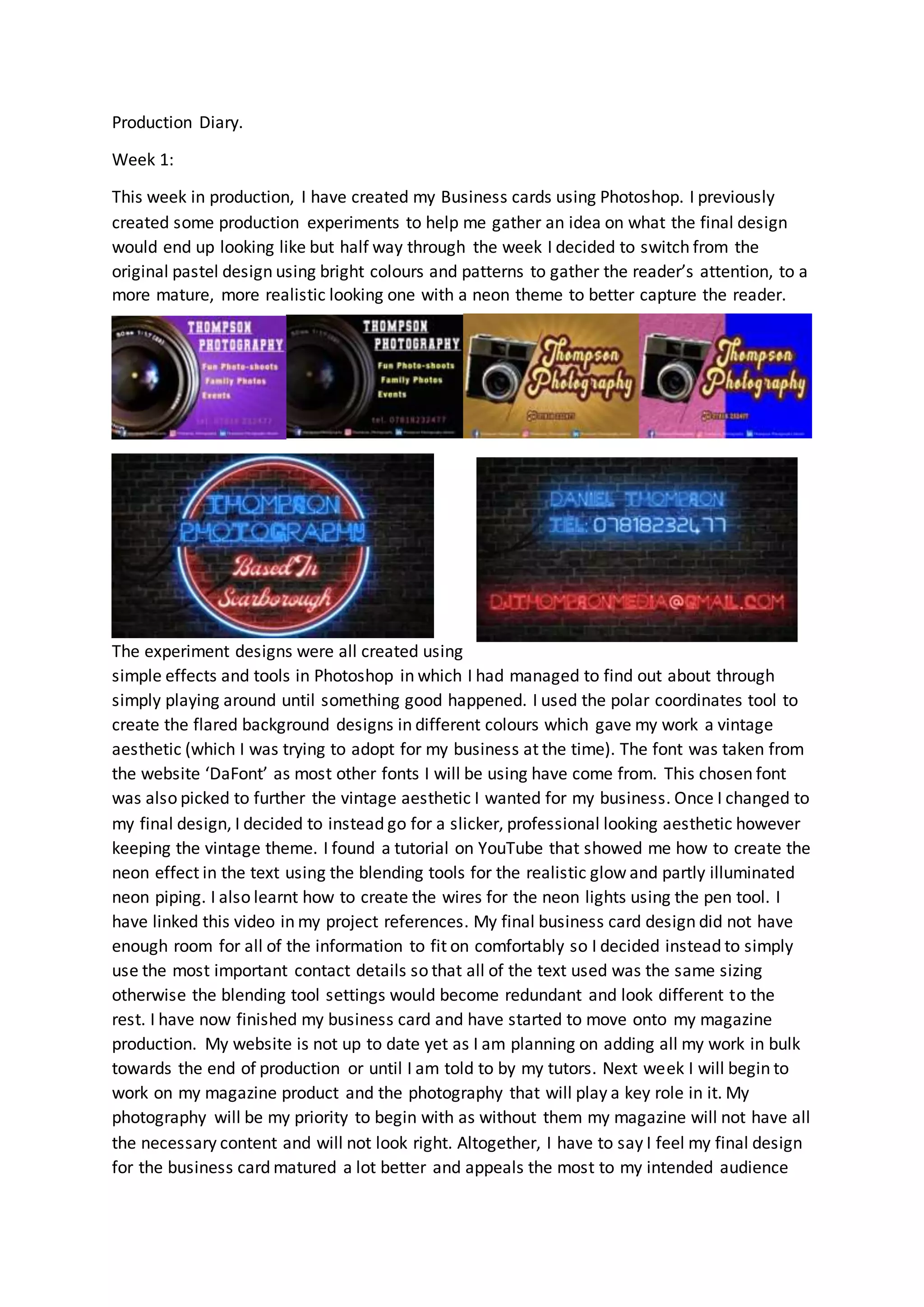
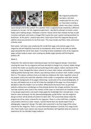
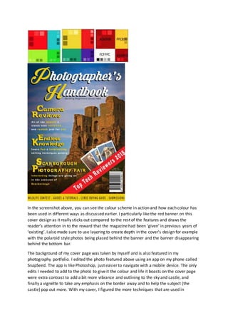


Week 1: The producer created business cards in Photoshop using a neon theme. They experimented with different designs before settling on a professional look. They learned Photoshop techniques like the polar coordinates tool. Week 2: The producer took landscape photos around Scarborough for their magazine and portfolio. They edited the photos in Photoshop to give them a vintage look by adding filters, scratches and grain. They designed the magazine cover using a faded, worn aesthetic. Week 3: The producer redesigned the magazine cover with a modern, professional color scheme. They applied the colors consistently across pages. They finished the cover design without tutorials by applying knowledge gained from prior experiments.