This is a presentation about the decisions I made for the font and masthead on the front cover of my 'Alternative Rock' music magazine. (AS Media Studies)
This is a presentation about the decisions I made for the font and masthead on the front cover of my 'Alternative Rock' music magazine. (AS Media Studies)
Looking back at your preliminary task, what do you feel you have learnt in the progression from it to the full product?
my response to the evaluation question
This my 7th evaluation presentation in relation to my media product. It will be looked at by examiners, but if you would like to leave comment, please feel free to do so.
'...The review itself consists of film terminology as the film should be analysed on a somewhat professional level rather than from a regular viewer’s perspective.'
Follow my Blogs:
divinelayokun.wordpress.com
divinelayokuna2mediafilm.wordpress.com
Goel Ganga Satellite Brochure - Zricks.comZricks.com
For more information about https://www.zricks.com/Goel-Ganga-Satellite-Wanowrie-Pune/15381
Goel Ganga Satellite, Wanowrie, VR Shinde Road, Pune. Visit: http://www.zricks.com
For more information about https://www.zricks.com/Acme-Hills-Goregaon-East-Mumbai/15155
Acme Hills, Goregaon East, Mumbai. Visit: http://www.zricks.com
Prestige Bella Vista Brochure - Zricks.comZricks.com
For more information about http://www.zricks.com/Prestige-Bella-Vista-Porur-Chennai/14275
Prestige Bella Vista, Porur, Chennai. Visit: http://www.zricks.com
Paranjape Richmond Park Brochure - Zricks.comZricks.com
For more information about https://www.zricks.com/Paranjape-Richmond-Park-Rahatani-Pune/15512
Paranjape Richmond Park, Rahatani, Aundh Road, Pune. Visit: http://www.zricks.com
For more information about http://www.zricks.com/Mana-Tropicale-Guttahalli-Bangalore/14890
Mana Tropicale, Sarjapur Road, Bangalore. Visit: http://www.zricks.com
For more information about http://www.zricks.com/Shriram-Greenfield-Budigere-Cross-Bangalore/14936
Shriram Greenfield, Budigere Cross, Old Madras Road, Bangalore. Visit: http://www.zricks.com
Pacifica The Meadows Brochure - Zricks.comZricks.com
For more information about http://www.zricks.com/Pacifica-The-Meadows-Gokuldham-Ahmedabad/14255 Pacifica The Meadows, Gokuldham, Ahmedabad. Visit: http://www.zricks.com
Palestine last event orientationfvgnh .pptxRaedMohamed3
An EFL lesson about the current events in Palestine. It is intended to be for intermediate students who wish to increase their listening skills through a short lesson in power point.
Operation “Blue Star” is the only event in the history of Independent India where the state went into war with its own people. Even after about 40 years it is not clear if it was culmination of states anger over people of the region, a political game of power or start of dictatorial chapter in the democratic setup.
The people of Punjab felt alienated from main stream due to denial of their just demands during a long democratic struggle since independence. As it happen all over the word, it led to militant struggle with great loss of lives of military, police and civilian personnel. Killing of Indira Gandhi and massacre of innocent Sikhs in Delhi and other India cities was also associated with this movement.
The Indian economy is classified into different sectors to simplify the analysis and understanding of economic activities. For Class 10, it's essential to grasp the sectors of the Indian economy, understand their characteristics, and recognize their importance. This guide will provide detailed notes on the Sectors of the Indian Economy Class 10, using specific long-tail keywords to enhance comprehension.
For more information, visit-www.vavaclasses.com
How to Split Bills in the Odoo 17 POS ModuleCeline George
Bills have a main role in point of sale procedure. It will help to track sales, handling payments and giving receipts to customers. Bill splitting also has an important role in POS. For example, If some friends come together for dinner and if they want to divide the bill then it is possible by POS bill splitting. This slide will show how to split bills in odoo 17 POS.
2024.06.01 Introducing a competency framework for languag learning materials ...Sandy Millin
http://sandymillin.wordpress.com/iateflwebinar2024
Published classroom materials form the basis of syllabuses, drive teacher professional development, and have a potentially huge influence on learners, teachers and education systems. All teachers also create their own materials, whether a few sentences on a blackboard, a highly-structured fully-realised online course, or anything in between. Despite this, the knowledge and skills needed to create effective language learning materials are rarely part of teacher training, and are mostly learnt by trial and error.
Knowledge and skills frameworks, generally called competency frameworks, for ELT teachers, trainers and managers have existed for a few years now. However, until I created one for my MA dissertation, there wasn’t one drawing together what we need to know and do to be able to effectively produce language learning materials.
This webinar will introduce you to my framework, highlighting the key competencies I identified from my research. It will also show how anybody involved in language teaching (any language, not just English!), teacher training, managing schools or developing language learning materials can benefit from using the framework.
Synthetic Fiber Construction in lab .pptxPavel ( NSTU)
Synthetic fiber production is a fascinating and complex field that blends chemistry, engineering, and environmental science. By understanding these aspects, students can gain a comprehensive view of synthetic fiber production, its impact on society and the environment, and the potential for future innovations. Synthetic fibers play a crucial role in modern society, impacting various aspects of daily life, industry, and the environment. ynthetic fibers are integral to modern life, offering a range of benefits from cost-effectiveness and versatility to innovative applications and performance characteristics. While they pose environmental challenges, ongoing research and development aim to create more sustainable and eco-friendly alternatives. Understanding the importance of synthetic fibers helps in appreciating their role in the economy, industry, and daily life, while also emphasizing the need for sustainable practices and innovation.
Students, digital devices and success - Andreas Schleicher - 27 May 2024..pptxEduSkills OECD
Andreas Schleicher presents at the OECD webinar ‘Digital devices in schools: detrimental distraction or secret to success?’ on 27 May 2024. The presentation was based on findings from PISA 2022 results and the webinar helped launch the PISA in Focus ‘Managing screen time: How to protect and equip students against distraction’ https://www.oecd-ilibrary.org/education/managing-screen-time_7c225af4-en and the OECD Education Policy Perspective ‘Students, digital devices and success’ can be found here - https://oe.cd/il/5yV
This is a presentation by Dada Robert in a Your Skill Boost masterclass organised by the Excellence Foundation for South Sudan (EFSS) on Saturday, the 25th and Sunday, the 26th of May 2024.
He discussed the concept of quality improvement, emphasizing its applicability to various aspects of life, including personal, project, and program improvements. He defined quality as doing the right thing at the right time in the right way to achieve the best possible results and discussed the concept of the "gap" between what we know and what we do, and how this gap represents the areas we need to improve. He explained the scientific approach to quality improvement, which involves systematic performance analysis, testing and learning, and implementing change ideas. He also highlighted the importance of client focus and a team approach to quality improvement.
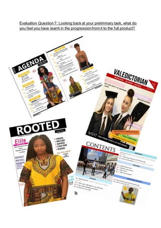
1. Evaluation Question 7: Looking back at your preliminary task, what do
you feel you have learnt in the progressionfrom it to the full product?
2. Aim of my Preliminary Task:
The purpose of my preliminary task was to create a school-based
magazine, complete with a contents page and front cover. At first I
was unsure of how I would plan and structure the creation of my
magazine and so I had to gain inspiration through researching and
looking at past candidates’ attempts. To be honest I was not really
fussed about the layout and structure of the preliminary task as a
whole because I knew that my final product had to be way more
professional and believable as a magazine. Hence, I started off the
creation with no set plan in mind apart from having a clear-cut vision
of a medium-shot of some younger student who attend my school,
decked out in a novel graduation gown and cap as the name of my
magazine was ‘Valedictorian’. Therefore, my key aim was to stress the
importance of education and how it is the ‘key to success’.
Aim of my Main Product:
The aim of my main task was to create a believable music magazine of
any genre possible. I opted for a genre I was familiar and comfortable
with and that was Afrobeats. In the making of my final product I had
to carefully consider every aspect of the magazine and include minor
details that I believed would convey the idea of Afrobeats upon first
glance. Therefore, on both occasions of my photoshoots {both sample
and real} I incorporated an African flare by asking my models to wear
an African traditional/ tribal clothing called the ‘Dashiki’. With that
sorted I ensured that my front cover star had her hair in braids too as
that’s a typical hairstyle that African girls wear today.
3. Masthead
These are the two mastheads I have used in the progression of my
media product. In terms of layout they are very different pieces of
work. By looking at the first masthead used in my preliminary task we
can see that I have used a third party font (KG Defying Gravity)- taken
from dafont.com- and the letters within are narrowly placed besides
one another, I wouldn't say that this looks particularly professional or
effective, however, comparing it to the second piece of work you can
see a vast improvement. The improvement comes from the layout and
the positioning on the page amongst other aspects. As you can see,
the masthead not only dominates over two-thirds of the page but it is
centred nicely against the contrasting black background, thus creating
a balanced sense for the page in which the focus is not only on one
side of the page. The font is also an aspect that adds to the difference
of the two pieces, as you can seem the text in the preliminary task
4. looks much narrow, sharp and conservative therefore less effective
whereas, in the main task a capitalised standard font (Khmer UI) has
been used alongside a black background, which looks far more
engaging yet minimal. To further this, I have employed the use of a
forced gap within the masthead of my main task, this allowed the
word to cver a majority of the black space and emphasises the effect
of letting the masthead ‘do the talking’
Front Cover
5. My preliminary task in comparison to my final task shows how much I
have improved my skills in producing a magazine. The front cover of
my preliminary task was made on Publisher while the front cover of
my final task was made on Adobe InDesign which was harder to use
but more effective as it provided an entirely different range of editing
opportunities.
The biggest improvement I can see would be the design formatting.
For my preliminary task, I did not put a lot of planning into it and this
was reflected in the layout as there is no coordinating colour scheme
and the taglines are in different sizes and fonts which does not make
the magazine look very professional. My preliminary task has awful
positioning and schemes that do not correlate at all so I discovered it
was better to keep one consistent pattern and also position things
correctly so the second time round I made sure that nothing was
blocking my cover star.
The layout for my preliminary task was poorly executed as it was
overloaded with irrelevant content: there were too many cover line
additions as well as the inserted images, all of these conveyed a
clustered look as opposed to the minimalist and clean-cut appearance
of my final product- thus distracting the readers. Meanwhile for my
final task, I developed an idea and deliberated on how the layout of
my magazine will look like and this is shown in the outcome of my final
magazine.
7. In regards to my final contents page I can also see a clear improvement
in my designing skills. In my preliminary I can see that I used an array
of colours which didn't gel well with the remaining magazine. The
overall layout is not presented appropriately as there are too many
gaps/ white spaces on the page which makes it feel cheap and vague.
Also, it looks unprofessional compared to my final product as the
boxes and layout is very passive.
The preliminary task does have quite a structured layout, however, I
think after looking into the conventions of magazines more, I was able
to develop a better layout which is separated up and easy to look at.
By using the lines between features on the page the contents looks
professional and stylish. Most importantly, I decided to have a focus
on the middle of the page with my main task by using an enlarged
main image, this is subtle but effective, in contrast to the preliminary
task it does create more of a focus. I also decided to separate the
features and the regulars, this was once more to create a more
organised feel.
However, in my final magazine I can see that have filled up most the
space in the magazine so it doesn’t feel completely empty and over
the double page spread I have categorized the content well and
broken up the text on the page with the inclusion of images. My final
contents page has more order and structure, the boxes also don’t
follow a set measurement which allows the layout to look more easy
to the eye, effectively making it more appealing. This design is lacking
in my preliminary magazine as it is less creative which make it appear
unprofessional.