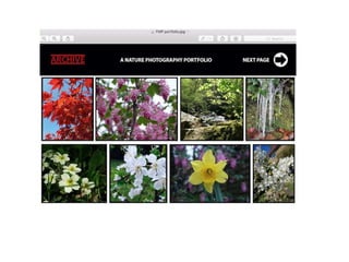
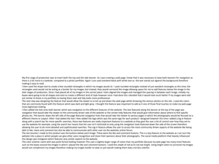
The document describes the process of creating a photography portfolio, website, and magazine. For the portfolio, the creator selected 8 photos to feature and placed them in boxes for structure. A simple black and white color scheme was used. For the website, images were placed in rounded rectangles and navigation bars were added. Features like search, login, and social buttons were included. The magazine's front cover included a featured photo, logo, and banner with content details. Colors like red, yellow and white were used to make the page vibrant but not busy. Care was taken to align elements and choose appropriate fonts and layouts to make the works look professional.
Strategies for Effective Upskilling is a presentation by Chinwendu Peace in a Your Skill Boost Masterclass organisation by the Excellence Foundation for South Sudan on 08th and 09th June 2024 from 1 PM to 3 PM on each day.
The simplified electron and muon model, Oscillating Spacetime: The Foundation...RitikBhardwaj56
Discover the Simplified Electron and Muon Model: A New Wave-Based Approach to Understanding Particles delves into a groundbreaking theory that presents electrons and muons as rotating soliton waves within oscillating spacetime. Geared towards students, researchers, and science buffs, this book breaks down complex ideas into simple explanations. It covers topics such as electron waves, temporal dynamics, and the implications of this model on particle physics. With clear illustrations and easy-to-follow explanations, readers will gain a new outlook on the universe's fundamental nature.
A review of the growth of the Israel Genealogy Research Association Database Collection for the last 12 months. Our collection is now passed the 3 million mark and still growing. See which archives have contributed the most. See the different types of records we have, and which years have had records added. You can also see what we have for the future.
This slide is special for master students (MIBS & MIFB) in UUM. Also useful for readers who are interested in the topic of contemporary Islamic banking.
Macroeconomics- Movie Location
This will be used as part of your Personal Professional Portfolio once graded.
Objective:
Prepare a presentation or a paper using research, basic comparative analysis, data organization and application of economic information. You will make an informed assessment of an economic climate outside of the United States to accomplish an entertainment industry objective.
it describes the bony anatomy including the femoral head , acetabulum, labrum . also discusses the capsule , ligaments . muscle that act on the hip joint and the range of motion are outlined. factors affecting hip joint stability and weight transmission through the joint are summarized.
Normal Labour/ Stages of Labour/ Mechanism of LabourWasim Ak
Normal labor is also termed spontaneous labor, defined as the natural physiological process through which the fetus, placenta, and membranes are expelled from the uterus through the birth canal at term (37 to 42 weeks
This presentation includes basic of PCOS their pathology and treatment and also Ayurveda correlation of PCOS and Ayurvedic line of treatment mentioned in classics.
A Strategic Approach: GenAI in EducationPeter Windle
Artificial Intelligence (AI) technologies such as Generative AI, Image Generators and Large Language Models have had a dramatic impact on teaching, learning and assessment over the past 18 months. The most immediate threat AI posed was to Academic Integrity with Higher Education Institutes (HEIs) focusing their efforts on combating the use of GenAI in assessment. Guidelines were developed for staff and students, policies put in place too. Innovative educators have forged paths in the use of Generative AI for teaching, learning and assessments leading to pockets of transformation springing up across HEIs, often with little or no top-down guidance, support or direction.
This Gasta posits a strategic approach to integrating AI into HEIs to prepare staff, students and the curriculum for an evolving world and workplace. We will highlight the advantages of working with these technologies beyond the realm of teaching, learning and assessment by considering prompt engineering skills, industry impact, curriculum changes, and the need for staff upskilling. In contrast, not engaging strategically with Generative AI poses risks, including falling behind peers, missed opportunities and failing to ensure our graduates remain employable. The rapid evolution of AI technologies necessitates a proactive and strategic approach if we are to remain relevant.
A workshop hosted by the South African Journal of Science aimed at postgraduate students and early career researchers with little or no experience in writing and publishing journal articles.
3. Process
I started out with a blank page on Photoshop. As I was creating a
photography portfolio I thought that I will try to fit as many
photos on as possible however I needed them to be a reasonable
size so that the viewer wouldn't’t have to zoom in to view them
so I carefully selected 8 photos to be featured on my photography
portfolio page. I decided to place the images in boxes so that the
photographs would have some kind of outline around them
which makes the page look neat and the images stand out a little
bit more. A benefit to doing this was that once I had the image
placed inside the box, I could then resize the box if I wanted to
make the image larger and smaller, I could also change the width
of the outline around the images.
My first steps were placing the boxes onto the page but also
creating a banner which is necessary for most online platforms
as this is where I would go on to placing things like the logo,
navigation and portfolio title in later stages of production. I went
with the simple black and white color scheme as I think it looks
very formal as I suppose that the overall theme is considered to
be more formal than other subject areas in photography. I also
wanted my vibrant and colorful pictures to stand out more
therefore not using other bright colors for the background and
banner.
After I had inserted the photographs that I wanted to feature, I
made sure that all of the images and borders around the images
were aligning to make the page look neat and tidy. The most
difficult part about inserting the images and borders was that the
majority of my photographs were different sizes therefore I spent a
large amount of time positioning my photos so that they could all
fit on the page yet remain the same size in height and also keep the
same size space in-between each photo. After I had done this, I
then turned my attention to creating my logo. I stuck with the same
logo that I had initially designed for my production experiments.
I positioned my logo in the top left corner and also
positioning it in the center of the banner. I chose dark
red as it is one of my favorite colors to use when
designing a formal product. I like this color because it
makes the logo stand out however it does not look to
bright which would make the logo look out of place
considering that it is against a black and white color
scheme. Initially I just wanted an underlined title
however once I had done that I thought I could make my
logo more distinctive by doing the same above the text
which I thought looked really good as its looks very
clean and professional looking.
Like the images I used, I had to also carefully edit the logo so that
every thing was aligned and equal distances apart. I did this by
zooming in 10X to allow me to see each individual pixel. This was
helpful as it allowed me to get the spacing perfect and as a result
of this I created what I think is a very neat logo.
On the left are another
two logo designs that I
had experimented with
during production that I
ultimately decided that I
did not like.
My final couple of steps were inserting the other features
onto the banner. The ‘next page’ button was designed using
the ellipse and free shape tool which was quite a simple
process but I also think this looks good as it is an easy way of
navigation for the viewer because it is very visible. For the
title I used bold white text which I think is effective in the
way that its easily readable and clearly visible. The title is
important to inform the viewer of what type of photography
that the portfolio features however that is self explanatory.
4.
5. My first stage of production was to insert both the top and the side banner. As I was creating a web page I knew that it was necessary to have both banners for navigation as
there is a lot more to a website compared to a photo portfolio. Again I just used standard black with white text as the text stands out against the background therefore
making it easy to read.
I then used the shape tool to create a few rounded rectangles in which my images would sit. I used rounded rectangles instead of just standard rectangles as this time, the
rectangles used would not be acting as a border for my images, but instead, they would surround the image allowing space for me to add features below the image in the
later stages of production. Once I had placed all of my images in the correct place I then aligned the images and managed the spacing in between each image. Initially my
boxes were going to be all shapes and sizes to create a different kind of style however once I had done this I decided that it would look much better if my images were laid
out similar to those in my portfolio as having them neat and tidy looks more professional.
The next step was designing the feature that would allow the viewer to scroll up and down the web page whilst browsing the various photos on the site. I used the colors
that are commonly found with this feature which was dark and light grey. I thought this feature was important to add as it one of those final touches to make my web page
more legitimate looking.
I then added the text onto both banner which was navigation to the different features of the website. The text featured along the banner at the top of the page was
navigation that would take the viewer to the community driven side of the website or the certain help features that would give information about where to find specific
photos etc. The banner down the left side of the page featured navigation links that would take the viewer to various pages in which the photography would be focused on a
different theme or subject. After I had added the text I then added the logo which was the same logo for each product I designed however this time I added a log in feature
along with a search bar for more specific searches, these two features are really important features to a website as they give the user a lot of control over how they ant to
use the website for example; using the search bar means that the user isn't restricted to only using the navigation tools featured down the side of the screen therefore
allowing the user to do more detailed and sophisticated searches. The Log in feature allows the user to access the more community driven aspects of the website like being
able to like, share and comment but also be able to communicate with other user via the websites online forum.
The last touches I made to this product was the buttons below each image. These were the like and comment buttons. This is a key feature to the website as I can turn the
website into a place in which people can give other users recognition and share their opinions about their photographs. The social media platform that heavily influenced
this design was Instagram which features very similar aspects to the website.
The color scheme i went with was quite formal looking however This uses a slightly larger range of colors than my portfolio because my web page has many more features
such as the boxes around the images in which I placed the like and comment buttons. I used this shade of red as its not too bright. Using bright colors to surround my images
would not compliment my images therefore making my images harder to view or just overall making them look a lot less colorful.
6.
7. My first stage of production with my magazine was to insert my feature photo that would be displayed across the front page. I chose this
photo carefully as I knew that the photo featured on the front of the magazine would reflect on the content inside. I like this picture as I
think its pleasant to view and also quite peaceful.
The next step was the insert my logo which was the same for each product that I designed however I altered it slightly to fit the width of
the page. I used the ‘myriad Pro’ font for the title of the magazine as it’s a very standard font which I think looks the most effective in
bold and upper case. Photography is quite a formal subject which is also why I chose this style of font however experimenting with
different fonts was something I did in the early stages of production which allowed me to browse a wide range of fonts and I did find a
few others that were also suitable. The text was also in the same font in both Bold and Regular as they varied because I featured Sub
headings above text. I then used the shape tool to produce the box underneath the page numbers and text and the bottom of the page
however I reduced the opacity down to 40% so that the feature photo was still visible underneath. Personally I think this feature works
very well with the image on the front cover. To make my front cover look more like a legitimate magazine front cover, I featured a
banner along the top of the page which states the content of the magazine and my products website. My color scheme had a slightly
larger range of colors as I used dark red, yellow and white text. I picked these colors because they are very basic but vibrant. I only stuck
with three colors so that the page didn’t look too busy with bright text and headings everywhere.
Editor's Notes
Discuss the tools and processes used in your production. Log your thoughts and feelings about your work.