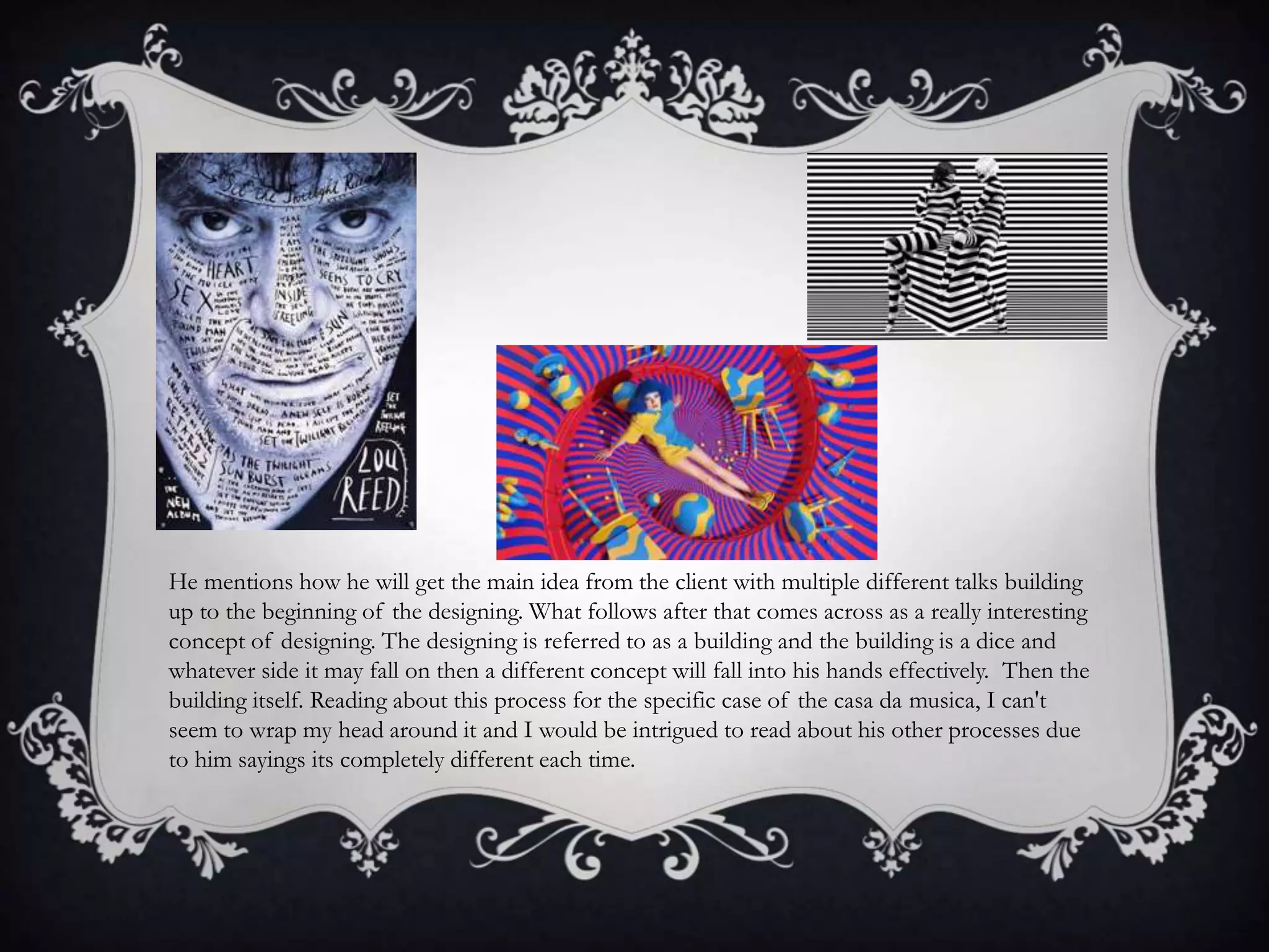
Stefan Sagmeister is an Austrian graphic designer born in 1962. He began his career at age 15 designing for a left-wing magazine. Notable clients include the Rolling Stones. His process for logo design involves reducing brand attributes to a minimum and conceptualizing the design process as "building a dice" to generate random concepts.
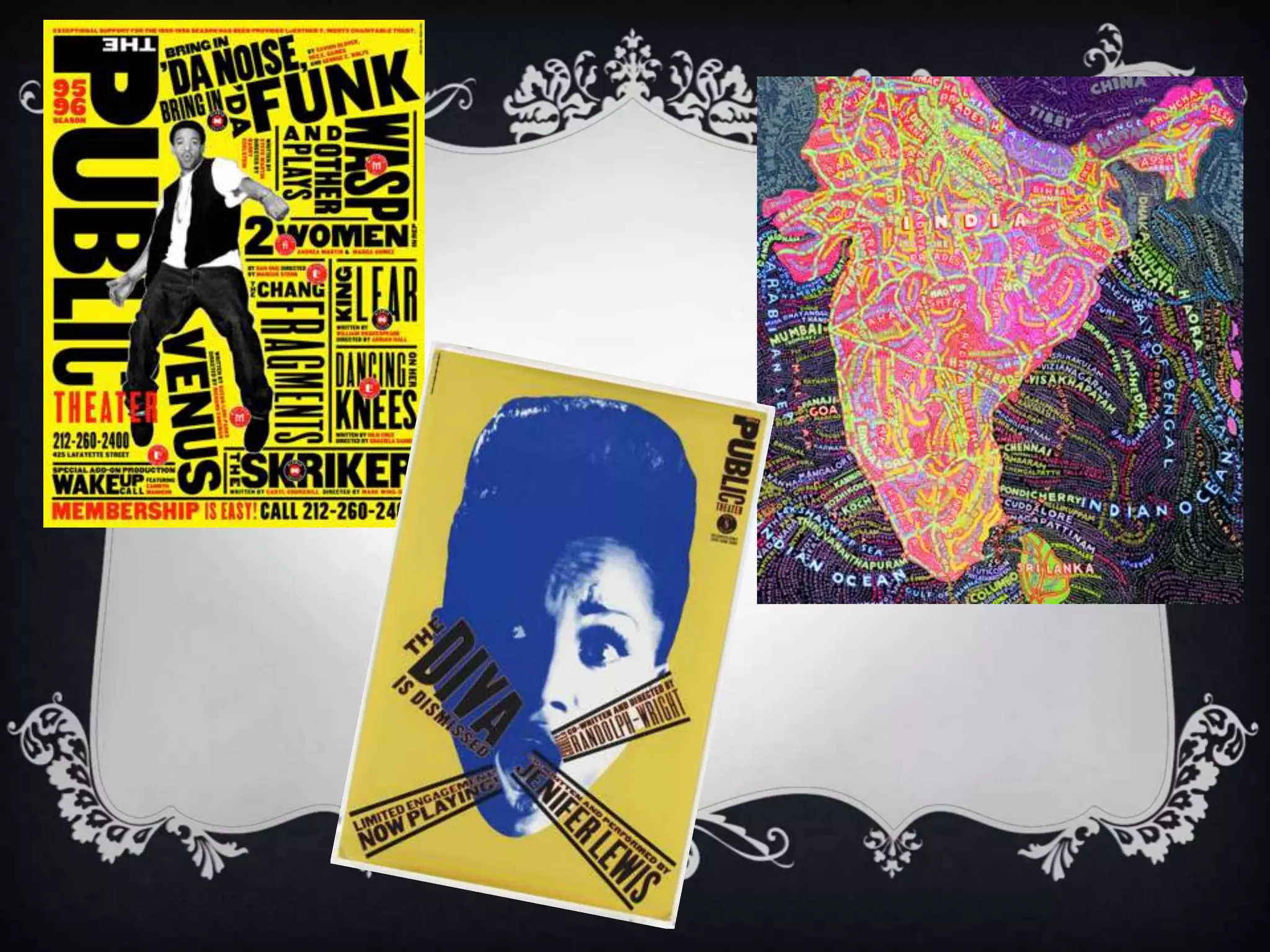
Paula Scher is an American graphic designer born in 1948 known for her work with major corporations like Microsoft and Coca-Cola. She believes identities are how things are recognized and that creativity thrives during periods of boredom.
Steven Heller is an American design historian and critic born in 1950. He has edited magazines and written columns promoting experimentation in design. He