This document summarizes Tom Batty's development diary for his first 6 weeks of work on a graphic design FMP (Final Major Project). Some key details:
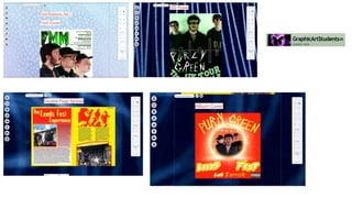
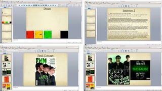
- In week 1, Tom researched graphic designers and created a proposal and PowerPoint on his research.
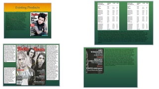
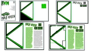
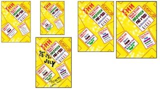
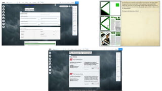
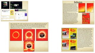
- In week 2, Tom analyzed existing graphic design products like magazine covers and spreads.
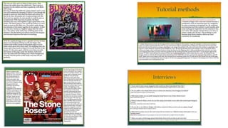
- In week 3, Tom continued analyzing products and began production research through tutorials.
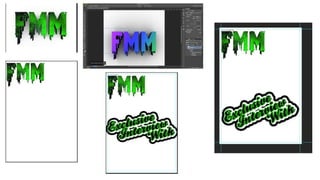
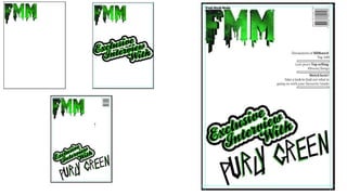
- In week 4, Tom created a problem-solving mind map and practiced Photoshop techniques.
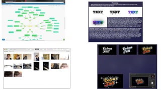
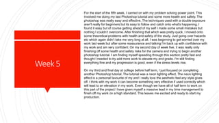
- In week 5, Tom finished his problem-solving presentation and practiced more Photoshop tutorials.
- Tom felt he was managing his