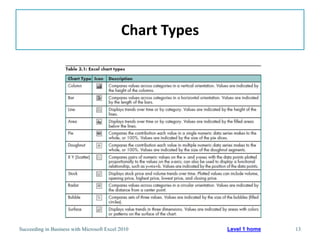
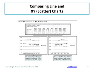
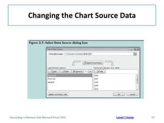
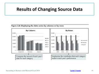
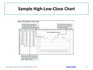
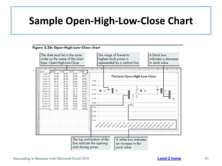
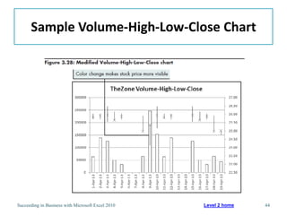
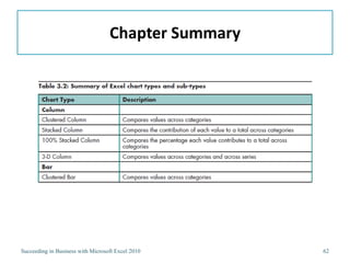
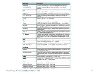
This chapter discusses different types of charts that can be used to visualize quantitative data in Excel. It covers basic chart types like line, column, and pie charts, as well as more advanced types like radar and bubble charts. The chapter also explores chart sub-types and how to combine multiple chart types into a single dashboard chart to analyze business data. The objectives are to determine the appropriate chart type for different situations, modify charts effectively, and create advanced visualizations like management dashboards.