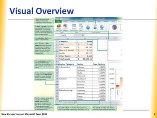
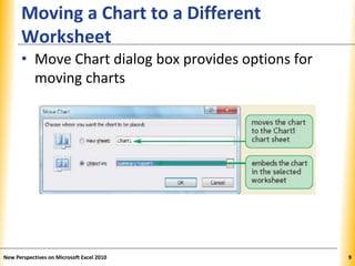
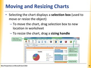
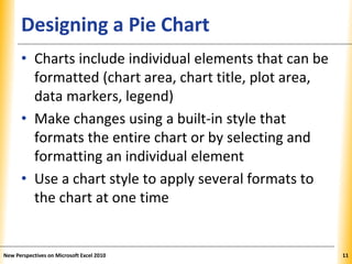
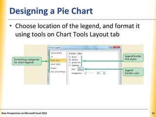
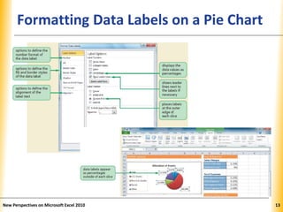
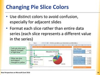
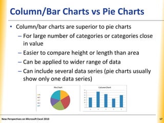
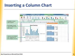
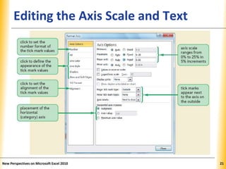
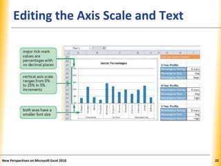
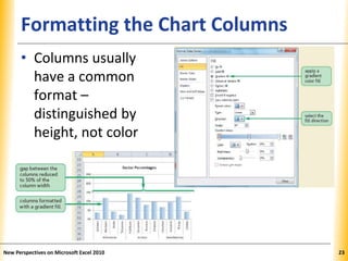
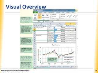
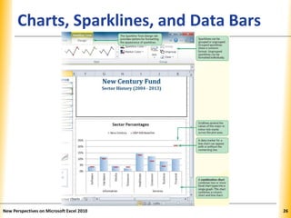
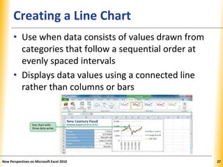
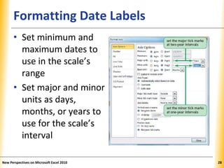
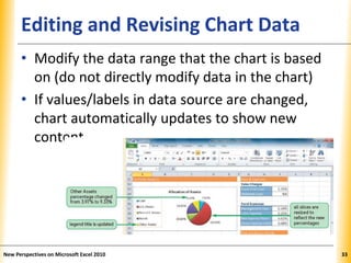
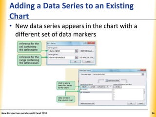
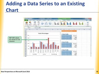
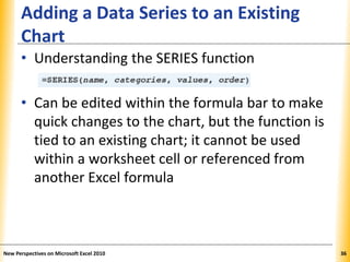
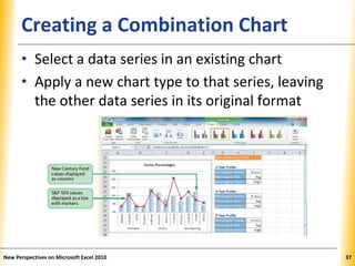
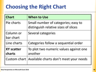
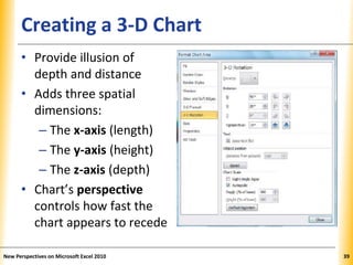
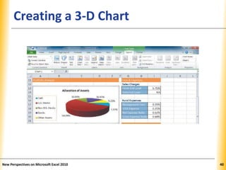
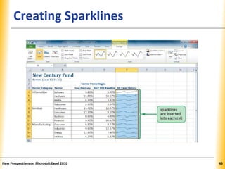
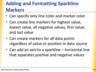
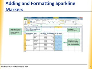
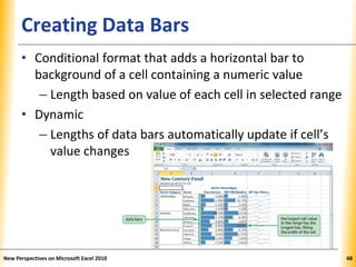
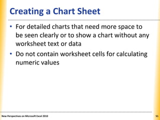
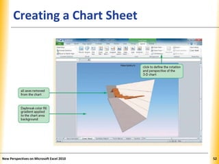
®
Microsoft Office 2010
Excel Tutorial 4:
Enhancing a Workbook
with Charts and Graphs
XPXPXPObjectives
• Create an embedded chart
• Create and format a pie chart
• Work with chart titles and legends
• Create and format a column chart
New Perspectives on Microsoft Excel 2010 2
XPXPXPObjectives
• Create and format a line chart
• Modify a chart data source
• Create and format a combined chart
• Create a 3-D chart
• Create and format sparklines and data bars
• Create a chart sheet
New Perspectives on Microsoft Excel 2010 3
XPXPXPVisual Overview
New Perspectives on Microsoft Excel 2010 4
XPXPXPChart Elements
New Perspectives on Microsoft Excel 2010 5
XPXPXPCreating an Excel Chart
• Charts show trends or relationships in data
that are difficult to show with numbers
• Select a range to use as chart’s data source
New Perspectives on Microsoft Excel 2010 6
XPXPXPCreating an Excel Chart
• Select chart type that best represents the data
– Use one of 73 built-in charts organized into 11
categories, or…
– Create custom chart types based on built-ins
New Perspectives on Microsoft Excel 2010 7
XPXPXPCreating an Excel Chart
• Three Chart Tools tabs appear on the Ribbon:
Design, Layout, and Format
New Perspectives on Microsoft Excel 2010 8
XPXPXP
Moving a Chart to a Different
Worksheet
• Move Chart dialog box provides options for
moving charts
New Perspectives on Microsoft Excel 2010 9
XPXPXPMoving and Resizing Charts
• Selecting the chart displays a selection box (used to
move or resize the object)
– To move the chart, drag selection box to new
location in worksheet
– To resize the chart, drag a sizing handle
New Perspectives on Microsoft Excel 2010 10
XPXPXPDesigning a Pie Chart
• Charts include individual elements that can be
formatted (chart area, chart title, plot area,
data markers, legend)
• Make changes using a built-in style that
formats the entire chart or by selecting and
formatting an individual element
• Use a chart style to apply several formats to
the chart at one time
New Perspectives on Microsoft Excel 2010 11
XPXPXPDesigning a Pie Chart
• Choose location of the legend, and format it
using tools on Chart Tools Layout tab
New Perspectives on Microsoft Excel 2010 12
XPXPXPFormatting Data Labels on a Pie Chart
New Perspectives on Microsoft Excel 2010 13
XPXPXPChanging Pie Slice Colors
• Use distinct colors to avoid confusion,
especially for adjacent slides
• Format each slice rather than entire data
series (each slice represents a different value
in the series)
New Perspectives on Microsoft Excel 2010 14
XPXPXPDesigning a Pie Chart
• Exploded pie charts
–Move one slice away from the others
–Useful for emphasizing one category above
all of the others
New Perspectives on Microsoft Excel 2010 15
XPXPXPCreating a Column Chart
• Column chart
–Displays values in different categories as
columns
–Height of each column is based on its value
• Bar chart
–Column chart turned on its side
–Length of each bar is based on its value
New Perspectives on Microsoft Excel 2010 16
XPXPXPColumn/Bar Charts vs Pie Charts
• Column/bar charts are superior to pie charts
– For large number of categories or categories close
in value
– Easier to compare height or length than area
– Can be applied to wider range of data
– Can include several data series (pie charts usually
show only one data series)
New Perspectives on Microsoft Excel 2010 17
XPXPXPInserting a Column Chart
• Select data source
• Select type of chart to create
• Move and resize the chart
• Change chart’s design, layout, and format by:
–Selecting one of the chart styles, or
–Formatting individual chart elements
New Perspectives on Microsoft Excel 2010 18
XPXPXPInserting a Column Chart
New Perspectives on Microsoft Excel 2010 19
XPXPXPEditing the Axis Scale and Text
• Range of values (scale) of an axis is based on
values in data source
• Vertical (value) axis: range of series values
• Horizontal (category) axis: category values
• Primary and secondary axes can use different
scales and labels
• Add descriptive axis titles if axis labels are not
self-explanatory (default is no titles)
New Perspectives on Microsoft Excel 2010 20
XPXPXPEditing the Axis Scale and Text
New Perspectives on Microsoft Excel 2010 21
XPXPXPEditing the Axis Scale and Text
New Perspectives on Microsoft Excel 2010 22
XPXPXPFormatting the Chart Columns
• Columns usually
have a common
format –
distinguished by
height, not color
New Perspectives on Microsoft Excel 2010 23
XPXPXP
Communicating Effectively with
Charts
• Keep it simple
• Focus on the message
• Limit the number of data series
• Use gridlines in moderation
• Choose colors carefully
• Limit chart to a few text styles
New Perspectives on Microsoft Excel 2010 24
XPXPXPVisual Overview
New Perspectives on Microsoft Excel 2010 25
XPXPXPCharts, Sparklines, and Data Bars
New Perspectives on Microsoft Excel 2010 26
XPXPXPCreating a Line Chart
• Use when data consists of values drawn from
categories that follow a sequential order at
evenly spaced intervals
• Displays data values using a connected line
rather than columns or bars
New Perspectives on Microsoft Excel 2010 27
XPXPXPFormatting Date Labels
• Set minimum and
maximum dates to
use in the scale’s
range
• Set major and minor
units as days,
months, or years to
use for the scale’s
interval
New Perspectives on Microsoft Excel 2010 28
XPXPXPFormatting Date Labels
• Custom date formats
use combinations of
“m”, “d”, and “y” for
months, days, and
years
• Number of letters
controls how Excel
displays the date
New Perspectives on Microsoft Excel 2010 29
XPXPXPSetting Label Units
• Simplify a chart’s appearance by displaying
units of measure appropriate to data values
–Useful when space is at a premium
–Example: Display the value 20 to represent
20,000 or 20,000,000
• Apply custom formats to numbers, including
adding text
New Perspectives on Microsoft Excel 2010 30
XPXPXPOverlaying a Chart Legend
• Makes more space for the plot area
• An overlaid chart element floats in the chart
area and is not fixed to a particular position;
can be dragged to a new location
New Perspectives on Microsoft Excel 2010 31
XPXPXPCreating a Line Chart
• Adding gridlines
• Adding an axis title
New Perspectives on Microsoft Excel 2010 32
XPXPXPEditing and Revising Chart Data
• Modify the data range that the chart is based
on (do not directly modify data in the chart)
• If values/labels in data source are changed,
chart automatically updates to show new
content
New Perspectives on Microsoft Excel 2010 33
XPXPXP
Adding a Data Series to an Existing
Chart
• New data series appears in the chart with a
different set of data markers
New Perspectives on Microsoft Excel 2010 34
XPXPXP
Adding a Data Series to an Existing
Chart
New Perspectives on Microsoft Excel 2010 35
XPXPXP
Adding a Data Series to an Existing
Chart
• Understanding the SERIES function
• Can be edited within the formula bar to make
quick changes to the chart, but the function is
tied to an existing chart; it cannot be used
within a worksheet cell or referenced from
another Excel formula
New Perspectives on Microsoft Excel 2010 36
XPXPXPCreating a Combination Chart
• Select a data series in an existing chart
• Apply a new chart type to that series, leaving
the other data series in its original format
New Perspectives on Microsoft Excel 2010 37
XPXPXPChoosing the Right Chart
New Perspectives on Microsoft Excel 2010 38
Chart When to Use
Pie charts Small number of categories; easy to
distinguish relative sizes of slices
Column or
bar chart
Several categories
Line charts Categories follow a sequential order
XY scatter
charts
To plot two numeric values against one
another
Custom chart Available charts don’t meet your needs
XPXPXPCreating a 3-D Chart
• Provide illusion of
depth and distance
• Adds three spatial
dimensions:
– The x-axis (length)
– The y-axis (height)
– The z-axis (depth)
• Chart’s perspective
controls how fast the
chart appears to recede
New Perspectives on Microsoft Excel 2010 39
XPXPXPCreating a 3-D Chart
New Perspectives on Microsoft Excel 2010 40
XPXPXPAdding Sparklines and Data Bars
• Both convey graphical information about
worksheet data without occupying a lot of
space
New Perspectives on Microsoft Excel 2010 41
XPXPXPCreating Sparklines
• A mini chart displayed within a worksheet cell
• Compact in size; doesn’t include chart
elements
• Goal is to convey maximum amount of
graphical information in a very small space
• Can be grouped or ungrouped
–Grouped sparklines share a common format
–Ungrouped sparklines can be formatted
individually
New Perspectives on Microsoft Excel 2010 42
XPXPXPTypes of Sparklines
• Line sparkline
– Highlights trends
• Column sparkline
– For column charts
• Win/Loss sparkline
– Highlights positive
and negative values
New Perspectives on Microsoft Excel 2010 43
XPXPXPCreating Sparklines
• Select a data range containing data to graph
• Select a location range where you want
sparklines to appear
New Perspectives on Microsoft Excel 2010 44
XPXPXPCreating Sparklines
New Perspectives on Microsoft Excel 2010 45
XPXPXP
Adding and Formatting Sparkline
Markers
• Can specify only line color and marker color
• Can create line markers for highest value,
lowest value, all negative values, first value,
and last value
• Can create markers for all data points
regardless of value or position in data source
• Can add an axis to a sparkline – horizontal line
that separates positive and negative values
New Perspectives on Microsoft Excel 2010 46
XPXPXP
Adding and Formatting Sparkline
Markers
New Perspectives on Microsoft Excel 2010 47
XPXPXPCreating Data Bars
• Conditional format that adds a horizontal bar to
background of a cell containing a numeric value
– Length based on value of each cell in selected range
• Dynamic
– Lengths of data bars automatically update if cell’s
value changes
New Perspectives on Microsoft Excel 2010 48
XPXPXPModifying a Data Bar Rule
• Alter rules of the conditional format
New Perspectives on Microsoft Excel 2010 49
XPXPXPModifying a Data Bar Rule
New Perspectives on Microsoft Excel 2010 50
XPXPXPCreating a Chart Sheet
• For detailed charts that need more space to
be seen clearly or to show a chart without any
worksheet text or data
• Do not contain worksheet cells for calculating
numeric values
New Perspectives on Microsoft Excel 2010 51
XPXPXPCreating a Chart Sheet
New Perspectives on Microsoft Excel 2010 52

Excel.t04

  • 1.
    ® Microsoft Office 2010 ExcelTutorial 4: Enhancing a Workbook with Charts and Graphs
  • 2.
    XPXPXPObjectives • Create anembedded chart • Create and format a pie chart • Work with chart titles and legends • Create and format a column chart New Perspectives on Microsoft Excel 2010 2
  • 3.
    XPXPXPObjectives • Create andformat a line chart • Modify a chart data source • Create and format a combined chart • Create a 3-D chart • Create and format sparklines and data bars • Create a chart sheet New Perspectives on Microsoft Excel 2010 3
  • 4.
    XPXPXPVisual Overview New Perspectiveson Microsoft Excel 2010 4
  • 5.
    XPXPXPChart Elements New Perspectiveson Microsoft Excel 2010 5
  • 6.
    XPXPXPCreating an ExcelChart • Charts show trends or relationships in data that are difficult to show with numbers • Select a range to use as chart’s data source New Perspectives on Microsoft Excel 2010 6
  • 7.
    XPXPXPCreating an ExcelChart • Select chart type that best represents the data – Use one of 73 built-in charts organized into 11 categories, or… – Create custom chart types based on built-ins New Perspectives on Microsoft Excel 2010 7
  • 8.
    XPXPXPCreating an ExcelChart • Three Chart Tools tabs appear on the Ribbon: Design, Layout, and Format New Perspectives on Microsoft Excel 2010 8
  • 9.
    XPXPXP Moving a Chartto a Different Worksheet • Move Chart dialog box provides options for moving charts New Perspectives on Microsoft Excel 2010 9
  • 10.
    XPXPXPMoving and ResizingCharts • Selecting the chart displays a selection box (used to move or resize the object) – To move the chart, drag selection box to new location in worksheet – To resize the chart, drag a sizing handle New Perspectives on Microsoft Excel 2010 10
  • 11.
    XPXPXPDesigning a PieChart • Charts include individual elements that can be formatted (chart area, chart title, plot area, data markers, legend) • Make changes using a built-in style that formats the entire chart or by selecting and formatting an individual element • Use a chart style to apply several formats to the chart at one time New Perspectives on Microsoft Excel 2010 11
  • 12.
    XPXPXPDesigning a PieChart • Choose location of the legend, and format it using tools on Chart Tools Layout tab New Perspectives on Microsoft Excel 2010 12
  • 13.
    XPXPXPFormatting Data Labelson a Pie Chart New Perspectives on Microsoft Excel 2010 13
  • 14.
    XPXPXPChanging Pie SliceColors • Use distinct colors to avoid confusion, especially for adjacent slides • Format each slice rather than entire data series (each slice represents a different value in the series) New Perspectives on Microsoft Excel 2010 14
  • 15.
    XPXPXPDesigning a PieChart • Exploded pie charts –Move one slice away from the others –Useful for emphasizing one category above all of the others New Perspectives on Microsoft Excel 2010 15
  • 16.
    XPXPXPCreating a ColumnChart • Column chart –Displays values in different categories as columns –Height of each column is based on its value • Bar chart –Column chart turned on its side –Length of each bar is based on its value New Perspectives on Microsoft Excel 2010 16
  • 17.
    XPXPXPColumn/Bar Charts vsPie Charts • Column/bar charts are superior to pie charts – For large number of categories or categories close in value – Easier to compare height or length than area – Can be applied to wider range of data – Can include several data series (pie charts usually show only one data series) New Perspectives on Microsoft Excel 2010 17
  • 18.
    XPXPXPInserting a ColumnChart • Select data source • Select type of chart to create • Move and resize the chart • Change chart’s design, layout, and format by: –Selecting one of the chart styles, or –Formatting individual chart elements New Perspectives on Microsoft Excel 2010 18
  • 19.
    XPXPXPInserting a ColumnChart New Perspectives on Microsoft Excel 2010 19
  • 20.
    XPXPXPEditing the AxisScale and Text • Range of values (scale) of an axis is based on values in data source • Vertical (value) axis: range of series values • Horizontal (category) axis: category values • Primary and secondary axes can use different scales and labels • Add descriptive axis titles if axis labels are not self-explanatory (default is no titles) New Perspectives on Microsoft Excel 2010 20
  • 21.
    XPXPXPEditing the AxisScale and Text New Perspectives on Microsoft Excel 2010 21
  • 22.
    XPXPXPEditing the AxisScale and Text New Perspectives on Microsoft Excel 2010 22
  • 23.
    XPXPXPFormatting the ChartColumns • Columns usually have a common format – distinguished by height, not color New Perspectives on Microsoft Excel 2010 23
  • 24.
    XPXPXP Communicating Effectively with Charts •Keep it simple • Focus on the message • Limit the number of data series • Use gridlines in moderation • Choose colors carefully • Limit chart to a few text styles New Perspectives on Microsoft Excel 2010 24
  • 25.
    XPXPXPVisual Overview New Perspectiveson Microsoft Excel 2010 25
  • 26.
    XPXPXPCharts, Sparklines, andData Bars New Perspectives on Microsoft Excel 2010 26
  • 27.
    XPXPXPCreating a LineChart • Use when data consists of values drawn from categories that follow a sequential order at evenly spaced intervals • Displays data values using a connected line rather than columns or bars New Perspectives on Microsoft Excel 2010 27
  • 28.
    XPXPXPFormatting Date Labels •Set minimum and maximum dates to use in the scale’s range • Set major and minor units as days, months, or years to use for the scale’s interval New Perspectives on Microsoft Excel 2010 28
  • 29.
    XPXPXPFormatting Date Labels •Custom date formats use combinations of “m”, “d”, and “y” for months, days, and years • Number of letters controls how Excel displays the date New Perspectives on Microsoft Excel 2010 29
  • 30.
    XPXPXPSetting Label Units •Simplify a chart’s appearance by displaying units of measure appropriate to data values –Useful when space is at a premium –Example: Display the value 20 to represent 20,000 or 20,000,000 • Apply custom formats to numbers, including adding text New Perspectives on Microsoft Excel 2010 30
  • 31.
    XPXPXPOverlaying a ChartLegend • Makes more space for the plot area • An overlaid chart element floats in the chart area and is not fixed to a particular position; can be dragged to a new location New Perspectives on Microsoft Excel 2010 31
  • 32.
    XPXPXPCreating a LineChart • Adding gridlines • Adding an axis title New Perspectives on Microsoft Excel 2010 32
  • 33.
    XPXPXPEditing and RevisingChart Data • Modify the data range that the chart is based on (do not directly modify data in the chart) • If values/labels in data source are changed, chart automatically updates to show new content New Perspectives on Microsoft Excel 2010 33
  • 34.
    XPXPXP Adding a DataSeries to an Existing Chart • New data series appears in the chart with a different set of data markers New Perspectives on Microsoft Excel 2010 34
  • 35.
    XPXPXP Adding a DataSeries to an Existing Chart New Perspectives on Microsoft Excel 2010 35
  • 36.
    XPXPXP Adding a DataSeries to an Existing Chart • Understanding the SERIES function • Can be edited within the formula bar to make quick changes to the chart, but the function is tied to an existing chart; it cannot be used within a worksheet cell or referenced from another Excel formula New Perspectives on Microsoft Excel 2010 36
  • 37.
    XPXPXPCreating a CombinationChart • Select a data series in an existing chart • Apply a new chart type to that series, leaving the other data series in its original format New Perspectives on Microsoft Excel 2010 37
  • 38.
    XPXPXPChoosing the RightChart New Perspectives on Microsoft Excel 2010 38 Chart When to Use Pie charts Small number of categories; easy to distinguish relative sizes of slices Column or bar chart Several categories Line charts Categories follow a sequential order XY scatter charts To plot two numeric values against one another Custom chart Available charts don’t meet your needs
  • 39.
    XPXPXPCreating a 3-DChart • Provide illusion of depth and distance • Adds three spatial dimensions: – The x-axis (length) – The y-axis (height) – The z-axis (depth) • Chart’s perspective controls how fast the chart appears to recede New Perspectives on Microsoft Excel 2010 39
  • 40.
    XPXPXPCreating a 3-DChart New Perspectives on Microsoft Excel 2010 40
  • 41.
    XPXPXPAdding Sparklines andData Bars • Both convey graphical information about worksheet data without occupying a lot of space New Perspectives on Microsoft Excel 2010 41
  • 42.
    XPXPXPCreating Sparklines • Amini chart displayed within a worksheet cell • Compact in size; doesn’t include chart elements • Goal is to convey maximum amount of graphical information in a very small space • Can be grouped or ungrouped –Grouped sparklines share a common format –Ungrouped sparklines can be formatted individually New Perspectives on Microsoft Excel 2010 42
  • 43.
    XPXPXPTypes of Sparklines •Line sparkline – Highlights trends • Column sparkline – For column charts • Win/Loss sparkline – Highlights positive and negative values New Perspectives on Microsoft Excel 2010 43
  • 44.
    XPXPXPCreating Sparklines • Selecta data range containing data to graph • Select a location range where you want sparklines to appear New Perspectives on Microsoft Excel 2010 44
  • 45.
  • 46.
    XPXPXP Adding and FormattingSparkline Markers • Can specify only line color and marker color • Can create line markers for highest value, lowest value, all negative values, first value, and last value • Can create markers for all data points regardless of value or position in data source • Can add an axis to a sparkline – horizontal line that separates positive and negative values New Perspectives on Microsoft Excel 2010 46
  • 47.
    XPXPXP Adding and FormattingSparkline Markers New Perspectives on Microsoft Excel 2010 47
  • 48.
    XPXPXPCreating Data Bars •Conditional format that adds a horizontal bar to background of a cell containing a numeric value – Length based on value of each cell in selected range • Dynamic – Lengths of data bars automatically update if cell’s value changes New Perspectives on Microsoft Excel 2010 48
  • 49.
    XPXPXPModifying a DataBar Rule • Alter rules of the conditional format New Perspectives on Microsoft Excel 2010 49
  • 50.
    XPXPXPModifying a DataBar Rule New Perspectives on Microsoft Excel 2010 50
  • 51.
    XPXPXPCreating a ChartSheet • For detailed charts that need more space to be seen clearly or to show a chart without any worksheet text or data • Do not contain worksheet cells for calculating numeric values New Perspectives on Microsoft Excel 2010 51
  • 52.
    XPXPXPCreating a ChartSheet New Perspectives on Microsoft Excel 2010 52