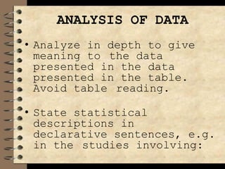
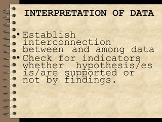
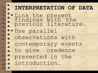
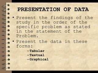
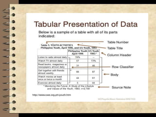
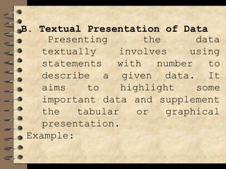
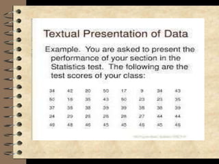
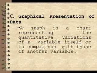
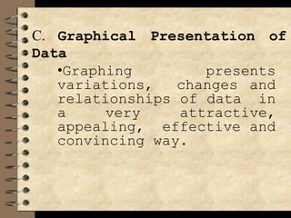
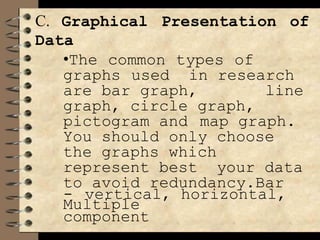
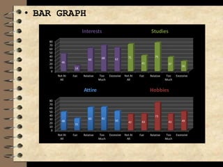
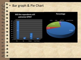
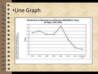
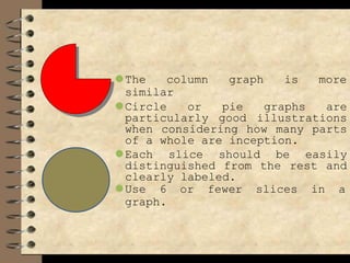
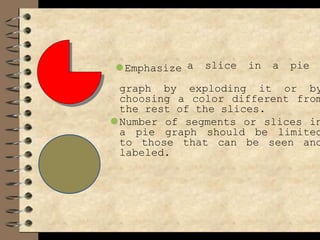
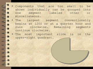
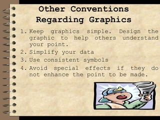
practical research I activity sheets intended for grade 11 students. This Senior High School (SHS) Disaster Readiness and Risk Reduction Quarter 1 – Module 1: Basic Concept of Disaster and Disaster Risk for School Year 2021-2022 is intended to help you
6. Data Presentation
The data presentation section
introduces the chapter by indicating
order of presentation.
• It summarizes background
information of the respondents and
the data
literature,
collected through
survey questionnaires,
interviews and observations.
• Data should be sufficient,
and accurate; presentation
valid
should
be clear and logical.
7. Data Presentation
• It follows the sequence
should adequately answer
questions raised. The data
the
research questions.
• The tables, graphs and figures
are appropriately presented,
placed, titled, numbered and
referred to in the text.
• The text presents only the
highlight of the tables.
8. Data Presentation
• Appropriate sub headings are
used to facilitate reader
perusal of text and presents
non-evaluative analysis of
data.
9. This chapter presents the findings of
the study.
Presentation should be clear and scholarly done
and may come in the form of tables, figures or
charts. Analysis refers to the skill of the
describing, delineating
differences,
researcher in
similarities and
significant findings or data and ability
extract information or messages out
presented data. Interpretation
explanation or suggestions inferred
highlighting the
to
of the
is the
from the
data, their implications but not conclusions.
10. ANALYSIS OF DATA
In analyzing data, stress only
those important result that
information that could
gives
answer
raised posed in
study
the problem you
or your
which you stated in
Chapter 1. you highlight
only those important and
unique findings. You have to
be consistent and coherent
in your approach as well as
logical, based on certain
academic conventions.
11. ANALYSIS OF DATA
• Data may be analyzed
quantitatively or
qualitatively depending on
the level of measurement
and the number of
dimensions and variables
of the study.
12. ANALYSIS OF DATA
• Analyze in depth to give
meaning to the data
presented in the data
presented in the table.
Avoid table reading.
• State statistical
descriptions in
declarative sentences, e.g.
in the studies involving:
13. INTERPRETATION OF DATA
• Establish
interconnection
between and among data
• Check for indicators
whether hypothesis/es
is/are supported or
not by findings.
14. INTERPRETATION OF DATA
• Link the present
findings with the
previous literature.
• Use parallel
observations with
contemporary events
to give credence
presented in the
introduction.
15. PRESENTATION OF DATA
• Present the findings of the
study in the order of the
specific problem as stated
in the statement of the
Problem.
• Present the data in these
forms:
–Tabular
–Textual
–Graphical
18. B. Textual Presentation of Data
the
involves
data
using
Presenting
textually
statements
describe a
with
given
aims to highlight
number to
data. It
some
important data
the tabular
and supplement
or graphical
presentation.
Example:
19.
20. C. Graphical Presentation of
Data
•A graph is a chart
representing the
quantitative variations
of a variable itself or
in comparison with those
of another variable.
21. C. Graphical Presentation of
Data
•Graphing presents
variations, changes and
relationships of data in
a very attractive,
appealing, effective and
convincing way.
22. C. Graphical Presentation of
Data
•The common types of
graphs used in research
are bar graph, line
graph, circle graph,
pictogram and map graph.
You should only choose
the graphs which
represent best your data
to avoid redundancy.Bar
- vertical, horizontal,
Multiple
component
23. • BAR GRAPH
80
70
60
50
40
30
20
10
0
Not At
All
Fair Relative Too Excessive
Much
Not At
All
Fair Relative Too Excessive
Much
46
14
60 68 62
71
41
75
37
26
Interests Studies
80
70
60
50
40
30
20
10
0
Not At
All
Fair Relative Too Excessive
Much
Not At
All
Fair Relative Too Excessive
Much
48
31
60 61
50 42 43
73
43 49
Attire Hobbies
24. • Bar graph & Pie Chart
20
0
80
60
40
120
100
160
140
180
Yes No Maybe I don't know
15
55
7
Will the repondents still
patronize OPM?
6.00%
173 69.20%
22.00%
Percentage
Yes No Maybe
2.80%
I don't know
26. The External Format
The use of tables and graph
• Tables and graphs are both ways
to organize and arrange data so
that it is more easily
understood by the viewer.
• Tables and graphs are related
in the sense that the
information used in tables is
frequently also used for the
basis of graphs.
27. ⚫ When designing table, keep the
format clear and simple. Line up
decimal places, note units clearly,
use a large enough typeface and
construct a clean orderly
arrangement of rows and columns.
28. ⚫ Bar graphs are an excellent
way to show the results that
are one time, that are not
continuous—especially
samplings such as surveys and
inventories.
⚫ Bar graphs are used to get an
overall idea or trends in
responses which categories
get, many versus few
responses.
29. • Bars in a graph should be wider
than the spaces between them.
• All bars should be of equal
and all spaces including the
width,
space
between the axis and the first bar,
should be equal of width.
• Bars should be neither very thin
nor very wide.
• Use the same color for all the bars
in a graph that are in a single
data set.
• Use different fill colors for
positive and negative values.
• Line graph is most useful in
displaying data or information that
change continuously over time.
30. ⚫The column graph is more
similar
⚫Circle or pie graphs are
particularly good illustrations
when considering how many parts
of a whole are inception.
⚫Each slice should be easily
distinguished from the rest and
clearly labeled.
⚫Use 6 or fewer slices in a
graph.
31. ⚫Emphasize a slice in a pie
graph by exploding it or by
choosing a color different from
the rest of the slices.
⚫Number of segments or slices in
a pie graph should be limited
to those that can be seen and
labeled.
32. • Components that are too small to be
shown individually can be grouped into
one segment labeled other or
miscellaneous.
• The largest segment conventionally
begins at 1200 or at a quarter hour and
runs clockwise. Remaining segments
continue clockwise.
• The most important slice is in the
upper-right quadrant.
33. Other Conventions
Regarding Graphics
1. Keep graphics simple. Design the
graphic to help others understand
your point.
2. Simplify your data
3. Use consistent symbols
4. Avoid special effects if they do
not enhance the point to be made.
34. Caption, Labels And Lines
Table caption should be the same as
that which appears in the list of
tables. It is placed above the table
unlike that which is used in
figures. The caption should tell in
precise terms what the table
contains.
35. Other Rules in Caption
1. No terminal punctuation.
2. Unusual abbreviation are not allowed
in the table, if necessary, put a
legend at the bottom of the table.
3. Captions should be worded as
concisely as clarity permits.
a page the caption should be on
4. When a table is placed broadside on
the
binding side.
5. Be consistent in label size, font
and style.
36. Figure (Chart, Graph And
Illustration)
These should be done judiciously. The
research reporter must ask himself
illustration necessary? Does
the following questions: is the
it
simply repeat what the text said?
Illustrative materials shall be called
figures. The figure number and
caption should be centered below the
illustration. An Arabic numeral is
written after the word “Figure”
followed by a period.
The caption should be brief and
explanatory.
37. QUIZ 4
1-3. Parts of Chapter
IV
4-6. List down the 3
ways on how to
present your data
38. QUIZ 4
7-9. Make a pie graph
using percentage
MOBILE GAMES APPS
USED BY GR 11 STUDENTS
10 ML,
15 COC
5 COD
39. QUIZ 4
10-12 Make a bar
graph
STUDENTS GADGETS
8 tablet, 14
Cellphones, 8
laptops
40. QUIZ 4
13-15 Make a table
STUDENTS CHOICE OF
TRACKS
ABM 19
TVL 10
GAS 21