Downloaded 147 times
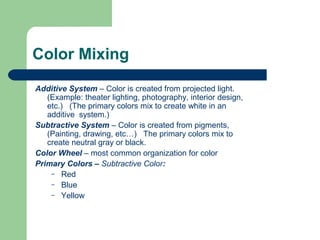
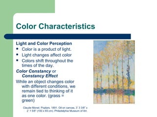
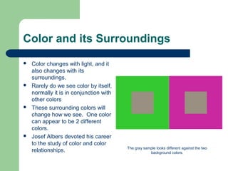

This document discusses color theory and principles of color. It covers topics such as color properties including hue, value, and intensity. It describes color mixing systems and color schemes. It discusses how color is perceived and how it can be used to create visual effects like emphasis, balance, and depth. It also covers concepts like emotional color, color symbolism, and the cultural meanings that can be associated with different colors.