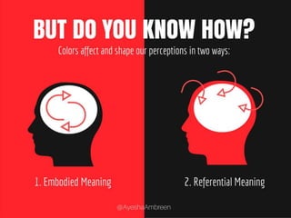
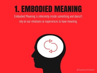
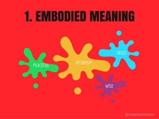
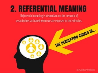
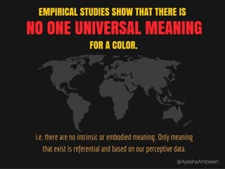
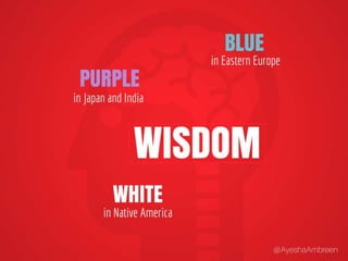
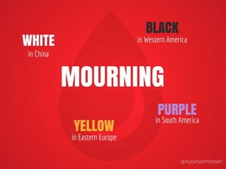
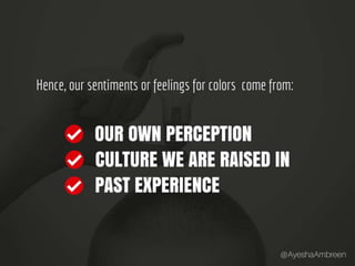
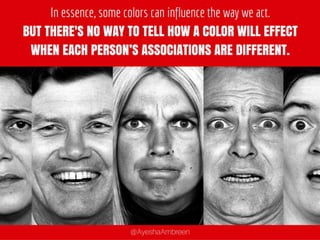
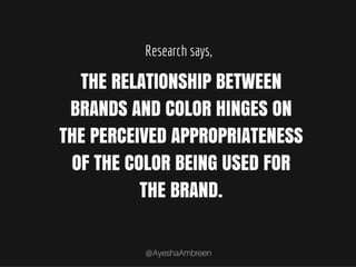
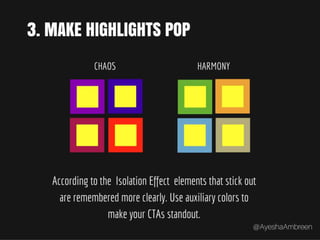
Color: Psychology vs. Perception
Colors…
Colors tell the story.
Ever noticed how movies use color
palettes to create visual cues? Let's
checkout few examples...
The Matrix: Real World vs. Into the Matrix
The Oz: Real World vs. The World of Oz
The Sixth Sense: Real World vs. Contaminated World
The Avatar: Real World vs. Pandora
This is no happenstance. Neither movies are the
only genre that use color to tell the story.
Colors feature a fantastic ability to tell stories
and infer emotions.
Colors can influence our mind and thinking.
But do you know how? Colors affect and shape
our perceptions in two ways: Embodied
Meaning and Referential Meaning.
1. Embodied Meaning: Embodied Meaning is
inherently inside something and doesn’t rely
on our emotions or experiences to have
meaning.
1. Embodied Meaning Examples
1. Referential Meaning: Referential meaning is
dependant on the network of associations
activated when we are exposed to the
stimulus.
Empirical studies show that there is no one
universal meaning for a color i.e. there are no
intrinsic or embodied meaning. Only meaning
that exist is referential or based on our
perceptive data.
Let’s checkout some examples…
Wisdom is purple in Japan and India, Blue in
Eastern Europe and White in Native America.
Love is Green in India, Red in Eastern Europe,
Red in Western America and Yellow in Native
America..
Mourning is White in China, Yellow in Eastern
Europe, Black in Western America and Purple
in South America..
Peace is White in China, Yellow in Eastern
Europe, Blue in Western America and Silver in
South America..
Hence, our sentiments or feelings for colors
come from: Our own perception, Culture we
are raised in and past experience.
In essence, some colors can influence the way
we act. But there’s no WAY TO TELL HOW A
COLOR WILL effect when each person’s
associations are different.
THERE's
Research says, the relationship between
brands and color hinges on the perceived
appropriateness of the color being used for the
brand.
Lets see how some popular brands nailed their
colors...
Lets see how some popular brands nailed their logo colors…
Apple’s Logo: Clean. Minimalist. Simple.
Barbie’s Logo: Beauty, joy and smile.
Fanta's Logo: Cheerful. Fun. Warmth.
BP's Logo: Natural. Soothing. Growth.
McDonalds’ Logo: Appetizing. Happy. Vibrant
The Crux: Color is your chance to create your
own brand story and symbolic meaning.
Because color do have power to effect the
way people respond to a brand's message.
Fact Check: 62-90% of snap judgements about
products can be based on the color alone.
COLOR SELECTION GUIDE: How to find a color
that makes your brand standout...
Step 1: Choose a color – Ask yourself
what color brings up the
associations you want with your
brand?
Step 2: Learn Color Theory – Get
acquainted with color science to
find the perfect combo for your
primary color.
Step 3: Make Highlights Pop–
According to the Isolation
Effect elements that stick out are
remembered more clearly. Use
auxiliary colors to make your CTAs
standout.
Step 4: Compliment Colors with
content – Give meaning to your
colors, leverage it through
content. Just like blue signified
PANDORA in Avatar. Set rules and
guidelines for color usage.
That’s it. Connect with me at @AyeshaAmbreen.

Color: Psychology vs. Perception

  • 1.
  • 2.
  • 3.
  • 4.
    Ever noticed howmovies use color palettes to create visual cues? Let's checkout few examples...
  • 5.
    The Matrix: RealWorld vs. Into the Matrix
  • 6.
    The Oz: RealWorld vs. The World of Oz
  • 7.
    The Sixth Sense:Real World vs. Contaminated World
  • 8.
    The Avatar: RealWorld vs. Pandora
  • 9.
    This is nohappenstance. Neither movies are the only genre that use color to tell the story.
  • 10.
    Colors feature afantastic ability to tell stories and infer emotions.
  • 11.
    Colors can influenceour mind and thinking.
  • 12.
    But do youknow how? Colors affect and shape our perceptions in two ways: Embodied Meaning and Referential Meaning.
  • 13.
    1. Embodied Meaning:Embodied Meaning is inherently inside something and doesn’t rely on our emotions or experiences to have meaning.
  • 14.
  • 15.
    1. Referential Meaning:Referential meaning is dependant on the network of associations activated when we are exposed to the stimulus.
  • 16.
    Empirical studies showthat there is no one universal meaning for a color i.e. there are no intrinsic or embodied meaning. Only meaning that exist is referential or based on our perceptive data.
  • 17.
  • 18.
    Wisdom is purplein Japan and India, Blue in Eastern Europe and White in Native America.
  • 19.
    Love is Greenin India, Red in Eastern Europe, Red in Western America and Yellow in Native America..
  • 20.
    Mourning is Whitein China, Yellow in Eastern Europe, Black in Western America and Purple in South America..
  • 21.
    Peace is Whitein China, Yellow in Eastern Europe, Blue in Western America and Silver in South America..
  • 22.
    Hence, our sentimentsor feelings for colors come from: Our own perception, Culture we are raised in and past experience.
  • 23.
    In essence, somecolors can influence the way we act. But there’s no WAY TO TELL HOW A COLOR WILL effect when each person’s associations are different. THERE's
  • 24.
    Research says, therelationship between brands and color hinges on the perceived appropriateness of the color being used for the brand.
  • 25.
    Lets see howsome popular brands nailed their colors... Lets see how some popular brands nailed their logo colors…
  • 26.
    Apple’s Logo: Clean.Minimalist. Simple.
  • 27.
  • 28.
  • 29.
    BP's Logo: Natural.Soothing. Growth.
  • 30.
  • 31.
    The Crux: Coloris your chance to create your own brand story and symbolic meaning. Because color do have power to effect the way people respond to a brand's message.
  • 32.
    Fact Check: 62-90%of snap judgements about products can be based on the color alone.
  • 33.
    COLOR SELECTION GUIDE:How to find a color that makes your brand standout...
  • 34.
    Step 1: Choosea color – Ask yourself what color brings up the associations you want with your brand?
  • 35.
    Step 2: LearnColor Theory – Get acquainted with color science to find the perfect combo for your primary color.
  • 36.
    Step 3: MakeHighlights Pop– According to the Isolation Effect elements that stick out are remembered more clearly. Use auxiliary colors to make your CTAs standout.
  • 37.
    Step 4: ComplimentColors with content – Give meaning to your colors, leverage it through content. Just like blue signified PANDORA in Avatar. Set rules and guidelines for color usage.
  • 38.
    That’s it. Connectwith me at @AyeshaAmbreen.