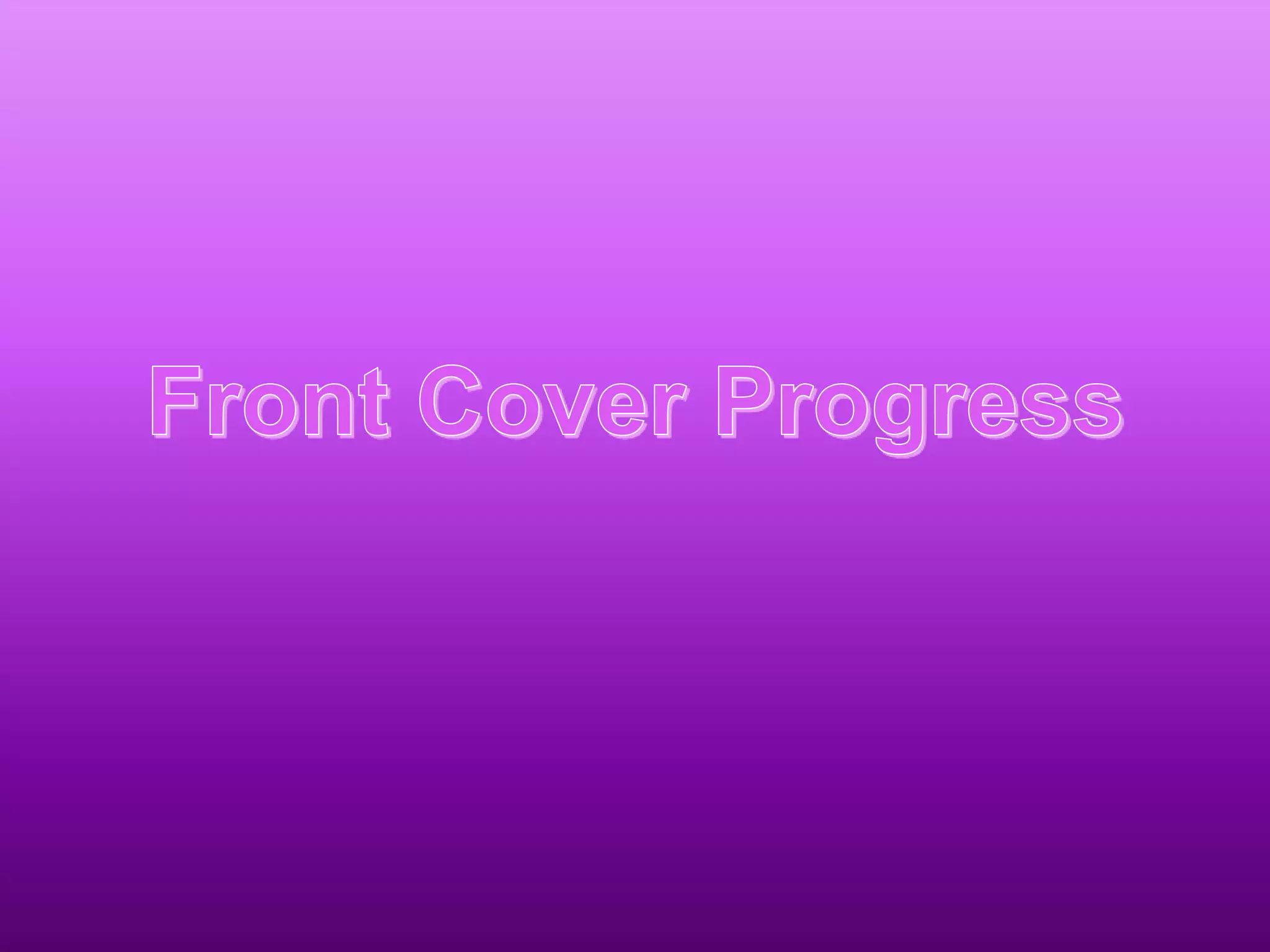
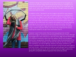
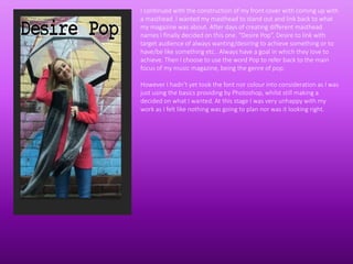
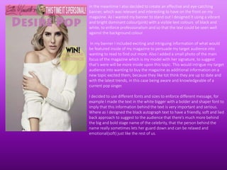
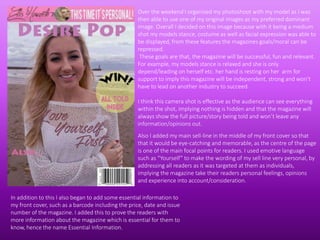
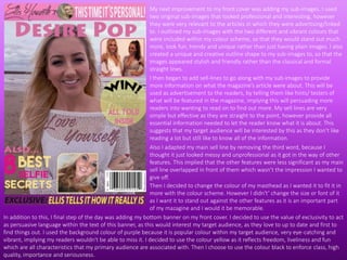
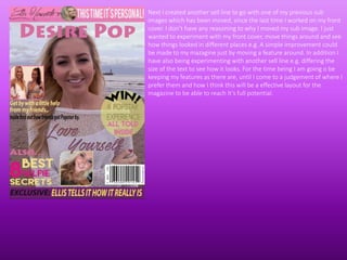
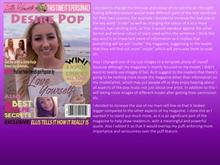
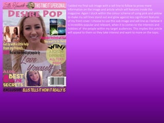
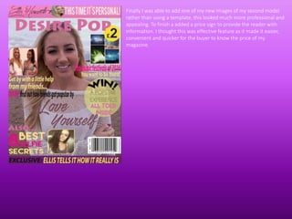
SlideShare a Scribd company logo
I started to design the construction of my front cover for my mazagine, by
choosing my domain image which would also be acting as a background. In
preparation for this task, I had captured serval shots of my model later that
week, so all I had to do was decide on what shot I thought suited my desired
layout and style the most.
In addition to this, I decided to use this image to the left for many reasons.
First reason being that it was clear and looked professional, implying that it
would make my magazine look high quality and official. Another Reason for
choosing this image was because of her facial expression. I asked my model if
she could look happy and playful and the result displayed exactly what I was
looking for. My model looks very cheerful and relaxed, as if she was laughing,
implying she has no worries and is free to do what she wishes. My final
reason for choosing this image was because of the shot itself, as I believe
using a medium-long shot shows a lot more of the model and the stance,
implying the audience can get more information from it.
However I wasn’t fully certain that this shot was going to be my final
dominant image to use because of the background and prop. Firstly, although
the background is very colourful it is also very dirty, edgy and dull which gives
off a different impression rather than the upbeat, vibrant and young pop
theme that I was going for. Secondly, I choose to have the photoshoot on the
day I did because the weather was the best this day for the rest of the week
and I wanted to use natural lighting. However, the props I wished to use
weren’t available that day so we had to go with a prop that was easy to get at
such last minute. Unfortunately the prop we eventually got had no relevance
to my desired approach at all, which could confuse the target audience by
giving off a completely different approach then what was aimed.
I continued with the construction of my front cover with coming up with
a masthead. I wanted my masthead to stand out and link back to what
my magazine was about. After days of creating different masthead
names I finally decided on this one. “Desire Pop”, Desire to link with
target audience of always wanting/desiring to achieve something or to
have/be like something etc.. Always have a goal in which they love to
achieve. Then I choose to use the word Pop to refer back to the main
focus of my music magazine, being the genre of pop.
However I hadn't yet took the font nor colour into consideration as I was
just using the basics providing by Photoshop, whilst still making a
decided on what I wanted. At this stage I was very unhappy with my
work as I felt like nothing was going to plan nor was it looking right.
After being so disappointed with my progress last lesson, I decided I
wasn’t going to get any nearer to my goal unless I started over again with
great focus and determination. Firstly I decided I wasn't happy with how
my photoshoot turned out so I planned another photoshoot with my
model. However for the time being I choose to use an unoriginal image to
act as a template of inspiration, because I wanted to achieve a similar
look, stance and facial expression when I come to produce my own
photos.
Firstly I started with adapting to my masthead as I didn’t like the font,
colour and size of it previously. I decided on having a bold and eye-
catching masthead font so that it would stand out, however I also decided
on this font because although its bold and out there, it still looks very
friendly and fun which links to the fun and lively music genre of pop.
Then I created a relevant and creative puff(competition) to interest my
target audience into wanting to buy my mazagine, because they would be
intrigued by the competition to buy the magazine and read on. As it suits
their interests of desiring to be successful, popular and known. I choose to
use the colours I did because the 2 out of 3 of them were vibrant, bright
and popular when it comes to my target audiences interests/likes. Where
as I choose the other colour of black to stand out and imply that the
magazine content is of a high standard, important and sophisticated.
In the meantime I also decided to create an effective and eye-catching
banner, which was relevant and interesting to have on the front on my
magazine. As I wanted my banner to stand out I designed It using a vibrant
and bright dominant colour(pink) with a visible text colours of black and
white, to enforce professionalism and so that the text could be seen well
against the background colour.
In my banner I included exciting and intriguing information of what would
be featured inside of my magazine to persuade my target audience into
wanting to read to find out more. Also I added a small photo of the main
focus of the magazine which is my model with her signature, to suggest
that’s were will be more inside upon this topic. This would intrigue my target
audience into wanting to buy the magazine as additional information on a
new topic excited them, because they like tot think they are up to date and
with the latest trends, in this case being aware and knowledgeable of a
current pop singer.
I decided to use different fonts and sizes to enforce different message, for
example I made the text in the white bigger with a bolder and shaper font to
imply that this information behind the text is very important and serious.
Where as I designed the black autograph text to have a friendly, soft and lied
back approach to suggest to the audience that there’s much more behind
the big and bold stage name of the celebrity, that the person behind the
name really sometimes lets her guard down and can be relaxed and
emotional(soft) just like the rest of us.
Over the weekend I organised my photoshoot with my model as I was
then able to use one of my original images as my preferred dominant
image. Overall I decided on this image because with it being a medium
shot my models stance, costume as well as facial expression was able to
be displayed, from these features the magazines goals/moral can be
repressed.
These goals are that, the magazine will be successful, fun and relevant.
For example, my models stance is relaxed and she is only
depend/leading on herself etc. her hand is resting on her arm for
support to imply this magazine will be independent, strong and won’t
have to lead on another industry to succeed.
I think this camera shot is effective as the audience can see everything
within the shot, implying nothing is hidden and that the magazine will
always show the full picture/story being told and won’t leave any
information/opinions out.
Also I added my main sell-line in the middle of my front cover so that
that it would be eye-catching and memorable, as the centre of the page
is one of the main focal points for readers. I used emotive language
such as “Yourself” to make the wording of my sell line very personal, by
addressing all readers as it was targeted at them as individuals,
implying the magazine take their readers personal feelings, opinions
and experience into account/consideration.
In addition to this I also began to add some essential information to
my front cover, such as a barcode including the price, date and issue
number of the magazine. I added this to prove the readers with
more information about the magazine which is essential for them to
know, hence the name Essential Information.
My next improvement to my front cover was adding my sub-images. I used
two original sub-images that looked professional and interesting, however
they were very relevant to the articles in which they were advertising/linked
to. I outlined my sub-images with the two different and vibrant colours that
were included within my colour scheme, so that they would stand out much
more, look fun, trendy and unique rather than just having plain images. I also
created a unique and creative outline shape to my sub-images to, so that the
images appeared stylish and friendly rather than the classical and formal
straight lines.
I then began to add sell-lines to go along with my sub-images to provide
more information on what the magazine’s article were about. This will be
used as advertisement to the readers, by telling them like hints/ testers of
what will be featured in the magazine, implying this will persuading more
readers into wanting to read on to find out more. My sell lines are very
simple but effective as they are straight to the point, however provide all
essential information needed to let the reader know what it is about. This
suggests that my target audience will be interested by this as they don’t like
reading a lot but still like to know all of the information.
Also I adapted my main sell line by removing the third word, because I
thought it just looked messy and unprofessional as it got in the way of other
features. This implied that the other features were less significant as my main
sell line overlapped in front of them which wasn’t the impression I wanted to
give off.
In addition to this, I final step of the day was adding my bottom banner on my front cover. I decided to use the value of exclusivity to act
as persuasive language within the text of this banner, as this would interest my target audience, as they love to up to date and first to
find things out. I used the background colour of purple because it is popular colour within my target audience, very eye-catching and
vibrant, implying my readers wouldn't be able to miss it. I decided to use the colour yellow as it reflects freedom, liveliness and fun
which are all characteristics that my primary audience are associated with. Then I choose to use the colour black to enforce class, high
quality, importance and seriousness.
Then I decided to change the colour of my masthead as I wanted it to fit it in
more with the colour scheme. However I didn't’ change the size or font of it
as I want it to stand out against the other features as it is an important part
of my mazagine and I would it be memorable.
Next I created another sell line to go with one of my previous sub
images which has been moved, since the last time I worked on my front
cover. I don’t have any reasoning to why I moved my sub image. I just
wanted to experiment with my front cover, move things around and see
how things looked in different places e.g. A simple improvement could
be made to my mazagine just by moving a feature around. In addition I
have also being experimenting with another sell line e.g. differing the
size of the text to see how it looks. For the time being I am going o be
keeping my features as there are, until I come to a judgement of where I
prefer them and how I think this will be a effective layout for the
magazine to be able to reach It’s full potential.
I decided to change the font size and colour of my sell line as I thought
having different colours would make different parts of the text stand out
for their own reasons. For example I decided to increase the text size of
the key word “inside” as well as changing the colour of it to a more
vibrant, eye-catching pink, so that it would standout against the other
formal and serious colour of black used within the sentence. I think this
key word is an important piece of information as it implies that
everything will be will “inside” the magazine, suggesting to the reader
that they will find out more” inside” which will persuade them to read
on.
Also I changed one of my sub-images to a template photo of myself
because although my magazine is mainly focused on my model, I didn’t
want to overly use images of her. As it suggest to the readers that there's
going to be nothing more inside the magazine other than information on
my model/artist, which may put people off as they enjoy hearing about
all aspects of the pop music not just about one artist. In addition to this I
will taking more images of different model after getting their permission
etc..
I decided to increase the size of my main sell line so that it looked
bigger compared to the other aspects of my magazine. I done this as I
wanted it to stand out much more, as it is an significant part of the
magazine to help draw readers in, with a meaningful and powerful
quote. Also I edited it so that it would overlap my puff, enforcing more
importance and seriousness over the puff feature.
I added my final sub image with a sell line to follow to prove more
information on the image and article which will features inside the
magazine. Again I stuck within the colour scheme of using pink and yellow
to make my sell lines stand out and glow against less significant features
of my front cover. I choose to use this sub image and sell line as I believe it
is incredibly popular and relevant, when it to comes to the interests and
hobbies of the people within my target audiences. This implies this article
will appeal to them so they take interest and want to more on the topic.
Finally I was able to add one of my new images of my second model
rather than using a template, this looked much more professional and
appealing. To finish a added a price sign to provide the reader with
information. I thought this was effective feature as it made it easier,
convenient and quicker for the buyer to know the price of my
magazine.

More Related Content

What's hot

Evaluation presentation
Evaluation presentationEvaluation presentation
Evaluation presentation
Sharkey1
 
Questio 5
Questio 5Questio 5
Questio 5
oliviadoug
 
Questio 5
Questio 5Questio 5
Questio 5
oliviagracexx99
 
Evaluation
EvaluationEvaluation
Evaluation
AnnaMasmedia
 
As media evaluation
As media   evaluationAs media   evaluation
As media evaluation
daniellewatkins11
 
My evaluation
My evaluationMy evaluation
My evaluation
JosephWebb
 
Media presentation
Media presentationMedia presentation
Media presentation
kaycee campbell
 
AS Media Evaluation
AS Media EvaluationAS Media Evaluation
AS Media Evaluation
hannahdelahunt
 
AS Media - Evaluation (Magazine)
AS Media - Evaluation (Magazine)AS Media - Evaluation (Magazine)
AS Media - Evaluation (Magazine)
hannahdelahuntasmedia
 
Evaluation 5
Evaluation 5Evaluation 5
Evaluation 5
ruba ibnwargan
 
Media evaluation
Media evaluationMedia evaluation
Media evaluation
Becca McPartland
 
Media evaluation
Media evaluationMedia evaluation
Media evaluation
reeceC
 
Content help page (1)
Content help page (1)Content help page (1)
Content help page (1)
sofiahowarth22
 
Question 5
Question 5Question 5
Evaluation
EvaluationEvaluation
Evaluation
Hazieee
 
Evaluation of music magazine
Evaluation of music magazineEvaluation of music magazine
Evaluation of music magazine
Mary Lee-Ann
 
Question 1
Question 1Question 1
Question 1
MasumaU
 
Amelia evaluation
Amelia evaluationAmelia evaluation
Amelia evaluation
guestba2a58
 

What's hot (18)

Evaluation presentation
Evaluation presentationEvaluation presentation
Evaluation presentation
 
Questio 5
Questio 5Questio 5
Questio 5
 
Questio 5
Questio 5Questio 5
Questio 5
 
Evaluation
EvaluationEvaluation
Evaluation
 
As media evaluation
As media   evaluationAs media   evaluation
As media evaluation
 
My evaluation
My evaluationMy evaluation
My evaluation
 
Media presentation
Media presentationMedia presentation
Media presentation
 
AS Media Evaluation
AS Media EvaluationAS Media Evaluation
AS Media Evaluation
 
AS Media - Evaluation (Magazine)
AS Media - Evaluation (Magazine)AS Media - Evaluation (Magazine)
AS Media - Evaluation (Magazine)
 
Evaluation 5
Evaluation 5Evaluation 5
Evaluation 5
 
Media evaluation
Media evaluationMedia evaluation
Media evaluation
 
Media evaluation
Media evaluationMedia evaluation
Media evaluation
 
Content help page (1)
Content help page (1)Content help page (1)
Content help page (1)
 
Question 5
Question 5Question 5
Question 5
 
Evaluation
EvaluationEvaluation
Evaluation
 
Evaluation of music magazine
Evaluation of music magazineEvaluation of music magazine
Evaluation of music magazine
 
Question 1
Question 1Question 1
Question 1
 
Amelia evaluation
Amelia evaluationAmelia evaluation
Amelia evaluation
 

Viewers also liked

HelloWorldProposalPaper
HelloWorldProposalPaperHelloWorldProposalPaper
HelloWorldProposalPaper
Emily McNary
 
O povo acordou
O povo acordouO povo acordou
Gold mmorpg
Gold mmorpgGold mmorpg
Gold mmorpg
unopflatab1976
 
Relaciones humanas cerebro truino - la memoria
Relaciones humanas   cerebro truino -  la memoriaRelaciones humanas   cerebro truino -  la memoria
Relaciones humanas cerebro truino - la memoria
96333
 
Reformas Y Acondicionamiento De Edificios
solomonageoaoaklv
 
Evolving business model_of_dell
Evolving business model_of_dellEvolving business model_of_dell
Evolving business model_of_dell
Aniket Harsh
 
Mapa de Riesgo
Mapa de RiesgoMapa de Riesgo
Mapa de Riesgo
B3lleza Online
 
Final3
Final3Final3
Jenis Karangan
Jenis KaranganJenis Karangan
MANUAL PROCEDIMIENTO HOTELERA
MANUAL PROCEDIMIENTO  HOTELERA MANUAL PROCEDIMIENTO  HOTELERA
MANUAL PROCEDIMIENTO HOTELERA
Ysrael Quereigua
 
Reportatge feg
Reportatge fegReportatge feg
Reportatge fegC C
 

Viewers also liked (12)

HelloWorldProposalPaper
HelloWorldProposalPaperHelloWorldProposalPaper
HelloWorldProposalPaper
 
O povo acordou
O povo acordouO povo acordou
O povo acordou
 
Gold mmorpg
Gold mmorpgGold mmorpg
Gold mmorpg
 
Relaciones humanas cerebro truino - la memoria
Relaciones humanas   cerebro truino -  la memoriaRelaciones humanas   cerebro truino -  la memoria
Relaciones humanas cerebro truino - la memoria
 
Reformas Y Acondicionamiento De Edificios
 
Evolving business model_of_dell
Evolving business model_of_dellEvolving business model_of_dell
Evolving business model_of_dell
 
Mapa de Riesgo
Mapa de RiesgoMapa de Riesgo
Mapa de Riesgo
 
Final3
Final3Final3
Final3
 
Jenis Karangan
Jenis KaranganJenis Karangan
Jenis Karangan
 
MANUAL PROCEDIMIENTO HOTELERA
MANUAL PROCEDIMIENTO  HOTELERA MANUAL PROCEDIMIENTO  HOTELERA
MANUAL PROCEDIMIENTO HOTELERA
 
Map of granada
Map of granadaMap of granada
Map of granada
 
Reportatge feg
Reportatge fegReportatge feg
Reportatge feg
 

Similar to Progress

Media evaluation questions
Media evaluation questionsMedia evaluation questions
Media evaluation questions
ninofrattolillo
 
In what ways does your media product use, develop and challenge forms and con...
In what ways does your media product use, develop and challenge forms and con...In what ways does your media product use, develop and challenge forms and con...
In what ways does your media product use, develop and challenge forms and con...
jenny cummings
 
How did you attract/address your audience?
How did you attract/address your audience?  How did you attract/address your audience?
How did you attract/address your audience?
Toddy888
 
Introduction
IntroductionIntroduction
Introduction
poppy
 
In what ways does your music magazine use, develop or challenge forms and con...
In what ways does your music magazine use, develop or challenge forms and con...In what ways does your music magazine use, develop or challenge forms and con...
In what ways does your music magazine use, develop or challenge forms and con...
Toddy888
 
Actual evaluation
Actual evaluationActual evaluation
Actual evaluation
megan
 
Powerpoint evaluation writting
Powerpoint evaluation writtingPowerpoint evaluation writting
Powerpoint evaluation writting
Steve_Royle
 
Music magazine evaluation final
Music magazine evaluation finalMusic magazine evaluation final
Music magazine evaluation final
leema1997
 
Media Evaluation
Media EvaluationMedia Evaluation
Media Evaluation
guest404096
 
Amelia evaluation
Amelia evaluationAmelia evaluation
Amelia evaluation
guestba2a58
 
Final evaluation
Final evaluationFinal evaluation
Final evaluation
MeganHardwick
 
School magazine evaluation
School magazine evaluation School magazine evaluation
School magazine evaluation
07hhalim1
 
Evaluation
EvaluationEvaluation
Evaluation
Hazieee
 
Evaluation
EvaluationEvaluation
Evaluation
Hazieee
 
Audience Feedback[1]
Audience Feedback[1]Audience Feedback[1]
Audience Feedback[1]
guestba61e7
 
Evaluation
EvaluationEvaluation
Evaluation
Carla
 
Question 1 f
Question 1 fQuestion 1 f
Question 1 f
jordanchilton
 
Evalautoion
EvalautoionEvalautoion
Evalautoion
joeweston96
 
Evaluation Questions
Evaluation QuestionsEvaluation Questions
Evaluation Questions
EmilyJayne
 
As proposal form
As proposal formAs proposal form
As proposal form
sofiahowarth22
 

Similar to Progress (20)

Media evaluation questions
Media evaluation questionsMedia evaluation questions
Media evaluation questions
 
In what ways does your media product use, develop and challenge forms and con...
In what ways does your media product use, develop and challenge forms and con...In what ways does your media product use, develop and challenge forms and con...
In what ways does your media product use, develop and challenge forms and con...
 
How did you attract/address your audience?
How did you attract/address your audience?  How did you attract/address your audience?
How did you attract/address your audience?
 
Introduction
IntroductionIntroduction
Introduction
 
In what ways does your music magazine use, develop or challenge forms and con...
In what ways does your music magazine use, develop or challenge forms and con...In what ways does your music magazine use, develop or challenge forms and con...
In what ways does your music magazine use, develop or challenge forms and con...
 
Actual evaluation
Actual evaluationActual evaluation
Actual evaluation
 
Powerpoint evaluation writting
Powerpoint evaluation writtingPowerpoint evaluation writting
Powerpoint evaluation writting
 
Music magazine evaluation final
Music magazine evaluation finalMusic magazine evaluation final
Music magazine evaluation final
 
Media Evaluation
Media EvaluationMedia Evaluation
Media Evaluation
 
Amelia evaluation
Amelia evaluationAmelia evaluation
Amelia evaluation
 
Final evaluation
Final evaluationFinal evaluation
Final evaluation
 
School magazine evaluation
School magazine evaluation School magazine evaluation
School magazine evaluation
 
Evaluation
EvaluationEvaluation
Evaluation
 
Evaluation
EvaluationEvaluation
Evaluation
 
Audience Feedback[1]
Audience Feedback[1]Audience Feedback[1]
Audience Feedback[1]
 
Evaluation
EvaluationEvaluation
Evaluation
 
Question 1 f
Question 1 fQuestion 1 f
Question 1 f
 
Evalautoion
EvalautoionEvalautoion
Evalautoion
 
Evaluation Questions
Evaluation QuestionsEvaluation Questions
Evaluation Questions
 
As proposal form
As proposal formAs proposal form
As proposal form
 

Recently uploaded

SHIVNA SAHITYIKI OCTOBER DECEMBER 2023 II.pdf
SHIVNA SAHITYIKI OCTOBER DECEMBER 2023 II.pdfSHIVNA SAHITYIKI OCTOBER DECEMBER 2023 II.pdf
SHIVNA SAHITYIKI OCTOBER DECEMBER 2023 II.pdf
Shivna Prakashan
 
Sattamatka satta matka sattamatka results
Sattamatka satta matka sattamatka resultsSattamatka satta matka sattamatka results
➒➌➎➏➑➐➋➑➐➐ Satta Matka Dpboss Matka Guessing Indian Matka
➒➌➎➏➑➐➋➑➐➐ Satta Matka Dpboss Matka Guessing Indian Matka➒➌➎➏➑➐➋➑➐➐ Satta Matka Dpboss Matka Guessing Indian Matka
➒➌➎➏➑➐➋➑➐➐ Satta Matka Dpboss Matka Guessing Indian Matka
➒➌➎➏➑➐➋➑➐➐Dpboss Matka Guessing Satta Matka Kalyan Chart Indian Matka
 
➒➌➎➏➑➐➋➑➐➐ Kalyan Matka Satta Matka Dpboss Matka Guessing Indian Matka
➒➌➎➏➑➐➋➑➐➐ Kalyan Matka Satta Matka Dpboss Matka Guessing Indian Matka➒➌➎➏➑➐➋➑➐➐ Kalyan Matka Satta Matka Dpboss Matka Guessing Indian Matka
➒➌➎➏➑➐➋➑➐➐ Kalyan Matka Satta Matka Dpboss Matka Guessing Indian Matka
➒➌➎➏➑➐➋➑➐➐Dpboss Matka Guessing Satta Matka Kalyan Chart Indian Matka
 
➒➌➎➏➑➐➋➑➐➐ Dpboss Matka Guessing Satta Matka Kalyan panel Chart Indian Matka ...
➒➌➎➏➑➐➋➑➐➐ Dpboss Matka Guessing Satta Matka Kalyan panel Chart Indian Matka ...➒➌➎➏➑➐➋➑➐➐ Dpboss Matka Guessing Satta Matka Kalyan panel Chart Indian Matka ...
➒➌➎➏➑➐➋➑➐➐ Dpboss Matka Guessing Satta Matka Kalyan panel Chart Indian Matka ...
➒➌➎➏➑➐➋➑➐➐Dpboss Matka Guessing Satta Matka Kalyan Chart Indian Matka
 
➒➌➎➏➑➐➋➑➐➐ Satta Matka Dpboss Matka Guessing Indian Matka KALYAN MATKA |
➒➌➎➏➑➐➋➑➐➐ Satta Matka Dpboss Matka Guessing Indian Matka KALYAN MATKA |➒➌➎➏➑➐➋➑➐➐ Satta Matka Dpboss Matka Guessing Indian Matka KALYAN MATKA |
➒➌➎➏➑➐➋➑➐➐ Satta Matka Dpboss Matka Guessing Indian Matka KALYAN MATKA |
➒➌➎➏➑➐➋➑➐➐Dpboss Matka Guessing Satta Matka Kalyan Chart Indian Matka
 
Minor_Michael_PowerPoint-Presentation.pptx
Minor_Michael_PowerPoint-Presentation.pptxMinor_Michael_PowerPoint-Presentation.pptx
Minor_Michael_PowerPoint-Presentation.pptx
MichaelMinor19
 
➒➌➎➏➑➐➋➑➐➐ Satta Matka Dpboss Matka Guessing
➒➌➎➏➑➐➋➑➐➐ Satta Matka Dpboss Matka Guessing➒➌➎➏➑➐➋➑➐➐ Satta Matka Dpboss Matka Guessing
➒➌➎➏➑➐➋➑➐➐ Satta Matka Dpboss Matka Guessing
➒➌➎➏➑➐➋➑➐➐Dpboss Matka Guessing Satta Matka Kalyan Chart Indian Matka
 
Tanjore Painting: Rich Heritage and Intricate Craftsmanship | Cottage9
Tanjore Painting: Rich Heritage and Intricate Craftsmanship | Cottage9Tanjore Painting: Rich Heritage and Intricate Craftsmanship | Cottage9
Tanjore Painting: Rich Heritage and Intricate Craftsmanship | Cottage9
Cottage9 Enterprises
 
SSG Boorman Purple Heart found research.pdf
SSG Boorman Purple Heart found research.pdfSSG Boorman Purple Heart found research.pdf
SSG Boorman Purple Heart found research.pdf
rbakerj2
 
Dpboss Matka Guessing Satta Matta Matka Kalyan panel Chart Indian Matka Dpbos...
Dpboss Matka Guessing Satta Matta Matka Kalyan panel Chart Indian Matka Dpbos...Dpboss Matka Guessing Satta Matta Matka Kalyan panel Chart Indian Matka Dpbos...
Dpboss Matka Guessing Satta Matta Matka Kalyan panel Chart Indian Matka Dpbos...
➒➌➎➏➑➐➋➑➐➐Dpboss Matka Guessing Satta Matka Kalyan Chart Indian Matka
 
❼❷⓿❺❻❷❽❷❼❽ Dpboss Matka ! Fix Satta Matka ! Matka Result ! Matka Guessing ! ...
❼❷⓿❺❻❷❽❷❼❽  Dpboss Matka ! Fix Satta Matka ! Matka Result ! Matka Guessing ! ...❼❷⓿❺❻❷❽❷❼❽  Dpboss Matka ! Fix Satta Matka ! Matka Result ! Matka Guessing ! ...
❼❷⓿❺❻❷❽❷❼❽ Dpboss Matka ! Fix Satta Matka ! Matka Result ! Matka Guessing ! ...
❼❷⓿❺❻❷❽❷❼❽ Dpboss Kalyan Satta Matka Guessing Matka Result Main Bazar chart
 
原版制作(UNITO毕业证书)都灵大学毕业证Offer一模一样
原版制作(UNITO毕业证书)都灵大学毕业证Offer一模一样原版制作(UNITO毕业证书)都灵大学毕业证Offer一模一样
原版制作(UNITO毕业证书)都灵大学毕业证Offer一模一样
dxtmnb3y
 
➒➌➎➏➑➐➋➑➐➐ Satta Matka Dpboss Matka Guessing Indian Matka
➒➌➎➏➑➐➋➑➐➐ Satta Matka Dpboss Matka Guessing Indian Matka➒➌➎➏➑➐➋➑➐➐ Satta Matka Dpboss Matka Guessing Indian Matka
➒➌➎➏➑➐➋➑➐➐ Satta Matka Dpboss Matka Guessing Indian Matka
➒➌➎➏➑➐➋➑➐➐Dpboss Matka Guessing Satta Matka Kalyan Chart Indian Matka
 
Ealing London Independent Photography meeting - June 2024
Ealing London Independent Photography meeting - June 2024Ealing London Independent Photography meeting - June 2024
Ealing London Independent Photography meeting - June 2024
Sean McDonnell
 
Satta matka guessing matka Kalyan chart
Satta matka guessing matka Kalyan  chartSatta matka guessing matka Kalyan  chart
Satta matka guessing matka Kalyan chart
Kalyan matka
 
➒➌➎➏➑➐➋➑➐➐ Satta Matka Dpboss Matka Guessing
➒➌➎➏➑➐➋➑➐➐  Satta Matka Dpboss Matka Guessing➒➌➎➏➑➐➋➑➐➐  Satta Matka Dpboss Matka Guessing
➒➌➎➏➑➐➋➑➐➐ Satta Matka Dpboss Matka Guessing
➒➌➎➏➑➐➋➑➐➐Dpboss Matka Guessing Satta Matka Kalyan Chart Indian Matka
 
哪里购买(ucr毕业证书)美国加州大学河滨分校毕业证研究生文凭证书原版一模一样
哪里购买(ucr毕业证书)美国加州大学河滨分校毕业证研究生文凭证书原版一模一样哪里购买(ucr毕业证书)美国加州大学河滨分校毕业证研究生文凭证书原版一模一样
哪里购买(ucr毕业证书)美国加州大学河滨分校毕业证研究生文凭证书原版一模一样
a0pr7yf1
 
Matka Guessing Satta Matta Matka Kalyan Chart Indian Matka Dpboss
Matka Guessing Satta Matta Matka Kalyan Chart Indian Matka DpbossMatka Guessing Satta Matta Matka Kalyan Chart Indian Matka Dpboss
Matka Guessing Satta Matta Matka Kalyan Chart Indian Matka Dpboss
➒➌➎➏➑➐➋➑➐➐Dpboss Matka Guessing Satta Matka Kalyan Chart Indian Matka
 

Recently uploaded (20)

SHIVNA SAHITYIKI OCTOBER DECEMBER 2023 II.pdf
SHIVNA SAHITYIKI OCTOBER DECEMBER 2023 II.pdfSHIVNA SAHITYIKI OCTOBER DECEMBER 2023 II.pdf
SHIVNA SAHITYIKI OCTOBER DECEMBER 2023 II.pdf
 
Sattamatka satta matka sattamatka results
Sattamatka satta matka sattamatka resultsSattamatka satta matka sattamatka results
Sattamatka satta matka sattamatka results
 
➒➌➎➏➑➐➋➑➐➐ Satta Matka Dpboss Matka Guessing Indian Matka
➒➌➎➏➑➐➋➑➐➐ Satta Matka Dpboss Matka Guessing Indian Matka➒➌➎➏➑➐➋➑➐➐ Satta Matka Dpboss Matka Guessing Indian Matka
➒➌➎➏➑➐➋➑➐➐ Satta Matka Dpboss Matka Guessing Indian Matka
 
➒➌➎➏➑➐➋➑➐➐ Kalyan Matka Satta Matka Dpboss Matka Guessing Indian Matka
➒➌➎➏➑➐➋➑➐➐ Kalyan Matka Satta Matka Dpboss Matka Guessing Indian Matka➒➌➎➏➑➐➋➑➐➐ Kalyan Matka Satta Matka Dpboss Matka Guessing Indian Matka
➒➌➎➏➑➐➋➑➐➐ Kalyan Matka Satta Matka Dpboss Matka Guessing Indian Matka
 
➒➌➎➏➑➐➋➑➐➐ Kalyan Matka Satta Matka Dpboss Matka Guessing Indian Matka
➒➌➎➏➑➐➋➑➐➐ Kalyan Matka Satta Matka Dpboss Matka Guessing Indian Matka➒➌➎➏➑➐➋➑➐➐ Kalyan Matka Satta Matka Dpboss Matka Guessing Indian Matka
➒➌➎➏➑➐➋➑➐➐ Kalyan Matka Satta Matka Dpboss Matka Guessing Indian Matka
 
➒➌➎➏➑➐➋➑➐➐ Dpboss Matka Guessing Satta Matka Kalyan panel Chart Indian Matka ...
➒➌➎➏➑➐➋➑➐➐ Dpboss Matka Guessing Satta Matka Kalyan panel Chart Indian Matka ...➒➌➎➏➑➐➋➑➐➐ Dpboss Matka Guessing Satta Matka Kalyan panel Chart Indian Matka ...
➒➌➎➏➑➐➋➑➐➐ Dpboss Matka Guessing Satta Matka Kalyan panel Chart Indian Matka ...
 
➒➌➎➏➑➐➋➑➐➐ Satta Matka Dpboss Matka Guessing Indian Matka KALYAN MATKA |
➒➌➎➏➑➐➋➑➐➐ Satta Matka Dpboss Matka Guessing Indian Matka KALYAN MATKA |➒➌➎➏➑➐➋➑➐➐ Satta Matka Dpboss Matka Guessing Indian Matka KALYAN MATKA |
➒➌➎➏➑➐➋➑➐➐ Satta Matka Dpboss Matka Guessing Indian Matka KALYAN MATKA |
 
Minor_Michael_PowerPoint-Presentation.pptx
Minor_Michael_PowerPoint-Presentation.pptxMinor_Michael_PowerPoint-Presentation.pptx
Minor_Michael_PowerPoint-Presentation.pptx
 
➒➌➎➏➑➐➋➑➐➐ Satta Matka Dpboss Matka Guessing
➒➌➎➏➑➐➋➑➐➐ Satta Matka Dpboss Matka Guessing➒➌➎➏➑➐➋➑➐➐ Satta Matka Dpboss Matka Guessing
➒➌➎➏➑➐➋➑➐➐ Satta Matka Dpboss Matka Guessing
 
Tanjore Painting: Rich Heritage and Intricate Craftsmanship | Cottage9
Tanjore Painting: Rich Heritage and Intricate Craftsmanship | Cottage9Tanjore Painting: Rich Heritage and Intricate Craftsmanship | Cottage9
Tanjore Painting: Rich Heritage and Intricate Craftsmanship | Cottage9
 
SSG Boorman Purple Heart found research.pdf
SSG Boorman Purple Heart found research.pdfSSG Boorman Purple Heart found research.pdf
SSG Boorman Purple Heart found research.pdf
 
Dpboss Matka Guessing Satta Matta Matka Kalyan panel Chart Indian Matka Dpbos...
Dpboss Matka Guessing Satta Matta Matka Kalyan panel Chart Indian Matka Dpbos...Dpboss Matka Guessing Satta Matta Matka Kalyan panel Chart Indian Matka Dpbos...
Dpboss Matka Guessing Satta Matta Matka Kalyan panel Chart Indian Matka Dpbos...
 
❼❷⓿❺❻❷❽❷❼❽ Dpboss Matka ! Fix Satta Matka ! Matka Result ! Matka Guessing ! ...
❼❷⓿❺❻❷❽❷❼❽  Dpboss Matka ! Fix Satta Matka ! Matka Result ! Matka Guessing ! ...❼❷⓿❺❻❷❽❷❼❽  Dpboss Matka ! Fix Satta Matka ! Matka Result ! Matka Guessing ! ...
❼❷⓿❺❻❷❽❷❼❽ Dpboss Matka ! Fix Satta Matka ! Matka Result ! Matka Guessing ! ...
 
原版制作(UNITO毕业证书)都灵大学毕业证Offer一模一样
原版制作(UNITO毕业证书)都灵大学毕业证Offer一模一样原版制作(UNITO毕业证书)都灵大学毕业证Offer一模一样
原版制作(UNITO毕业证书)都灵大学毕业证Offer一模一样
 
➒➌➎➏➑➐➋➑➐➐ Satta Matka Dpboss Matka Guessing Indian Matka
➒➌➎➏➑➐➋➑➐➐ Satta Matka Dpboss Matka Guessing Indian Matka➒➌➎➏➑➐➋➑➐➐ Satta Matka Dpboss Matka Guessing Indian Matka
➒➌➎➏➑➐➋➑➐➐ Satta Matka Dpboss Matka Guessing Indian Matka
 
Ealing London Independent Photography meeting - June 2024
Ealing London Independent Photography meeting - June 2024Ealing London Independent Photography meeting - June 2024
Ealing London Independent Photography meeting - June 2024
 
Satta matka guessing matka Kalyan chart
Satta matka guessing matka Kalyan  chartSatta matka guessing matka Kalyan  chart
Satta matka guessing matka Kalyan chart
 
➒➌➎➏➑➐➋➑➐➐ Satta Matka Dpboss Matka Guessing
➒➌➎➏➑➐➋➑➐➐  Satta Matka Dpboss Matka Guessing➒➌➎➏➑➐➋➑➐➐  Satta Matka Dpboss Matka Guessing
➒➌➎➏➑➐➋➑➐➐ Satta Matka Dpboss Matka Guessing
 
哪里购买(ucr毕业证书)美国加州大学河滨分校毕业证研究生文凭证书原版一模一样
哪里购买(ucr毕业证书)美国加州大学河滨分校毕业证研究生文凭证书原版一模一样哪里购买(ucr毕业证书)美国加州大学河滨分校毕业证研究生文凭证书原版一模一样
哪里购买(ucr毕业证书)美国加州大学河滨分校毕业证研究生文凭证书原版一模一样
 
Matka Guessing Satta Matta Matka Kalyan Chart Indian Matka Dpboss
Matka Guessing Satta Matta Matka Kalyan Chart Indian Matka DpbossMatka Guessing Satta Matta Matka Kalyan Chart Indian Matka Dpboss
Matka Guessing Satta Matta Matka Kalyan Chart Indian Matka Dpboss
 

Progress

  • 1.
  • 2. I started to design the construction of my front cover for my mazagine, by choosing my domain image which would also be acting as a background. In preparation for this task, I had captured serval shots of my model later that week, so all I had to do was decide on what shot I thought suited my desired layout and style the most. In addition to this, I decided to use this image to the left for many reasons. First reason being that it was clear and looked professional, implying that it would make my magazine look high quality and official. Another Reason for choosing this image was because of her facial expression. I asked my model if she could look happy and playful and the result displayed exactly what I was looking for. My model looks very cheerful and relaxed, as if she was laughing, implying she has no worries and is free to do what she wishes. My final reason for choosing this image was because of the shot itself, as I believe using a medium-long shot shows a lot more of the model and the stance, implying the audience can get more information from it. However I wasn’t fully certain that this shot was going to be my final dominant image to use because of the background and prop. Firstly, although the background is very colourful it is also very dirty, edgy and dull which gives off a different impression rather than the upbeat, vibrant and young pop theme that I was going for. Secondly, I choose to have the photoshoot on the day I did because the weather was the best this day for the rest of the week and I wanted to use natural lighting. However, the props I wished to use weren’t available that day so we had to go with a prop that was easy to get at such last minute. Unfortunately the prop we eventually got had no relevance to my desired approach at all, which could confuse the target audience by giving off a completely different approach then what was aimed.
  • 3. I continued with the construction of my front cover with coming up with a masthead. I wanted my masthead to stand out and link back to what my magazine was about. After days of creating different masthead names I finally decided on this one. “Desire Pop”, Desire to link with target audience of always wanting/desiring to achieve something or to have/be like something etc.. Always have a goal in which they love to achieve. Then I choose to use the word Pop to refer back to the main focus of my music magazine, being the genre of pop. However I hadn't yet took the font nor colour into consideration as I was just using the basics providing by Photoshop, whilst still making a decided on what I wanted. At this stage I was very unhappy with my work as I felt like nothing was going to plan nor was it looking right.
  • 4. After being so disappointed with my progress last lesson, I decided I wasn’t going to get any nearer to my goal unless I started over again with great focus and determination. Firstly I decided I wasn't happy with how my photoshoot turned out so I planned another photoshoot with my model. However for the time being I choose to use an unoriginal image to act as a template of inspiration, because I wanted to achieve a similar look, stance and facial expression when I come to produce my own photos. Firstly I started with adapting to my masthead as I didn’t like the font, colour and size of it previously. I decided on having a bold and eye- catching masthead font so that it would stand out, however I also decided on this font because although its bold and out there, it still looks very friendly and fun which links to the fun and lively music genre of pop. Then I created a relevant and creative puff(competition) to interest my target audience into wanting to buy my mazagine, because they would be intrigued by the competition to buy the magazine and read on. As it suits their interests of desiring to be successful, popular and known. I choose to use the colours I did because the 2 out of 3 of them were vibrant, bright and popular when it comes to my target audiences interests/likes. Where as I choose the other colour of black to stand out and imply that the magazine content is of a high standard, important and sophisticated.
  • 5. In the meantime I also decided to create an effective and eye-catching banner, which was relevant and interesting to have on the front on my magazine. As I wanted my banner to stand out I designed It using a vibrant and bright dominant colour(pink) with a visible text colours of black and white, to enforce professionalism and so that the text could be seen well against the background colour. In my banner I included exciting and intriguing information of what would be featured inside of my magazine to persuade my target audience into wanting to read to find out more. Also I added a small photo of the main focus of the magazine which is my model with her signature, to suggest that’s were will be more inside upon this topic. This would intrigue my target audience into wanting to buy the magazine as additional information on a new topic excited them, because they like tot think they are up to date and with the latest trends, in this case being aware and knowledgeable of a current pop singer. I decided to use different fonts and sizes to enforce different message, for example I made the text in the white bigger with a bolder and shaper font to imply that this information behind the text is very important and serious. Where as I designed the black autograph text to have a friendly, soft and lied back approach to suggest to the audience that there’s much more behind the big and bold stage name of the celebrity, that the person behind the name really sometimes lets her guard down and can be relaxed and emotional(soft) just like the rest of us.
  • 6. Over the weekend I organised my photoshoot with my model as I was then able to use one of my original images as my preferred dominant image. Overall I decided on this image because with it being a medium shot my models stance, costume as well as facial expression was able to be displayed, from these features the magazines goals/moral can be repressed. These goals are that, the magazine will be successful, fun and relevant. For example, my models stance is relaxed and she is only depend/leading on herself etc. her hand is resting on her arm for support to imply this magazine will be independent, strong and won’t have to lead on another industry to succeed. I think this camera shot is effective as the audience can see everything within the shot, implying nothing is hidden and that the magazine will always show the full picture/story being told and won’t leave any information/opinions out. Also I added my main sell-line in the middle of my front cover so that that it would be eye-catching and memorable, as the centre of the page is one of the main focal points for readers. I used emotive language such as “Yourself” to make the wording of my sell line very personal, by addressing all readers as it was targeted at them as individuals, implying the magazine take their readers personal feelings, opinions and experience into account/consideration. In addition to this I also began to add some essential information to my front cover, such as a barcode including the price, date and issue number of the magazine. I added this to prove the readers with more information about the magazine which is essential for them to know, hence the name Essential Information.
  • 7. My next improvement to my front cover was adding my sub-images. I used two original sub-images that looked professional and interesting, however they were very relevant to the articles in which they were advertising/linked to. I outlined my sub-images with the two different and vibrant colours that were included within my colour scheme, so that they would stand out much more, look fun, trendy and unique rather than just having plain images. I also created a unique and creative outline shape to my sub-images to, so that the images appeared stylish and friendly rather than the classical and formal straight lines. I then began to add sell-lines to go along with my sub-images to provide more information on what the magazine’s article were about. This will be used as advertisement to the readers, by telling them like hints/ testers of what will be featured in the magazine, implying this will persuading more readers into wanting to read on to find out more. My sell lines are very simple but effective as they are straight to the point, however provide all essential information needed to let the reader know what it is about. This suggests that my target audience will be interested by this as they don’t like reading a lot but still like to know all of the information. Also I adapted my main sell line by removing the third word, because I thought it just looked messy and unprofessional as it got in the way of other features. This implied that the other features were less significant as my main sell line overlapped in front of them which wasn’t the impression I wanted to give off. In addition to this, I final step of the day was adding my bottom banner on my front cover. I decided to use the value of exclusivity to act as persuasive language within the text of this banner, as this would interest my target audience, as they love to up to date and first to find things out. I used the background colour of purple because it is popular colour within my target audience, very eye-catching and vibrant, implying my readers wouldn't be able to miss it. I decided to use the colour yellow as it reflects freedom, liveliness and fun which are all characteristics that my primary audience are associated with. Then I choose to use the colour black to enforce class, high quality, importance and seriousness. Then I decided to change the colour of my masthead as I wanted it to fit it in more with the colour scheme. However I didn't’ change the size or font of it as I want it to stand out against the other features as it is an important part of my mazagine and I would it be memorable.
  • 8. Next I created another sell line to go with one of my previous sub images which has been moved, since the last time I worked on my front cover. I don’t have any reasoning to why I moved my sub image. I just wanted to experiment with my front cover, move things around and see how things looked in different places e.g. A simple improvement could be made to my mazagine just by moving a feature around. In addition I have also being experimenting with another sell line e.g. differing the size of the text to see how it looks. For the time being I am going o be keeping my features as there are, until I come to a judgement of where I prefer them and how I think this will be a effective layout for the magazine to be able to reach It’s full potential.
  • 9. I decided to change the font size and colour of my sell line as I thought having different colours would make different parts of the text stand out for their own reasons. For example I decided to increase the text size of the key word “inside” as well as changing the colour of it to a more vibrant, eye-catching pink, so that it would standout against the other formal and serious colour of black used within the sentence. I think this key word is an important piece of information as it implies that everything will be will “inside” the magazine, suggesting to the reader that they will find out more” inside” which will persuade them to read on. Also I changed one of my sub-images to a template photo of myself because although my magazine is mainly focused on my model, I didn’t want to overly use images of her. As it suggest to the readers that there's going to be nothing more inside the magazine other than information on my model/artist, which may put people off as they enjoy hearing about all aspects of the pop music not just about one artist. In addition to this I will taking more images of different model after getting their permission etc.. I decided to increase the size of my main sell line so that it looked bigger compared to the other aspects of my magazine. I done this as I wanted it to stand out much more, as it is an significant part of the magazine to help draw readers in, with a meaningful and powerful quote. Also I edited it so that it would overlap my puff, enforcing more importance and seriousness over the puff feature.
  • 10. I added my final sub image with a sell line to follow to prove more information on the image and article which will features inside the magazine. Again I stuck within the colour scheme of using pink and yellow to make my sell lines stand out and glow against less significant features of my front cover. I choose to use this sub image and sell line as I believe it is incredibly popular and relevant, when it to comes to the interests and hobbies of the people within my target audiences. This implies this article will appeal to them so they take interest and want to more on the topic.
  • 11. Finally I was able to add one of my new images of my second model rather than using a template, this looked much more professional and appealing. To finish a added a price sign to provide the reader with information. I thought this was effective feature as it made it easier, convenient and quicker for the buyer to know the price of my magazine.