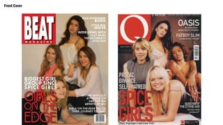
The document discusses how a student's media product challenges and develops conventions of real media.
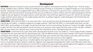
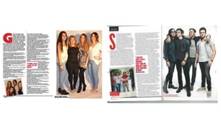
The student kept some conventions like bold mastheads and cover photos showing the subject. However, the student challenged conventions by using a montage on the contents page instead of a group photo, and placing the masthead in the top right instead of left. The student also included a bar with the masthead and page number at the bottom of the contents page, which is not a convention in real media products.
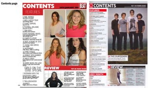
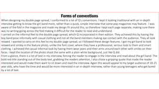
On the double page spread, the student conformed to conventions like keeping each page separate around the fold and having an informal photo. But the student included more text than some pop magazines to engage older readers. The student developed