Download to read offline
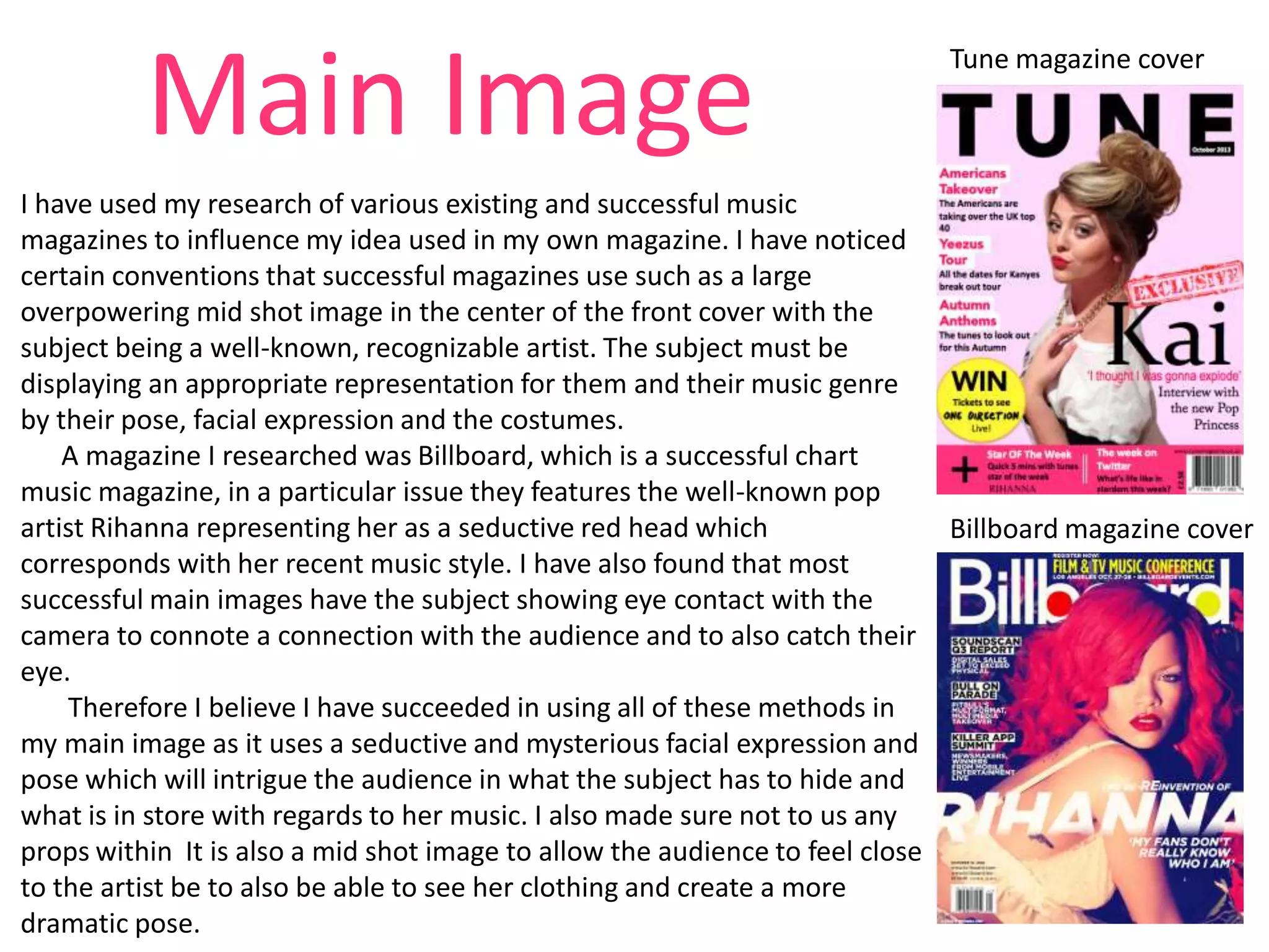
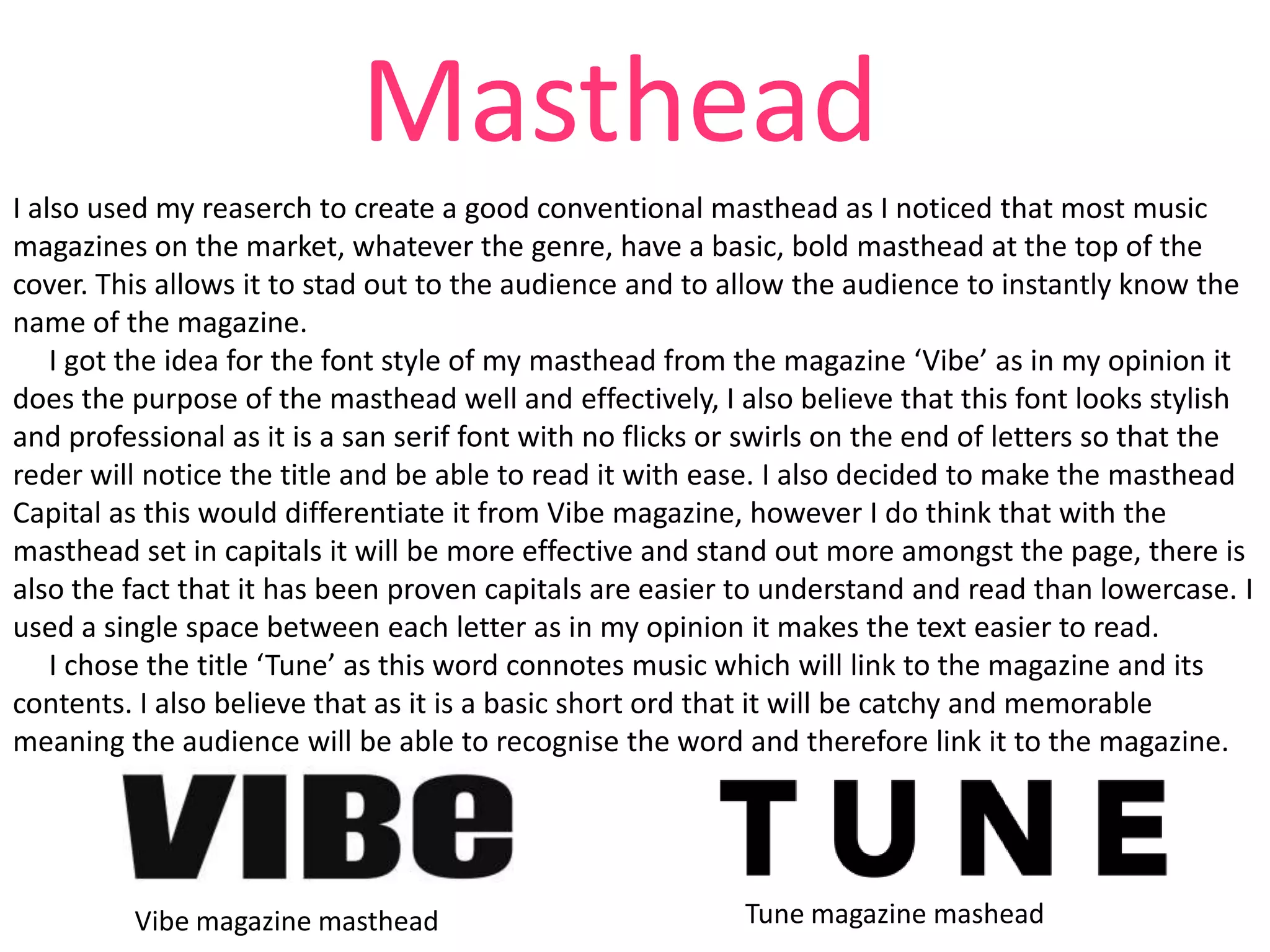
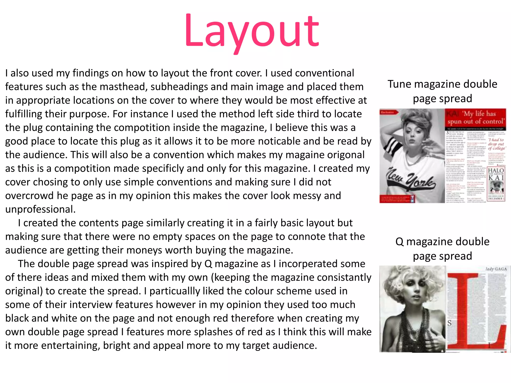

The document discusses how the media product uses and develops conventions of real music magazines. It summarizes how the cover, layout, images, and content draw from conventions of magazines like Billboard and Q, such as large central images of recognizable artists and bold mastheads. However, it also challenges some conventions, such as using varied color schemes throughout instead of a single house style. The goal is to make the magazine entertaining while still appealing to its target audience within the chart music genre. In conclusion, the media product follows many major music magazine conventions but also innovates in some areas to broaden its appeal and entertainment value.


