Downloaded 107 times


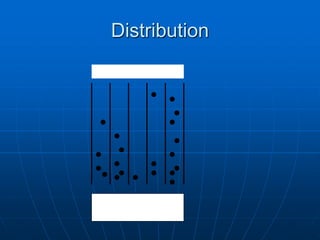
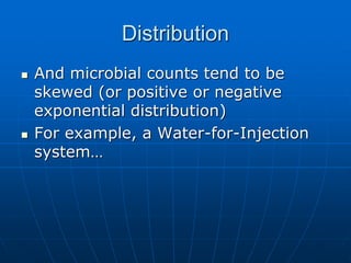
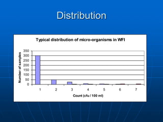

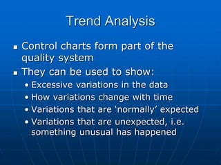
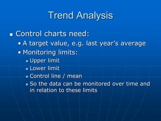
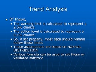
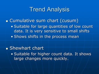
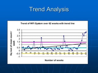
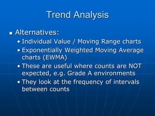
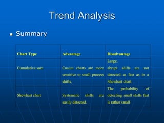
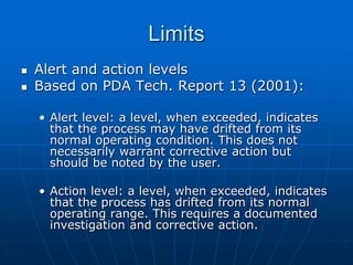


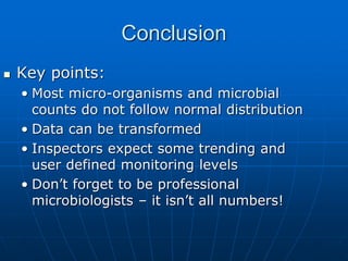


The document discusses the distribution and analysis of microbiological data, emphasizing that most such data does not follow a normal distribution and often requires transformation for proper interpretation. It outlines various statistical methods for trend analysis using control charts, such as cumulative sum and Shewhart charts, to monitor process variations and establish alert and action levels. The conclusion highlights the importance of understanding microbial distributions and emphasizes a professional approach to microbiology beyond mere numerical analysis.