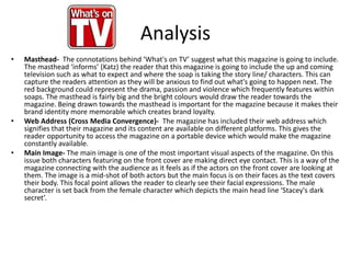
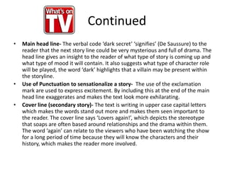
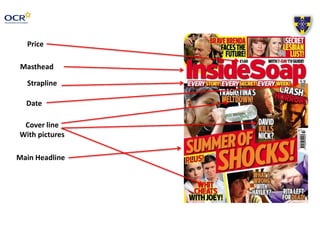
This document analyzes the front covers of two soap opera magazines - "What's on TV" and "Inside Soap". It discusses various design elements of the magazines including the mastheads, headlines, images, and other textual elements. It explains how these elements are used to attract readers' attention, convey important information about storylines, and create a sense of drama. The document also discusses techniques these magazines use that the author intends to replicate in their own soap opera magazine cover, such as the use of bold red colors and large attention-grabbing text.