
Recommended
More Related Content
What's hot
What's hot (19)
Viewers also liked
Viewers also liked (20)
Similar to Preliminary task and planning and research
Similar to Preliminary task and planning and research (20)
More from pregnaul99
More from pregnaul99 (20)
Recently uploaded
Recently uploaded (20)
Preliminary task and planning and research
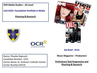
- 1. OCR Media Studies – AS Level Unit G321: Foundation Portfolio in Media Planning & Research Name: Phoebe Regnault Candidate Number: 1212 Center Name: St. Andrew’s Catholic School Center Number:64135 Set Brief - Print Music Magazine – Production Preliminary Task Progression and Planning & Research
- 2. Section 1) – Preliminary Task
- 3. Preliminary Task Progression– Evidence Front Cover Step-by-step Step 1 I inserted the top blue and yellow lines by using the shape tool and placed the St Andrews logo. I used the eye drop tool to pick out the blue and yellow and used my gradient tool to create the background.
- 4. Step 2 I inserted my text and wrote the name of my magazine ‘the saints’ as the ,masthead. I changed the font style to ‘Varisty’. Additionally I put the ‘T’ and ‘S’ into capitals to make the stand out. I then placed my picture of Patrick, I used my quick selection tool to crop him. To make sure I selected all of him I went into quick mask mode, where I used black to conceal and white to reveal. My image was to small so by pressing *cmd t* I was able to resize the image. By pressing shift at the same time my picture quality stayed the same.
- 5. Step 3 First of all I inserted a white box in the bottom right. I set my ruler lines to give me a guide on where I am going to place my social media logos and the barcode. I placed my barcode and resized it. I then placed the social media logos and moved them to fit within my ruler lines. Finally I used my text tool to type the issue, date and price. I also used my text tool to write the social media link.
- 6. Step 4 I inserted the strapline in the say font as my masthead. I put the ‘saints’ all in capitals to make it stand out because that is part of the name of the magazine. I added a stroke effect of ‘2’ in the same navy as my masthead to make the strapline bolder.
- 7. Step 4 I added my sublines to the left side of my magazine. These are the items that will feature in my magazine. I put these in yellow to make them different to the rest of the text but still within the color scheme. I also started to add to my main head line, I used a blue stroke effect around the text.
- 8. Step 5 I finished my main headline and continued to put a stroke effect around all the text. I made Patrick's name the biggest because he is the most important feature within my magazine as he is the main image. I also changed the font to the same blue by using my eye drop tool.
- 9. Step 6 I replicated the St Andrews logo and used it to make the bullet points for all my sublines. I also added one to my barcode. Additionally I placed small images that represented my sublines, such as the Chessington World of Adventures logo.
- 10. Step 7 To make my puff promotion I inserted a circle from my shape tool, I changed the color to yellow and added a blue stroke effect to it. I wrote ‘win’ in the same blue with a yellow stroke effect. I also placed a picture on a iPad to show the reader what they could win.
- 11. Preliminary Task Progression– Evidence Contents Page Step-by-step Step 1 I use the same layout and background as my front cover. I also copied the background deign of my front cover of the blue and yellow lines.
- 12. Step 2 I used my text tool to identify that this was my contents page as I wrote ‘contents’ for my strapline. I placed the school logo to split up the two texts. I put the name of the magazine in the same font style as my masthead and enlarged the word ‘contents’ because the reader would need to find the page quickly so they know where to look for articles. This also shoes a constant style within all the pages within y magazine.
- 13. Step 3 I place a photo of Imani in Photoshop and used my quick select tool to crop her. Her hair was difficult so I lowered the capacity of my brush when I was in quick mask mode.
- 14. Step 4 I added features of the magazine, this included the sub lines mentioned on the front cover. i used a white box with a yellow boarder as the background. I put the title of the boxes in yellow boxes to make them standout. I used the shape tool to do this. I also added briefly what each page was about and what it included.
- 15. Step 5 I added the editors information above my features section. It included the editors name and contact details of the magazine. I placed social media logos to inform the consumer that ‘the saints’ is available on other platforms of media.
- 16. Step 6 I used my pen tool to create an area for my text to go into, to ensure it was neat and tidy. I wrote my editorial on word and the copied and pasted it into Photoshop. When creating my drop capital I used the same font style as my masthead and the same blue.
- 17. Step 7 I inserted my editors photo to show to the reader a visual image of who the editor was. I has to crop the photo to make it fit within my text. I added a blue boarder around the picture to separate it from the text.
- 18. Section 2) – Log Book
- 19. Music Magazine – Genre research source; http://www.magforum.com/glossies/music_magazines.htm • NME mobile website grew 85% year on year, with nearly 40% of its total online audience now reading on mobile in 2014 •an estimated 248,000 adults read Mojo •an estimated 150,000 adults read Top of the Pops • The les popular classical music magazine, With a readership of over 20,000. • Q magazine is most popular for music in 2015
- 20. Established Magazine for my Research Masthead- The masthead has a bright red background which makes it very eye catching. This is important as it can catch the attention of passers and stands out form the rest of the page. Cover lines- These give the reader a glimpse of what the magazine includes and what they could read about. The cover lines include artists names which is the star appeal of the magazine (Richard Dyer) Promotional- The connotation behind ’20th anniversary special’ , is used as an incentive for the reader to buy this issue as it is special Main Headline- This helps the reader see what the main focus if of the that issue of the magazine, the word ‘Beyonce’ highlights that the magazine will have content and information on Beyonce, which her fans will respond well to Main Image- the main image has a famous artist on the front cover, Beyonce which is the star appeal (Richard Dyer), it also signifies to the reader who the main article is usually about Barcode/ price/date /issue
- 21. Target audience; The majority of Q’s magazine readers are male, for the with the percentage for men being 66.2%. The statistics also show that 83.8% of the readers are 15-44 years of age. ‘Q Magazine’ targets their audience and keeps them interested by getting their favourite bands, involving current artist, being included by popular UK festivals, this makes the magazine very popular resulting in a large following by young adults. What is the USP of this magazine? From the research completed into this media product, I think the USP of ‘Q’ is it is an alternative music magazine. Q magazine does not really have a set genre of music, its main interest is new releases and upcoming artists they also base on interviews, this means they have a very large target audience.
- 22. Publisher research http://magazines.bauermediaadvertising.com/magazines/detail/Q http://www.bauermedia.co.uk/brands/q Publisher; Bauer media Q selectively publish their magazines based on renowned rock and roll bands. Consequently their target market are mainly teens and young adults aged 15-25, who appreciate reading about rock. This target audience has given Q magazine 339,000 readers and in 2014 48,353 copies were distributed. Q was founded in 1986 by Mark Ellen and David Hepworth, who were dismayed by the music press of the time, which they felt was ignoring a generation of older music buyers who were buying CDs — then still a new technology. Q was first published by the EMAP media group in October 1986.
- 23. Conventions of a Music Magazine Masthead- The masthead has a bright red background which makes it very eye catching. This is important as it can catch the attention of passers and stands out form the rest of the page. Cover lines- These give the reader a glimpse of what the magazine includes and what they could read about. The cover lines include artists names which is the star appeal of the magazine (Richard Dyer) Promotional- The connotation behind ‘collect all 5 special covers, is used as an incentive for the reader to continue to read ‘XXL’ Main Headline- This helps the reader see what the main focus if of the that issue of the magazine, the number “40’ highlights that the magazine will have a lot of content within it about all the ages of Hip Hop. Main Image- the main image has a famous artist on the front cover which is the star appeal (Richard Dyer), it also signifies to the reader who the main article is usually about Barcode/ price/date /issue
- 24. Target Audience The general target audience for XXL has a median age of 27, magazine is 78% male reader, 44.7% college buyers, and 67% African Americans. Those who have an interest in fashion, tattoos and music will buy this magazine. What is the USP of this magazine? From the research completed into this media product, I think the USP is XXL take a mature, advance and intelligent approach to hip hop music. XXL updates with hip hops news and targets the people that live and listen for urban music. They produce at magazine with up to date information about the hottest hip hop artists at the current time. Of this magazine the unique selling point is Jay Z on the front cover as he adds ‘star appeal’ and would appeal to the target audience.
- 26. Publisher research Publisher; Townsquare Media Founded in 1997, XXL is an American hip-hop magazine, Priced at $5.99 XXL is the number 1 selling magazine, which outsells magazines like Rolling Stone, Vibe, and spin. Their assets include 309 radio stations and more than 325 local websites in 66 U.S ,markets, they have approximately 550 live events with nearly 18 million attending each year in the U.S and Canada. Townsquare media say that they ‘’Townsquare Cares, a non-profit organization that seeks to better the lives of troops and their families”