Soap Opera Genre –
Ancillary Product
Analysis
Name: Patrick Coll
Candidate Number: 1102
Center Name: St. Andrew’s Catholic School
Center Number: 64135
OCR Media Studies – A2 Level
Unit G324: Advanced Portfolio
Headline- The verbal code of the masthead
“Shock Murder Twist” hints towards the plot
of the EastEnders soap without giving too
much away. The minimalistic headline using
three words is effective as generally people
who consume Soap Opera’s are generally
more attracted by less text and more images.
The verbal code ‘Shock’, successfully engages
the reader as it explores the idea of the
unexpected happening making this a must
read. The colours and the size of the headline
compared to the other conventions is much
bolder and the yellow and pink colours
significantly contrast each other and the
background.
Masthead- The masthead is located in the
top left portion of the page as this is the
area which most people first look. The red
colour could connote danger, which is highly
representative of the Soap Opera genre.
Alternatively, red could be associated with
information, which is one of the main
purposes of this magazine. The verbal code
“What’s on TV” is generally a question that
people would ask when watching television,
hence the magazine is aimed to answer this
question.
Web Address- The web address is used to
add cross media convergence to the
publication, giving the audience the ability
to read more into the magazine and access
exclusive online content.
Main Image- The main image of two of the
protagonists in the EastEnders series could be
utilised for ‘Star appeal’ (Richard Dyer), which
would entice readers to purchase the
magazine. The medium close up of the
characters has been successfully utilised to
give a close up look of the characters and to
also make them fill up most of the page to
show they are the most important part of the
magazine.
Cover Line- There are several cover lines
used by ‘What’s on TV’, to hint towards the
plots of the latest Soap Opera episodes.
There are primarily shows listed in the
bottom right hand corner of the page
entitled ‘Hot New Shows’. The verbal code
of ‘Hot’ could express how it is a must read
for the reader and the verbal code ‘new’
denotes that the magazine is contemporary
and up to date in regards to it’s material.
The use of punctuation in the cover line
‘Alicia sent to prison!’ expresses the
importance of the article and the necessity
to read it.
Colours- The bright vibrant colours used on
the page attract the audience as it is bold
and stands out against other magazine’s
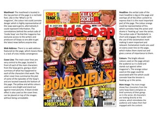
Masthead- The masthead is located in
the top portion of the page in a red bold
font. Like in the ‘What’s on TV
magazine’, the colour red could connote
danger which is highly representative of
the soap opera genre, alternatively it
could represent information. The
connotations behind the verbal code of
‘Inside Soap’ are that the magazine has
exclusive access to the writers and
producers of Soaps so are able to get
the latest news before anyone else.
Web Address- There is no web address
featured on the page, which means there
is a lack of cross media convergence.
Cover Line- The main cover lines are
very central to the page, located in
front of each of the main characters
from the Soap genre, giving a short
summary of what has happened to
each of the characters that week. The
other cover lines summarize the plot
of some of the episodes of the Soap’s
and are located towards the bottom of
the page. The yellow and white colours
used are very bright and stand out
against most pictures. A black stroke
effect is also used so the cover lines
can be placed on top of the images
without being unreadable.
Headline- the verbal code of the
main headline is big on the page and
overlaps all of the other content to
express that it is the most important
part of the page. The colour orange
could be representative of fire,
which connotes how the action and
drama is ‘heating up’ over the series.
The verbal code of ‘Bombshells’ is
short and engages the reader with
the use of the exclamation mark
making it seem important and
relevant. Exclamation marks are used
on every cover line on the page,
which makes them stand out and
gives a sense of importance to them.
Colours- The bright vibrant
colours used on the page attract
the audience as it is bold and
stands out against other
magazine’s. The orange colour
used on the page could be
associated with fire which could
connote how the tension is
heating up in the series.
Main Image- The main image
shows four characters from the
same Soap Opera and gives as
brief summary of their goings
on in the series. All characters
are looking directly at the
camera, which intimidates the
audience and makes them feel
engaged with the content.
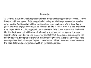
To create a magazine that is representative of the Soap Opera genre I will ‘repeat’ (Steve
Neale - 1980) the layout of the magazine by having a main image surrounded by other
cover stories. Additionally I will have minimalistic text, as viewers of the Soap Opera
genre are more engaged by images as opposed to lots of text. I think it is also important
that I replicated the bold, bright colours used on the front cover to reinstate the brand
identity. Furthermore I will have multiple puff promotions on the page acting as an
incentive for people buying the magazine. It is likely that the price of the magazine will
be low at about £0.49p as this is what the audience (working class) can afford to spend
on magazine’s. I will also try to ‘repeat’ (Steve Neale - 1980) the use of punctuation on
the page, following each sentence with an exclamation mark.
Conclusion

Magazine Textual Analysis

  • 1.
    Soap Opera Genre– Ancillary Product Analysis Name: Patrick Coll Candidate Number: 1102 Center Name: St. Andrew’s Catholic School Center Number: 64135 OCR Media Studies – A2 Level Unit G324: Advanced Portfolio
  • 2.
    Headline- The verbalcode of the masthead “Shock Murder Twist” hints towards the plot of the EastEnders soap without giving too much away. The minimalistic headline using three words is effective as generally people who consume Soap Opera’s are generally more attracted by less text and more images. The verbal code ‘Shock’, successfully engages the reader as it explores the idea of the unexpected happening making this a must read. The colours and the size of the headline compared to the other conventions is much bolder and the yellow and pink colours significantly contrast each other and the background. Masthead- The masthead is located in the top left portion of the page as this is the area which most people first look. The red colour could connote danger, which is highly representative of the Soap Opera genre. Alternatively, red could be associated with information, which is one of the main purposes of this magazine. The verbal code “What’s on TV” is generally a question that people would ask when watching television, hence the magazine is aimed to answer this question. Web Address- The web address is used to add cross media convergence to the publication, giving the audience the ability to read more into the magazine and access exclusive online content. Main Image- The main image of two of the protagonists in the EastEnders series could be utilised for ‘Star appeal’ (Richard Dyer), which would entice readers to purchase the magazine. The medium close up of the characters has been successfully utilised to give a close up look of the characters and to also make them fill up most of the page to show they are the most important part of the magazine. Cover Line- There are several cover lines used by ‘What’s on TV’, to hint towards the plots of the latest Soap Opera episodes. There are primarily shows listed in the bottom right hand corner of the page entitled ‘Hot New Shows’. The verbal code of ‘Hot’ could express how it is a must read for the reader and the verbal code ‘new’ denotes that the magazine is contemporary and up to date in regards to it’s material. The use of punctuation in the cover line ‘Alicia sent to prison!’ expresses the importance of the article and the necessity to read it. Colours- The bright vibrant colours used on the page attract the audience as it is bold and stands out against other magazine’s
  • 3.
    Masthead- The mastheadis located in the top portion of the page in a red bold font. Like in the ‘What’s on TV magazine’, the colour red could connote danger which is highly representative of the soap opera genre, alternatively it could represent information. The connotations behind the verbal code of ‘Inside Soap’ are that the magazine has exclusive access to the writers and producers of Soaps so are able to get the latest news before anyone else. Web Address- There is no web address featured on the page, which means there is a lack of cross media convergence. Cover Line- The main cover lines are very central to the page, located in front of each of the main characters from the Soap genre, giving a short summary of what has happened to each of the characters that week. The other cover lines summarize the plot of some of the episodes of the Soap’s and are located towards the bottom of the page. The yellow and white colours used are very bright and stand out against most pictures. A black stroke effect is also used so the cover lines can be placed on top of the images without being unreadable. Headline- the verbal code of the main headline is big on the page and overlaps all of the other content to express that it is the most important part of the page. The colour orange could be representative of fire, which connotes how the action and drama is ‘heating up’ over the series. The verbal code of ‘Bombshells’ is short and engages the reader with the use of the exclamation mark making it seem important and relevant. Exclamation marks are used on every cover line on the page, which makes them stand out and gives a sense of importance to them. Colours- The bright vibrant colours used on the page attract the audience as it is bold and stands out against other magazine’s. The orange colour used on the page could be associated with fire which could connote how the tension is heating up in the series. Main Image- The main image shows four characters from the same Soap Opera and gives as brief summary of their goings on in the series. All characters are looking directly at the camera, which intimidates the audience and makes them feel engaged with the content.
  • 4.
    To create amagazine that is representative of the Soap Opera genre I will ‘repeat’ (Steve Neale - 1980) the layout of the magazine by having a main image surrounded by other cover stories. Additionally I will have minimalistic text, as viewers of the Soap Opera genre are more engaged by images as opposed to lots of text. I think it is also important that I replicated the bold, bright colours used on the front cover to reinstate the brand identity. Furthermore I will have multiple puff promotions on the page acting as an incentive for people buying the magazine. It is likely that the price of the magazine will be low at about £0.49p as this is what the audience (working class) can afford to spend on magazine’s. I will also try to ‘repeat’ (Steve Neale - 1980) the use of punctuation on the page, following each sentence with an exclamation mark. Conclusion