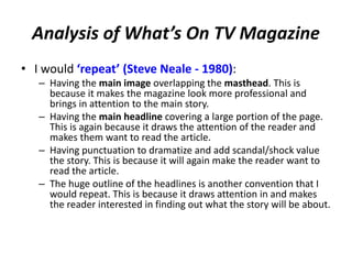
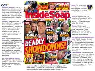
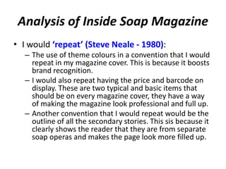
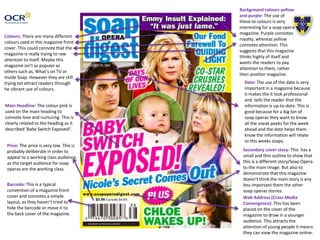
The document analyzes conventions used in magazine covers for soap opera audiences. It discusses several magazines' use of headlines, images, colors, and other design elements to attract readers. For example, sensationalized headlines with punctuation intrigue audiences, and price points appeal to working-class readers. The analysis also notes design conventions the author would repeat, such as overlapping images and outlines around headlines to draw attention. Overall, the document examines how magazine covers employ visual rhetoric to target soap opera fans.