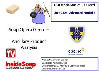
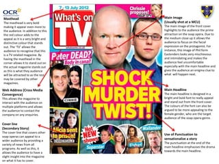
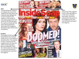
This document analyzes the front cover design of two soap opera magazines: InsideSoap and What's on TV. It discusses several key design elements and which elements would be effective to repeat across magazine covers. Specifically, it recommends repeating the bold masthead from InsideSoap, cover lines with pictures and pull quotes from both magazines, the bold and colorful main headline used in What's on TV, and the use of main images featuring two protagonists displaying contrasting emotions. Repeating these elements across magazine covers was said to increase audience appeal, identification, curiosity and recognition of the magazines.