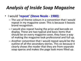
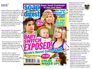
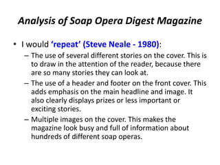
Soap Opera Genre –
Ancillary Product
Analysis
Name: Hannah Hughes
Candidate Number: 4067
Center Name: St. Andrew’s Catholic School
Center Number: 64135
OCR Media Studies – A2 Level
Unit G324: Advanced Portfolio
Puffs: This is used to attract the
attention of the working class
audience. This sis because they are the
stereotypical group that are interested
in ‘sneak peeks’ and prizes which are
usually written in a puff.
Masthead: The masthead is very big,
so that it draws attention in from
the reader. This is because the
institution want brand recognition,
so that readers will continue to buy
their magazines rather that another
competitor soap opera magazine.
Main Headline: The colour pink is used
on the main heading to connote love
and nurturing. This is clearly related to
the heading as it described Kat giving
birth. It is also the biggest bit of text
because it related to the main image.
This is because you wouldn’t have a
main text relating to any other image
other then the main image.
Use of Punctuation to sensationalize a
story: This it to dramatize the main
headline. This draw emphasis on the
fact that they want the reader to read
this article. The punctuation intrigues
the audience and makes them want to
purchase the magazine and find out
what happens to make ‘Kat’s Birth
Shocking!’
Web Address (Cross Media
Convergence): This has been placed
on the cover of the magazine to
draw in a younger audience. This
attracts the attention of young
people and connotes they can view
the magazine online.
Main Image
(Usually shot at a MCU):
This is a traditional shot for magazine
covers. It is used to clearly
demonstrate that this is the main
image and that readers should focus
on this image rather then any others.
This is probable because this is the
biggest story of the week.
Price: The price is very low. This is
probably to appeal to a working
class audience, as the target
audience for soap operas are the
working class.
Background colour blue: The
colour blue is consistently
used in the background of
What’s on TV Magazine.
This would be to create brand
identity and brand recognition.
Secondary cover story: This has a
yellow outline to show that this is a
different story/Soap Opera to the
main image. This connotes that it
may not be as important as the main
image.
Bold outline of text: This is to
outline the fact that this is an
important article and it successfully
draws attention in from the reader,
and suggests that every reader
needs to read.
Logos on text: This is used to ‘inform’
(Katz) the readers what Soap Operas all
the image relate to.it could also be to
attract big fans of certain shows into
buying the magazine, purely because
their show is mention in it.
Analysis of What’s On TV Magazine
• I would ‘repeat’ (Steve Neale - 1980):
– Having the main image overlapping the masthead. This is
because it makes the magazine look more professional and
brings in attention to the main story.
– Having the main headline covering a large portion of the page.
This is again because it draws the attention of the reader and
makes them want to read the article.
– Having punctuation to dramatize and add scandal/shock value
the story. This is because it will again make the reader want to
read the article.
– The huge outline of the headlines is another convention that I
would repeat. This is because it draws attention in and makes
the reader interested in finding out what the story will be about.
Strapline: This has the rule of
three within it. This is to connote
the repeating stories that are
within soap operas. It could also be
used as a buzz word. The reader
could see the words from the
strapline and then think of the
magazine and therefore feel they
should go and purchase the
magazine.
Date: The use of the date is very
important in a magazine because it
makes the it look professional and
tells the reader that the
information is up-to-date. This is
good because for a big fan of soap
operas they want to know all the
sneak peeks for the week ahead
and the date helps them know the
information will relate to this
weeks soaps.
Price: This magazine costs a lot
more then other magazines such as
What’s on TV. This could be
because it is targeted at a richer/
higher class market.
Barcode: This is a typical
convention of a magazine front
cover and connotes a simple
layout, as they haven’t tried to
hide the barcode or move it to the
back cover of the magazine.
Use of the colour red (theme):
Throughout the magazine red is a
continuing theme. This is probable
because red connotes lust and
danger, which are 2 main themes
of a soap opera.
Secondary cover story: This has a
yellow outline to show that this is a
different story/Soap Opera to the
main image. The connotations of
the colour yellow are to draw in
attention. This is probable why the
colour yellow is used in magazine
covers.
Tragedy: This verbal code is
repeated in many of Inside
Soaps magazines. This could
be used so that the company
have brand recognize .
Logos on text: This is used to tell the readers what Soap Operas all the
image relate to.it could also be to attract big fans of certain shows into
buying the magazine, purely because their show is mention in it.
Main Headline: The colours red and
yellow are used in this main heading
to connote danger and attracts the
attention of the audience. This is
clearly related to the heading as it
describes ‘Deadly Showdowns!’. It is
also the biggest bit of text because it
probable the biggest story of that
week in all soap operas.
Use of Punctuation to sensationalize a
story: This it to dramatize the main
headline. This draw emphasis on the
fact that they want the reader to read
this article. The punctuation intrigues
the audience and makes them want to
purchase the magazine and find out
what happens to make ‘Kat’s Birth
Shocking!’
Analysis of Inside Soap Magazine
• I would ‘repeat’ (Steve Neale - 1980):
– The use of theme colours in a convention that I would
repeat in my magazine cover. This is because it boosts
brand recognition.
– I would also repeat having the price and barcode on
display. These are two typical and basic items that
should be on every magazine cover, they have a way
of making the magazine look professional and full up.
– Another convention that I would repeat would be the
outline of all the secondary stories. This sis because it
clearly shows the reader that they are from separate
soap operas and makes the page look more filled up.
Main Headline: The colour pink is
used on the main heading to
connote love and nurturing. This is
clearly related to the heading as it
described ‘Baby Switch Exposed!’.
Secondary cover story: This has a
small and thin outline to show that
this is a different story/Soap Opera
to the main image. But also to
demonstrate that this magazine
doesn’t think the main story is any
less important them the other
soap operas stories.
Background colours yellow
and purple: The use of
these to colours is very
interesting for a soap opera
magazine. Purple connotes
royalty, whereas yellow
connotes attention. This
suggests that this magazine
thinks highly of itself and
wants the readers to pay
attention to them, rather
then another magazine.
Barcode: This is a typical
convention of a magazine front
cover and connotes a simple
layout, as they haven’t tried to
hide the barcode or move it to
the back cover of the magazine.
Colours: There are many different
colours used in this magazine front
cover. This could connote that the
magazine is really trying to raw
attention to itself. Maybe this
magazine isn’t as popular as
others such as, What’s on TV or
Inside Soap. However they are still
trying tot attract readers through
he vibrant use of colours.
Price: The price is very low. This is
probably deliberate in order to
appeal to a working class audience,
as the target audience for soap
operas are the working class.
Web Address (Cross Media
Convergence): This has been
placed on the cover of the
magazine to draw in a younger
audience. This attracts the
attention of young people it means
they can view the magazine online.
Date: The use of the date is very
important in a magazine because
it makes the it look professional
and tells the reader that the
information is up-to-date. This is
good because for a big fan of
soap operas they want to know
all the sneak peeks for the week
ahead and the date helps them
know the information will relate
to this weeks soaps.
Analysis of Soap Opera Digest Magazine
• I would ‘repeat’ (Steve Neale - 1980):
– The use of several different stories on the cover. This is
to draw in the attention of the reader, because there
are so many stories they can look at.
– The use of a header and footer on the front cover. This
adds emphasis on the main headline and image. It
also clearly displays prizes or less important or
exciting stories.
– Multiple images on the cover. This makes the
magazine look busy and full of information about
hundreds of different soap operas.

Ancillary product magazine - analysis task.pptx2

  • 1.
    Soap Opera Genre– Ancillary Product Analysis Name: Hannah Hughes Candidate Number: 4067 Center Name: St. Andrew’s Catholic School Center Number: 64135 OCR Media Studies – A2 Level Unit G324: Advanced Portfolio
  • 2.
    Puffs: This isused to attract the attention of the working class audience. This sis because they are the stereotypical group that are interested in ‘sneak peeks’ and prizes which are usually written in a puff. Masthead: The masthead is very big, so that it draws attention in from the reader. This is because the institution want brand recognition, so that readers will continue to buy their magazines rather that another competitor soap opera magazine. Main Headline: The colour pink is used on the main heading to connote love and nurturing. This is clearly related to the heading as it described Kat giving birth. It is also the biggest bit of text because it related to the main image. This is because you wouldn’t have a main text relating to any other image other then the main image. Use of Punctuation to sensationalize a story: This it to dramatize the main headline. This draw emphasis on the fact that they want the reader to read this article. The punctuation intrigues the audience and makes them want to purchase the magazine and find out what happens to make ‘Kat’s Birth Shocking!’ Web Address (Cross Media Convergence): This has been placed on the cover of the magazine to draw in a younger audience. This attracts the attention of young people and connotes they can view the magazine online. Main Image (Usually shot at a MCU): This is a traditional shot for magazine covers. It is used to clearly demonstrate that this is the main image and that readers should focus on this image rather then any others. This is probable because this is the biggest story of the week. Price: The price is very low. This is probably to appeal to a working class audience, as the target audience for soap operas are the working class. Background colour blue: The colour blue is consistently used in the background of What’s on TV Magazine. This would be to create brand identity and brand recognition. Secondary cover story: This has a yellow outline to show that this is a different story/Soap Opera to the main image. This connotes that it may not be as important as the main image. Bold outline of text: This is to outline the fact that this is an important article and it successfully draws attention in from the reader, and suggests that every reader needs to read. Logos on text: This is used to ‘inform’ (Katz) the readers what Soap Operas all the image relate to.it could also be to attract big fans of certain shows into buying the magazine, purely because their show is mention in it.
  • 3.
    Analysis of What’sOn TV Magazine • I would ‘repeat’ (Steve Neale - 1980): – Having the main image overlapping the masthead. This is because it makes the magazine look more professional and brings in attention to the main story. – Having the main headline covering a large portion of the page. This is again because it draws the attention of the reader and makes them want to read the article. – Having punctuation to dramatize and add scandal/shock value the story. This is because it will again make the reader want to read the article. – The huge outline of the headlines is another convention that I would repeat. This is because it draws attention in and makes the reader interested in finding out what the story will be about.
  • 4.
    Strapline: This hasthe rule of three within it. This is to connote the repeating stories that are within soap operas. It could also be used as a buzz word. The reader could see the words from the strapline and then think of the magazine and therefore feel they should go and purchase the magazine. Date: The use of the date is very important in a magazine because it makes the it look professional and tells the reader that the information is up-to-date. This is good because for a big fan of soap operas they want to know all the sneak peeks for the week ahead and the date helps them know the information will relate to this weeks soaps. Price: This magazine costs a lot more then other magazines such as What’s on TV. This could be because it is targeted at a richer/ higher class market. Barcode: This is a typical convention of a magazine front cover and connotes a simple layout, as they haven’t tried to hide the barcode or move it to the back cover of the magazine. Use of the colour red (theme): Throughout the magazine red is a continuing theme. This is probable because red connotes lust and danger, which are 2 main themes of a soap opera. Secondary cover story: This has a yellow outline to show that this is a different story/Soap Opera to the main image. The connotations of the colour yellow are to draw in attention. This is probable why the colour yellow is used in magazine covers. Tragedy: This verbal code is repeated in many of Inside Soaps magazines. This could be used so that the company have brand recognize . Logos on text: This is used to tell the readers what Soap Operas all the image relate to.it could also be to attract big fans of certain shows into buying the magazine, purely because their show is mention in it. Main Headline: The colours red and yellow are used in this main heading to connote danger and attracts the attention of the audience. This is clearly related to the heading as it describes ‘Deadly Showdowns!’. It is also the biggest bit of text because it probable the biggest story of that week in all soap operas. Use of Punctuation to sensationalize a story: This it to dramatize the main headline. This draw emphasis on the fact that they want the reader to read this article. The punctuation intrigues the audience and makes them want to purchase the magazine and find out what happens to make ‘Kat’s Birth Shocking!’
  • 5.
    Analysis of InsideSoap Magazine • I would ‘repeat’ (Steve Neale - 1980): – The use of theme colours in a convention that I would repeat in my magazine cover. This is because it boosts brand recognition. – I would also repeat having the price and barcode on display. These are two typical and basic items that should be on every magazine cover, they have a way of making the magazine look professional and full up. – Another convention that I would repeat would be the outline of all the secondary stories. This sis because it clearly shows the reader that they are from separate soap operas and makes the page look more filled up.
  • 6.
    Main Headline: Thecolour pink is used on the main heading to connote love and nurturing. This is clearly related to the heading as it described ‘Baby Switch Exposed!’. Secondary cover story: This has a small and thin outline to show that this is a different story/Soap Opera to the main image. But also to demonstrate that this magazine doesn’t think the main story is any less important them the other soap operas stories. Background colours yellow and purple: The use of these to colours is very interesting for a soap opera magazine. Purple connotes royalty, whereas yellow connotes attention. This suggests that this magazine thinks highly of itself and wants the readers to pay attention to them, rather then another magazine. Barcode: This is a typical convention of a magazine front cover and connotes a simple layout, as they haven’t tried to hide the barcode or move it to the back cover of the magazine. Colours: There are many different colours used in this magazine front cover. This could connote that the magazine is really trying to raw attention to itself. Maybe this magazine isn’t as popular as others such as, What’s on TV or Inside Soap. However they are still trying tot attract readers through he vibrant use of colours. Price: The price is very low. This is probably deliberate in order to appeal to a working class audience, as the target audience for soap operas are the working class. Web Address (Cross Media Convergence): This has been placed on the cover of the magazine to draw in a younger audience. This attracts the attention of young people it means they can view the magazine online. Date: The use of the date is very important in a magazine because it makes the it look professional and tells the reader that the information is up-to-date. This is good because for a big fan of soap operas they want to know all the sneak peeks for the week ahead and the date helps them know the information will relate to this weeks soaps.
  • 7.
    Analysis of SoapOpera Digest Magazine • I would ‘repeat’ (Steve Neale - 1980): – The use of several different stories on the cover. This is to draw in the attention of the reader, because there are so many stories they can look at. – The use of a header and footer on the front cover. This adds emphasis on the main headline and image. It also clearly displays prizes or less important or exciting stories. – Multiple images on the cover. This makes the magazine look busy and full of information about hundreds of different soap operas.