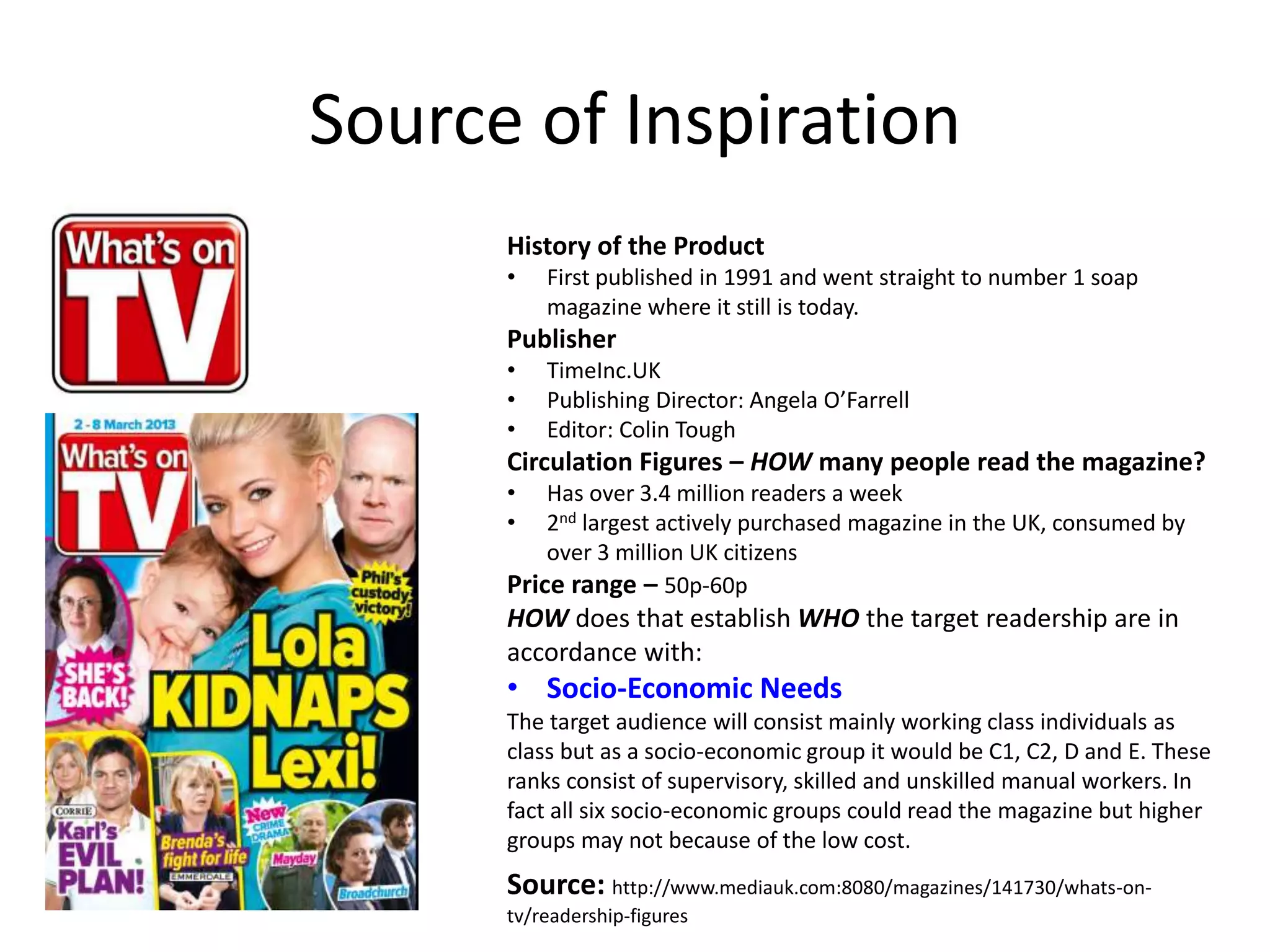
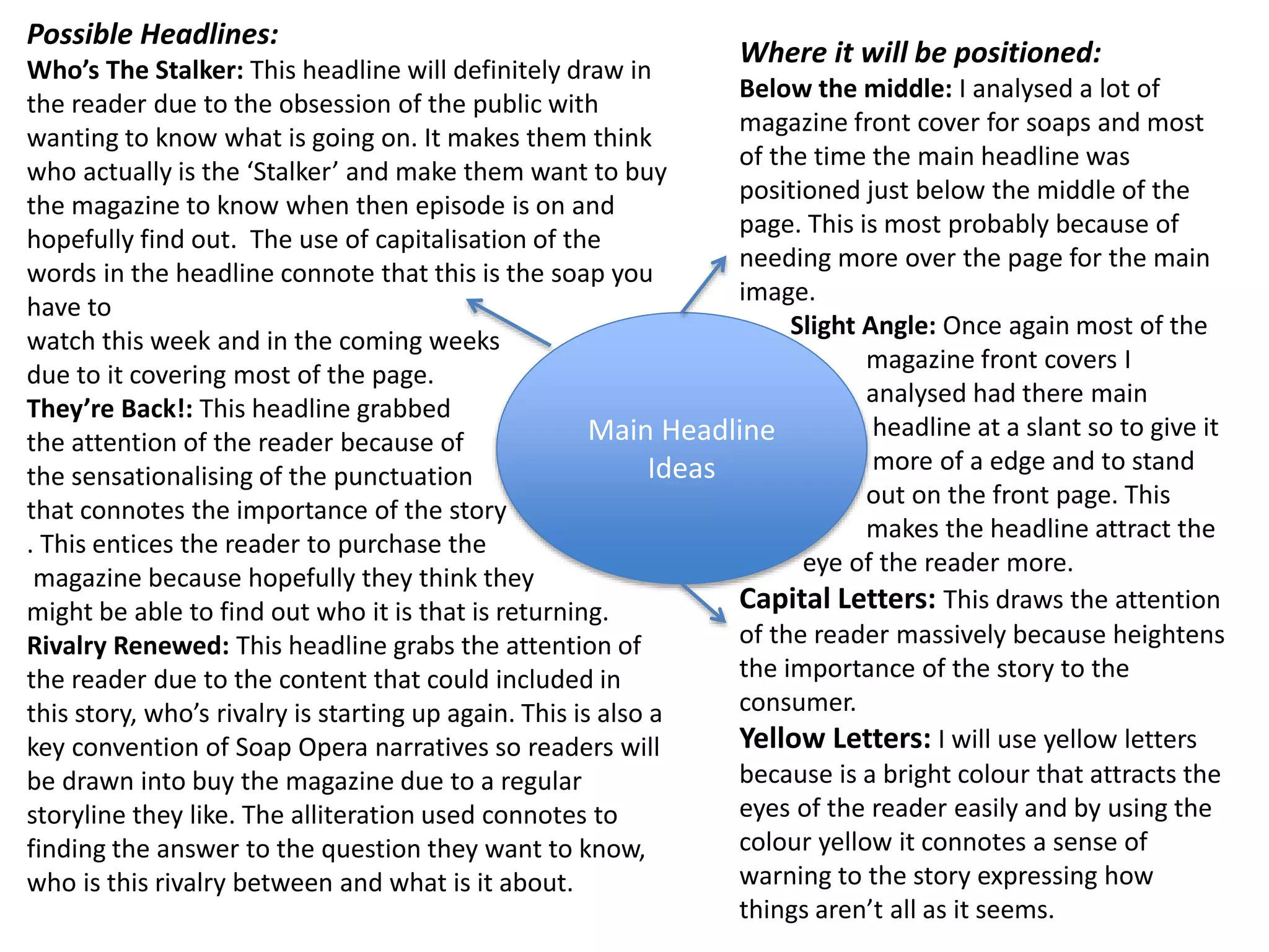
9953330565 Low Rate Call Girls In Rohini Delhi NCR
Magazine mind map1
1. OCR Media Studies – A2 Level
Unit G324: Advanced Portfolio
Mind Map and
Research
Generation of Ideas for Ancillary Product 1) –
Name: Chris Jacobs
Candidate Number: 4068
Center Name: St. Andrew’s Catholic School
Center Number: 64135
TV Magazine Front Cover
2. Source of Inspiration
History of the Product
• First published in 1991 and went straight to number 1 soap
magazine where it still is today.
Publisher
• TimeInc.UK
• Publishing Director: Angela O’Farrell
• Editor: Colin Tough
Circulation Figures – HOW many people read the magazine?
• Has over 3.4 million readers a week
• 2nd largest actively purchased magazine in the UK, consumed by
over 3 million UK citizens
Price range – 50p-60p
HOW does that establish WHO the target readership are in
accordance with:
• Socio-Economic Needs
The target audience will consist mainly working class individuals as
class but as a socio-economic group it would be C1, C2, D and E. These
ranks consist of supervisory, skilled and unskilled manual workers. In
fact all six socio-economic groups could read the magazine but higher
groups may not because of the low cost.
Source: http://www.mediauk.com:8080/magazines/141730/whats-on-tv/
readership-figures
3. Verbal Codes:
In some soap magazines they use words that can connote a certain
meaning such as Inside. This connotes the intake of information by
the reader and is an option I could use in my magazine.
Soap: In most magazines ‘Soap’ is a keyword that is analysed
because it displays the what magazine genre the reader will be
consuming and what to expect.
Masthead Ideas
Possible Mastheads:
SoapSide: This works well
because of the use of sibilance in
masthead which makes it roll off
the tongue well which engages
the reader.
Weekly Soap: I think is a simple
idea that works when comes to
the idea of soap operas, and tells
exactly in the title what it’s going
to be about predominantly.
Soapster: This masthead idea is
good because of it being all one
word which attracts the readers
attention and once again easy to
roll off the tongue.
Positioning of Masthead on the Page:
Top Left of the Page: Most magazines adopt this idea of having their
masthead in the top left hand corner of the page. The brand is easily
recognised because apart from the main headline masthead in next thing
that catches the readers attention.
Top of the Page: On some magazines they choose to have there masthead
spread across the top of the page because it is then clearly noticeable to
the reader. This leaves a lot of space on the rest front cover for the stories
which is what sells the magazines.
Colour:
This is a key convention for a
soap magazine because it
helps it gain brand recognition
and stand out in the market.
Red: This is popular colour for
soap magazines because of
the connotations it brings,
with red being symbolic of
danger and love. These two
themes are commonly related
with Soaps.
White: This is normally
common colour used in soap
magazines because of the
good contrast it has with the
colour red.
Both of these colours I would
like to use in my magazine.
4. Possible Headlines:
Who’s The Stalker: This headline will definitely draw in
the reader due to the obsession of the public with
wanting to know what is going on. It makes them think
who actually is the ‘Stalker’ and make them want to buy
the magazine to know when then episode is on and
hopefully find out. The use of capitalisation of the
words in the headline connote that this is the soap you
have to
watch this week and in the coming weeks
due to it covering most of the page.
They’re Back!: This headline grabbed
the attention of the reader because of
the sensationalising of the punctuation
that connotes the importance of the story
. This entices the reader to purchase the
magazine because hopefully they think they
might be able to find out who it is that is returning.
Rivalry Renewed: This headline grabs the attention of
the reader due to the content that could included in
this story, who’s rivalry is starting up again. This is also a
key convention of Soap Opera narratives so readers will
be drawn into buy the magazine due to a regular
storyline they like. The alliteration used connotes to
finding the answer to the question they want to know,
who is this rivalry between and what is it about.
Main Headline
Ideas
Where it will be positioned:
Below the middle: I analysed a lot of
magazine front cover for soaps and most
of the time the main headline was
positioned just below the middle of the
page. This is most probably because of
needing more over the page for the main
image.
Slight Angle: Once again most of the
magazine front covers I
analysed had there main
headline at a slant so to give it
more of a edge and to stand
out on the front page. This
makes the headline attract the
eye of the reader more.
Capital Letters: This draws the attention
of the reader massively because heightens
the importance of the story to the
consumer.
Yellow Letters: I will use yellow letters
because is a bright colour that attracts the
eyes of the reader easily and by using the
colour yellow it connotes a sense of
warning to the story expressing how
things aren’t all as it seems.
5. Images
Needed
Main Image: All the magazine front
covers that I have analysed were always an
eye level mid shot so to be able to see the
emotions of the characters. This is
important because of the faces on the front
cover from the main image is what draws in
the reader to buying the magazine.
Mid Shot: In most of the soap opera
magazines I have analysed Mid shots are
the most common because you can see as
reader most of the characters body as
well as a clear facial expression. This
helps portray what the emotion/
mood of the character is so the storyline
can be understood.
Cover Line Imagery:
Outskirts: Most of the Soap Opera
Magazines I have analysed have most
of there cover line images around the
outskirts of the page so not to obscure
the main headline and main image.
Box Outlines around the Image: This is
once again to make sure that none of
the attention is taken away from the
main image. Although they are
done like this to portray
their importance and
being different stories.
Other Soaps:
EastEnders, Emmerdale and
Coronation Street: Using these
Soap Operas in my magazine to
support the new soap opera I am
promoting is key because the
readers are more likely to buy a
product with shows they know
and like inside it. This gains a
wider audience for my magazine
as a whole and will lead to
expanding my target
demographic.
6. Mind Map - Conclusion
• What you need to do next
So I can get a good idea of the codes, conventions and what content is needed used in a Soap Opera
Magazine I will have to purchase one of the magazines. This will give me a clear picture of what is
needed for my magazine to look professional and fit for purpose.
• What you’ll need to organise/arrange
What I will need to arrange and organise for my magazine to be fit for purpose is a few things. These
includes the images needed to be taken for my main image which I can take on the day of filming or in
my spare time. Furthermore I need to find out a suitable font style for my Soap Opera magazine, for this
I will use websites such as DaFont to find the right one.
• What software you will use to create the product and Why?
The creation of my Soap Opera magazine will need the use of different pieces of software. They include
Adobe Photoshop and Adobe Fireworks so to make fit for purpose. Photoshop I will need to make the
magazine look professional because it has a range of tools that can assist me in making magazine look
like a real magazine. Then Fireworks will allow me to edit my images so they are right to go on my cover,
it includes removing backgrounds or editing colours.
Name: Chris Jacobs
Candidate Number: 4068
Center Name: St. Andrew’s Catholic School
Center Number: 64135