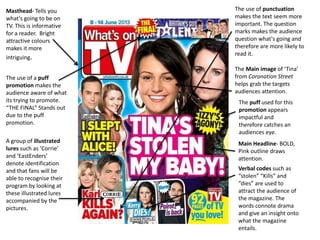
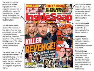
This document analyzes the covers of two soap opera magazines: What's on TV and Inside Soap. For What's on TV, the summary notes the magazine has a simplistic layout but effective use of fonts for the masthead and positioning of images and headlines. For Inside Soap, the summary highlights conventions it would repeat for its own magazine, including the prominent masthead at the top of the page, bold strap line, use of bright colors and bold background color, sensationalized language with exclamation marks, and puff promotions and secondary images/headlines.