Soap Opera Genre –
Ancillary Product
Analysis
Name: Zeyan Mirza
Candidate Number: 1178
Center Name: St. Andrew’s Catholic School
Center Number: 64135
OCR Media Studies – A2 Level
Unit G324: Advanced Portfolio
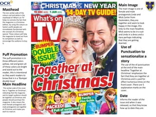
Main Headline
The verbal code of the cover
line is ‘Together at Christmas’,
indicating that the magazine
and its target audience should
be together at Christmas and
people should purchase the
magazine. It also means the
main female protagonist and
male protagonist are together
at Christmas and makes you
want to read on.
Masthead
The non verbal code of the
colours red and white in the
masthead of ‘What’s on TV’
helps to connote the fact that
the magazine is a Christmas
edition, by using the colours on
Santa's outfit people are
immediately familiarized with
the concept of a Christmas
special. These colours will help
the magazine to stand out from
its competitors as well as
encourage the audience to buy
it.
Use of
Punctuation to
sensationalize a
story
The use of the of punctuation
at the end of the main
headline ‘Together at
Christmas’ emphasizes the
fact that they are together at
Christmas and is used for
effect numerous times on the
front cover. There are 5
explanation marks on the
cover.
Main Image
The main image is one of
female and male
protagonists Linda and
Mick Carter from
Eastenders, they are
together and seem to look
happy in the image, this
links to the main headline.
Mick seems to be in a suit
and Linda in a dress and a
tiara perhaps indicating
that they are getting
married.
Puff Promotion
The puff promotion is in
three different colors
yellow, red and green all
of these colors are bright
and stand out to the
reader, this is intentional
as they want readers to
know that is is a ‘Bumper
double Issue’
Date
Informs the reader of the
issue and when it was
released, so that they know
how up to date they are.
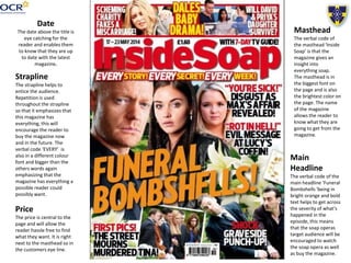
Strapline
The strapline helps to
entice the audience.
Repetition is used
throughout the strapline
so that it emphasizes that
this magazine has
everything, this will
encourage the reader to
buy the magazine now
and in the future. The
verbal code ‘EVERY’ is
also in a different colour
font and bigger than the
others words again
emphasizing that the
magazine has everything a
possible reader could
possibly want.
Date
The date above the title is
eye catching for the
reader and enables them
to know that they are up
to date with the latest
magazine.
Price
The price is central to the
page and will allow the
reader hassle free to find
what they want. It is right
next to the masthead so in
the customers eye line.
Masthead
The verbal code of
the masthead ‘Inside
Soap’ is that the
magazine gives an
insight into
everything soap.
The masthead is in
the biggest font on
the page and is also
the brightest color on
the page. The name
of the magazine
allows the reader to
know what they are
going to get from the
magazine.
Main
Headline
The verbal code of the
main headline ‘Funeral
Bombshells 'being in
bright orange and bold
text helps to get across
the severity of what's
happened in the
episode, this means
that the soap operas
target audience will be
encouraged to watch
the soap opera as well
as buy the magazine.
Conclusion
I intend to ‘repeat’ (Steve Neale) many of the conventions I have seen in the two
magazines I have analysed. I especially intend to repeat the use of bright colours for the
mastheads and main story's as this will help my magazine to stand out from the rest on the
shelf. Both of the magazines also used punctuation to sensationalize a story, this is clever
as it will encourage potential customers to buy the magazine because the content seems
more interesting. The necessities of a soap opera magazine are also highlighted in both
these magazine and has reminded me of what I must include when making the magazine
such as the masthead, price, main story and puff promotion.
One convention that I would not use from the ‘Inside Soap’ magazine would be the price
being in the middle of the page, I firmly believe that the price should be subtle in the
corner, unless the price is cheaper so that customers would be able to see the product is
every cheap. If the price is the same as our competitors I would put it alongside the
barcode, in the bottom left hand corner of the page.
In conclusion this task has helped me to identify what I should and should not have in my
magazine and has given me more ideas as to how I want my magazine to look. Sticking to
conventions such as bright colours are a guaranteed and proven success, therefore I will
look to use them in my own magazine.

Ancillary Product Magazine Analysis

  • 1.
    Soap Opera Genre– Ancillary Product Analysis Name: Zeyan Mirza Candidate Number: 1178 Center Name: St. Andrew’s Catholic School Center Number: 64135 OCR Media Studies – A2 Level Unit G324: Advanced Portfolio
  • 2.
    Main Headline The verbalcode of the cover line is ‘Together at Christmas’, indicating that the magazine and its target audience should be together at Christmas and people should purchase the magazine. It also means the main female protagonist and male protagonist are together at Christmas and makes you want to read on. Masthead The non verbal code of the colours red and white in the masthead of ‘What’s on TV’ helps to connote the fact that the magazine is a Christmas edition, by using the colours on Santa's outfit people are immediately familiarized with the concept of a Christmas special. These colours will help the magazine to stand out from its competitors as well as encourage the audience to buy it. Use of Punctuation to sensationalize a story The use of the of punctuation at the end of the main headline ‘Together at Christmas’ emphasizes the fact that they are together at Christmas and is used for effect numerous times on the front cover. There are 5 explanation marks on the cover. Main Image The main image is one of female and male protagonists Linda and Mick Carter from Eastenders, they are together and seem to look happy in the image, this links to the main headline. Mick seems to be in a suit and Linda in a dress and a tiara perhaps indicating that they are getting married. Puff Promotion The puff promotion is in three different colors yellow, red and green all of these colors are bright and stand out to the reader, this is intentional as they want readers to know that is is a ‘Bumper double Issue’ Date Informs the reader of the issue and when it was released, so that they know how up to date they are.
  • 3.
    Strapline The strapline helpsto entice the audience. Repetition is used throughout the strapline so that it emphasizes that this magazine has everything, this will encourage the reader to buy the magazine now and in the future. The verbal code ‘EVERY’ is also in a different colour font and bigger than the others words again emphasizing that the magazine has everything a possible reader could possibly want. Date The date above the title is eye catching for the reader and enables them to know that they are up to date with the latest magazine. Price The price is central to the page and will allow the reader hassle free to find what they want. It is right next to the masthead so in the customers eye line. Masthead The verbal code of the masthead ‘Inside Soap’ is that the magazine gives an insight into everything soap. The masthead is in the biggest font on the page and is also the brightest color on the page. The name of the magazine allows the reader to know what they are going to get from the magazine. Main Headline The verbal code of the main headline ‘Funeral Bombshells 'being in bright orange and bold text helps to get across the severity of what's happened in the episode, this means that the soap operas target audience will be encouraged to watch the soap opera as well as buy the magazine.
  • 4.
    Conclusion I intend to‘repeat’ (Steve Neale) many of the conventions I have seen in the two magazines I have analysed. I especially intend to repeat the use of bright colours for the mastheads and main story's as this will help my magazine to stand out from the rest on the shelf. Both of the magazines also used punctuation to sensationalize a story, this is clever as it will encourage potential customers to buy the magazine because the content seems more interesting. The necessities of a soap opera magazine are also highlighted in both these magazine and has reminded me of what I must include when making the magazine such as the masthead, price, main story and puff promotion. One convention that I would not use from the ‘Inside Soap’ magazine would be the price being in the middle of the page, I firmly believe that the price should be subtle in the corner, unless the price is cheaper so that customers would be able to see the product is every cheap. If the price is the same as our competitors I would put it alongside the barcode, in the bottom left hand corner of the page. In conclusion this task has helped me to identify what I should and should not have in my magazine and has given me more ideas as to how I want my magazine to look. Sticking to conventions such as bright colours are a guaranteed and proven success, therefore I will look to use them in my own magazine.