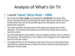
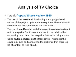
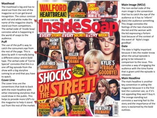
Soap Opera Genre- 
Ancillary Product Analysis
Masthead 
The masthead is big and stands out 
from the rest of the magazine so it 
can get brand recognition on the shelf 
when other competitors are 
surrounding it. The connotations of 
the colour contrast of red and white 
make the brand logo stand out and 
catches the audiences eye. 
The verbal code “What’s on TV” 
connotes to the audience what is 
actually on TV. 
Puff 
The use of the puff is another 
technique to catch the eye of the 
audience because it normally stands 
by being a certain shape and a 
different colour to the rest of the 
cover. The verbal codes “Big Week” 
connote how big the shows are that 
are being scheduled and you need to 
read about them in What’s on TV. 
Cover Line 
The cover line stories are essential 
conventions to a front cover because 
they are “backs ups” to the main 
headline; if the main headline doesn’t 
catch the attention then the cover line 
might because it is a text they enjoy 
and helps provide further USPs to the 
magazine. The use of the cover lines 
being separated from the main story 
implies that they are not as significant 
as the main story. 
Bold Outlines 
This is to represent the high 
importance of the article in question 
on this front cover. This successfully 
draws the attention of the reader and 
making them read the article. 
Main Image (MCU) 
The non-verbal code of the main image is 
the convention that has to catch the eye 
of the audience so it has to ‘inform’ (Katz) 
the audience something. 
This image connotes a feeling of Roxy 
being under threat from Derek who is 
portraying a monkey on the back of the 
character with the use of a medium close 
up. 
Date 
The date is highly important because it 
lets the reader know when the actual 
episode is going to be released in 
comparison to the issue. This connotes 
a way of engaging the audience with 
the time frame that is given until the 
episode is released. 
Main Headline 
The main headline is also a convention 
that has to catch the readers eye if 
they want it sell, because if it’s not 
interesting they won’t read it. The use 
of yellow connotes how important the 
story is and for to stand out on the 
page with the use of a black outline. 
Use of punctuation to 
sensationalise a story 
This punctuation normally 
expresses another side to the 
story by putting across that this 
story is impactful which draws in 
the consumers of the magazine. 
This connotes that the story is big 
news and the audience have to 
watch to find out was is going to 
happen. 
Background: the background colour is consistently blue in every 
magazine from What’s on TV so it creates brand recognition for the 
magazine.
Analysis of What’s On TV 
• I would ‘repeat’ (Steve Neale – 1980): 
• By having the main image overlapping the masthead. This gives off a 
sense of professionalism and brings the main story to the centre of focus. 
Furthermore the use of the positioning of the characters on the shot 
portray the storyline. 
• The main headline covering most of the page and taking most of the 
attention. This attracts the audience to the article makes them want to 
read the article. 
• Sensationalising the punctuation is key to adding emotion such as shock to 
the storyline. This will draw in the reader to the magazine and make them 
want to read the article. 
• The bold outlines to the headlines and cover lines are a convention that I 
would like to repeat because makes the stories stand out by drawing the 
attention of the reader.
Masthead 
The verbal code of the 
masthead is key to convincing 
the audience to buy the 
magazine because it has to 
stand out from the rest in the 
market. The colour contrast of 
red and white connote a strong 
way of portraying storylines 
that will continue throughout 
the issue. 
Puff 
The use of a puff is key to 
catching the audiences eye 
because it stands out from the 
rest of the magazine by being a 
different shape and colour so it 
can be noticed. The text 
connotes how the price of the 
magazine is going to attract 
new readers. 
Cover Line 
Cover lines are pivotal to a 
magazine because it “backs 
ups” the main stories so there 
is more to read about in the 
issue. The text ‘Corrie Shock’ 
presents a verbal code of 
shock which connotes to how 
important this cover story is. 
Main Image 
The main image is the convention that has to catch the eye of the consumer otherwise the 
magazine won’t sell. The non-verbal code of this image connotes the severity of the issue being 
covered with his facial expression in this medium close up. 
Date 
The date is key to ‘informing’ 
(Katz) the reader to know when 
this story will be portrayed in 
an episode in comparison to 
the release date. This connotes 
another way of engaging the 
audience into the show being 
promoted. 
Main Headline 
The verbal code of the main 
headline has to catch the eye of 
the audience otherwise the 
consumers will not read or buy 
the issue. 
The use of yellow connotes the 
importance of the story and so 
it stands out on the page. 
Use of punctuation 
to sensationalise a 
story 
The punctuation in the main 
headline is normally used to 
increase the impact of the story 
on the reader and how 
important it is to the show. This 
connotes the punctuation 
expressing how big the story is 
in terms of the show itself, as 
well as being the same colour 
as the headline which makes it 
stand out more.
Analysis of TV Choice 
• I would ‘repeat’ (Steve Neale – 1980): 
• The use of the masthead dominating the top right hand 
corner of the page to gain brand recognition. The contrasts in 
colours make this stand out to the consumer. 
• The use of a puff can be useful because it a convention is put 
onto a magazine front cover stand out to the public either 
expressing how cheap the magazine is or advertising stories. 
• Using multiple images on the front cover. This makes the 
cover look busy and connote to the audience that there is a 
lot of content to read about.
Masthead 
The masthead is big and has to 
stand out from the rest of the 
magazine so it can get brand 
recognition. The colour contrast 
with red and white make the 
name of the magazine clearly 
stand out from competitors. 
The verbal code of ‘Inside Soap’ 
connotes what is happening in 
the world of soaps to the 
audience. 
Puff 
The use of the puff is way to 
catch the consumers eye from 
the rest of the page. This is 
done by with it normally being 
a different colour and in bold 
type. The verbal code of ‘Corrie 
Special’ connotes that this is a 
one off big episode from the 
show with a big storyline 
coming to an end that you have 
to watch. 
Cover Line 
The cover lines are the 
conventions that look to back 
with the main headline with 
other interesting storylines that 
could draw in the public. This 
helps to provide more USP’s to 
the magazine to help it stand 
out from the rest of the market. 
Main Image (MCU) 
The non-verbal code of the 
main image is the convention 
that has to catch the eye of the 
audience so it has to ‘inform’ 
(Katz) the audience something. 
This image connotes the 
feelings of the two characters 
the kid and the woman with 
the kid expressing a forlorn 
look because of the context of 
the event of ‘Kylie’s tragic 
goodbye’. 
Date 
The date is highly important 
because it lets the reader know 
when the actual episode is 
going to be released in 
comparison to the issue. This 
connotes a way of engaging the 
audience with the time frame 
that is given until the episode is 
released. 
Main Headline 
The main headline is another 
key convention in selling the 
magazine because it is the first 
text the customer see, so if it’s 
not appealing they won’t buy it. 
The orange standing out 
connotes a warning feel to the 
story and the importance of the 
story is exclaimed by the bold 
outlines.
Analysis of Inside Soap 
• I would ‘repeat’ (Steve Neale – 1980): 
• The use of the masthead going across the majority of the 
page at the top to get clear brand recognition. Also with this 
specific colour contrast allows it to stand out from the rest of 
the page. 
• The use of the date above the masthead is a key convention 
because it allows the audience to know when the issue was 
released and can relate when the episodes will be in the TV. 
• Another convention that I would repeat would be the use of 
cover lines scattering around the main headline. This is 
because these stories can also catch the eye and back up the 
main headline if it doesn’t appeal to the public.

Soap opera genre 1

  • 1.
    Soap Opera Genre- Ancillary Product Analysis
  • 2.
    Masthead The mastheadis big and stands out from the rest of the magazine so it can get brand recognition on the shelf when other competitors are surrounding it. The connotations of the colour contrast of red and white make the brand logo stand out and catches the audiences eye. The verbal code “What’s on TV” connotes to the audience what is actually on TV. Puff The use of the puff is another technique to catch the eye of the audience because it normally stands by being a certain shape and a different colour to the rest of the cover. The verbal codes “Big Week” connote how big the shows are that are being scheduled and you need to read about them in What’s on TV. Cover Line The cover line stories are essential conventions to a front cover because they are “backs ups” to the main headline; if the main headline doesn’t catch the attention then the cover line might because it is a text they enjoy and helps provide further USPs to the magazine. The use of the cover lines being separated from the main story implies that they are not as significant as the main story. Bold Outlines This is to represent the high importance of the article in question on this front cover. This successfully draws the attention of the reader and making them read the article. Main Image (MCU) The non-verbal code of the main image is the convention that has to catch the eye of the audience so it has to ‘inform’ (Katz) the audience something. This image connotes a feeling of Roxy being under threat from Derek who is portraying a monkey on the back of the character with the use of a medium close up. Date The date is highly important because it lets the reader know when the actual episode is going to be released in comparison to the issue. This connotes a way of engaging the audience with the time frame that is given until the episode is released. Main Headline The main headline is also a convention that has to catch the readers eye if they want it sell, because if it’s not interesting they won’t read it. The use of yellow connotes how important the story is and for to stand out on the page with the use of a black outline. Use of punctuation to sensationalise a story This punctuation normally expresses another side to the story by putting across that this story is impactful which draws in the consumers of the magazine. This connotes that the story is big news and the audience have to watch to find out was is going to happen. Background: the background colour is consistently blue in every magazine from What’s on TV so it creates brand recognition for the magazine.
  • 3.
    Analysis of What’sOn TV • I would ‘repeat’ (Steve Neale – 1980): • By having the main image overlapping the masthead. This gives off a sense of professionalism and brings the main story to the centre of focus. Furthermore the use of the positioning of the characters on the shot portray the storyline. • The main headline covering most of the page and taking most of the attention. This attracts the audience to the article makes them want to read the article. • Sensationalising the punctuation is key to adding emotion such as shock to the storyline. This will draw in the reader to the magazine and make them want to read the article. • The bold outlines to the headlines and cover lines are a convention that I would like to repeat because makes the stories stand out by drawing the attention of the reader.
  • 4.
    Masthead The verbalcode of the masthead is key to convincing the audience to buy the magazine because it has to stand out from the rest in the market. The colour contrast of red and white connote a strong way of portraying storylines that will continue throughout the issue. Puff The use of a puff is key to catching the audiences eye because it stands out from the rest of the magazine by being a different shape and colour so it can be noticed. The text connotes how the price of the magazine is going to attract new readers. Cover Line Cover lines are pivotal to a magazine because it “backs ups” the main stories so there is more to read about in the issue. The text ‘Corrie Shock’ presents a verbal code of shock which connotes to how important this cover story is. Main Image The main image is the convention that has to catch the eye of the consumer otherwise the magazine won’t sell. The non-verbal code of this image connotes the severity of the issue being covered with his facial expression in this medium close up. Date The date is key to ‘informing’ (Katz) the reader to know when this story will be portrayed in an episode in comparison to the release date. This connotes another way of engaging the audience into the show being promoted. Main Headline The verbal code of the main headline has to catch the eye of the audience otherwise the consumers will not read or buy the issue. The use of yellow connotes the importance of the story and so it stands out on the page. Use of punctuation to sensationalise a story The punctuation in the main headline is normally used to increase the impact of the story on the reader and how important it is to the show. This connotes the punctuation expressing how big the story is in terms of the show itself, as well as being the same colour as the headline which makes it stand out more.
  • 5.
    Analysis of TVChoice • I would ‘repeat’ (Steve Neale – 1980): • The use of the masthead dominating the top right hand corner of the page to gain brand recognition. The contrasts in colours make this stand out to the consumer. • The use of a puff can be useful because it a convention is put onto a magazine front cover stand out to the public either expressing how cheap the magazine is or advertising stories. • Using multiple images on the front cover. This makes the cover look busy and connote to the audience that there is a lot of content to read about.
  • 6.
    Masthead The mastheadis big and has to stand out from the rest of the magazine so it can get brand recognition. The colour contrast with red and white make the name of the magazine clearly stand out from competitors. The verbal code of ‘Inside Soap’ connotes what is happening in the world of soaps to the audience. Puff The use of the puff is way to catch the consumers eye from the rest of the page. This is done by with it normally being a different colour and in bold type. The verbal code of ‘Corrie Special’ connotes that this is a one off big episode from the show with a big storyline coming to an end that you have to watch. Cover Line The cover lines are the conventions that look to back with the main headline with other interesting storylines that could draw in the public. This helps to provide more USP’s to the magazine to help it stand out from the rest of the market. Main Image (MCU) The non-verbal code of the main image is the convention that has to catch the eye of the audience so it has to ‘inform’ (Katz) the audience something. This image connotes the feelings of the two characters the kid and the woman with the kid expressing a forlorn look because of the context of the event of ‘Kylie’s tragic goodbye’. Date The date is highly important because it lets the reader know when the actual episode is going to be released in comparison to the issue. This connotes a way of engaging the audience with the time frame that is given until the episode is released. Main Headline The main headline is another key convention in selling the magazine because it is the first text the customer see, so if it’s not appealing they won’t buy it. The orange standing out connotes a warning feel to the story and the importance of the story is exclaimed by the bold outlines.
  • 7.
    Analysis of InsideSoap • I would ‘repeat’ (Steve Neale – 1980): • The use of the masthead going across the majority of the page at the top to get clear brand recognition. Also with this specific colour contrast allows it to stand out from the rest of the page. • The use of the date above the masthead is a key convention because it allows the audience to know when the issue was released and can relate when the episodes will be in the TV. • Another convention that I would repeat would be the use of cover lines scattering around the main headline. This is because these stories can also catch the eye and back up the main headline if it doesn’t appeal to the public.