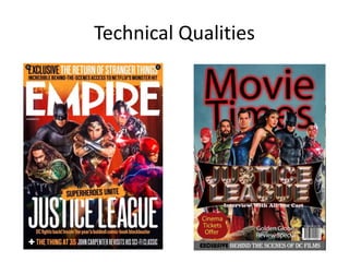
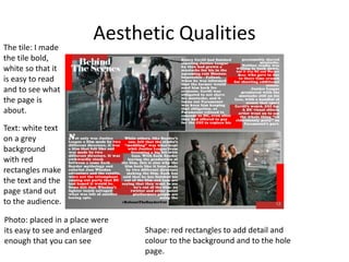
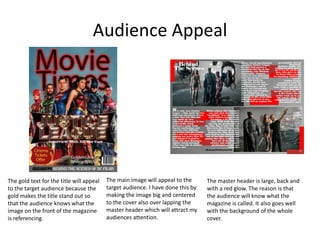
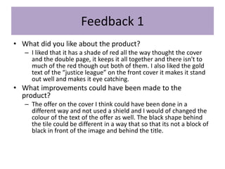
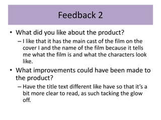
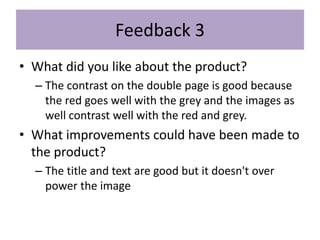
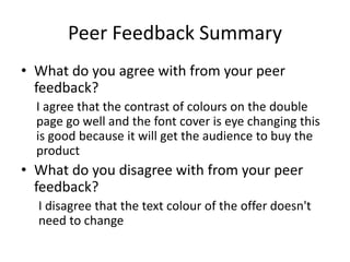
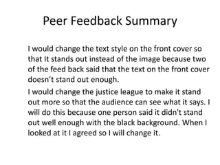
The document summarizes the production process for a film magazine cover. It discusses research done on existing magazines, planning elements like target audience and layout, and time management. Feedback from peers praised the use of red throughout and eye-catching gold text, but suggested improving the text clarity and changing the black shape behind the title. The creator agreed the title needed adjusting to stand out more against the background.
