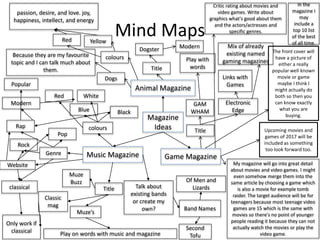
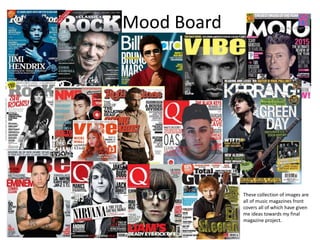
Magazine and Website
Project
Jay Birkin
Research
Product 1 - Front page spread
The masthead is bold and the colour white,
this makes the audience understand what
they are buying but it doesn’t draw to much
attention because the attention wants to be
placed elsewhere on the front cover which is
why it is the simple white and isn’t in capital
letters. White is Clean, fresh, innocent,
progressive. White could also represent for
winter magazines but there are not many of
them.
The Cover Line is a subtitle to
the main topic so the subtitle of
this is the specific game that the
magazine is going to go into
detail about.
The Bar code is important because it
establishes the magazine as a product.
The image in my opinion is the most
important part of a magazine, this
image is central making it the main
focus of the magazine. It also creates a
basis for what the magazine is going to
be about. The colour grey is an
emotionless, moody colour that is
typically associated with meanings of
dull, dirty, and dingy, which is the topic
of the magazine.
The banner at the top of the page
shows what topic the magazine will
cover and it is good because it has a
colour change gradient from a cream
yellow to a darker orange. The dark
orange still matches the white and
other colours and it doesn’t draw to
much attention because it isn’t red
which is the most standing colour but
it is almost their.
This magazine includes a plug giving deals or competitions to win
prizes inside the magazine and this is very good advertisement so
people have too buy if they want these deals because their getting
something extra. Plus the item can be exclusive.
As a whole I really like this magazine front cover and think
that it is a great example that I can use to make mine to
the best of my ability.
Product 1 - Double page spread
The double page spread sticks with
a similar colour scheme to the
front cover which gives the
magazine consistency, which is a
good thing to have. The whole
colour of the background matches
the theme of the product that is
being talked about, which is what a
magazine really needs.
I could not find a article about the walking dead game so instead I
decided to use this game due to some similarities with them in the
magazine type.
The images are simple and more
compact they are not spread out
and this gives the audience
something to draw attention to.
The image takes up one page of
the dps and this again is an
establishing shot including the
message of what is to be expected
to be found.
Pull Quotes are good
things to use because it
makes a product more
appealing knowing
somebody has said
something about it.
Overall this double page
spread was rather useful
and helpful towards my
final task.
The text is in a good format
for an article in little text
boxes and it is broken up in
paragraphs making it simple
to read and the general
layout of it is good, allowing
it too look like you don’t
have too much to read,
which is an audience
attraction method.
The title of the article is the name of the game that the
article is talking about and reviewing. The title of the
double page spread is the actual font and text from the
game making it link well with the article.
This is the main image which will show what the article is focused on
and this had to draw in the consumer to make them read this page so
it has to be very appealing and interesting. The text is also very straight
(in line) and organized. I think that this really suits the video game
genre with it being simple for gamers and including a little bit of action
and graphics which tend to attract the gaming audience.
Product 1 - Website
Yet again this is another product that uses the colour red in it,
the red is used to make certain parts of the website stand out.
Such as the top bar which can guide you through the whole
website.
Down the side of the page of the website it uses different
advertisements giving different sales and offers which are
exclusive towards them, they do this too draw in a specific type
of audience.
With a black background the lettering tends to stand out more
onto to background than with other colored backgrounds. Black
is one of the few surfaces that lets other colored text work great
together. Beware of too small lettering with too high contrast
(white lettering), these will lead to less legibility of the text
because of overwhelming background. With large lettering white
on black works great. Also orange on black is a good
combination.
I do not like this white blank background space that is at the
bottom, this is because I feel that it needs to be filled, in my
opinion their shouldn’t be a blank space which could potentially
bore the audience.
This web page was very useful and a great product to analyse,
this will come to help with my later on project decided on layout
and a colour scheme to go with.
Product 2 – Front Cover
This magazine has a banner at the top and
bottom of the cover, it is the colour red
which is a very bold colour on the colour
spectrum. The colour red represents
assertive, daring, determined, energetic,
powerful, enthusiastic, impulsive, exciting,
and aggressive. Red also represents physical
energy, lust, passion, and desire. It
symbolizes action, confidence, and courage.
The colour red is linked to the most
primitive physical, emotional, and financial
needs of survival and self-preservation.
Blob and stars are included to give the
audience some extra content besides the
magazine to get to talk about different
content so too not bore them.
The colour scheme of the magazine is
very bright colours such as green and
blue, the colour green and blue
represent nature and match the whole
theme of the entire magazine very well.
The masthead of the magazine goes all the
way along the magazine from left to write
and is in a simple font and white text but it
is all in capital letters, this is a contrast
because white is simple but cap letters are
loud and stand out, they have used this too
get their point across more clearly.
I really like this front cover because it is
so simple yet it works so effectively and I
might use this in my final idea.
The term dog denotes an animal with fur,
four legs, and a tail. But when someone
calls someone else a dog, this does not
mean that the person has four legs and is
furry. Instead, the connotative meaning of
the word is used, which conjures up ideas
based on how it is used in pop-culture or in
an overall metaphorical sense which means
that it relates to the audience that is buying
the magazine, making them seem more up
to date and well with culture. Plus most
people enjoy dogs and love their company
compared to dogs, this was proven in many
surveys.
Product 2 – Double Page Spread
This double page article has lots
of images on it with some of the
images goes over the two pages.
These break up the text and
work, allowing the reader to not
become bored. Everything is in
line and neat and this just
finishes up an article and makes
it 100x better for visual
appealing.
The pictures in the dps relate to the topic/
theme that the magazine was aiming for which
is good because if the audience bought it then
that is what they are looking for inside the
magazine This is a travel magazine so the
contents of each article could vary massive.
This Fact File has a different
coloured background in the
shape of a square, this is because
it is special and something more
interesting which separates from
the articles, if I were to include
special offers or a competition
then it would be best to use this
technique but not too much
otherwise ill have to much colour
which would not be good.
I think that this article is very
good but it includes maybe a
few too many pictures and
not enough text, although
sometimes more text gets rid
of a reader, so if everything
can be said in a short amount
of space that would be better.
This double page is simple it is
black text on white
background which is very
bland but works well with
most magazine s. If you were
to add a colour to the
background it might be too
visual and hurt the readers
eyes but a different colour
could be better because then
it has its own style and
sometimes can really allow
the text to stand out.
Product 2 – Website
This website links massively to the magazine since it has images of
them on it which is very useful. The layout of the page is great and
works, it has a selection bar at the top above the image and then
content bellow. It doesn't include too much writing, none which
isn't necessary which allows the reader to be more interested and
only read more if they want too or are engaged enough in the
article which highlights its bests parts.
In my opinion, this website is a little bland and plain and doesn't
include much, plus I don’t think the different colours for each
section works, I think that they should have just stuck to one
colour.
I think that the exclusive content for this website works and t is a
great idea to have placed it on the home page, the subscription
part however, I believe should go on its own separate page
because it is an important decision and should not have any other
distractions on the page.
This website has its own logo so I think that I should create my
own logo which I should include on the website as well as the
magazine to have the two link together more. I f I am going to
create my own logo then it will have to be something simple
because I wont have that much time to create one.
The image on the first page is the most important because it
draws in the attention of the viewer so it has to be good and
relatable which I think this image is.
Product 3 – Front cover
This Masthead of this magazine is used
by its logo and it is very big taking up one
corner of the cover with the white
coloured Q on a red background which
makes it pop out.
The layout of the cover is simple and
isn’t too crowded, it clearly states
everything that it needs to tell
without giving away too much and it
does it all for the audience.
The Bar code is important because it
establishes the magazine as a product.
The text in brackets at the top of
the page is included because it is
showing the audience that they
are buying something special and
a one time type magazine.
In the quote that is used the text
music and life are bold and bigger,
this is too make it seem that if you
read this then it will be life
changing news. Furthermore the
font is closer together too fit a lot
of mount of text in a smaller
compact space but it still looks
good and is clear to read.
The other colours which are on this cover
are pink and light blue. The color pink is
the color of universal love of oneself and
of others. Pink represents friendship,
affection, harmony, inner peace, and
approachability. Light blue is associated
with health, healing, tranquility,
understanding, and softness. These colours
are used for mixture and they merge
together stating the opinion that this
magazine is a ‘chilled’ or ‘layed back’
magazine.
Product 3 – Double Page Spread
The double page spread yet again includes an
image on one side of the page but it has a
contrast on the image half red and half green.
Greens and reds are used a lot through all of
the magazines. The green and red can mean
two different sides to the person that the
audience is looking at.
The J is central on the page
and it has a red overlay on it
so you can see through the
colouring to read some of
the text.
The headline that is used is central and sets
the page up well for the article below.
Although this double page is all about text I
might include competitions or free giveaways
on the article to get more people to pay for it.
An article title is the large heading displayed above
the article's content and the basis for the article's
page name. The title indicates what the article is
about and distinguishes it from other articles.
Because the title is bold it means that it is standing
out distinctly an example of this would be
conspicuous: a figure carved in bold relief.
All articles on double page spreads in magazines will
always be in column form, it is set out like so that it
is easy for the reader to understand, as well as it
being more aesthetically pleasing , the aspect of
laying the writing out like this which will
consequently draw in the reader. At he starts of the
paragraphs there are bigger bolder letters, this
feature has been used again to catch the audiences
eye. It is also a very neat and tidy article and I can
take a lot from it.
Product 3 - Website
I do not feel that this website is as good as the others this is because of the layout
and the plainness of it. It again uses the logo which is something to only represent
them by.
It also only includes the simple contrasting colours of black and white. It’s important
to recognize that although quintessentially opposite in a cultural and visual sense,
black and white shouldn’t compete, but rather complete when used in professional
marketing. It’s been said that “opposites attract.” To put it another way: contrast
creates completion. The convergence of black and white is an example of how two
different colors communicate more powerfully together than they do on their own.
Together they create balance, peace and clarity.
The pictures take up all of this page and there isn’t really any type of text talking
about anything which I think that at least a website needs a bit of writing in an
article or brief text about the website.
This website page also has adverts go down the page this improves the audiences
attraction and makes them spend even more money with them because they are
offering something special.
The pictures are simple and really relate to the audience mainly because they are
almost so natural and are not really edited or changed much to improve the image
for better looks. The colours are very neutral they are not dark or light this makes
them even more intriguing, especially since you can not see the text that comes
with it or what genre of music they're from.
For existing websites this is a simple one and good for beginners to start off with
and make however I think that I can do better and this and create something that
is a little more popping and spectacular.
Bibliography
Page 3: GAV. (2016). Tabletop gaming magazine.
Available:
https://gavthorpe.co.uk/2016/09/22/tabletop-
gaming-magazine/. Last accessed 20th February
2018.
Page 4: ADRIAN LEE MOKRYJ. (2015). Game Zone.
Available:
https://almdesigns.wordpress.com/2015/04/08/gam
e-zone-magazine/. Last accessed 20th February
2018.
Page 5: Anon. (.). Tabletop Gaming. Available:
https://www.tabletopgaming.co.uk/. Last accessed
20th February 2018.
Page 7: Anon. (.). Press Coverage. Available:
https://www.thehoste.com/information/press-
coverage/. Last accessed 20th February 2018.
Page 6+8: Anon. (.). The Dog Freindly
Magazine. Available:
https://www.dogfriendlybooks.com/. Last
accessed 20th February 2018.
Page 9: heathenmedia. (2014). Research: Task
one (Music Magazine Institutions Research).
Available:
http://heathenmedia.co.uk/rgriffin/2014/09/1
1/research-task-one-music-magazine-
institutions-research/. Last accessed 20th
February 2018.
Page 11: Anon. (.). THE WORLD'S GREATEST
MUSIC MAGAZINE. Available:
https://www.qthemusic.com/. Last accessed
20th February 2018.
Page 10: Kieran Hepworth. (.). Magazine
layouts. Available:
https://www.pinterest.co.uk/pin/33411086609
0847281/. Last accessed 20th February 2018
Summary
• I chose three different types of magazine in my research because I was going to choose one of these types for my final
design. I chose these three topics because they really interest me and I think that I have quite a lot of good things to say
about each of them. The magazines that I have analysed were very useful, when creating my front cover I am going to use
brighter colours and place a banner at the top and bottom of the page, the banners will include a competition and a sub
heading about the topic that I am talking about. In nearly all of the magazines you can see that they all have one major thing
in common which would be that they have made the whole page in the double page spreads only one picture which shows
the importance of the person throughout the magazine which I think it something which I am going to do in my magazine
because I want people to know that there will be one key area. Also they more than likely on the website have made them
very simplistic which is what I am aiming to do because although it may be simple it is very easy to understand and navigate
your way through the different pages. When making a website I am going to make the colour scheme of it pretty simple only
using colours such as white, black and red because I think this is the best and is the most effective colour scheme to use. I
am going to include a simple default font because it doesn’t need to complex throughout my magazine. With the title of my
magazine I think that I should have my own logo because it will be good for a magazine and to specify certain things, plus it
think that it will help me get a better mark.
Experiments
Experiments-Front Cover
Because I am leaning towards making a music magazine for my experiment I decided to make a gaming magazine. The colours that I
have used are the same as in the gaming title which is a good method to use of matching colours, I will definitely do this in the making
of my final magazine. I am going to include a few aspects of this magazine experiment but I will also create some new ones because
these aren't that good, it was just a draft which I quickly put together but it was a good basis/starting point for my project.
The process I decided to undertake whilst making this was to get an
already made magazine front cover and more or less take this and
create a really similar looking experiment.
Every magazine needs its own logo and I
think that this is as a good thing to have, I
should include this in my final magazine.
Whilst creating the experiment I used ruler guidelines and this was
really helpful and is a good tool to use to keep everything in line and
allow it to placed exactly where I wanted it.
Strokes on text are always a good tool to use on magazines
because it defines the text and makes it easier too read,
plus it attracts the audience because of its new clearness.
Experiments-Front Cover
I didn't’t use dafont with any of the fonts on the experiments but I will
probably use them on my final design because there are a lot better
fonts here which can relate to my style and they make an magazine
more aesthetically pleasing. With the magazine front cover I tried to
stick with a plain and simplistic colour scheme so I went with black and
white. I made the title which I focused on first and based the rest from
their, this related to cartoon logos that already exist.
Whilst making this front
cover I decided to stick to
one colour scheme so I
made the magazine black
and white apart from the
offer in the box and this is
too make it stand out and
seem that it is important. I
am going to do this in my
final magazine , using
different colours for offers
and such.
I really like the layout I went for it is really plain and simplistic but it
tells you just enough, this is the key to magazines and sales. The
different shapes will include different texts and offer, they are all
different to mix it up a little plus it makes the magazine look much
more pleasing. I would only change the banner at the bottom of the
page because i think that it looks a little boring and could definitely
be changed.
Experiments-Double page spread
I used InDesign to create this double page, I have
never used this software before but I think that I
picked it up fairly easy and created something that
is good and worth an experiment. Because this was
just an experiment I used already existing pictures
which I got off the internet but when it comes to
my final magazine I will be capturing my own
images.
To improve I could have maybe added a background colour
because some of the white makes it more boring than others. The
grey square at the bottom is also a little plain and not in line and
this was due to the fact that I didn’t have enough time to really
finish my experiment. Overall though I think that my double page
spread is good and has a great layout and I should probably do
something like this for my final product.
Again just like in Photoshop InDesign has a ruler
guideline system, this is really useful and makes
articles more aesthetically pleasing. The only tools
that I used were the text box tool and the place
tool for images.
I really like the layout of the DPS, I think that it looks like a
professional magazine so I am hoping to just take this layout and
make my final product similar. The only problem I faced was when
placing images they were a little blurry and pixelated but this was
fixed when the actual document was exported but whilst creating
it doesn’t look good.
Experiments-Website Home Page
I have never used this website creator before, its name was WIX and I
think I used it well. To start I created a home page I started this by using a
template I did this just because it was an experiment but when I go onto
the final task I will create it all from scratch. In this template I placed
some random text generator and got some images, these images all seem
related and titled them all because I had never used this before I took the
time to get used to using the website.
I added new parts such as
shapes and effects and
took some away onto the
website template. I added
shapes which I could then
type into and I figured out
how to change fonts and
colours, then I figured how
to add certain effects on to
parts for example the title
that I have. To add images I
had to insert them using a
tool on WIX because it
doesn’t work great with
images being copied, due
to blurriness.
I really like the experiment for the website and think that I can make
something which could look good for a final project. I wouldn’t change
anything with this experiment and think that it looks fine just as it is.
Scroll through all the
website pages.
Add new parts.
Because this was all new
too me I didn’t really
know how to work the
program so I only ended
up using 2 specific tools
from the menu tab
which went down the
side of the page.
Experiments-Website page
The next task that I carried out which was the
final task for the experiments was a link from the
homepage to a secondary page. The secondary
page focused on one certain article about one
certain anime and then included other top
mentions. Yet again I used a random text
generator but when I move on to planning I plan
on writing my own article for later use.
This is probably how I would like to make my final
website page with the layout. Whilst doing this I
learned about how to link pages on the website
because I almost ended up making an entirely
new website if I hadn't learned how to it.
I really like the layout of this web page, the only
real problem I have with it is the blank space
towards the left I think that their should be
something their filling in the space. Also I don’t
know about the white, the website could have
looked a lot better with a different colour
background and I should have tried but I didn’t
have much time on my hands.
I think that this page doesn’t really have any other problems with it and I should follow this template/simple design for one of my final
pages because simplicity" can imply beauty, purity, or clarity. Although "Simplicity" may also occur with negative connotations to suggest a
deficit or insufficiency of nuance or of complexity of a thing, relative to what one supposes as required but I think that it looks good on a
website because they don’t want too much information on them.
Planning
Mind Maps
Animal Magazine
Game MagazineMusic Magazine
Magazine
Ideas
Genre
Title
colours
Muze’s
Muze
Buzz
Classic
mag
Play on words with music and magazine
Only work if
classical
classical Talk about
existing bands
or create my
own?
Rap
Rock
Pop
Blue
Red White
Popular
Modern
Black
Website
Band Names
Of Men and
Lizards
Second
Tofu
My magazine will go into great detail
about movies and video games. I might
even somehow merge them into the
same article by choosing a game which
is also a movie for example tomb
raider. The target audience will be for
teenagers because most teenage video
games are 15 which is the same with
movies so there's no point of younger
people reading it because they can not
actually watch the movies or play the
video game.
Critic rating about movies and
video games. Write about
graphics what's good about them
and the actors/actresses and
specific genres.
In the
magazine I
may
include a
top 10 list
of the best
of all time.
Upcoming movies and
games of 2017 will be
included as something
too look forward too.
The front cover will
have a picture of
either a really
popular well known
movie or game
maybe I think I
might actually do
both so then you
can know exactly
what you are
buying.
Title
GAM
WHAM
Electronic
Edge
Play with
words
Mix of already
existing named
gaming magazines
Links with
Games
Title
Dogster Modern
Dogs
Because they are my favourite
topic and I can talk much about
them.
colours
Red Yellow
passion, desire, and love. joy,
happiness, intellect, and energy
Mood Board
These collection of images are
all of music magazines front
covers all of which have given
me ideas towards my final
magazine project.
Flat Plans
This flat plans I made in Photoshop were great plans and guides. A mast head in my opinion
should also be at the top of the page and be the first piece of text that they read. The layouts
of the magazine flat plans are simple but I have tried to make them more complex to fill out
the space a little more. One thing that I have not included that is probably needed is the
magazine date and issue number. This is important for people who want to frequently collect
a certain type of magazine.
DPSWebsite Home Page
Front Cover
I can not change my flat plans anymore but I have
realised at the end that I would have wanted in the
bottom right or left corner the page number and the
magazine website address just to make everything
become linked together.
The website that I have designed is really simple but I
think this is the best way too do it because it makes it
way easier too understand and it will be quite more
visually pleasing to look at.
The best designed flat plan here
in my opinion is the double page
spread, I really like the layout of it
and think it will look really good
when the finished product comes
out.
The flat plans as a whole really
helped me towards the
production of the final
magazine and website because I
could already see how my
project was playing out and I
could adjust it to suit my needs
at any time, even whilst
creating it in Photoshop.
Images
The image Where I will acquire it from
Barcode Google images
Guitar I will take it because that is something I have in
possession
artist Google images
Image of someone in which I will
make a review next to it
I will take it in college using the studio room
Guitar Google images
Front cover image I will take it in college using the studio room and
green screen
Other artists I will acquire them from my classmates
All of these pictures will need to be used in my magazine and are necessary to make it fully complete
and with them in it hopefully it will make my magazine really good and be to the best of the ability
that I can get it up too.
Style Sheet
I went on dafont and looked up musical
fonts and took many of the fonts from
these. I will end up using one of these
fonts because they are more complex
and intriguing and can relate more to
the genre.
These fonts are fonts that suits a
classical style, house style music and
eclectic. Mine however will be a band
and I think these fonts will suit the
magazine title well.
All of these colours are of similar
colours but they include many different
shades from darker to light. I think that
for my magazine the style and genre I
should include many lighter colours
however most magazines do this so I
could go darker to make it different but
I don’t think it suits the overall style
that I am going for. I decided to grab
this colour wheel of google images
because it has many colours and
explores the different feels and
meanings that these colours give off. I
really like the idea of using a blue.
My favourite fonts although I am
undecided are the top two fonts I like
them because I really think they relate to
music. Ill probably end up using Musicals
font.
Website Plan
Home
Blog Magazines
Year
month
comment
Post
articles
artists
About
price
signup
Post
My website is going to all be
linked starting with a home
page and including a certain
article and a few pieces of
content and then their will be
tabs, these different tabs will
link to three different pages.
These different pages will be a
blog where anybody can go on
to talk about music. A magazine
page which sells some of the
magazine and includes a few
article posts and artists to talk
about. Finally an about page
where it has a blurb describing
the magazine and then has a
sign up link to a sign up page.
All of these of course will end
up linking back to the home
page.
copy (written words)
The new band ‘Second tofu’ is an absolute astonishing. Their name is never mentioned and they just came out of nowhere, yet
they’re everywhere. The band follows three 18 year olds Alex, Ayrton and Fintan, for them “the band” is everything. This band
bounce on to stage and belt out some of the best songs to be produced, playing only for the masses of fans. “The band was soon
joined by manager James/, who spiced up the mix with both his powerful Bonham-style playing and way of dealing and
organizing. ‘At first we just had this sort of 90’s revival thing in mind,’ recalls Alex, ‘But when James came along he started
breaking out all these loops and effects and we were like, cool!’ The combination worked, and it gave Second Tofu the unique
edge that defines the band’s sound.”
The band ends up doubling all over the place on various instruments. Alex, for instance, not only sings but plays piano, drums,
baritone sax and mouth harp; Fintan plays organ, drums, soprano, tenor and baritone sax and slide trumpet. Ayrton plays drums,
mandolin and guitar.
The new single ‘Careful With That Sausage’ was yet another hit and fantastic success for the lads from this band and with the new
single ‘The High Street is Your Land’ being just on the horizon, We have many things to be looking forward to. Lets hope that this
band stays together and continues playing music for many years to come because lets be honest they’re going to keep growing.
All of the boys started out by playing together at the age of 13 at school in a band for a competition that they entered, they had
known each other since childhood and continued their friendship for many years.
The professional musician Noel Gallagher said “ the new pop band Second Tofu are good and they are definitely rising up the
ranks fast and playing you know for the fans, who knows we may even end up doing festivals and music together in the near
future. This band is certainly interesting and has everybody on their toes waiting for something next to come.”
Q: How did you get to where you are today?
A: “I started playing music when I was at the age of 10, and I was very focused on that and when we became a band a few years
later you know the people just loved us, and we love what we do bringing happiness to all of our fans.”
Q: Who is your biggest form of inspiration?
A: “I would say that as a band are biggest form of inspiration would be the pop band blink 182 who started back in 1996, theyre
music really inspired us and touched are hearts, almost like we flowed with the beat.”
Q: Are you going to go on tour soon or ever have a tour?
A: “Not any time soon no, but later on when we have a lot more content and we are a few years older then i think that that will be
a possibility. Of course it will be fun to go around the country or world.”
Competition
Win a brand new Gibson Flying V
Upload 2 videos (5 min maximum per video) to YouTube. If you already have them on YouTube, provide us the URL link, as you will
need them during registration process. Just email muzes.magazine@gmail.com.
Evaluation
Comparison
I think that my planning compared to my final design are very similar. I stuck to most of my starting ideas and this made my project
run much more smoothly and work well on a whole. I decided to choose the ages 15-24 because it is the ages of the largest group
of people who listen to music however not all of them buy magazines but this was the best course of action for the audience and I
chose my content and images well to math this. The research was the starting point for my project, in it I researched three different
types/genres of magazines, one of which I was going to choose to create for my final project. In each analysis I talked about the
magazine and wrote down what was good about the magazine and if I was going to include it in my final design. This was a good
way of researching and really helped me for my product because it is where a drew most of my ideas from and thought what I could
do, what was good and bad and so on. Something which I think that I did which I had planned on doing for the final project would
be that I have made sure that I have made it quite simple because I wanted the simplicity because with some other magazines
which I have seen online they are either very detailed or simple, which I have taken into my idea but with the simple front cover I
have made there are things which I could improve if I where to do a similar project for the FMP It would help me in the future as
even though I may not decide to do the exact same thing I could do something which needs the same kind of effort into making it or
the detail or lack of detail which you would want.
Production Reflection – Front cover
My front cover is great and was the starting point for the production of my project. I started it from the top of the page and made my way to the bottom,
the masthead of the page was going to take up most of the page but I thought that it looked too plain so I made the ‘M’ large and separate from the rest of
the title like in ‘Q’ magazine. Once the top and bottom of the page were full and I wasn’t going to change them, that’s were I needed to fill in the space in
the middle a little more before I added my front cover image in which I still had yet to take . To fill in the space I looked at an already existing magazine and
took the band line up idea from it. The image I took in the studio, it was of three classmates, they are all posed very well for the front cover and it looks like
a professional picture. Once the picture was imported into Photoshop I cut out the green screen and then placed the image on the front cover.
To make this front cover I used Photoshop, which is nothing new
to me, I used the quick select tool to get rid off the green screen
on the image and the text an stroke tool, all of which have made
my product look better and I am well explored in them. The only
new tool I explored in Photoshop for this project was the filter
gallery and I used this to make the guitar neon. I have used the
fonts ‘Agency FB’ and ‘Bauhaus 93’ in my front cover, these were
not decided in my planning but I think that these fonts suit the
cover well. Of course their were many other options to choose
from.
I have used the colour red and blue because red brings
text and images to the foreground. Red is used because
it as an accent colour to stimulate people to make
quick decisions; it is a perfect colour for 'Buy Now' or
'Click Here' buttons on Internet banners and websites.
As opposed to emotionally warm colours like red,
orange, and yellow; blue is linked to consciousness and
intellect. I used the colour blue to suggest precision
when promoting high-tech products.
This is my finished and final front cover for the print project. I thought that it was very good and well made and that it
really related to the criteria for music and the style and theme that I went for across this project. The colours included on
are simple but effective and they work better than any other colours because they are the colours of appealing and
selling, I would’ve definitely not changed them. The font was the same across the print project and it was big and bold
which I think was a really good choice because it makes it easier to understand the font style. I like it exactly how it is and
it fits into the theme of many other print adverts as it is simple and looks quite modern which really helps with relating
to the audience who are of the younger teen generation, between 15-24.
Production Reflection - DPS
The double page spread was made in InDesign, which is a software I have never used before apart from earlier on in this project so I only know
the basics of the program but it is fairly easy to understand. I only used the basics such as placing images and drawing text boxes because that
was all my dps needed. I used the front cover picture again on the DPS to show consistency in the magazine and to show that it is the correct
article for the audience.
The double page spreads
background colour was
like this due to the fact
that it made the project
consistent because the
background colour is the
same as the front cover.
Whilst In the production of the double page I got some
feedback from a teacher giving me a few pointers on how
to improve my work and one of the ones that really stuck
out was the characters on the left of the page when they
were at the top because they are cut off at the legs it
looked as if they were hovering, so I decided to fix that and
changed it on top of the box. You can still see it however
but I have fixed it as best as I could.
I like the layout of the left hand side of my DPS and
think that it looks really good apart from the error
with the sub heading but I don’t really like the right
hand side and think that it could have turned out
better, I could have laid it out much better
rearranging everything it just seems like I have
rushed it and stuffed all of my content on their.
Production Reflection - Website
https://jaybirkin2000.wixsite.com/muzes
The website is my opinion met the brief of what was being looked for. I started by going into Wix, the free website creator and then I
used a template and started making my website. I used tools which I had never done before such as adding an animation effect on an
image, placing a satellite map down and making images have pop ups and picture effects on them. These were all good to make my
website have more depth and not be so boring.
Overall I created 5 website pages
and they all linked, I think that this
was a good number which I decided
upon even though it was different
in my planning. It was just enough
pages and I covered absolutely
everything that I needed too.
Because I am so not use to using this program I
decided to use a template to start off with but then I
deleted certain parts from it and then I spent some
time experimenting with different tools which really
helped me because I can now use it well for future
projects if need be.
The banner image background for the title was an image
of the internet I chose this because I thought that it
suited the genre well and I wouldn’t have changed
anything. The other images on the home page are of the
internet and this is because they are professional bands
which I wouldn’t have been able to get photos of so my
pictures came from a variety of sources.
One change I would like to
make would be the articles
page , one of the articles is
mine the other are from
different online sources, I would
have liked to have written them
all myself but I didn’t have
enough time but I think that
they work and everything is laid
out well as a whole.
The website is simple but it includes
all of the necessary information and
the audience can understand it really
well, I decided upon this in planning
and am glad I stuck with it because it
was a very good idea.
Comparison - Front Cover
A similarity between the two magazines is the square in the top left corner of both magazines the
existing's one is much larger than mine, also mine is implemented as part of the masthead and is
not its own separate title of the magazine, I did this to make the magazine more interesting with a
different type of masthead. The blob which is the circle including text are on both magazines fills
in the space and creates extra addition to the magazine.
Both of the magazine use brighter colours,
they both use red to attract attention to the
audience. I decided to use blue because it
draws more attention then white/grey which
is a little plain.
The magazines both have a similar
layout with an image centrepiece
and many of the text and lines are
in similar places. These layouts
are really good and are the best
for a magazine front cover.
This magazine unlike mine
includes the comedy and
humour line of appeal.
Humour is always good to
include because it is an
everyday necessity, it
appears to help people's
psychological and physical
well-being - for example,
helping folks cope with
stress and adversity.
This magazine front cover
uses many different colours
on text like red green and
black. In my opinion I don’t
think that this looks as good
and that the magazine
should have stuck to one
colour when text is grouped
together like this or they
could have just limited their
information and not have
said as much.
Both of the magazines use exclusive on their front covers, exclusive content
is a really good marketing technique, it allows people to be the first to
receive headline news, behind the scenes photos and secret interviews
before anyone else. Which makes the audience really want to buy that
magazine, that is why nearly all magazine include their best content and
such on the front cover.
A large difference is the type of
shots. A headshot is generally a
close-up style shot of head and
shoulders that the subject uses
for branding, marketing and for
identifying themselves in the
marketplace. Subject is looking at
the camera. The goal is to
recognize/identify the subject. A
portrait is any other kind of shot
of a person. Expressions can really
show any kind of emotion and the
subject may not even be looking
at the camera. Portraits can be of
one person or more than one
person.
Comparison – Double Page Spread
SECOND
TOFUTheworldsgreatestpopband
Thenew band ‘Second tofu’ isan absoluteastonishing. eir nameisnever mentioned and they just came
out of nowhere, yet they’reeverywhere. eband followsthree18year oldsAlex, Ayrton and Fintan, for
them “theband” iseverything. isband bounceon to stageand belt out someof thebest songsto bepro-
duced, playingonly for themassesof fans. “ eband wassoon joined by manager james/, who spiced
up themix with both hispowerful Bonham-styleplayingand way of dealingand organising. ‘At rst wejust
had thissort of 90’srevival thingin mind,’ recallsAlex, ‘But when Jamescamealonghestarted breakingout
all theseloopsand e ectsand wewerelike, cool!’ ecombination worked, and it gaveSecond Tofu the
uniqueedgethat de nestheband’ssound.”
Q: How did you get to whereyou
aretoday?
A: “I started playingmusicwhen
I wasat theageof 10, and I was
very focused on that and when we
becameaband afew yearslater
you know thepeoplejust loved us,
and welovewhat wedo bringing
happinessto all of our fans.”
https://jaybirkin2000.wixsite.com/Muzes
Q: Who isyour biggest form of
inspiration?
A: “I would say that asaband are
biggest form of inspiration would
bethepop band blink 182who
started back in 1996, theyremusic
really inspired usand touched are
hearts, almost likewe owed with
thebeat.”
Q: Areyou goingto go on tour
soon or ever haveatour?
A: “Not any timesoon no, but
later on when wehavealot more
content and weareafew years
older then i think that that will be
apossibilitly. Of courseit will be
fun to go around thecountry or
world.”
Page17
Theband endsup doublingall over theplaceon variousin-
struments. Alex, for instance, not only singsbut playspiano,
drums, baritonesax and mouth harp; Fintan playsorgan,
drums, soprano, tenor and baritonesax and slidetrumpet.
Ayrton playsdrums, mandolin and guitar.
enew single‘Careful With at Sausage’ wasyet another
hit and fantasticsuccessfor theladsfrom thisband and with
thenew single‘ eHigh Street isYour Land’ beingjust on
thehorizon, Wehavemany thingsto belookingforward to.
Letshopethat thisband staystogether and continuesplaying
musicfor many yearsto comebecauseletsbehonest they’re
goingto keep growing.
All of theboysstarted out by playingtogether at theageof
13at school in aband for acompetition that they entered,
they had known each other sincechildhood and continued
their freindship for many years.
epro essional musician Noel Gallagher said “ thenew
pop band Second Tofu aregood and they arede nitely
risingup theranksfast and playingyou know for thefans,
who knowswemay even end up doingfestivalsand music
together in thenear future. isband iscertainly interesting
and haseverybody on their toeswaitingfor somethingnext
to come.”
Competition
Win abrand new Gibson FlyingV
Upload 2videos(5min maximum per video) to YouTube. If
you already havethem on YouTube, provideustheURL link,
asyou will need them duringregistration process. Just email
muzes.magazine@gmail.com.
Page18
Search up Second
Tofu on Facebook
and check out
their awesome
page!!!
My magazine DPS was very plain and I think that I should have added a border around both pages,
the best course of action would have been to add a black box outline because it will fill in the space
more just like the existing double page which has a border on it which I really like because they have
a glowing effect looking like lights which makes the background different shades. This adds depth to
the magazine.
The sub heading on my double page
when exported has got an error, all of
the letters have come really close
together and the text cant be read.
Both the magazines however are very
formal and that is a good mode of
address.
A difference which I can see between the two would be the amount of
text which I have included in mine compared to the existing product,
as I feel like I was trying to get straight to the point in my article and
not bore the reader where as the existing one has lots of detail in and
you have to read all of it to understand what the article is all about.
A similarity which you can see would be the fonts between the two because in mine the text is not default but it is small and a font where the
letters are closer together making it a little more fancy where as in this existing product it is also small and very default Ariel font. They are also
both in the same colour. The reason which I have gone for a more formal text was because I didn't want it to stand out, I think that formal suited
my magazine well because it is for kids and didn’t need to be fancy
Another piece of content which I can see that are quite similar would be
the photography. Both of them are body upwards shots and look like
studio photography both of them are really detailed and with the
effects I have put on mine and the effect on the existing product makes
both of them stand out to the audience.
Another difference which
you can see between the
two different double page
spreads would be the
colour scheme because in
the existing product it is
very dark and bold which
is the opposite to mine as I
have gone for the bright
and appealing blue which
stand outs much more
than the existing product.
A comparison which you
can visually see between
the two would be that
the way they are layed
out because the existing
one has an image on
one side and then have
the text on the other
side, which I have not
done on mine even
though I did this in
planning because I
wanted to make mine
different to existing
magazines.
Comparison - Website
https://www.qthemusic.com/https://jaybirkin2000.wixsite.com/muzes
The websites are similar in the way with their colours, they both use
simplistic white backgrounds with images and black text. The only
reason why I didn’t do this was because whenever I tried a different
colour it didn’t look visually good, so I stuck with this and I think it
still came out as an aesthetically pleasing website. The existing one
could pull of using a different colour but they have used all the
simple but effective matching colours white, black and red. My
images unlike the existing product have pop up text on them talking
about the image rather than having an article on the page and filling
up way too much space, which is why I decided upon this. The home
page image also has an animation effect on it were it fades between
two different images when you first view the page, this is because I
didn’t want to fill space so I placed two images together and I linked
them this way. I feel like the main difference would be that way in
which that the website in general is presented to the audience.
A comparison between the existing product and mine would be that
both of them are layed out in a similar way which includes the bars at
the top of the website which will help you to get to other pages to
look for information which you are looking for, in my website there is
content on the home page which you can click on which isn’t the tab
at the top whereas the home page on the existing website doesn’t
include any text, also there is load of promotion on existing where as
in mine there is none, promotion is a good way to attract the
audience.
In my opinion my website is much better and complex because
although it has a simplicity side with the black and white it has links
and pop ups which make it much more interesting compared to the
default boring picture and text method which I have used some of
that as well just to keep some originality.
Summary
• The project in my opinion went rather well and I hope to get a good grade for it, it has come in handy for future projects if I ever
decided to make another similar one. I will not be doing this for my FMP, I am thinking of doing video game instead but I enjoyed this
project and think that I worked well on it. I will definitely change one certain part of my front cover and that is the error on the banner
at the top of the page, that is that it’s not the same model of guitar which is described before it so I would change that, unfortunately I
don’t have anymore time. The double page spread was a little weak in my opinion and didn’t turn out as good as it could have in my
opinion, I really liked the idea and layout plan of it at first but when I finished it I think that it was a little plain. I think that I should have
added a border around both pages on the double page, this would have improved it massively. My time management in my opinion has
been pretty good this project I have finished all of my work on time, its just my blog posts which I need to catch up on and sought
everything out on their because all of my PowerPoints were removed so I had to re-upload every single piece of work I have done. In
this rotation I have learned how to use the software InDesign, this was of huge use to me and hopefully I can use it in the future, all of
my work in each part of the project was in a steady flow. A problem that I faced at the beginning of the production process was I had
decided on a music magazine but I hadn’t yet chose a band so if I was going to choose a real band I only had the selection of some
images of the internet because Its not like I could get the image of a band or artist for real, however if I was an actual person working
for the website company I would have got a professional photographer and allowed to have the picture taken. Too make this project
more interesting I could have created a poster as well and included this in my magazine, I should have linked it to the entire style by
including the characters in it, this had no problems really. I got some feedback from a teacher saying that the masthead was a bit too
small and that I should have changed it up a little, so I fixed it up by putting that in a larger font size and spread of letters I even changed
the first letter. Next time I make a magazine for another project I am going to make it more complex by learning even more effect
tutorials on Photoshop. I had a problem whilst in InDesign where the main image was at the top of the page making it look like the main
image, which was floating because it was cut off at the knees which didn’t look visually correct so I changed it and placed it in the
middle on top of the Q + A boxes. Another problem I faced was at the end of the project when I saw that some of my work was not up
to the standards that I wanted them to be at but I couldn’t change them, however I am quite happy as how the project turned out and
think that if I were to do another similar project I could do even better next time because this has taught me so much.

Presentation1 [autosaved]

  • 1.
  • 2.
  • 3.
    Product 1 -Front page spread The masthead is bold and the colour white, this makes the audience understand what they are buying but it doesn’t draw to much attention because the attention wants to be placed elsewhere on the front cover which is why it is the simple white and isn’t in capital letters. White is Clean, fresh, innocent, progressive. White could also represent for winter magazines but there are not many of them. The Cover Line is a subtitle to the main topic so the subtitle of this is the specific game that the magazine is going to go into detail about. The Bar code is important because it establishes the magazine as a product. The image in my opinion is the most important part of a magazine, this image is central making it the main focus of the magazine. It also creates a basis for what the magazine is going to be about. The colour grey is an emotionless, moody colour that is typically associated with meanings of dull, dirty, and dingy, which is the topic of the magazine. The banner at the top of the page shows what topic the magazine will cover and it is good because it has a colour change gradient from a cream yellow to a darker orange. The dark orange still matches the white and other colours and it doesn’t draw to much attention because it isn’t red which is the most standing colour but it is almost their. This magazine includes a plug giving deals or competitions to win prizes inside the magazine and this is very good advertisement so people have too buy if they want these deals because their getting something extra. Plus the item can be exclusive. As a whole I really like this magazine front cover and think that it is a great example that I can use to make mine to the best of my ability.
  • 4.
    Product 1 -Double page spread The double page spread sticks with a similar colour scheme to the front cover which gives the magazine consistency, which is a good thing to have. The whole colour of the background matches the theme of the product that is being talked about, which is what a magazine really needs. I could not find a article about the walking dead game so instead I decided to use this game due to some similarities with them in the magazine type. The images are simple and more compact they are not spread out and this gives the audience something to draw attention to. The image takes up one page of the dps and this again is an establishing shot including the message of what is to be expected to be found. Pull Quotes are good things to use because it makes a product more appealing knowing somebody has said something about it. Overall this double page spread was rather useful and helpful towards my final task. The text is in a good format for an article in little text boxes and it is broken up in paragraphs making it simple to read and the general layout of it is good, allowing it too look like you don’t have too much to read, which is an audience attraction method. The title of the article is the name of the game that the article is talking about and reviewing. The title of the double page spread is the actual font and text from the game making it link well with the article. This is the main image which will show what the article is focused on and this had to draw in the consumer to make them read this page so it has to be very appealing and interesting. The text is also very straight (in line) and organized. I think that this really suits the video game genre with it being simple for gamers and including a little bit of action and graphics which tend to attract the gaming audience.
  • 5.
    Product 1 -Website Yet again this is another product that uses the colour red in it, the red is used to make certain parts of the website stand out. Such as the top bar which can guide you through the whole website. Down the side of the page of the website it uses different advertisements giving different sales and offers which are exclusive towards them, they do this too draw in a specific type of audience. With a black background the lettering tends to stand out more onto to background than with other colored backgrounds. Black is one of the few surfaces that lets other colored text work great together. Beware of too small lettering with too high contrast (white lettering), these will lead to less legibility of the text because of overwhelming background. With large lettering white on black works great. Also orange on black is a good combination. I do not like this white blank background space that is at the bottom, this is because I feel that it needs to be filled, in my opinion their shouldn’t be a blank space which could potentially bore the audience. This web page was very useful and a great product to analyse, this will come to help with my later on project decided on layout and a colour scheme to go with.
  • 6.
    Product 2 –Front Cover This magazine has a banner at the top and bottom of the cover, it is the colour red which is a very bold colour on the colour spectrum. The colour red represents assertive, daring, determined, energetic, powerful, enthusiastic, impulsive, exciting, and aggressive. Red also represents physical energy, lust, passion, and desire. It symbolizes action, confidence, and courage. The colour red is linked to the most primitive physical, emotional, and financial needs of survival and self-preservation. Blob and stars are included to give the audience some extra content besides the magazine to get to talk about different content so too not bore them. The colour scheme of the magazine is very bright colours such as green and blue, the colour green and blue represent nature and match the whole theme of the entire magazine very well. The masthead of the magazine goes all the way along the magazine from left to write and is in a simple font and white text but it is all in capital letters, this is a contrast because white is simple but cap letters are loud and stand out, they have used this too get their point across more clearly. I really like this front cover because it is so simple yet it works so effectively and I might use this in my final idea. The term dog denotes an animal with fur, four legs, and a tail. But when someone calls someone else a dog, this does not mean that the person has four legs and is furry. Instead, the connotative meaning of the word is used, which conjures up ideas based on how it is used in pop-culture or in an overall metaphorical sense which means that it relates to the audience that is buying the magazine, making them seem more up to date and well with culture. Plus most people enjoy dogs and love their company compared to dogs, this was proven in many surveys.
  • 7.
    Product 2 –Double Page Spread This double page article has lots of images on it with some of the images goes over the two pages. These break up the text and work, allowing the reader to not become bored. Everything is in line and neat and this just finishes up an article and makes it 100x better for visual appealing. The pictures in the dps relate to the topic/ theme that the magazine was aiming for which is good because if the audience bought it then that is what they are looking for inside the magazine This is a travel magazine so the contents of each article could vary massive. This Fact File has a different coloured background in the shape of a square, this is because it is special and something more interesting which separates from the articles, if I were to include special offers or a competition then it would be best to use this technique but not too much otherwise ill have to much colour which would not be good. I think that this article is very good but it includes maybe a few too many pictures and not enough text, although sometimes more text gets rid of a reader, so if everything can be said in a short amount of space that would be better. This double page is simple it is black text on white background which is very bland but works well with most magazine s. If you were to add a colour to the background it might be too visual and hurt the readers eyes but a different colour could be better because then it has its own style and sometimes can really allow the text to stand out.
  • 8.
    Product 2 –Website This website links massively to the magazine since it has images of them on it which is very useful. The layout of the page is great and works, it has a selection bar at the top above the image and then content bellow. It doesn't include too much writing, none which isn't necessary which allows the reader to be more interested and only read more if they want too or are engaged enough in the article which highlights its bests parts. In my opinion, this website is a little bland and plain and doesn't include much, plus I don’t think the different colours for each section works, I think that they should have just stuck to one colour. I think that the exclusive content for this website works and t is a great idea to have placed it on the home page, the subscription part however, I believe should go on its own separate page because it is an important decision and should not have any other distractions on the page. This website has its own logo so I think that I should create my own logo which I should include on the website as well as the magazine to have the two link together more. I f I am going to create my own logo then it will have to be something simple because I wont have that much time to create one. The image on the first page is the most important because it draws in the attention of the viewer so it has to be good and relatable which I think this image is.
  • 9.
    Product 3 –Front cover This Masthead of this magazine is used by its logo and it is very big taking up one corner of the cover with the white coloured Q on a red background which makes it pop out. The layout of the cover is simple and isn’t too crowded, it clearly states everything that it needs to tell without giving away too much and it does it all for the audience. The Bar code is important because it establishes the magazine as a product. The text in brackets at the top of the page is included because it is showing the audience that they are buying something special and a one time type magazine. In the quote that is used the text music and life are bold and bigger, this is too make it seem that if you read this then it will be life changing news. Furthermore the font is closer together too fit a lot of mount of text in a smaller compact space but it still looks good and is clear to read. The other colours which are on this cover are pink and light blue. The color pink is the color of universal love of oneself and of others. Pink represents friendship, affection, harmony, inner peace, and approachability. Light blue is associated with health, healing, tranquility, understanding, and softness. These colours are used for mixture and they merge together stating the opinion that this magazine is a ‘chilled’ or ‘layed back’ magazine.
  • 10.
    Product 3 –Double Page Spread The double page spread yet again includes an image on one side of the page but it has a contrast on the image half red and half green. Greens and reds are used a lot through all of the magazines. The green and red can mean two different sides to the person that the audience is looking at. The J is central on the page and it has a red overlay on it so you can see through the colouring to read some of the text. The headline that is used is central and sets the page up well for the article below. Although this double page is all about text I might include competitions or free giveaways on the article to get more people to pay for it. An article title is the large heading displayed above the article's content and the basis for the article's page name. The title indicates what the article is about and distinguishes it from other articles. Because the title is bold it means that it is standing out distinctly an example of this would be conspicuous: a figure carved in bold relief. All articles on double page spreads in magazines will always be in column form, it is set out like so that it is easy for the reader to understand, as well as it being more aesthetically pleasing , the aspect of laying the writing out like this which will consequently draw in the reader. At he starts of the paragraphs there are bigger bolder letters, this feature has been used again to catch the audiences eye. It is also a very neat and tidy article and I can take a lot from it.
  • 11.
    Product 3 -Website I do not feel that this website is as good as the others this is because of the layout and the plainness of it. It again uses the logo which is something to only represent them by. It also only includes the simple contrasting colours of black and white. It’s important to recognize that although quintessentially opposite in a cultural and visual sense, black and white shouldn’t compete, but rather complete when used in professional marketing. It’s been said that “opposites attract.” To put it another way: contrast creates completion. The convergence of black and white is an example of how two different colors communicate more powerfully together than they do on their own. Together they create balance, peace and clarity. The pictures take up all of this page and there isn’t really any type of text talking about anything which I think that at least a website needs a bit of writing in an article or brief text about the website. This website page also has adverts go down the page this improves the audiences attraction and makes them spend even more money with them because they are offering something special. The pictures are simple and really relate to the audience mainly because they are almost so natural and are not really edited or changed much to improve the image for better looks. The colours are very neutral they are not dark or light this makes them even more intriguing, especially since you can not see the text that comes with it or what genre of music they're from. For existing websites this is a simple one and good for beginners to start off with and make however I think that I can do better and this and create something that is a little more popping and spectacular.
  • 12.
    Bibliography Page 3: GAV.(2016). Tabletop gaming magazine. Available: https://gavthorpe.co.uk/2016/09/22/tabletop- gaming-magazine/. Last accessed 20th February 2018. Page 4: ADRIAN LEE MOKRYJ. (2015). Game Zone. Available: https://almdesigns.wordpress.com/2015/04/08/gam e-zone-magazine/. Last accessed 20th February 2018. Page 5: Anon. (.). Tabletop Gaming. Available: https://www.tabletopgaming.co.uk/. Last accessed 20th February 2018. Page 7: Anon. (.). Press Coverage. Available: https://www.thehoste.com/information/press- coverage/. Last accessed 20th February 2018. Page 6+8: Anon. (.). The Dog Freindly Magazine. Available: https://www.dogfriendlybooks.com/. Last accessed 20th February 2018. Page 9: heathenmedia. (2014). Research: Task one (Music Magazine Institutions Research). Available: http://heathenmedia.co.uk/rgriffin/2014/09/1 1/research-task-one-music-magazine- institutions-research/. Last accessed 20th February 2018. Page 11: Anon. (.). THE WORLD'S GREATEST MUSIC MAGAZINE. Available: https://www.qthemusic.com/. Last accessed 20th February 2018. Page 10: Kieran Hepworth. (.). Magazine layouts. Available: https://www.pinterest.co.uk/pin/33411086609 0847281/. Last accessed 20th February 2018
  • 13.
    Summary • I chosethree different types of magazine in my research because I was going to choose one of these types for my final design. I chose these three topics because they really interest me and I think that I have quite a lot of good things to say about each of them. The magazines that I have analysed were very useful, when creating my front cover I am going to use brighter colours and place a banner at the top and bottom of the page, the banners will include a competition and a sub heading about the topic that I am talking about. In nearly all of the magazines you can see that they all have one major thing in common which would be that they have made the whole page in the double page spreads only one picture which shows the importance of the person throughout the magazine which I think it something which I am going to do in my magazine because I want people to know that there will be one key area. Also they more than likely on the website have made them very simplistic which is what I am aiming to do because although it may be simple it is very easy to understand and navigate your way through the different pages. When making a website I am going to make the colour scheme of it pretty simple only using colours such as white, black and red because I think this is the best and is the most effective colour scheme to use. I am going to include a simple default font because it doesn’t need to complex throughout my magazine. With the title of my magazine I think that I should have my own logo because it will be good for a magazine and to specify certain things, plus it think that it will help me get a better mark.
  • 14.
  • 15.
    Experiments-Front Cover Because Iam leaning towards making a music magazine for my experiment I decided to make a gaming magazine. The colours that I have used are the same as in the gaming title which is a good method to use of matching colours, I will definitely do this in the making of my final magazine. I am going to include a few aspects of this magazine experiment but I will also create some new ones because these aren't that good, it was just a draft which I quickly put together but it was a good basis/starting point for my project. The process I decided to undertake whilst making this was to get an already made magazine front cover and more or less take this and create a really similar looking experiment. Every magazine needs its own logo and I think that this is as a good thing to have, I should include this in my final magazine. Whilst creating the experiment I used ruler guidelines and this was really helpful and is a good tool to use to keep everything in line and allow it to placed exactly where I wanted it. Strokes on text are always a good tool to use on magazines because it defines the text and makes it easier too read, plus it attracts the audience because of its new clearness.
  • 16.
    Experiments-Front Cover I didn't’tuse dafont with any of the fonts on the experiments but I will probably use them on my final design because there are a lot better fonts here which can relate to my style and they make an magazine more aesthetically pleasing. With the magazine front cover I tried to stick with a plain and simplistic colour scheme so I went with black and white. I made the title which I focused on first and based the rest from their, this related to cartoon logos that already exist. Whilst making this front cover I decided to stick to one colour scheme so I made the magazine black and white apart from the offer in the box and this is too make it stand out and seem that it is important. I am going to do this in my final magazine , using different colours for offers and such. I really like the layout I went for it is really plain and simplistic but it tells you just enough, this is the key to magazines and sales. The different shapes will include different texts and offer, they are all different to mix it up a little plus it makes the magazine look much more pleasing. I would only change the banner at the bottom of the page because i think that it looks a little boring and could definitely be changed.
  • 17.
    Experiments-Double page spread Iused InDesign to create this double page, I have never used this software before but I think that I picked it up fairly easy and created something that is good and worth an experiment. Because this was just an experiment I used already existing pictures which I got off the internet but when it comes to my final magazine I will be capturing my own images. To improve I could have maybe added a background colour because some of the white makes it more boring than others. The grey square at the bottom is also a little plain and not in line and this was due to the fact that I didn’t have enough time to really finish my experiment. Overall though I think that my double page spread is good and has a great layout and I should probably do something like this for my final product. Again just like in Photoshop InDesign has a ruler guideline system, this is really useful and makes articles more aesthetically pleasing. The only tools that I used were the text box tool and the place tool for images. I really like the layout of the DPS, I think that it looks like a professional magazine so I am hoping to just take this layout and make my final product similar. The only problem I faced was when placing images they were a little blurry and pixelated but this was fixed when the actual document was exported but whilst creating it doesn’t look good.
  • 18.
    Experiments-Website Home Page Ihave never used this website creator before, its name was WIX and I think I used it well. To start I created a home page I started this by using a template I did this just because it was an experiment but when I go onto the final task I will create it all from scratch. In this template I placed some random text generator and got some images, these images all seem related and titled them all because I had never used this before I took the time to get used to using the website. I added new parts such as shapes and effects and took some away onto the website template. I added shapes which I could then type into and I figured out how to change fonts and colours, then I figured how to add certain effects on to parts for example the title that I have. To add images I had to insert them using a tool on WIX because it doesn’t work great with images being copied, due to blurriness. I really like the experiment for the website and think that I can make something which could look good for a final project. I wouldn’t change anything with this experiment and think that it looks fine just as it is. Scroll through all the website pages. Add new parts. Because this was all new too me I didn’t really know how to work the program so I only ended up using 2 specific tools from the menu tab which went down the side of the page.
  • 19.
    Experiments-Website page The nexttask that I carried out which was the final task for the experiments was a link from the homepage to a secondary page. The secondary page focused on one certain article about one certain anime and then included other top mentions. Yet again I used a random text generator but when I move on to planning I plan on writing my own article for later use. This is probably how I would like to make my final website page with the layout. Whilst doing this I learned about how to link pages on the website because I almost ended up making an entirely new website if I hadn't learned how to it. I really like the layout of this web page, the only real problem I have with it is the blank space towards the left I think that their should be something their filling in the space. Also I don’t know about the white, the website could have looked a lot better with a different colour background and I should have tried but I didn’t have much time on my hands. I think that this page doesn’t really have any other problems with it and I should follow this template/simple design for one of my final pages because simplicity" can imply beauty, purity, or clarity. Although "Simplicity" may also occur with negative connotations to suggest a deficit or insufficiency of nuance or of complexity of a thing, relative to what one supposes as required but I think that it looks good on a website because they don’t want too much information on them.
  • 20.
  • 21.
    Mind Maps Animal Magazine GameMagazineMusic Magazine Magazine Ideas Genre Title colours Muze’s Muze Buzz Classic mag Play on words with music and magazine Only work if classical classical Talk about existing bands or create my own? Rap Rock Pop Blue Red White Popular Modern Black Website Band Names Of Men and Lizards Second Tofu My magazine will go into great detail about movies and video games. I might even somehow merge them into the same article by choosing a game which is also a movie for example tomb raider. The target audience will be for teenagers because most teenage video games are 15 which is the same with movies so there's no point of younger people reading it because they can not actually watch the movies or play the video game. Critic rating about movies and video games. Write about graphics what's good about them and the actors/actresses and specific genres. In the magazine I may include a top 10 list of the best of all time. Upcoming movies and games of 2017 will be included as something too look forward too. The front cover will have a picture of either a really popular well known movie or game maybe I think I might actually do both so then you can know exactly what you are buying. Title GAM WHAM Electronic Edge Play with words Mix of already existing named gaming magazines Links with Games Title Dogster Modern Dogs Because they are my favourite topic and I can talk much about them. colours Red Yellow passion, desire, and love. joy, happiness, intellect, and energy
  • 22.
    Mood Board These collectionof images are all of music magazines front covers all of which have given me ideas towards my final magazine project.
  • 23.
    Flat Plans This flatplans I made in Photoshop were great plans and guides. A mast head in my opinion should also be at the top of the page and be the first piece of text that they read. The layouts of the magazine flat plans are simple but I have tried to make them more complex to fill out the space a little more. One thing that I have not included that is probably needed is the magazine date and issue number. This is important for people who want to frequently collect a certain type of magazine. DPSWebsite Home Page Front Cover I can not change my flat plans anymore but I have realised at the end that I would have wanted in the bottom right or left corner the page number and the magazine website address just to make everything become linked together. The website that I have designed is really simple but I think this is the best way too do it because it makes it way easier too understand and it will be quite more visually pleasing to look at. The best designed flat plan here in my opinion is the double page spread, I really like the layout of it and think it will look really good when the finished product comes out. The flat plans as a whole really helped me towards the production of the final magazine and website because I could already see how my project was playing out and I could adjust it to suit my needs at any time, even whilst creating it in Photoshop.
  • 24.
    Images The image WhereI will acquire it from Barcode Google images Guitar I will take it because that is something I have in possession artist Google images Image of someone in which I will make a review next to it I will take it in college using the studio room Guitar Google images Front cover image I will take it in college using the studio room and green screen Other artists I will acquire them from my classmates All of these pictures will need to be used in my magazine and are necessary to make it fully complete and with them in it hopefully it will make my magazine really good and be to the best of the ability that I can get it up too.
  • 25.
    Style Sheet I wenton dafont and looked up musical fonts and took many of the fonts from these. I will end up using one of these fonts because they are more complex and intriguing and can relate more to the genre. These fonts are fonts that suits a classical style, house style music and eclectic. Mine however will be a band and I think these fonts will suit the magazine title well. All of these colours are of similar colours but they include many different shades from darker to light. I think that for my magazine the style and genre I should include many lighter colours however most magazines do this so I could go darker to make it different but I don’t think it suits the overall style that I am going for. I decided to grab this colour wheel of google images because it has many colours and explores the different feels and meanings that these colours give off. I really like the idea of using a blue. My favourite fonts although I am undecided are the top two fonts I like them because I really think they relate to music. Ill probably end up using Musicals font.
  • 26.
    Website Plan Home Blog Magazines Year month comment Post articles artists About price signup Post Mywebsite is going to all be linked starting with a home page and including a certain article and a few pieces of content and then their will be tabs, these different tabs will link to three different pages. These different pages will be a blog where anybody can go on to talk about music. A magazine page which sells some of the magazine and includes a few article posts and artists to talk about. Finally an about page where it has a blurb describing the magazine and then has a sign up link to a sign up page. All of these of course will end up linking back to the home page.
  • 27.
    copy (written words) Thenew band ‘Second tofu’ is an absolute astonishing. Their name is never mentioned and they just came out of nowhere, yet they’re everywhere. The band follows three 18 year olds Alex, Ayrton and Fintan, for them “the band” is everything. This band bounce on to stage and belt out some of the best songs to be produced, playing only for the masses of fans. “The band was soon joined by manager James/, who spiced up the mix with both his powerful Bonham-style playing and way of dealing and organizing. ‘At first we just had this sort of 90’s revival thing in mind,’ recalls Alex, ‘But when James came along he started breaking out all these loops and effects and we were like, cool!’ The combination worked, and it gave Second Tofu the unique edge that defines the band’s sound.” The band ends up doubling all over the place on various instruments. Alex, for instance, not only sings but plays piano, drums, baritone sax and mouth harp; Fintan plays organ, drums, soprano, tenor and baritone sax and slide trumpet. Ayrton plays drums, mandolin and guitar. The new single ‘Careful With That Sausage’ was yet another hit and fantastic success for the lads from this band and with the new single ‘The High Street is Your Land’ being just on the horizon, We have many things to be looking forward to. Lets hope that this band stays together and continues playing music for many years to come because lets be honest they’re going to keep growing. All of the boys started out by playing together at the age of 13 at school in a band for a competition that they entered, they had known each other since childhood and continued their friendship for many years. The professional musician Noel Gallagher said “ the new pop band Second Tofu are good and they are definitely rising up the ranks fast and playing you know for the fans, who knows we may even end up doing festivals and music together in the near future. This band is certainly interesting and has everybody on their toes waiting for something next to come.” Q: How did you get to where you are today? A: “I started playing music when I was at the age of 10, and I was very focused on that and when we became a band a few years later you know the people just loved us, and we love what we do bringing happiness to all of our fans.” Q: Who is your biggest form of inspiration? A: “I would say that as a band are biggest form of inspiration would be the pop band blink 182 who started back in 1996, theyre music really inspired us and touched are hearts, almost like we flowed with the beat.” Q: Are you going to go on tour soon or ever have a tour? A: “Not any time soon no, but later on when we have a lot more content and we are a few years older then i think that that will be a possibility. Of course it will be fun to go around the country or world.” Competition Win a brand new Gibson Flying V Upload 2 videos (5 min maximum per video) to YouTube. If you already have them on YouTube, provide us the URL link, as you will need them during registration process. Just email muzes.magazine@gmail.com.
  • 28.
  • 29.
    Comparison I think thatmy planning compared to my final design are very similar. I stuck to most of my starting ideas and this made my project run much more smoothly and work well on a whole. I decided to choose the ages 15-24 because it is the ages of the largest group of people who listen to music however not all of them buy magazines but this was the best course of action for the audience and I chose my content and images well to math this. The research was the starting point for my project, in it I researched three different types/genres of magazines, one of which I was going to choose to create for my final project. In each analysis I talked about the magazine and wrote down what was good about the magazine and if I was going to include it in my final design. This was a good way of researching and really helped me for my product because it is where a drew most of my ideas from and thought what I could do, what was good and bad and so on. Something which I think that I did which I had planned on doing for the final project would be that I have made sure that I have made it quite simple because I wanted the simplicity because with some other magazines which I have seen online they are either very detailed or simple, which I have taken into my idea but with the simple front cover I have made there are things which I could improve if I where to do a similar project for the FMP It would help me in the future as even though I may not decide to do the exact same thing I could do something which needs the same kind of effort into making it or the detail or lack of detail which you would want.
  • 30.
    Production Reflection –Front cover My front cover is great and was the starting point for the production of my project. I started it from the top of the page and made my way to the bottom, the masthead of the page was going to take up most of the page but I thought that it looked too plain so I made the ‘M’ large and separate from the rest of the title like in ‘Q’ magazine. Once the top and bottom of the page were full and I wasn’t going to change them, that’s were I needed to fill in the space in the middle a little more before I added my front cover image in which I still had yet to take . To fill in the space I looked at an already existing magazine and took the band line up idea from it. The image I took in the studio, it was of three classmates, they are all posed very well for the front cover and it looks like a professional picture. Once the picture was imported into Photoshop I cut out the green screen and then placed the image on the front cover. To make this front cover I used Photoshop, which is nothing new to me, I used the quick select tool to get rid off the green screen on the image and the text an stroke tool, all of which have made my product look better and I am well explored in them. The only new tool I explored in Photoshop for this project was the filter gallery and I used this to make the guitar neon. I have used the fonts ‘Agency FB’ and ‘Bauhaus 93’ in my front cover, these were not decided in my planning but I think that these fonts suit the cover well. Of course their were many other options to choose from. I have used the colour red and blue because red brings text and images to the foreground. Red is used because it as an accent colour to stimulate people to make quick decisions; it is a perfect colour for 'Buy Now' or 'Click Here' buttons on Internet banners and websites. As opposed to emotionally warm colours like red, orange, and yellow; blue is linked to consciousness and intellect. I used the colour blue to suggest precision when promoting high-tech products. This is my finished and final front cover for the print project. I thought that it was very good and well made and that it really related to the criteria for music and the style and theme that I went for across this project. The colours included on are simple but effective and they work better than any other colours because they are the colours of appealing and selling, I would’ve definitely not changed them. The font was the same across the print project and it was big and bold which I think was a really good choice because it makes it easier to understand the font style. I like it exactly how it is and it fits into the theme of many other print adverts as it is simple and looks quite modern which really helps with relating to the audience who are of the younger teen generation, between 15-24.
  • 31.
    Production Reflection -DPS The double page spread was made in InDesign, which is a software I have never used before apart from earlier on in this project so I only know the basics of the program but it is fairly easy to understand. I only used the basics such as placing images and drawing text boxes because that was all my dps needed. I used the front cover picture again on the DPS to show consistency in the magazine and to show that it is the correct article for the audience. The double page spreads background colour was like this due to the fact that it made the project consistent because the background colour is the same as the front cover. Whilst In the production of the double page I got some feedback from a teacher giving me a few pointers on how to improve my work and one of the ones that really stuck out was the characters on the left of the page when they were at the top because they are cut off at the legs it looked as if they were hovering, so I decided to fix that and changed it on top of the box. You can still see it however but I have fixed it as best as I could. I like the layout of the left hand side of my DPS and think that it looks really good apart from the error with the sub heading but I don’t really like the right hand side and think that it could have turned out better, I could have laid it out much better rearranging everything it just seems like I have rushed it and stuffed all of my content on their.
  • 32.
    Production Reflection -Website https://jaybirkin2000.wixsite.com/muzes The website is my opinion met the brief of what was being looked for. I started by going into Wix, the free website creator and then I used a template and started making my website. I used tools which I had never done before such as adding an animation effect on an image, placing a satellite map down and making images have pop ups and picture effects on them. These were all good to make my website have more depth and not be so boring. Overall I created 5 website pages and they all linked, I think that this was a good number which I decided upon even though it was different in my planning. It was just enough pages and I covered absolutely everything that I needed too. Because I am so not use to using this program I decided to use a template to start off with but then I deleted certain parts from it and then I spent some time experimenting with different tools which really helped me because I can now use it well for future projects if need be. The banner image background for the title was an image of the internet I chose this because I thought that it suited the genre well and I wouldn’t have changed anything. The other images on the home page are of the internet and this is because they are professional bands which I wouldn’t have been able to get photos of so my pictures came from a variety of sources. One change I would like to make would be the articles page , one of the articles is mine the other are from different online sources, I would have liked to have written them all myself but I didn’t have enough time but I think that they work and everything is laid out well as a whole. The website is simple but it includes all of the necessary information and the audience can understand it really well, I decided upon this in planning and am glad I stuck with it because it was a very good idea.
  • 33.
    Comparison - FrontCover A similarity between the two magazines is the square in the top left corner of both magazines the existing's one is much larger than mine, also mine is implemented as part of the masthead and is not its own separate title of the magazine, I did this to make the magazine more interesting with a different type of masthead. The blob which is the circle including text are on both magazines fills in the space and creates extra addition to the magazine. Both of the magazine use brighter colours, they both use red to attract attention to the audience. I decided to use blue because it draws more attention then white/grey which is a little plain. The magazines both have a similar layout with an image centrepiece and many of the text and lines are in similar places. These layouts are really good and are the best for a magazine front cover. This magazine unlike mine includes the comedy and humour line of appeal. Humour is always good to include because it is an everyday necessity, it appears to help people's psychological and physical well-being - for example, helping folks cope with stress and adversity. This magazine front cover uses many different colours on text like red green and black. In my opinion I don’t think that this looks as good and that the magazine should have stuck to one colour when text is grouped together like this or they could have just limited their information and not have said as much. Both of the magazines use exclusive on their front covers, exclusive content is a really good marketing technique, it allows people to be the first to receive headline news, behind the scenes photos and secret interviews before anyone else. Which makes the audience really want to buy that magazine, that is why nearly all magazine include their best content and such on the front cover. A large difference is the type of shots. A headshot is generally a close-up style shot of head and shoulders that the subject uses for branding, marketing and for identifying themselves in the marketplace. Subject is looking at the camera. The goal is to recognize/identify the subject. A portrait is any other kind of shot of a person. Expressions can really show any kind of emotion and the subject may not even be looking at the camera. Portraits can be of one person or more than one person.
  • 34.
    Comparison – DoublePage Spread SECOND TOFUTheworldsgreatestpopband Thenew band ‘Second tofu’ isan absoluteastonishing. eir nameisnever mentioned and they just came out of nowhere, yet they’reeverywhere. eband followsthree18year oldsAlex, Ayrton and Fintan, for them “theband” iseverything. isband bounceon to stageand belt out someof thebest songsto bepro- duced, playingonly for themassesof fans. “ eband wassoon joined by manager james/, who spiced up themix with both hispowerful Bonham-styleplayingand way of dealingand organising. ‘At rst wejust had thissort of 90’srevival thingin mind,’ recallsAlex, ‘But when Jamescamealonghestarted breakingout all theseloopsand e ectsand wewerelike, cool!’ ecombination worked, and it gaveSecond Tofu the uniqueedgethat de nestheband’ssound.” Q: How did you get to whereyou aretoday? A: “I started playingmusicwhen I wasat theageof 10, and I was very focused on that and when we becameaband afew yearslater you know thepeoplejust loved us, and welovewhat wedo bringing happinessto all of our fans.” https://jaybirkin2000.wixsite.com/Muzes Q: Who isyour biggest form of inspiration? A: “I would say that asaband are biggest form of inspiration would bethepop band blink 182who started back in 1996, theyremusic really inspired usand touched are hearts, almost likewe owed with thebeat.” Q: Areyou goingto go on tour soon or ever haveatour? A: “Not any timesoon no, but later on when wehavealot more content and weareafew years older then i think that that will be apossibilitly. Of courseit will be fun to go around thecountry or world.” Page17 Theband endsup doublingall over theplaceon variousin- struments. Alex, for instance, not only singsbut playspiano, drums, baritonesax and mouth harp; Fintan playsorgan, drums, soprano, tenor and baritonesax and slidetrumpet. Ayrton playsdrums, mandolin and guitar. enew single‘Careful With at Sausage’ wasyet another hit and fantasticsuccessfor theladsfrom thisband and with thenew single‘ eHigh Street isYour Land’ beingjust on thehorizon, Wehavemany thingsto belookingforward to. Letshopethat thisband staystogether and continuesplaying musicfor many yearsto comebecauseletsbehonest they’re goingto keep growing. All of theboysstarted out by playingtogether at theageof 13at school in aband for acompetition that they entered, they had known each other sincechildhood and continued their freindship for many years. epro essional musician Noel Gallagher said “ thenew pop band Second Tofu aregood and they arede nitely risingup theranksfast and playingyou know for thefans, who knowswemay even end up doingfestivalsand music together in thenear future. isband iscertainly interesting and haseverybody on their toeswaitingfor somethingnext to come.” Competition Win abrand new Gibson FlyingV Upload 2videos(5min maximum per video) to YouTube. If you already havethem on YouTube, provideustheURL link, asyou will need them duringregistration process. Just email muzes.magazine@gmail.com. Page18 Search up Second Tofu on Facebook and check out their awesome page!!! My magazine DPS was very plain and I think that I should have added a border around both pages, the best course of action would have been to add a black box outline because it will fill in the space more just like the existing double page which has a border on it which I really like because they have a glowing effect looking like lights which makes the background different shades. This adds depth to the magazine. The sub heading on my double page when exported has got an error, all of the letters have come really close together and the text cant be read. Both the magazines however are very formal and that is a good mode of address. A difference which I can see between the two would be the amount of text which I have included in mine compared to the existing product, as I feel like I was trying to get straight to the point in my article and not bore the reader where as the existing one has lots of detail in and you have to read all of it to understand what the article is all about. A similarity which you can see would be the fonts between the two because in mine the text is not default but it is small and a font where the letters are closer together making it a little more fancy where as in this existing product it is also small and very default Ariel font. They are also both in the same colour. The reason which I have gone for a more formal text was because I didn't want it to stand out, I think that formal suited my magazine well because it is for kids and didn’t need to be fancy Another piece of content which I can see that are quite similar would be the photography. Both of them are body upwards shots and look like studio photography both of them are really detailed and with the effects I have put on mine and the effect on the existing product makes both of them stand out to the audience. Another difference which you can see between the two different double page spreads would be the colour scheme because in the existing product it is very dark and bold which is the opposite to mine as I have gone for the bright and appealing blue which stand outs much more than the existing product. A comparison which you can visually see between the two would be that the way they are layed out because the existing one has an image on one side and then have the text on the other side, which I have not done on mine even though I did this in planning because I wanted to make mine different to existing magazines.
  • 35.
    Comparison - Website https://www.qthemusic.com/https://jaybirkin2000.wixsite.com/muzes Thewebsites are similar in the way with their colours, they both use simplistic white backgrounds with images and black text. The only reason why I didn’t do this was because whenever I tried a different colour it didn’t look visually good, so I stuck with this and I think it still came out as an aesthetically pleasing website. The existing one could pull of using a different colour but they have used all the simple but effective matching colours white, black and red. My images unlike the existing product have pop up text on them talking about the image rather than having an article on the page and filling up way too much space, which is why I decided upon this. The home page image also has an animation effect on it were it fades between two different images when you first view the page, this is because I didn’t want to fill space so I placed two images together and I linked them this way. I feel like the main difference would be that way in which that the website in general is presented to the audience. A comparison between the existing product and mine would be that both of them are layed out in a similar way which includes the bars at the top of the website which will help you to get to other pages to look for information which you are looking for, in my website there is content on the home page which you can click on which isn’t the tab at the top whereas the home page on the existing website doesn’t include any text, also there is load of promotion on existing where as in mine there is none, promotion is a good way to attract the audience. In my opinion my website is much better and complex because although it has a simplicity side with the black and white it has links and pop ups which make it much more interesting compared to the default boring picture and text method which I have used some of that as well just to keep some originality.
  • 36.
    Summary • The projectin my opinion went rather well and I hope to get a good grade for it, it has come in handy for future projects if I ever decided to make another similar one. I will not be doing this for my FMP, I am thinking of doing video game instead but I enjoyed this project and think that I worked well on it. I will definitely change one certain part of my front cover and that is the error on the banner at the top of the page, that is that it’s not the same model of guitar which is described before it so I would change that, unfortunately I don’t have anymore time. The double page spread was a little weak in my opinion and didn’t turn out as good as it could have in my opinion, I really liked the idea and layout plan of it at first but when I finished it I think that it was a little plain. I think that I should have added a border around both pages on the double page, this would have improved it massively. My time management in my opinion has been pretty good this project I have finished all of my work on time, its just my blog posts which I need to catch up on and sought everything out on their because all of my PowerPoints were removed so I had to re-upload every single piece of work I have done. In this rotation I have learned how to use the software InDesign, this was of huge use to me and hopefully I can use it in the future, all of my work in each part of the project was in a steady flow. A problem that I faced at the beginning of the production process was I had decided on a music magazine but I hadn’t yet chose a band so if I was going to choose a real band I only had the selection of some images of the internet because Its not like I could get the image of a band or artist for real, however if I was an actual person working for the website company I would have got a professional photographer and allowed to have the picture taken. Too make this project more interesting I could have created a poster as well and included this in my magazine, I should have linked it to the entire style by including the characters in it, this had no problems really. I got some feedback from a teacher saying that the masthead was a bit too small and that I should have changed it up a little, so I fixed it up by putting that in a larger font size and spread of letters I even changed the first letter. Next time I make a magazine for another project I am going to make it more complex by learning even more effect tutorials on Photoshop. I had a problem whilst in InDesign where the main image was at the top of the page making it look like the main image, which was floating because it was cut off at the knees which didn’t look visually correct so I changed it and placed it in the middle on top of the Q + A boxes. Another problem I faced was at the end of the project when I saw that some of my work was not up to the standards that I wanted them to be at but I couldn’t change them, however I am quite happy as how the project turned out and think that if I were to do another similar project I could do even better next time because this has taught me so much.