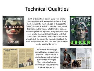
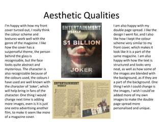
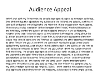
Luke Headland evaluated his research, planning, time management, and the technical and aesthetic qualities of his magazine cover and double page spread focused on the film "Joker." For his research, he was able to choose design elements like textures and colors but had difficulty finding specific matching images. His planning helped with layouts but he had to make his final product different than experiments. He spent too much time on the cover and could have added more to the double page spread. Both pages appeal to the target audience through their dark, gritty themes relating to the Joker character and discussion of the film's box office success.
2024.06.01 Introducing a competency framework for languag learning materials ...Sandy Millin
http://sandymillin.wordpress.com/iateflwebinar2024
Published classroom materials form the basis of syllabuses, drive teacher professional development, and have a potentially huge influence on learners, teachers and education systems. All teachers also create their own materials, whether a few sentences on a blackboard, a highly-structured fully-realised online course, or anything in between. Despite this, the knowledge and skills needed to create effective language learning materials are rarely part of teacher training, and are mostly learnt by trial and error.
Knowledge and skills frameworks, generally called competency frameworks, for ELT teachers, trainers and managers have existed for a few years now. However, until I created one for my MA dissertation, there wasn’t one drawing together what we need to know and do to be able to effectively produce language learning materials.
This webinar will introduce you to my framework, highlighting the key competencies I identified from my research. It will also show how anybody involved in language teaching (any language, not just English!), teacher training, managing schools or developing language learning materials can benefit from using the framework.
Read| The latest issue of The Challenger is here! We are thrilled to announce that our school paper has qualified for the NATIONAL SCHOOLS PRESS CONFERENCE (NSPC) 2024. Thank you for your unwavering support and trust. Dive into the stories that made us stand out!
Students, digital devices and success - Andreas Schleicher - 27 May 2024..pptxEduSkills OECD
Andreas Schleicher presents at the OECD webinar ‘Digital devices in schools: detrimental distraction or secret to success?’ on 27 May 2024. The presentation was based on findings from PISA 2022 results and the webinar helped launch the PISA in Focus ‘Managing screen time: How to protect and equip students against distraction’ https://www.oecd-ilibrary.org/education/managing-screen-time_7c225af4-en and the OECD Education Policy Perspective ‘Students, digital devices and success’ can be found here - https://oe.cd/il/5yV
How to Make a Field invisible in Odoo 17Celine George
It is possible to hide or invisible some fields in odoo. Commonly using “invisible” attribute in the field definition to invisible the fields. This slide will show how to make a field invisible in odoo 17.
Welcome to TechSoup New Member Orientation and Q&A (May 2024).pdfTechSoup
In this webinar you will learn how your organization can access TechSoup's wide variety of product discount and donation programs. From hardware to software, we'll give you a tour of the tools available to help your nonprofit with productivity, collaboration, financial management, donor tracking, security, and more.
2. Research
• Strengths:
– My research helped me come up with the design I wanted for my cover and
double page spread. For example, I was able to chose what types of textures,
colours, fonts etc I wanted on my pages, and I was able to experiment with
which fonts and colours worked by looking at existing magazine covers.
– The Bibliography research helped me understand how to structure my writing
for my double page spread and taught me the correct terminology to use
when referencing any other media, like films in my article.
• Weaknesses:
– One weakness with my research is I was unable to find specific content that
was very similar to what I wanted to create, I was only able to find content
with similar colours and fonts, rather than similar images that I wanted to
implement into my own work.
– It took a lot of time to find content / material that was relatable to what I
wanted to make. For examples I wanted to find magazine covers that had a
‘blurred glass’ effect, but because I couldn’t find one I had to compromise
with other similar images.
3. Planning
• Strengths:
– The planning helped me decide how I was going to layout my pages and
decide what all the different images I wanted on them. Because of my
Production Experiments, I could see which colours and textures worked and
which ones didn’t.
– I could also plan out how I was going to layout both my double page spread
and front cover, and where my images and text would go. This helped me
layout the text properly for my double page spread and helped my structure
everything, so I would know where to place my images.
• Weaknesses:
– One weakness with the planning was that I needed to make sure that my final
product was not completely similar to my experiment, which is why I used a
completely different image that I took and also chose a different colour pallet.
4. Time Management
• Strengths:
– I was able to plan out when I was going to do certain tasks, and was able to
plan out what I was going to research at what times. I spent most research
time looking at existing products to see what image, colour & text styles
worked for magazine covers and such.
– I was able to spend the most of my time on my double page spread, as that
was the page that required the most detail and research. I spent more time
researching for my double page spread and taking notes for what I was going
to add to it.
• Weaknesses:
– I think I spent too much time on my front cover, and could have finished in
much quicker which would have given me more time to add detail onto my
double page spread.
– I think I could have spent a little more time on research for my double page
spread to find out what other things are on the pages besides from what I
already had, just to add in more detail.
5. Technical Qualities
Both of these front covers use a very similar
colour pallets with a very similar theme. They
both feature the main subject, in this case the
‘Joker’, that is the main focus of the cover, which
highlights to the viewer what film this is about
and what genre it is a part of. They both also have
very similar fonts, with big titles and text that
stand out to the viewer. They both also have an
overall dark theme, as the magazine is about the
Joker, which is quite a dark film. This can also help
easily identify the genre.
Both of the double page
spread feature images from
the film. They also have a
similar layout out, with text
surrounded by images.
They both also feature
information about the films
they are focused on.
6. Aesthetic Qualities
I’m happy with how my front
cover turned out, I really think
the colour scheme and
textures work well with the
genre of the magazine. I like
how the cover has a
suspenseful theme, the person
behind the glass is
recognisable, but the face
looks quite abstract and
mysterious. The character is
also recognizable because of
the colours used, the colours I
have used are well known with
the character of ‘Joker’, which
will help bring in fans of the
character. One thing I would
change next time is adding
more images, even is it is just
one extra advertising another
film, to make it seem like more
of a magazine cover.
I am also happy with my
double page spread. I like the
design I went for, and I also
like how I kept the colour
scheme very similar to my
front cover, which makes it
look like it is a part of the
same magazine. I am also
happy with how the text is
structured and looks very
neat, as well as how some of
the images are blended with
the background, as if they are
a part of the background. One
thing I wish I could change is
the images, I wish I could’ve
added more of my own
images to make the double
page spread more
personalised and unique.
7. Audience Appeal
I think that both my front cover and double page spread appeal to my target audience.
One of the things that appeals to my audience is the textures and colours, as they are
very dark and gritty, which highlights the main film I have focused on in my magazine.
The colours are also in relation to the character of the ‘Joker’, which will help fans of
the film easily identify the subject of the magazine and what it will be featuring.
Another thing that I think will appeal to my audience is the tagline talking about the
$1 billion box office record for the ‘Joker’ film. Fans who were supportive of the film
would love to read about why the film was so successful and other statistics compared
to other films of the year. I also think the content in my double page spread would
appeal to my audience. A lot of what I have spoken about is the success of the film, as
well as how it compares to other films of the year, which I think my audience would
find interesting. The double page spread also has basic Joker images, as a reminder to
the viewer that the Joker film is the main focus of the magazine. It also has similar
connotations to the front cover, for example the colours, which I think my audience
would appreciate, as I am sticking with the same ‘Joker’ theme throughout the
magazine. The article is also very easy to read, and isn’t written in a complex way. As
my primary target audience age range is 16 plus, I think that this my audience would
also appreciate simple literature in the magazine, as it is easier / more simple to read.
Editor's Notes
What were the strengths of your research? How did your research help your product?
What were the weaknesses of your research? What could you have done better/improve? What effect would this have had on your product?
What were the strengths of your planning? How did your planning help your product?
What were the weaknesses of your planning? What could you have done better/improve? What effect would this have had on your product?
Did you manage your time well? Did you complete your project on time or would your products have improved with additional time?
What would you have done if you had more time to produce your work?
Compare your work to similar existing products and discuss the similarities and differences
Put your final piece(s) in the centre of a page alongside an existing product
Use text boxes and arrows
Does your work look good? Was it creative? What aspects of your game’s visuals do you like? What would you improve? How would you improve it?
Discuss the strengths and weaknesses
Put your final piece(s) in the centre of a page and analyse them
Use text boxes and arrows
How have you appealed to your target audience? What specific bits of content would appeal to your target audience.
Refer to your findings from your questionnaire.
Put your final piece(s) in the centre of a page and analyse them
Use text boxes and arrows