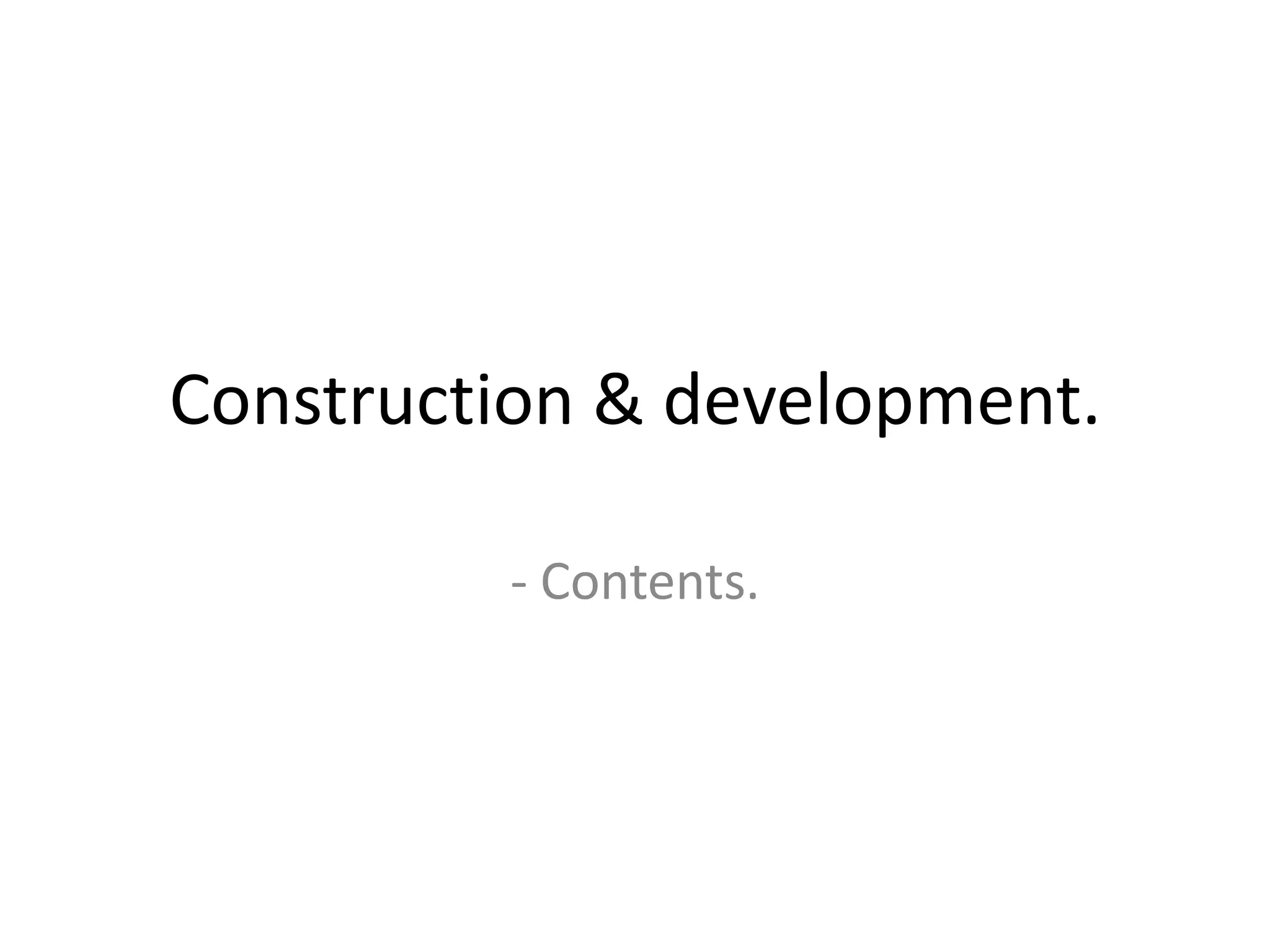
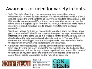
Construction & development.

         - Contents.
Understanding Conventions.
•   The page layout for my contents page was mainly inspired by Q magazine. I used
    there magazine layout for guidance and applied it into my work but in a different
    way. I though it was effective as it included all the required information without
    being over crowded. I am happy with my layout as it is effective in delivering
    information clearly whilst being stylish and incorporating pictures. One could
    argue I followed standard conventions when developing my contents page as I
    have used a mid shot, however the way I have written “Contents” is unique and
    the positioning of my page information is to the right therefore this is something I
    created myself. Also the box that outlines the page is something which would not
    be expected to be found on a contents page.
•   Again the style if my magazine is pop, this is reflected in my contents page due to
    the colours used and the background image. It is more aimed at a teenage age
    range, I considered this when choosing my colours e.g. Blue, pink and white. The
    style of “contents” also has a blur behind it like my title on the front cover, this
    keeps a consistency through the magazine and makes it unique. My subject image
    is also of a 17 year old, this therefore relates to my genre. Therefore my contents
    page has a pop style to it in a distinctive way.
My contents page is similar to Q’s as both pictures are mid shots and the
information is structured to the edge of the page, the only difference is that my
image and information is on opposite side’s to that of Q’s. Therefore I took
standard conventions into consideration and developed then in a sole way.
Awareness of need for variety in fonts.
•    Style; The style of writing is the same as my front cover, this creates
     consistency as I have used the same font Trajan Pro and the same blur effect. I
     decided to split the word contents up to overlook standard conventions, O did
     this to make my magazine different from the others. Also as you can see the
     whole word is in capitals apart from the last letter, s. I did this to make my title
     more different and individual also to prevent from following standard
     conventions.
•    Size; I used a large font size for my contents to make it stand out, it was also a
     good size at around 250 to fill the space at the top of the page. Also the other
     information is of the same size so it is readable for the buyer and they can see
     clearly where the information is and where to look for it. The size of the
     numbers are 2 sizes bigger than the writing to make them more clear and so
     the readers know which article it relates to which number.
•    Colour; For my contents page I tried to carry on the colour theme from my
     front page by using the blue’s and pink’s. For example, my title had a red blur
     therefore I toned it down for my contents paged and used a pink. Also some of
     the articles on my front cover are blue therefore I decided to do use this
     colour for my article information on the right of my contents.
                               From red
                               blur, lightened to
                               pink. Both are Trajan
                               Pro font.
Accurate use of language.
• During the construction of my contents page i took it
  upon myself to get feedback from other students as to
  what would be appropriate content and interesting
  articles. Therefore some of my articles were suggested
  by other class members. This is also an advantage as
  they are the same age range as my target audience.
  When including the content I used spell check to
  ensure everything was spelt correctly and asked
  various people to read it over. In the research and
  development process, analysing other contents pages
  gave me an idea of what was to be expected within the
  pop genre magazines and this therefore gave me
  guidance when including my own content.
Appropriate integration of illustration
              and text
• I have used pictures and information from my front cover to
  keep consistency and flow through my magazine. The articles
  still relate to the pictures, for example the “new releases”.
  This makes it clear to the reader what the pictures are and
  they can view them if desired. There is also a combination of
  information with page numbers. Great care was taken when
  deciding what stories to put on what page as a certain types
  of articles are major and others not so. Therefore I was careful
  to set it out evenly. Some of these ideas were influenced from
  other magazines however so of it was not.

Construction & development contents

  • 1.
  • 2.
    Understanding Conventions. • The page layout for my contents page was mainly inspired by Q magazine. I used there magazine layout for guidance and applied it into my work but in a different way. I though it was effective as it included all the required information without being over crowded. I am happy with my layout as it is effective in delivering information clearly whilst being stylish and incorporating pictures. One could argue I followed standard conventions when developing my contents page as I have used a mid shot, however the way I have written “Contents” is unique and the positioning of my page information is to the right therefore this is something I created myself. Also the box that outlines the page is something which would not be expected to be found on a contents page. • Again the style if my magazine is pop, this is reflected in my contents page due to the colours used and the background image. It is more aimed at a teenage age range, I considered this when choosing my colours e.g. Blue, pink and white. The style of “contents” also has a blur behind it like my title on the front cover, this keeps a consistency through the magazine and makes it unique. My subject image is also of a 17 year old, this therefore relates to my genre. Therefore my contents page has a pop style to it in a distinctive way.
  • 3.
    My contents pageis similar to Q’s as both pictures are mid shots and the information is structured to the edge of the page, the only difference is that my image and information is on opposite side’s to that of Q’s. Therefore I took standard conventions into consideration and developed then in a sole way.
  • 4.
    Awareness of needfor variety in fonts. • Style; The style of writing is the same as my front cover, this creates consistency as I have used the same font Trajan Pro and the same blur effect. I decided to split the word contents up to overlook standard conventions, O did this to make my magazine different from the others. Also as you can see the whole word is in capitals apart from the last letter, s. I did this to make my title more different and individual also to prevent from following standard conventions. • Size; I used a large font size for my contents to make it stand out, it was also a good size at around 250 to fill the space at the top of the page. Also the other information is of the same size so it is readable for the buyer and they can see clearly where the information is and where to look for it. The size of the numbers are 2 sizes bigger than the writing to make them more clear and so the readers know which article it relates to which number. • Colour; For my contents page I tried to carry on the colour theme from my front page by using the blue’s and pink’s. For example, my title had a red blur therefore I toned it down for my contents paged and used a pink. Also some of the articles on my front cover are blue therefore I decided to do use this colour for my article information on the right of my contents. From red blur, lightened to pink. Both are Trajan Pro font.
  • 5.
    Accurate use oflanguage. • During the construction of my contents page i took it upon myself to get feedback from other students as to what would be appropriate content and interesting articles. Therefore some of my articles were suggested by other class members. This is also an advantage as they are the same age range as my target audience. When including the content I used spell check to ensure everything was spelt correctly and asked various people to read it over. In the research and development process, analysing other contents pages gave me an idea of what was to be expected within the pop genre magazines and this therefore gave me guidance when including my own content.
  • 6.
    Appropriate integration ofillustration and text • I have used pictures and information from my front cover to keep consistency and flow through my magazine. The articles still relate to the pictures, for example the “new releases”. This makes it clear to the reader what the pictures are and they can view them if desired. There is also a combination of information with page numbers. Great care was taken when deciding what stories to put on what page as a certain types of articles are major and others not so. Therefore I was careful to set it out evenly. Some of these ideas were influenced from other magazines however so of it was not.