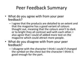
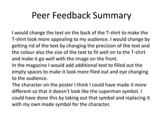
FMP Evaluation
Thomas Bond
Production Process Evaluation
Research
The strength of research is that I can get some ideas from existing products that
relate to the same products that I'm going to make. In the research, I looked at
different film magazines for teenagers between 16 – 35 years old. The products I
looked at all had similar colour scheme, layouts, fonts and graphics. I mainly
looked at the front covers, but I also had a look at some articles inside of them. I
did this because I wanted to know how other film magazines have their content
laid out. I also learned about what type of information goes on the front cover so
that I can put similar information and images on my own magazine. I did this with
the poster and t-shirt so that I can get ideas of how they are done by other
people. This is so I can do this best work and that I can take some inspiration from
existing products.
The one thing I could have done in my research is a get more people to do my
survey this would of help know because I could get more feedback and make my
products more interesting for the buyer. Like to have more input on specific fonts
In the magazine or on the t-shirt.
Planning
In my planning I did a good detailed mind map and style sheets to help me to
visualise what my magazine, poster and T-shirt will look like once they’re
done. The mind map helps me look at what my target audience and genre will
be so that I can make my products to a targeted audience. Which will help me
decide on what content to put in my products e.g. images, text i.e.
In the style sheet I looked at a range of fonts, colour schemes, size of font and
different images. These help me more to visualise what I want my final
product to be like. Some of the colour schemes and text font which I have
looked at in the style sheet will be Included in the final pieces of work.
I looked at different film magazines, posters and T-shirts which will help me
do the planning because it helped get the colour schemes, text, text font/size
and what existing film products like mine have in them.
I could have had more variety of colours to be included in the fine pieces of
work.
Time Management
The planning and research time went well. In this this time i found good quality
images with a high resolution that which did not take a long time to find and save
into my documents. When I looked at existing products this took a bit more time
because I had to go to find three different types of existing products (magazine,
poster, T-shirt) which took time to find the right types of products that went well
with my own.
I could have looked at more fonts on my style sheet and tested them out in
Photoshop because they look slightly different when in Photoshop. I would of
done this if I gave it more time to done this.
I drafted the content text in Microsoft Word so that I could use spell check and
also so that I had a back up in case Photoshop corrupted and so that I dint waist
time on rewriting and remembering it all again. After drafting it, I put it into
Photoshop and arranged it to fit in the guidelines for the products. This took quite
a long time because I had to resize the text and format it to fit were I wanted it to
go.
If I had more time I would have added more detail in the magazine and poster to
make them more attractive and to attract more of the audience to the products.
Technical Qualities
The similarity of my work to existing product is that it
has similar colours (red, blue, black) and that the logo is
in the center of the t-shirt.
Aesthetic Qualities
I would improve on the
character such as changing
some aspects like the
position of the character
and the colour of the suit. I
would also change improve
the text at the bottom
which has the cast and
directors on the have more
people and to have the text
enlarge a bit more then it is.
I like how the title font and
colour go well with the rest
of the poster colours and
the style of images that are
used in making the poster.
it looks good and creative
because it is using different
shades of colours and
altering existing aspect to
be my own adaptation on
the character.
Strength of this product is
that it is detailed and eye
catching to the audience.
Audience Appeal
I have appealed to my audience by using a colour scheme that most people in my survey
thought was the best for the type of magazine cover I was going for. I also mead sure that I stuck
to the sc-fi aspect which 40% people said they preferred. By doing so I got a hand full of already
existing posters and put them in the film reel , it think this will appeal well to may target
audience. I included a little bit of bright colours because in my survey most people said that
bright colours would attract their attention.
Peer
Feedback
Feedback 1
• What did you like about the product?
– I like that it is has detail and it uses a colour scheme
thought some of the products like in the t-shirt and
poster they both have red which is the main colour
throughout.
• What improvements could have been made to
the product?
– You could improve is that you could of changed the
text on the back of the t-shirt or/and have an image or
nothing on the back and keep what's on the front.
Feedback 2
• What did you like about the product?
– I like that the magazine has a range of colours
though out, which I like because there's no really
bright colours and not to dark colours.
• What improvements could have been made to
the product?
– Could of added more text on front of cover of
magazine.
Feedback 3
• What did you like about the product?
– I liked how all the assets on the poster fit well with
each other.
• What improvements could have been made to
the product?
– Could have had the character look different and
not look like a superman.
Peer Feedback Summary
• What do you agree with from your peer
feedback?
– I agree that the products are detailed to an extent and
that the magazine has a good variant of colours
thought out, meaning that the colours aren’t to dark
or to bright they all contrast well with each other. I
also agree that I could of added more text on the
magazine which could attract more people.
• What do you disagree with from your peer
feedback?
– I disagree with the character I think i could if changed
the symbol on the chest but the character I think is
good enough for the part.
Peer Feedback Summary
I would change the text on the back of the T-shirt to make the
T-shirt look more appealing to my audience. I would change by
getting rid of the text by changing the precision of the text and
the colour also the size of the text to fit well on to the T-shirt
and make it go well with the image on the front.
In the magazine I would add additional text to filled out the
empty spaces to make it look more filed out and eye changing
to the audience.
The character on the poster I think I could have made it more
different so that it doesn’t look like the superman symbol. I
could have done this by taking out that symbol and replacing it
with my own made symbol for the character.

7. fmp evaluation

  • 1.
  • 2.
  • 3.
    Research The strength ofresearch is that I can get some ideas from existing products that relate to the same products that I'm going to make. In the research, I looked at different film magazines for teenagers between 16 – 35 years old. The products I looked at all had similar colour scheme, layouts, fonts and graphics. I mainly looked at the front covers, but I also had a look at some articles inside of them. I did this because I wanted to know how other film magazines have their content laid out. I also learned about what type of information goes on the front cover so that I can put similar information and images on my own magazine. I did this with the poster and t-shirt so that I can get ideas of how they are done by other people. This is so I can do this best work and that I can take some inspiration from existing products. The one thing I could have done in my research is a get more people to do my survey this would of help know because I could get more feedback and make my products more interesting for the buyer. Like to have more input on specific fonts In the magazine or on the t-shirt.
  • 4.
    Planning In my planningI did a good detailed mind map and style sheets to help me to visualise what my magazine, poster and T-shirt will look like once they’re done. The mind map helps me look at what my target audience and genre will be so that I can make my products to a targeted audience. Which will help me decide on what content to put in my products e.g. images, text i.e. In the style sheet I looked at a range of fonts, colour schemes, size of font and different images. These help me more to visualise what I want my final product to be like. Some of the colour schemes and text font which I have looked at in the style sheet will be Included in the final pieces of work. I looked at different film magazines, posters and T-shirts which will help me do the planning because it helped get the colour schemes, text, text font/size and what existing film products like mine have in them. I could have had more variety of colours to be included in the fine pieces of work.
  • 5.
    Time Management The planningand research time went well. In this this time i found good quality images with a high resolution that which did not take a long time to find and save into my documents. When I looked at existing products this took a bit more time because I had to go to find three different types of existing products (magazine, poster, T-shirt) which took time to find the right types of products that went well with my own. I could have looked at more fonts on my style sheet and tested them out in Photoshop because they look slightly different when in Photoshop. I would of done this if I gave it more time to done this. I drafted the content text in Microsoft Word so that I could use spell check and also so that I had a back up in case Photoshop corrupted and so that I dint waist time on rewriting and remembering it all again. After drafting it, I put it into Photoshop and arranged it to fit in the guidelines for the products. This took quite a long time because I had to resize the text and format it to fit were I wanted it to go. If I had more time I would have added more detail in the magazine and poster to make them more attractive and to attract more of the audience to the products.
  • 6.
    Technical Qualities The similarityof my work to existing product is that it has similar colours (red, blue, black) and that the logo is in the center of the t-shirt.
  • 7.
    Aesthetic Qualities I wouldimprove on the character such as changing some aspects like the position of the character and the colour of the suit. I would also change improve the text at the bottom which has the cast and directors on the have more people and to have the text enlarge a bit more then it is. I like how the title font and colour go well with the rest of the poster colours and the style of images that are used in making the poster. it looks good and creative because it is using different shades of colours and altering existing aspect to be my own adaptation on the character. Strength of this product is that it is detailed and eye catching to the audience.
  • 8.
    Audience Appeal I haveappealed to my audience by using a colour scheme that most people in my survey thought was the best for the type of magazine cover I was going for. I also mead sure that I stuck to the sc-fi aspect which 40% people said they preferred. By doing so I got a hand full of already existing posters and put them in the film reel , it think this will appeal well to may target audience. I included a little bit of bright colours because in my survey most people said that bright colours would attract their attention.
  • 9.
  • 10.
    Feedback 1 • Whatdid you like about the product? – I like that it is has detail and it uses a colour scheme thought some of the products like in the t-shirt and poster they both have red which is the main colour throughout. • What improvements could have been made to the product? – You could improve is that you could of changed the text on the back of the t-shirt or/and have an image or nothing on the back and keep what's on the front.
  • 11.
    Feedback 2 • Whatdid you like about the product? – I like that the magazine has a range of colours though out, which I like because there's no really bright colours and not to dark colours. • What improvements could have been made to the product? – Could of added more text on front of cover of magazine.
  • 12.
    Feedback 3 • Whatdid you like about the product? – I liked how all the assets on the poster fit well with each other. • What improvements could have been made to the product? – Could have had the character look different and not look like a superman.
  • 13.
    Peer Feedback Summary •What do you agree with from your peer feedback? – I agree that the products are detailed to an extent and that the magazine has a good variant of colours thought out, meaning that the colours aren’t to dark or to bright they all contrast well with each other. I also agree that I could of added more text on the magazine which could attract more people. • What do you disagree with from your peer feedback? – I disagree with the character I think i could if changed the symbol on the chest but the character I think is good enough for the part.
  • 14.
    Peer Feedback Summary Iwould change the text on the back of the T-shirt to make the T-shirt look more appealing to my audience. I would change by getting rid of the text by changing the precision of the text and the colour also the size of the text to fit well on to the T-shirt and make it go well with the image on the front. In the magazine I would add additional text to filled out the empty spaces to make it look more filed out and eye changing to the audience. The character on the poster I think I could have made it more different so that it doesn’t look like the superman symbol. I could have done this by taking out that symbol and replacing it with my own made symbol for the character.

Editor's Notes

  • #4 What were the strengths of your research? How did your research help your product? What were the weaknesses of your research? What could you have done better/improve? What effect would this have had on your product?
  • #5 What were the strengths of your planning? How did your planning help your product? What were the weaknesses of your planning? What could you have done better/improve? What effect would this have had on your product?
  • #6 Did you manage your time well? Did you complete your project on time or would your products have improved with additional time? What would you have done if you had more time to produce your work?
  • #7 Compare your work to similar existing products and discuss the similarities and differences Put your final piece(s) in the centre of a page alongside an existing product Use text boxes and arrows
  • #8 Does your work look good? Was it creative? What aspects of your game’s visuals do you like? What would you improve? How would you improve it? Discuss the strengths and weaknesses Put your final piece(s) in the centre of a page and analyse them Use text boxes and arrows
  • #9 How have you appealed to your target audience? What specific bits of content would appeal to your target audience. Refer to your findings from your questionnaire. Put your final piece(s) in the centre of a page and analyse them Use text boxes and arrows
  • #15 What changes would you make to your product based upon your peer feedback and why?