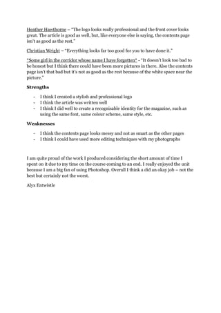
The student created a film magazine called FILM: A for a class assignment. They conducted research including a survey to determine the target demographic and preferences. For the magazine, the student designed a logo, front cover, contents page, and double page article spread. Based on peer feedback, the contents page was identified as the weakest element while the logo and article were strengths. Overall, the student was pleased with their work but felt they could have spent more time editing photographs.
Palestine last event orientationfvgnh .pptxRaedMohamed3
An EFL lesson about the current events in Palestine. It is intended to be for intermediate students who wish to increase their listening skills through a short lesson in power point.
Students, digital devices and success - Andreas Schleicher - 27 May 2024..pptxEduSkills OECD
Andreas Schleicher presents at the OECD webinar ‘Digital devices in schools: detrimental distraction or secret to success?’ on 27 May 2024. The presentation was based on findings from PISA 2022 results and the webinar helped launch the PISA in Focus ‘Managing screen time: How to protect and equip students against distraction’ https://www.oecd-ilibrary.org/education/managing-screen-time_7c225af4-en and the OECD Education Policy Perspective ‘Students, digital devices and success’ can be found here - https://oe.cd/il/5yV
How to Split Bills in the Odoo 17 POS ModuleCeline George
Bills have a main role in point of sale procedure. It will help to track sales, handling payments and giving receipts to customers. Bill splitting also has an important role in POS. For example, If some friends come together for dinner and if they want to divide the bill then it is possible by POS bill splitting. This slide will show how to split bills in odoo 17 POS.
This is a presentation by Dada Robert in a Your Skill Boost masterclass organised by the Excellence Foundation for South Sudan (EFSS) on Saturday, the 25th and Sunday, the 26th of May 2024.
He discussed the concept of quality improvement, emphasizing its applicability to various aspects of life, including personal, project, and program improvements. He defined quality as doing the right thing at the right time in the right way to achieve the best possible results and discussed the concept of the "gap" between what we know and what we do, and how this gap represents the areas we need to improve. He explained the scientific approach to quality improvement, which involves systematic performance analysis, testing and learning, and implementing change ideas. He also highlighted the importance of client focus and a team approach to quality improvement.
Unit 8 - Information and Communication Technology (Paper I).pdfThiyagu K
This slides describes the basic concepts of ICT, basics of Email, Emerging Technology and Digital Initiatives in Education. This presentations aligns with the UGC Paper I syllabus.
How to Make a Field invisible in Odoo 17Celine George
It is possible to hide or invisible some fields in odoo. Commonly using “invisible” attribute in the field definition to invisible the fields. This slide will show how to make a field invisible in odoo 17.
Ethnobotany and Ethnopharmacology:
Ethnobotany in herbal drug evaluation,
Impact of Ethnobotany in traditional medicine,
New development in herbals,
Bio-prospecting tools for drug discovery,
Role of Ethnopharmacology in drug evaluation,
Reverse Pharmacology.
GIÁO ÁN DẠY THÊM (KẾ HOẠCH BÀI BUỔI 2) - TIẾNG ANH 8 GLOBAL SUCCESS (2 CỘT) N...
JL02 Evaluation
1. JL02 – EVALUATION
JL02 was all about creating a magazine which showed off my photography, photo
editing and Photoshop skills. I had to create a masthead and a selling line for the
magazine as well as producing a front cover, a contents page and a double page
spread which contained a Q&A article with a made up actor.
I decided to make mine a film magazine and call it FILM: A.
Initial Research
I created a questionnaire in order to find out information about the magazine
preferences of college students. I handed some out in class and some around the
college. The questionnaire helped me in several ways with things like – (should it be
a real magazine) how often a new issue would come out, how much it will cost, what
type of articles I should place more importance on and if they‟d prefer to read
specifically about British film or involve other countries and cultures too. I also
learnt about what competition I‟d face from other film magazines and magazines
from different genres. It was also important to find out the core demographic so it
could influence me with my decision at the magazine‟s target audience (gender and
age).
2. Product Research
For Product Research, I analysed front covers and contents pages. This helped me
gain a full understanding of the words and names for things featured in magazines,
as well as looking at layouts and designs and trying to spot certain similarities and
some of the differences.
3.
4. Logo Design
This is my logo. I like this logo because I think the metal texture of the text works
well with the contrasting wood-like texture of the border. It took a while to create the
5. text because I had to type in out twice, delete half of both of them, add them together
while leaving a small gap in between and then edit them both in order to create the
metal-like texture. I really like the text and am pleased I persevered with it after
nearly giving up. It also has a 3D look to it and to me it looks like someone has stuck
the letters onto the border with glue or something.
Image Editing
I didn‟t really do too much in terms of changing things when editing my images. All I
did do was get rid of the background to all 5 of the photos I took. However, on one of
the images, I deleted the background and changed it from looking left-to-right to
right-to-left. I think it looked good because I made it look like the „actor‟ was looking
up at the text that was used in the article. This is what it looked like and how I did it.
6.
7. Magazine Cover
This is the front cover to my magazine. I decided, in order to fit in with the
demographic, to only feature one image on the cover. It was enlarged in order to take
up the majority of the space. I did this because I felt if there was too much images
and not enough information, then it would attract the wrong audience (like children)
– alternatively, I felt like I found the right balance between the image and the text
because if there was too much text and just one small image then it would attract
adults. I chose the red and gold colour scheme for the front cover (and subsequently
for all pages I produced) because red is a popular colour with the target audience,
and gold symbolises that my magazine is the best when compared to the competition.
I felt it was also important to feature the „actor‟ in a similar red to the red I used
because it fit in perfectly with the colour scheme, especially with the plain white
background.
8. Contents Page
This is my contents page. As you can see, I decided to stick to the colour scheme of
the front cover, as well as featuring the logo and the same text from the logo was used
for the „CONTENTS‟ header. I also repeated the border style from the logo and the
front cover for this page. I felt this was important as a way of creating a recognisable
identity for FILM: A. The text remains the same style too.
9. Double Page Spread
This is my double page spread article. It features the article, 2 edited images from the
photo-shoot, a header featuring a sentence from the article and an introduction. The
article retains the colour scheme of the previous pages, but drops the borders and the
metallic style text. What I like about this is how the colours complement each other
in regards to the questions and the answers. The font remains the same as from the
other pages and this is important as it keeps a stable theme between the other pages.
I also like how I made the images of the „actor‟ appear like he is reading the article.
Peer Group Feedback
James Picken – “I think the magazine looks quite good but could have certain
improvements like more images”
Josh Whipday – “You can kind of tell that it has been rushed so the quality isn‟t as
high as it would‟ve been if you had spent more time on it. Other than that it‟s pretty
good.”
Nick McCabe – “I think the logo and slogan looks really good. The contents page
looks a bit dodgy though.”
Jody Entwistle – “Everything looks pretty good apart from the contents page. Sorry,
our kid.”
Matthew Rogero – “I think you‟ve done a good job, especially with the logo and the
double page spread. The contents page doesn‟t look that great though and you could
have edited the pictures more.”
10. Heather Hawthorne – “The logo looks really professional and the front cover looks
great. The article is good as well, but, like everyone else is saying, the contents page
isn‟t as good as the rest.”
Christian Wright – “Everything looks far too good for you to have done it.”
*Some girl in the corridor whose name I have forgotten* - “It doesn‟t look too bad to
be honest but I think there could have been more pictures in there. Also the contents
page isn‟t that bad but it‟s not as good as the rest because of the white space near the
picture.”
Strengths
- I think I created a stylish and professional logo
- I think the article was written well
- I think I did well to create a recognisable identity for the magazine, such as
using the same font, same colour scheme, same style, etc.
Weaknesses
- I think the contents page looks messy and not as smart as the other pages
- I think I could have used more editing techniques with my photographs
I am quite proud of the work I produced considering the short amount of time I
spent on it due to my time on the course coming to an end. I really enjoyed the unit
because I am a big fan of using Photoshop. Overall I think a did an okay job – not the
best but certainly not the worst.
Alyx Entwistle