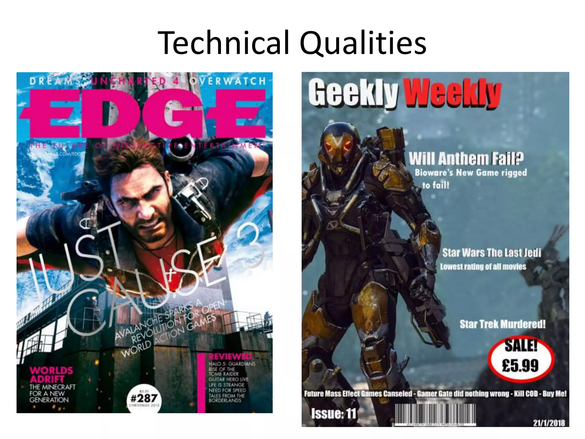
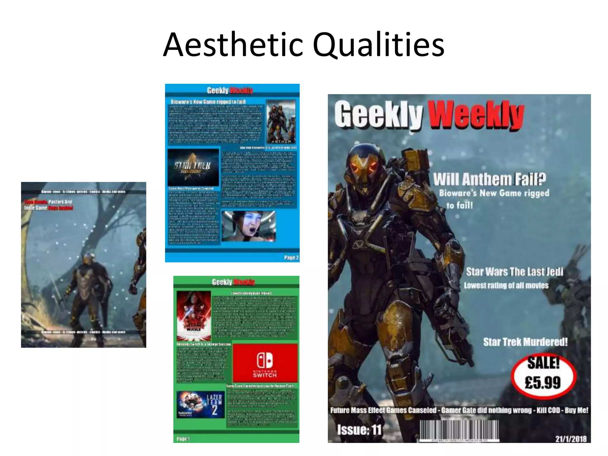
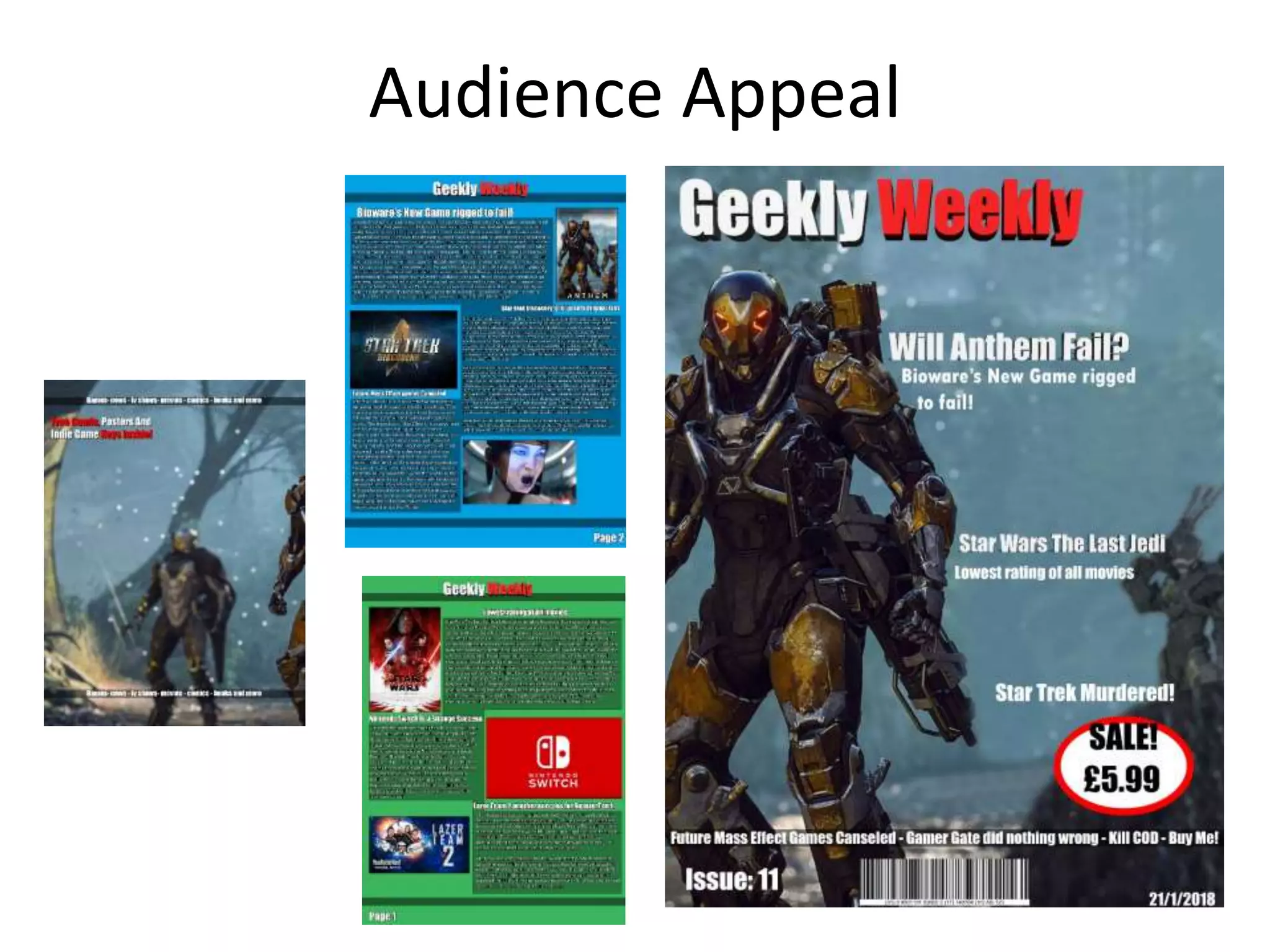
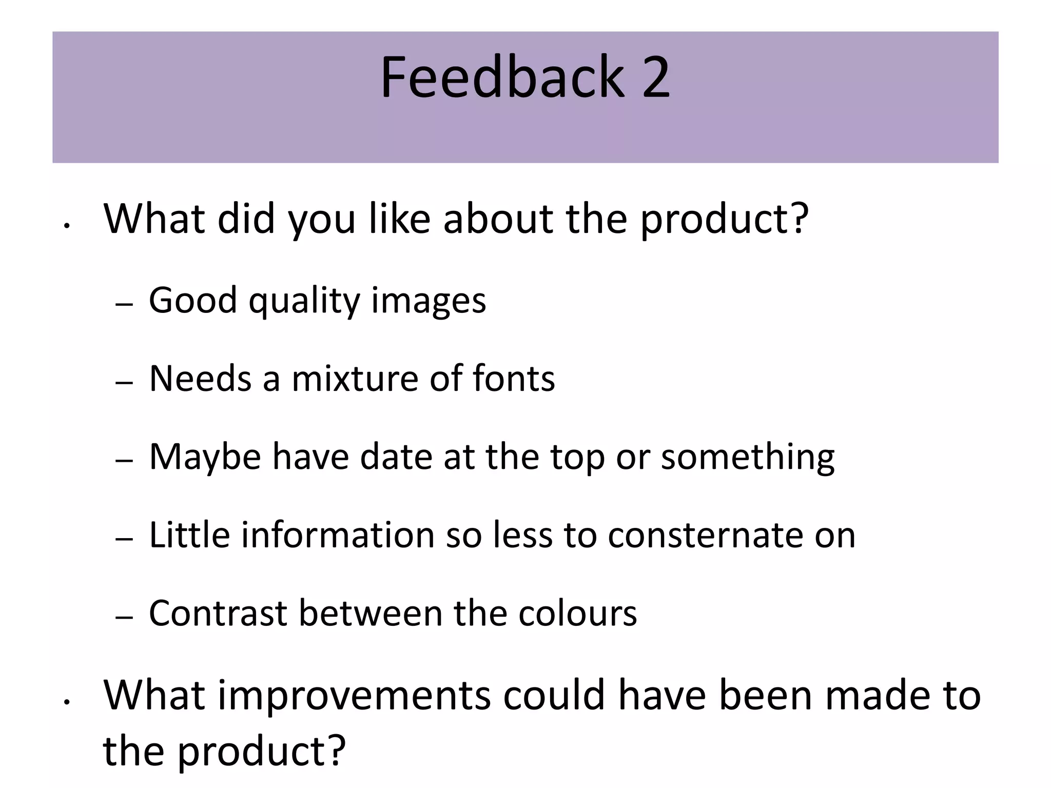
FMP Evaluation
Sean Cawood
Production Process Evaluation
Research
Strengths
• My existing products research helped me get ideas for what I wanted to
do for my final design of my product Because it had lots of good ideas
which had been refined for that media that i can take inspiration from
them to improve my ideas
• My Research analysis helped me work out what ideas I liked and what
ideas I would incorporate into my project and improve upon in my final
product.
• My Audience Profile allows me to figure out who would be my primary
target audience who will like this product the most so we could improve
the product to try to better suit them.
Weaknesses
Planning
• What were the strengths of your planning?
• One of my strength was my Layout plan where I worked out where I wanted to
place aspects of my ideas I had taken from my initial plans and research
• Another one of my strengths was my Style sheet where I collected lots of photos
and fonts which were the type of things I was going to be using to create my final
product
• Health and safety was one of my strengths because I was able to make sure not
me or anyone was hurt during the magazines construction. I checked everything in
my health and safety to ,minimize the rate of casualties while creating the
magazine
• How did your planning help your product?
• My planning helped me figure out how I was going to work towards and finally
finish
• What were the weaknesses of your planning?
• One of my weaknesses of my planning was that I didn’t plan out how I wanted the
inside pages and back page wanted to look
• What could you have done better/improve?
• I could have improved this by thinking of how I wanted to layout my poster and
then ask people whether or not they like the product
• What effect would this have had on your product?
• I think it would have improved it as I would have had a better idea of what I
wanted to do, where and how
Time Management
• Did you manage your time well?
• I managed my time very well and managed to complete all the work on time
according to my schedule
• Did you complete your project on time or would your products have improved with
additional time?
• I completed my work on time but I could have made more improvements
• What would you have done if you had more time to produce your work?
• If I had more time to improve my work I would have created more pages with more
detail. Maybe improve on the written work
Technical Qualities
Technical Qualities
Similarities
• Both magazines have Big eye catching titles of the
magazines with bold fonts manage to attract readers to
buy the magazines and become familiar with the title so if
this magazine interests them they will come back and buy
the next.
• Both magazines use Headlines big bold fonts to gain the
readers attention to try and get them to read their
magazine.
• Both use a single image instead of a cluster of lots of
smaller images. This makes them both look more clean and
less of an overload of images and information. It tells you
exactly what it needs to tell you to get you hooked In the
shortest amount of writing
• Both have a Clean and simple Professional quality to them
which attracts readers because it makes them look like
they were designed by people who knew what they were
doing.
• Both have good colour contrasts from the background.
This helps the writing be seen on the page be more easily
readable for the reader
• Both have some shade of blue for the background which
doesn’t seem to be important but it’s a strange
coincidence
• Both use a white text against a darker background. This
works well because lighter colours are easy to distinguish
from darker omes
• Both have barcodes and issue numbers this helps keep
track of the magazines in sales and to make sure they are
well organised and if someone realises they missed an
issue they want they can go and buy the one they missed
• Both have price tags so the reader knows how much they
are paying for the product
Differences
• Theirs uses different fonts for headlines and descriptions where I only use
one font. Theirs might be a better idea so they are easier to distinguish
between the headlines and descriptions. Their way also adds variety to make
sure its not all just the same
• Theirs has a much better and eye catching layout of their front cover which is
more likely to attract a reader. Their layout is more likely to stick out because
its more orderly compared to mine. They were also very smart with their
placing so that its very aesthetically pleasing to the reader making them want
to buy it and the next issue
• On my magazine thee is a lot of white space where they use different fonts
and sizes to make sure that space is filled so nothing is wasted. This make its
seems a lot more professional and eye catching
• My title of my magazine uses different colours where they use a single colour
foe their title. I guess its how you want to try and make it look rather that
effects the colours it uses so its not that important. But I would argue that
using the same colour could bet boring for readers
• They use different colours and fonts on their headlines and descriptions
• Their photo sticks out more as it has one of the characters jumping out of the
page where mine is slowly walking towards it so it makes it less eye-catching
to the reader than their magazine
Aesthetic Qualities
Aesthetic Qualities
Strengths
• bold 3D title which made it look good professional and eye catching to
the audience. Strangely in my mood board and existing products didn’t
have many with 3d titles for the magazine. Maybe it looks too cheap
now its that easy to make it 3d
• good layout of headlines which look like its going around the character
in the armour. This blends the background image and the text together
to make it more appealing
• good choice of fonts which are bold relating to sci fi which is on the
cover and many geeky things are to do with science fiction. This does
well to use that idea that sci fi uses bold fonts and text
• The magazine has Quality images for the front cover and the interior of
the magazine. Using high quality images which are well rendered and
high resolution, looks good because bad lighting or blurry images could
push customers away from the product. In my research of existing
products I found that little to non use badly rendered or low resolution
images. Another good thing about it is that it looks professional so thats
why I chose to use it while I was doing my research evaluation
• The layout for the articles is very good and unique because not many
articles in a magazine are layered out this way. I also think it’s good
because it helps the articles flow better so you know which ones are
intended for you to read next
• Catchy headlines look good and attract the reader well if it’s something
they are interested in. But one of the important thing is that the
headlines look good on the front cover. If they didn’t they wouldn’t be
as likely to pull in an audience
• Title stands out so people remember the name of the magazine and if
they enjoy the magazine they will come back for the next one
• Good use of colour. This is good because it attracts audiences to the
magazine. Colour is very important too the article
Weaknesses
• back-cover is nearly empty making it a bit boring. This is bad because it
doesn’t look professional and it could disinterest readers from buying if
it doesn’t look up to their standards
• The first 2 pages are a bit too colourful. This makes it look childish and
less professional. This is bad because it may push away the target
audience from reading because it might look like its too young for
them. I could have fixed this by maybe using a large image for the
background instead and maybe blurred so it doesn’t draw too much
attention from the writing
• Needs more of a mixture of fonts on the front cover. The interior pages
have it right where it has a different font for the titles and for the
writing but the front cover has the same for the headlines, title and
descriptions of the headlines. This can get a little repetitive and can
look unprofessional which it does. I would go back and improve this by
changing the font the descriptions and title uses to mix it up a little
• Too much unused space on the front cover. This can make the magazine
boring as it tells the reader there isnt much inside and they will go and
pick up another magazine with a more interesting cover. Meaning it
could drastically effect sales
• Because of how long it took me to create the magazine the titles are
kinda dated, if the audience sees that they have already read about all
the headlines then they wont be interested in picking up the magazine
• Pictures on the articles take up too much room meaning there is less
space for the text and smaller articles, this can make the magazine very
unprofessional and would drastically effect sales because of how it
looks
• Does your work look good?
• Apart from the kinda childish quality it looks alright and I like it
• Was it creative?
• Yes i think it was as I decided to try out something different with my layout which would have looked better with different
colours instead of childish colours as I mentioned before
• What aspects of your Magazines visuals do you like?
• I like that it has a unique style and look to the magazine that most magazines don’t have
• What would you improve? And how?
• I would improve my magazine by trying to refine the look and style to something more cool and professional and more
appropriate for my target audience
Audience Appeal
Audience Appeal
• How have you appealed to your target
audience?
• I have appealed to my target audience
by giving them articles that talk about
subjects they would be interested in.
such as geeky media and video games
• What specific bits of content would appeal to
your target audience?
• The specific articles that appeal to my
target audience are things about Star
wars the last Jedi, the Nintendo switch
and anthem
Things that appeal to the target audience
• Big picture of a game on the front cover of one of the games coming
out this year will appeal to the target audience because they will be
interested in the game or to see what else is being said about the
upcoming games, this can be seen being very successful in gaming
magazines like ”EDGE” which is a magazine I analysed in my existing
products research where I got the inspiration for the single picture for
the front cover idea because it proved to be effective with their target
audience. My magazines target audience isnt so different so it will
most likely be very effective for them too.
• Headlines relating to geeky subjects will appeal to the target audience
• Interesting articles that captivate the audience. When they like a show
such as “star trek” and they like it they will most likely want to read
anything related to it.
• Its on sale Which will appeal to the audience more because it will
make them more likely to buy it cheap than to buy it high
• Has the release date so people know its about the latest stories and
games. For people who frantically want to keep up with gaming news
(who are within my primary target audience) this will be a great
feature for them so they can keep up with it all
• Bold title font which attracts the reader because it relates to geeks
and sci fi. This subconscious relation has links to classic sci fi such as
Star Wars. This will help the reader/audience get the idea that it’s a
geeky product and they will most likely be more attracted into buying.
The choice for a big bold font for the title has also links back to my
existing products research where all of my existing products had big
bold titles and they were all related to games or other geek media.
Further proving the audience appeal
Peer
Feedback
Feedback 1
• What did you like about the product?
– Good quality images
– Good use of fonts
– Constrast from the words to the background like it
pops out to your eyes
• What improvements could have been made to
the product?
– Put the sale fully inside the box
Feedback 2
• What did you like about the product?
– Good quality images
– Needs a mixture of fonts
– Maybe have date at the top or something
– Little information so less to consternate on
– Contrast between the colours
• What improvements could have been made to
the product?
Feedback 3
• What did you like about the product?
– Bold
– Stands out
– Colourful
– Good contrast
• What improvements could have been made to
the product?
– Could have used up more of the empty space
Peer Feedback Summary
• What do you agree with from your peer
feedback?
– I agree that it used good quality images and that I
could have used up the empty space more
– I should have used a Varity of fonts too
• What do you disagree with from your peer
feedback?
– I disagree that the headlines should be more
relevant which is true I guess but they are events
Peer Feedback Summary
• What changes would you make to your product based upon your peer feedback and
why?
• I would change my front cover and back cover to add more information on and
make them look more professional by using different fonts because it would be
more likely to pull the reader into buying the product
• In my interior pages I would have change them to not make them look like its for
children because they arent my target audience. Maybe if I made them look
more grown up it might do better on the market

7. evaluation(3) 1 (1)

  • 1.
  • 2.
  • 3.
    Research Strengths • My existingproducts research helped me get ideas for what I wanted to do for my final design of my product Because it had lots of good ideas which had been refined for that media that i can take inspiration from them to improve my ideas • My Research analysis helped me work out what ideas I liked and what ideas I would incorporate into my project and improve upon in my final product. • My Audience Profile allows me to figure out who would be my primary target audience who will like this product the most so we could improve the product to try to better suit them. Weaknesses
  • 4.
    Planning • What werethe strengths of your planning? • One of my strength was my Layout plan where I worked out where I wanted to place aspects of my ideas I had taken from my initial plans and research • Another one of my strengths was my Style sheet where I collected lots of photos and fonts which were the type of things I was going to be using to create my final product • Health and safety was one of my strengths because I was able to make sure not me or anyone was hurt during the magazines construction. I checked everything in my health and safety to ,minimize the rate of casualties while creating the magazine • How did your planning help your product? • My planning helped me figure out how I was going to work towards and finally finish • What were the weaknesses of your planning? • One of my weaknesses of my planning was that I didn’t plan out how I wanted the inside pages and back page wanted to look • What could you have done better/improve? • I could have improved this by thinking of how I wanted to layout my poster and then ask people whether or not they like the product • What effect would this have had on your product? • I think it would have improved it as I would have had a better idea of what I wanted to do, where and how
  • 5.
    Time Management • Didyou manage your time well? • I managed my time very well and managed to complete all the work on time according to my schedule • Did you complete your project on time or would your products have improved with additional time? • I completed my work on time but I could have made more improvements • What would you have done if you had more time to produce your work? • If I had more time to improve my work I would have created more pages with more detail. Maybe improve on the written work
  • 6.
  • 7.
    Technical Qualities Similarities • Bothmagazines have Big eye catching titles of the magazines with bold fonts manage to attract readers to buy the magazines and become familiar with the title so if this magazine interests them they will come back and buy the next. • Both magazines use Headlines big bold fonts to gain the readers attention to try and get them to read their magazine. • Both use a single image instead of a cluster of lots of smaller images. This makes them both look more clean and less of an overload of images and information. It tells you exactly what it needs to tell you to get you hooked In the shortest amount of writing • Both have a Clean and simple Professional quality to them which attracts readers because it makes them look like they were designed by people who knew what they were doing. • Both have good colour contrasts from the background. This helps the writing be seen on the page be more easily readable for the reader • Both have some shade of blue for the background which doesn’t seem to be important but it’s a strange coincidence • Both use a white text against a darker background. This works well because lighter colours are easy to distinguish from darker omes • Both have barcodes and issue numbers this helps keep track of the magazines in sales and to make sure they are well organised and if someone realises they missed an issue they want they can go and buy the one they missed • Both have price tags so the reader knows how much they are paying for the product Differences • Theirs uses different fonts for headlines and descriptions where I only use one font. Theirs might be a better idea so they are easier to distinguish between the headlines and descriptions. Their way also adds variety to make sure its not all just the same • Theirs has a much better and eye catching layout of their front cover which is more likely to attract a reader. Their layout is more likely to stick out because its more orderly compared to mine. They were also very smart with their placing so that its very aesthetically pleasing to the reader making them want to buy it and the next issue • On my magazine thee is a lot of white space where they use different fonts and sizes to make sure that space is filled so nothing is wasted. This make its seems a lot more professional and eye catching • My title of my magazine uses different colours where they use a single colour foe their title. I guess its how you want to try and make it look rather that effects the colours it uses so its not that important. But I would argue that using the same colour could bet boring for readers • They use different colours and fonts on their headlines and descriptions • Their photo sticks out more as it has one of the characters jumping out of the page where mine is slowly walking towards it so it makes it less eye-catching to the reader than their magazine
  • 8.
  • 9.
    Aesthetic Qualities Strengths • bold3D title which made it look good professional and eye catching to the audience. Strangely in my mood board and existing products didn’t have many with 3d titles for the magazine. Maybe it looks too cheap now its that easy to make it 3d • good layout of headlines which look like its going around the character in the armour. This blends the background image and the text together to make it more appealing • good choice of fonts which are bold relating to sci fi which is on the cover and many geeky things are to do with science fiction. This does well to use that idea that sci fi uses bold fonts and text • The magazine has Quality images for the front cover and the interior of the magazine. Using high quality images which are well rendered and high resolution, looks good because bad lighting or blurry images could push customers away from the product. In my research of existing products I found that little to non use badly rendered or low resolution images. Another good thing about it is that it looks professional so thats why I chose to use it while I was doing my research evaluation • The layout for the articles is very good and unique because not many articles in a magazine are layered out this way. I also think it’s good because it helps the articles flow better so you know which ones are intended for you to read next • Catchy headlines look good and attract the reader well if it’s something they are interested in. But one of the important thing is that the headlines look good on the front cover. If they didn’t they wouldn’t be as likely to pull in an audience • Title stands out so people remember the name of the magazine and if they enjoy the magazine they will come back for the next one • Good use of colour. This is good because it attracts audiences to the magazine. Colour is very important too the article Weaknesses • back-cover is nearly empty making it a bit boring. This is bad because it doesn’t look professional and it could disinterest readers from buying if it doesn’t look up to their standards • The first 2 pages are a bit too colourful. This makes it look childish and less professional. This is bad because it may push away the target audience from reading because it might look like its too young for them. I could have fixed this by maybe using a large image for the background instead and maybe blurred so it doesn’t draw too much attention from the writing • Needs more of a mixture of fonts on the front cover. The interior pages have it right where it has a different font for the titles and for the writing but the front cover has the same for the headlines, title and descriptions of the headlines. This can get a little repetitive and can look unprofessional which it does. I would go back and improve this by changing the font the descriptions and title uses to mix it up a little • Too much unused space on the front cover. This can make the magazine boring as it tells the reader there isnt much inside and they will go and pick up another magazine with a more interesting cover. Meaning it could drastically effect sales • Because of how long it took me to create the magazine the titles are kinda dated, if the audience sees that they have already read about all the headlines then they wont be interested in picking up the magazine • Pictures on the articles take up too much room meaning there is less space for the text and smaller articles, this can make the magazine very unprofessional and would drastically effect sales because of how it looks • Does your work look good? • Apart from the kinda childish quality it looks alright and I like it • Was it creative? • Yes i think it was as I decided to try out something different with my layout which would have looked better with different colours instead of childish colours as I mentioned before • What aspects of your Magazines visuals do you like? • I like that it has a unique style and look to the magazine that most magazines don’t have • What would you improve? And how? • I would improve my magazine by trying to refine the look and style to something more cool and professional and more appropriate for my target audience
  • 10.
  • 11.
    Audience Appeal • Howhave you appealed to your target audience? • I have appealed to my target audience by giving them articles that talk about subjects they would be interested in. such as geeky media and video games • What specific bits of content would appeal to your target audience? • The specific articles that appeal to my target audience are things about Star wars the last Jedi, the Nintendo switch and anthem Things that appeal to the target audience • Big picture of a game on the front cover of one of the games coming out this year will appeal to the target audience because they will be interested in the game or to see what else is being said about the upcoming games, this can be seen being very successful in gaming magazines like ”EDGE” which is a magazine I analysed in my existing products research where I got the inspiration for the single picture for the front cover idea because it proved to be effective with their target audience. My magazines target audience isnt so different so it will most likely be very effective for them too. • Headlines relating to geeky subjects will appeal to the target audience • Interesting articles that captivate the audience. When they like a show such as “star trek” and they like it they will most likely want to read anything related to it. • Its on sale Which will appeal to the audience more because it will make them more likely to buy it cheap than to buy it high • Has the release date so people know its about the latest stories and games. For people who frantically want to keep up with gaming news (who are within my primary target audience) this will be a great feature for them so they can keep up with it all • Bold title font which attracts the reader because it relates to geeks and sci fi. This subconscious relation has links to classic sci fi such as Star Wars. This will help the reader/audience get the idea that it’s a geeky product and they will most likely be more attracted into buying. The choice for a big bold font for the title has also links back to my existing products research where all of my existing products had big bold titles and they were all related to games or other geek media. Further proving the audience appeal
  • 12.
  • 13.
    Feedback 1 • Whatdid you like about the product? – Good quality images – Good use of fonts – Constrast from the words to the background like it pops out to your eyes • What improvements could have been made to the product? – Put the sale fully inside the box
  • 14.
    Feedback 2 • Whatdid you like about the product? – Good quality images – Needs a mixture of fonts – Maybe have date at the top or something – Little information so less to consternate on – Contrast between the colours • What improvements could have been made to the product?
  • 15.
    Feedback 3 • Whatdid you like about the product? – Bold – Stands out – Colourful – Good contrast • What improvements could have been made to the product? – Could have used up more of the empty space
  • 16.
    Peer Feedback Summary •What do you agree with from your peer feedback? – I agree that it used good quality images and that I could have used up the empty space more – I should have used a Varity of fonts too • What do you disagree with from your peer feedback? – I disagree that the headlines should be more relevant which is true I guess but they are events
  • 17.
    Peer Feedback Summary •What changes would you make to your product based upon your peer feedback and why? • I would change my front cover and back cover to add more information on and make them look more professional by using different fonts because it would be more likely to pull the reader into buying the product • In my interior pages I would have change them to not make them look like its for children because they arent my target audience. Maybe if I made them look more grown up it might do better on the market