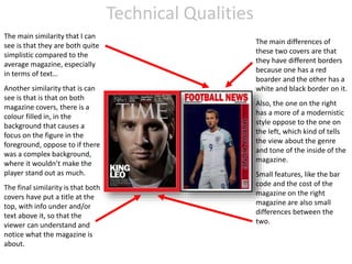
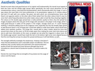
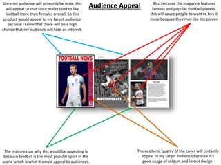
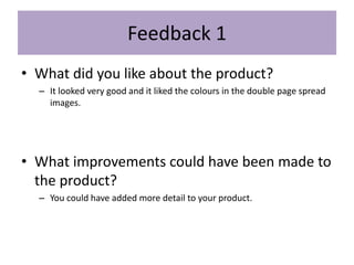
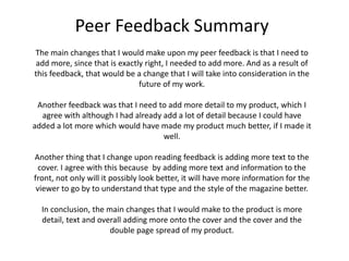
thGAP - BAbyss in Moderno!! Transgenic Human Germline Alternatives ProjectMarc Dusseiller Dusjagr
thGAP - Transgenic Human Germline Alternatives Project, presents an evening of input lectures, discussions and a performative workshop on artistic interventions for future scenarios of human genetic and inheritable modifications.
To begin our lecturers, Marc Dusseiller aka "dusjagr" and Rodrigo Martin Iglesias, will give an overview of their transdisciplinary practices, including the history of hackteria, a global network for sharing knowledge to involve artists in hands-on and Do-It-With-Others (DIWO) working with the lifesciences, and reflections on future scenarios from the 8-bit computer games of the 80ies to current real-world endeavous of genetically modifiying the human species.
We will then follow up with discussions and hands-on experiments on working with embryos, ovums, gametes, genetic materials from code to slime, in a creative and playful workshop setup, where all paticipant can collaborate on artistic interventions into the germline of a post-human future.
The Legacy of Breton In A New Age by Master Terrance LindallBBaez1
Brave Destiny 2003 for the Future for Technocratic Surrealmageddon Destiny for Andre Breton Legacy in Agenda 21 Technocratic Great Reset for Prison Planet Earth Galactica! The Prophecy of the Surreal Blasphemous Desires from the Paradise Lost Governments!
Explore the multifaceted world of Muntadher Saleh, an Iraqi polymath renowned for his expertise in visual art, writing, design, and pharmacy. This SlideShare delves into his innovative contributions across various disciplines, showcasing his unique ability to blend traditional themes with modern aesthetics. Learn about his impactful artworks, thought-provoking literary pieces, and his vision as a Neo-Pop artist dedicated to raising awareness about Iraq's cultural heritage. Discover why Muntadher Saleh is celebrated as "The Last Polymath" and how his multidisciplinary talents continue to inspire and influence.
The perfect Sundabet Slot mudah menang Promo new member Animated PDF for your conversation. Discover and Share the best GIFs on Tenor
Admin Ramah Cantik Aktif 24 Jam Nonstop siap melayani pemain member Sundabet login via apk sundabet rtp daftar slot gacor daftar
2137ad Merindol Colony Interiors where refugee try to build a seemengly norm...luforfor
This are the interiors of the Merindol Colony in 2137ad after the Climate Change Collapse and the Apocalipse Wars. Merindol is a small Colony in the Italian Alps where there are around 4000 humans. The Colony values mainly around meritocracy and selection by effort.
2137ad - Characters that live in Merindol and are at the center of main storiesluforfor
Kurgan is a russian expatriate that is secretly in love with Sonia Contado. Henry is a british soldier that took refuge in Merindol Colony in 2137ad. He is the lover of Sonia Contado.
3. Research
• The strengths of my research is are that I gain knowledge on topics, which
I can then apply to my work, which would better aid me on creating
something as tightly tied to the topic as possible.
• The weaknesses of my research is that it used up some time and I knew a
lot about the topic already, so it wasn’t that important.
• If I spend more time on my on the creation of my produce, it would have
made me more productive within my time space also I could then create a
better product overall, since I would have more time to produce it thus
the quality would be better.
4. Planning
• The strengths of planning are that I have a better idea of what I would do
for my product and it’s all laid out on a PowerPoint so I can go onto I when
I need to get a brain storm of ideas.
• The weaknesses of planning is that it uses up a lot of time and also it isn’t
always needed to create a product if you already have an idea on what
your going to make.
• I could have, if I wanted to, dived deeper into the topics and the trending
aspects of it, so that I could add more up to date information to my
product.
• If I spent more time I could have also improved my planning on my
football magazine cover.
5. Time Management
• No, I didn’t manage my time well because I didn’t use my time to my full
potential. However, I did finish my project in time, it was slightly rushed
but it was great overall. My project would certainly been improved with
additional time since I would have had more time to complete the project
and to complete the project at a higher standard.
• If I had more time to complete my product, I would have added more
aesthetic effects to my product and also I would have added ore to my
double page spread because that was definitely rushed.
6. Technical Qualities
The main similarity that I can
see is that they are both quite
simplistic compared to the
average magazine, especially
in terms of text…
Another similarity that is can
see is that is that on both
magazine covers, there is a
colour filled in, in the
background that causes a
focus on the figure in the
foreground, oppose to if there
was a complex background,
where it wouldn’t make the
player stand out as much.
The final similarity is that both
covers have put a title at the
top, with info under and/or
text above it, so that the
viewer can understand and
notice what the magazine is
about.
The main differences of
these two covers are that
they have different borders
because one has a red
boarder and the other has a
white and black border on it.
Also, the one on the right
has a more of a modernistic
style oppose to the one on
the left, which kind of tells
the view about the genre
and tone of the inside of the
magazine.
Small features, like the bar
code and the cost of the
magazine on the right
magazine are also small
differences between the
two.
7. Overall my work does look good because of its original and fundamentally, the overall visual appeal of
both the cover and the double page spread. More specifically, the main visual attractions are the
complementary colours, navy blue/red and black/white, which dramatically alters the image, in such a
way, where the cover feels a lot more professional, in its presentation, oppose to if I choose colours
that don’t fit well with one another, like green and pink which are uncomplimentary hence why
they’re not opposite and/or on the other side of them wheel from the other colours that it’s near to,
since that’s what frequently determines what makes colours able to look like they should go together.
The colours on the double page spread have a really aesthetic quality to them, thus the spread has
images of players where the only part of the image with saturation is the player in the image, which is
really good because it makes all the players in the images, strongly stand out. If I could improve
anything, it would be adding more to the magazine cover especially, but also the double page spread
as well because there’s a lot of things that I could have added to make them better, which would have
added more aesthetic qualities. The things that I would add to make it better would be more text
around Harry Kane on the cover, to fill the empty space thus making the cover look more dense and
also to add more information on the cover, so people can see what the magazine is about more. On
the double page spread I would have made the text on the bottom right to be more aligned because
that the one thing that annoys me about the spread and because it will look Better, as well…
The strengths defiantly outweighs the weaknesses. However, that doesn’t
mean that the weaknesses aren’t noticeable and/or not effective. The one
weakness that crucially needs to be improved is the overall production
quality of both the spread and cover because although they are at
somewhat at a decent level of production quality, it could be made a lot
better.
Overall, the main things that are strengths of my product are the usage of
colours and the layout.
8. The main reason why this would be appealing is
because football is the most popular sport in the
world which is what it would appeal to audiences.
The aesthetic quality of the cover will certainly
appeal to my target audience because it’s
good usage of colours and layout design.
Also because the magazine features
famous and popular football players,
this will cause people to want to buy it
more because they may like the player.
Since my audience will primarily be male, this
will appeal to that since males tend to like
football more then females overall. So this
product would appeal to my target audience
because I know that there will be a high
chance that my audience will take an interest.
Audience Appeal
10. Feedback 1
• What did you like about the product?
– It looked very good and it liked the colours in the double page spread
images.
• What improvements could have been made to
the product?
– You could have added more detail to your product.
11. Feedback 2
• What did you like about the product?
– I liked the style of the products.
• What improvements could have been made to
the product?
– Add more to the cover of the magazine.
12. Feedback 3
• What did you like about the product?
– I liked the colours of the double page and I also liked the text on the side of
the cover.
• What improvements could have been made to
the product?
– Having more text on the cover.
13. Peer Feedback Summary
• What do you agree with from your peer
feedback?
– Everything, but more specifically the opinion about adding more to my
product, since that is one thing that I needed to do.
– I also agree with my usage of colours and style.
• What do you disagree with from your peer
feedback?
– Nothing.
14. Peer Feedback Summary
The main changes that I would make upon my peer feedback is that I need to
add more, since that is exactly right, I needed to add more. And as a result of
this feedback, that would be a change that I will take into consideration in the
future of my work.
Another feedback was that I need to add more detail to my product, which I
agree with although I had already add a lot of detail because I could have
added a lot more which would have made my product much better, if I made it
well.
Another thing that I change upon reading feedback is adding more text to the
cover. I agree with this because by adding more text and information to the
front, not only will it possibly look better, it will have more information for the
viewer to go by to understand that type and the style of the magazine better.
In conclusion, the main changes that I would make to the product is more
detail, text and overall adding more onto the cover and the cover and the
double page spread of my product.
Editor's Notes
What were the strengths of your research? How did your research help your product?
What were the weaknesses of your research? What could you have done better/improve? What effect would this have had on your product?
What were the strengths of your planning? How did your planning help your product?
What were the weaknesses of your planning? What could you have done better/improve? What effect would this have had on your product?
Did you manage your time well? Did you complete your project on time or would your products have improved with additional time?
What would you have done if you had more time to produce your work?
Compare your work to similar existing products and discuss the similarities and differences
Put your final piece(s) in the centre of a page alongside an existing product
Use text boxes and arrows
Does your work look good? Was it creative? What aspects of your game’s visuals do you like? What would you improve? How would you improve it?
Discuss the strengths and weaknesses
Put your final piece(s) in the centre of a page and analyse them
Use text boxes and arrows
How have you appealed to your target audience? What specific bits of content would appeal to your target audience.
Refer to your findings from your questionnaire.
Put your final piece(s) in the centre of a page and analyse them
Use text boxes and arrows
What changes would you make to your product based upon your peer feedback and why?