Evaluation
James cooper-abel
Production Process Evaluation
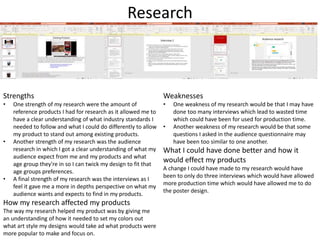
Research
Strengths
• One strength of my research were the amount of
reference products I had for research as it allowed me to
have a clear understanding of what industry standards I
needed to follow and what I could do differently to allow
my product to stand out among existing products.
• Another strength of my research was the audience
research in which I got a clear understanding of what my
audience expect from me and my products and what
age group they're in so I can twick my design to fit that
age groups preferences.
• A final strength of my research was the interviews as I
feel it gave me a more in depths perspective on what my
audience wants and expects to find in my products.
How my research affected my products
The way my research helped my product was by giving me
an understanding of how it needed to set my colors out
what art style my designs would take ad what products were
more popular to make and focus on.
Weaknesses
• One weakness of my research would be that I may have
done too many interviews which lead to wasted time
which could have been for used for production time.
• Another weakness of my research would be that some
questions I asked in the audience questionnaire may
have been too similar to one another.
What I could have done better and how it
would effect my products
A change I could have made to my research would have
been to only do three interviews which would have allowed
more production time which would have allowed me to do
the poster design.
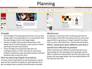
Planning
Strength
• One strength of my planning was the how I set out ever
design option I was deciding to use in my products from
the color designs to font and image design.
• Another strength I feel my planning had was in the
design layout as I feel they give a clear picture of what I
planning to do with each product
• A final strength of my planning I feel were my
contingency plans as I feel I was able to cover every
problem I would encounter during this project and how I
would be able to deal with them.
How my planning helped my products
The way my planning helped me was by giving me a good
base for how I wanted my product to look allowing me to
get my designs done as quickly and efficiently as possible.
Weaknesses
A weakness I could state with my planning was that for
some product I did I didn’t do layout plans for so the web
page and the mug because I though I wouldn't be doing
them so when I did make them, I improvised the designs.
What I could have done different and how it
would have effected my product
What could have done different would have been to do
layout design for the web page and mug design and the
effect I would have had would be that the look of the mug
design and news page design may have looked different to
the way they look now.
Time Management
• I felt I was able to manage my time well as I was able to get most of the
work for this project done the only one being the poster design but most
of other work was able to be completed in time, however I do believe my
project would have been better if I had more time.
• What I would have done if I had more time to produce my work, I would
have done work for the poster design in which I would have redone the
design I did for the magazine front cover in a previous project in which I
would have redraw each character and the background to look more
professional and up to industry standards.
Technical Qualities
Similarity's
• One similarity between my products and the existing
ones is that each design has an image related to the
game it is representing.
• Another similarity is that most use simple color schemes
using very little detail color.
• A third similarity is that both my designs and existing
one-use logos from different factions from their
respective game franchises.
• A final similarity is that both the existing hoodie design
and my shirt design have characters from their
respective game franchises.
Differences
• One difference between my product and the existing
product is that the art style for the existing hoodie
image design has a realistic look to it whilst my shirt
design has an anime look to it.
• Another difference is that the existing product image
design are more based in sci-fi whilst mine is medieval
fantasy
• A final difference is that the existing hoodie has the
image design on the front whilst mine has it on the back.
Aesthetic Qualities
Strengths
• One strength of my work was the
way I made the logo for each faction
as I feel that each design is simple,
unique and standout among each
other and represent each faction
through their design.
• Another strength of my work was
the shirt design as I was able to stick
to the image theme which was
anime.
• A final strength of my product would
be that news in which I have been
able to have what was expected
from a news page from a title to the
main article to the advertisement for
games and other stories.
I believe my work looks fantastic and
creative and would attract a large
audience with the simple yet sleek
design to the vibrant colours used.
Weaknesses
• One weakness of my products is
that the design I did for the shirt
mug and cap design are both logo
which could bee seen as
oversaturated.
• Another weaknesses is that the
background color I did for news
page which was dark grey, and the
article letters are black so it may
be difficult for the viewer to read
the article.
What I would improve would be that I
would change color background of
the news page to make it easier for
the view to read the article and the
way I would do this is by selecting
another color that black stand out
more against and use the paint
bucket tool to pain the background
that color.
Audience Appeal
I feel that I have appealed to my target audience through my use aesthetically pleasing designs
and colors one specific bit being the style I chose for the shirt design as many people voted that
they liked more cartoony design than realistic ones which is why the shirt design art style is
anime another appealing aspect was that I was able to do the shirt, hoodie and cap design due
to real life circumstances as originally on the questioner the hoodie option won out but due to
me not being able to dedicate time to the behind the scenes video due to real life events I was
able to dedicate that time to do all three appealing to all three audiences.
Peer
Feedback
Feedback 1
• What did you like about the product?
– I liked the aesthetics look of the product as the anime inspired
image on the shirt design which really drew me in.
– I liked the usage of colours used for each product as I feel they
really draw people in.
– I like the web news page as It felt like a real news page with
secondary stories for other articles and advertisements.
• What improvements could have been made to the
product?
– What could have been improved to make the product better
would be to do more different designs like another character
image or object image instead of the oversaturation of logo
design.
– Another improvement I would make to the product would be to
change the background colour of he news page its hard to read
the text.
Feedback 2
• What did you like about the product?
– I liked the usage of bright colours for some products and darker
colours for others as I feel they help draw in their intended audience.
– Another thing I liked about the product was the way the logo for each
faction as each image used in the logo tells what each faction is about
which I found myself really appreciating.
– A final thing I liked about the product was the news page a It felt like
an actual gaming news page.
• What improvements could have been made to the product?
– A improvement I would have mad to the product would be to change
the background colour for the news page as the text was hard to read.
– Another improvement I would have made to the product would have
been not to do many logo designs for the product images
Feedback 3
• What did you like about the product?
– One thing I liked about the product was the simplicity of the designs.
– Another thing I liked about the product was the colour usage as I feel
that it catches the eye of the observer quite well.
– A final thing I liked about the product was the way the news page was
set out with advertisement secondary article and the main story
making it feel like it was the real deal.
• What improvements could have been made to the product?
– One improvement I would make to the product would be to change
the back ground colour of the news page as I was difficult to read the
story.
– Another improvement I would make would be to emphasise less logos
when doing image design for products.
Peer Feedback Summary
• What do you agree with from your peer
feedback?
– That I need to emphasise logo less when doing
design images.
– That the aesthetic of the designs were done well.
– The usage of colours.
• What do you disagree with from your peer
feedback?
– That the news page felt real.
Peer Feedback Summary
The changes I would make to my products based on
feedback would be to redo some of the image design
on some products and the reason for this that nearly
every product design I did was a logo which can seem
repetitive and boring.
Another change I would make to my product based
on feed back would be to change the background
color of my news page and the reason for this is that
when trying the read the black letter over dark grey
background is quite difficult especially at a distance
compared to reading it over a more brighter
background it would be more easier.

7. evaluation(2)

  • 1.
  • 2.
  • 3.
    Research Strengths • One strengthof my research were the amount of reference products I had for research as it allowed me to have a clear understanding of what industry standards I needed to follow and what I could do differently to allow my product to stand out among existing products. • Another strength of my research was the audience research in which I got a clear understanding of what my audience expect from me and my products and what age group they're in so I can twick my design to fit that age groups preferences. • A final strength of my research was the interviews as I feel it gave me a more in depths perspective on what my audience wants and expects to find in my products. How my research affected my products The way my research helped my product was by giving me an understanding of how it needed to set my colors out what art style my designs would take ad what products were more popular to make and focus on. Weaknesses • One weakness of my research would be that I may have done too many interviews which lead to wasted time which could have been for used for production time. • Another weakness of my research would be that some questions I asked in the audience questionnaire may have been too similar to one another. What I could have done better and how it would effect my products A change I could have made to my research would have been to only do three interviews which would have allowed more production time which would have allowed me to do the poster design.
  • 4.
    Planning Strength • One strengthof my planning was the how I set out ever design option I was deciding to use in my products from the color designs to font and image design. • Another strength I feel my planning had was in the design layout as I feel they give a clear picture of what I planning to do with each product • A final strength of my planning I feel were my contingency plans as I feel I was able to cover every problem I would encounter during this project and how I would be able to deal with them. How my planning helped my products The way my planning helped me was by giving me a good base for how I wanted my product to look allowing me to get my designs done as quickly and efficiently as possible. Weaknesses A weakness I could state with my planning was that for some product I did I didn’t do layout plans for so the web page and the mug because I though I wouldn't be doing them so when I did make them, I improvised the designs. What I could have done different and how it would have effected my product What could have done different would have been to do layout design for the web page and mug design and the effect I would have had would be that the look of the mug design and news page design may have looked different to the way they look now.
  • 5.
    Time Management • Ifelt I was able to manage my time well as I was able to get most of the work for this project done the only one being the poster design but most of other work was able to be completed in time, however I do believe my project would have been better if I had more time. • What I would have done if I had more time to produce my work, I would have done work for the poster design in which I would have redone the design I did for the magazine front cover in a previous project in which I would have redraw each character and the background to look more professional and up to industry standards.
  • 6.
    Technical Qualities Similarity's • Onesimilarity between my products and the existing ones is that each design has an image related to the game it is representing. • Another similarity is that most use simple color schemes using very little detail color. • A third similarity is that both my designs and existing one-use logos from different factions from their respective game franchises. • A final similarity is that both the existing hoodie design and my shirt design have characters from their respective game franchises. Differences • One difference between my product and the existing product is that the art style for the existing hoodie image design has a realistic look to it whilst my shirt design has an anime look to it. • Another difference is that the existing product image design are more based in sci-fi whilst mine is medieval fantasy • A final difference is that the existing hoodie has the image design on the front whilst mine has it on the back.
  • 7.
    Aesthetic Qualities Strengths • Onestrength of my work was the way I made the logo for each faction as I feel that each design is simple, unique and standout among each other and represent each faction through their design. • Another strength of my work was the shirt design as I was able to stick to the image theme which was anime. • A final strength of my product would be that news in which I have been able to have what was expected from a news page from a title to the main article to the advertisement for games and other stories. I believe my work looks fantastic and creative and would attract a large audience with the simple yet sleek design to the vibrant colours used. Weaknesses • One weakness of my products is that the design I did for the shirt mug and cap design are both logo which could bee seen as oversaturated. • Another weaknesses is that the background color I did for news page which was dark grey, and the article letters are black so it may be difficult for the viewer to read the article. What I would improve would be that I would change color background of the news page to make it easier for the view to read the article and the way I would do this is by selecting another color that black stand out more against and use the paint bucket tool to pain the background that color.
  • 8.
    Audience Appeal I feelthat I have appealed to my target audience through my use aesthetically pleasing designs and colors one specific bit being the style I chose for the shirt design as many people voted that they liked more cartoony design than realistic ones which is why the shirt design art style is anime another appealing aspect was that I was able to do the shirt, hoodie and cap design due to real life circumstances as originally on the questioner the hoodie option won out but due to me not being able to dedicate time to the behind the scenes video due to real life events I was able to dedicate that time to do all three appealing to all three audiences.
  • 9.
  • 10.
    Feedback 1 • Whatdid you like about the product? – I liked the aesthetics look of the product as the anime inspired image on the shirt design which really drew me in. – I liked the usage of colours used for each product as I feel they really draw people in. – I like the web news page as It felt like a real news page with secondary stories for other articles and advertisements. • What improvements could have been made to the product? – What could have been improved to make the product better would be to do more different designs like another character image or object image instead of the oversaturation of logo design. – Another improvement I would make to the product would be to change the background colour of he news page its hard to read the text.
  • 11.
    Feedback 2 • Whatdid you like about the product? – I liked the usage of bright colours for some products and darker colours for others as I feel they help draw in their intended audience. – Another thing I liked about the product was the way the logo for each faction as each image used in the logo tells what each faction is about which I found myself really appreciating. – A final thing I liked about the product was the news page a It felt like an actual gaming news page. • What improvements could have been made to the product? – A improvement I would have mad to the product would be to change the background colour for the news page as the text was hard to read. – Another improvement I would have made to the product would have been not to do many logo designs for the product images
  • 12.
    Feedback 3 • Whatdid you like about the product? – One thing I liked about the product was the simplicity of the designs. – Another thing I liked about the product was the colour usage as I feel that it catches the eye of the observer quite well. – A final thing I liked about the product was the way the news page was set out with advertisement secondary article and the main story making it feel like it was the real deal. • What improvements could have been made to the product? – One improvement I would make to the product would be to change the back ground colour of the news page as I was difficult to read the story. – Another improvement I would make would be to emphasise less logos when doing image design for products.
  • 13.
    Peer Feedback Summary •What do you agree with from your peer feedback? – That I need to emphasise logo less when doing design images. – That the aesthetic of the designs were done well. – The usage of colours. • What do you disagree with from your peer feedback? – That the news page felt real.
  • 14.
    Peer Feedback Summary Thechanges I would make to my products based on feedback would be to redo some of the image design on some products and the reason for this that nearly every product design I did was a logo which can seem repetitive and boring. Another change I would make to my product based on feed back would be to change the background color of my news page and the reason for this is that when trying the read the black letter over dark grey background is quite difficult especially at a distance compared to reading it over a more brighter background it would be more easier.

Editor's Notes

  • #4 What were the strengths of your research? How did your research help your product? What were the weaknesses of your research? What could you have done better/improve? What effect would this have had on your product?
  • #5 What were the strengths of your planning? How did your planning help your product? What were the weaknesses of your planning? What could you have done better/improve? What effect would this have had on your product?
  • #6 Did you manage your time well? Did you complete your project on time or would your products have improved with additional time? What would you have done if you had more time to produce your work?
  • #7 Compare your work to similar existing products and discuss the similarities and differences Put your final piece(s) in the centre of a page alongside an existing product Use text boxes and arrows
  • #8 Does your work look good? Was it creative? What aspects of your game’s visuals do you like? What would you improve? How would you improve it? Discuss the strengths and weaknesses Put your final piece(s) in the centre of a page and analyse them Use text boxes and arrows
  • #9 How have you appealed to your target audience? What specific bits of content would appeal to your target audience. Refer to your findings from your questionnaire. Put your final piece(s) in the centre of a page and analyse them Use text boxes and arrows
  • #15 What changes would you make to your product based upon your peer feedback and why?