Evaluation
Louis Biddles
Research
• For my research, I collected a variety of sources and analysed them. I used Empire
the film magazine, GQ the men's magazine and Match of the Day the children's
football magazine. I chose these three magazines as each is very different therefore
allowing me to collect an array of knowledge from different kinds of magazine. This
is beneficial as it allows me to expand my ideas as the knowledge I collected from
each product was very diverse therefore allowing me to create a more well
rounded product. Another positive about my research is the fact that I researched
3 magazines. This allowed me to collect more knowledge than if I would have just
researched a smaller amount of products. This allows me to create a better final
product as I have a larger collected skill set and knowledge base.
• To improve my research, I would research even more products than I did. This is
because it allows me to gather even more information and the more information
collected the better. This helps to create the best possible final product as I will pick
up a more substantial amount of skills and techniques.
Planning
• My planning was good as it included many different features. It included different
mind maps, a mood board, a schedule, a style sheet and my different
planned page layouts. This was good as it allowed me to view my ideas visually
therefore seeing what ideas and features may work and what may not. The idea of
using a mind map allows me to expand my ideas therefore creating an overall
more developed product. The style sheet saves me crucial time as I can decide my
colour schemes and themes before production. This means that I can spend more
time on creating the product instead of thinking of colour schemes and themes
whilst in the process of production. This will lead to me making the best possible
product I can make.
• To improve my planning, I would include even more detail. For example, what
type of fonts I was going to include in my product. This would have significantly
saved me time which I could have invested in improving my product even more. I
would have also included more detail when designing my page layouts. This is
because it would allow me to almost not think whilst in production therefore
creating my product more efficiently.
Time Management
• I believe that I have managed my time quite well. This is because I completed
most of my work in time so that I could move onto the next task. The task I
completed most efficiently was my proposal. This was because I feel
comfortable with the tasks included in the document and I also knew the exact
answers to each question as I had a clear idea of what I wanted to create at that
point. If I had additional time, I would work more on my experiments. This is
because I believe I could have improved them and tested out different formats
and theories. This would save me more time once in my production stage and
allowed me to perhaps improve my final product as I would have developed
and extended my ideas more.
• A factor that had an impact on my time was that I had saving issues. Because of
the different versions of photoshop that college has on different types of
computers, may work often saved in the incorrect file type or format.
Technical Qualities
On my front cover, I
included a very large
Masthead. This is
because it highly attracts
the attention of people
therefore keeping the
brand in their minds. This
will increase sales and
popularity of the
magazine. The NME
magazine includes a
similar feature however,
this specific magazine's
masthead isn't as big as
mine. This may because
they believe the content
on the front sell the
magazine enough or that
the magazine is already
very well known and
loved by many therefore,
they don’t feel the need
to advertise the brand as
much.
On my product, my cover
lines are quite small and
are backgrounded by
rectangles. I decided to do
this as I thought that t
would make the bands
names stand more out off
the page therefore
attracting the bands
fanbase to the product.
However, after evaluating
my product, I mush prefer
the coverlines on the NME
magazine. This is because
each is very clean and even
though they aren't
outlined or backgrounded,
they still stand out enough
to read but keep with
element of
professionalism.
Both products include very large
images in the entre of the page. This
is used to attract a specific audience
as humans always recognize images
more than text. The idea that it is
also positioned in the centre of the
page shows the significance of the
image.
Technical QualitiesOn my double page spread,
I have included large
headlines to title the
featured bands. This is to
direct the reader and to
organize the product well.
In comparison, in the other
product, there is only one
large heading. This is
clearly used as the double
page is only based on one
or similar ideas. The text
used in the other product
is very large and bold
which makes it easily stand
out. There choice in text
creates a very mature look.
Whereas, the text in my
created product gives a
more relaxed feel but still
keeping gits mature and
slick theme.
For the background box for
my titles, I used the layer
effect tool to create an outer
glow and stroke for the
rectangle. I decided to this to
give the headlines a unique
look but keep them looking
clean and professional. The
box also helps the text stand
out even more. The colour
red symbolizes the theme of
gigs and indie music
therefore, the boxes help
portray the theme of the
product.
Both products include a large amount of text which is
arranged into columns. This is a good technique as it
breaks the text up and makes it much easier to read
which is highly beneficial for the reader. It also gives
the product a clean look.
Aesthetic Qualities
My front cover looks okay. I
think that the background
image looks good as it
symbolizes the theme of
the product well and
creates a very aesthetic
feel for the magazine. I also
like the masthead. This is
because it looks very
mature and clean whilst
maintaining a very inviting
look. This leads to the
product attracting a large
audience and also fitting
the exact audience I want
to attract. The triangle
shapes at each end of the
front cover work well. This
is because it adds layers to
the product and gives it a
very unique look.
If I could do my front cover
again, I would definitely
improve my cover lines.
This is because I think that
they look very basic and
not very clean therefore
not fitting the tone I
wanted to create in the
magazine. I would have
changed the text and
messed around with the
colour. I would have also
removed the background
boxes as I don’t think they
correlate with the
background and theme of
the magazine.
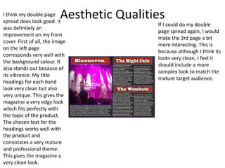
Aesthetic QualitiesI think my double page
spread does look good. It
was definitely an
improvement on my front
cover. First of all, the image
on the left page
corresponds very well with
the background colour. It
also stands out because of
its vibrance. My title
headings for each band
look very clean but also
very unique. This gives the
magazine a very edgy look
which fits perfectly with
the topic of the product.
The chosen text for the
headings works well with
the product and
connotates a very mature
and professional theme.
This gives the magazine a
very clean look.
If I could do my double
page spread again, I would
make the 3rd page a bit
more interesting. This is
because although I think its
looks very clean, I feel it
should include a more
complex look to match the
mature target audience.
Audience Appeal
• In my final product, I have appealed to my target audience by sticking to a
specific colour theme. The entirety of my magazine symbolises the theme of
indie music and gigs. It does this by including colours like grey red and purple.
This will attract my audience as grey is a dark colour therefore matching the
theme of many bands. It also attracts a more mature audience as it looks clean
and professional. As well as that, grey connotates the idea of the darkness of
gigs therefore attracting the exact audience I want to attract. Red and Purple
reflect the colour of lights and gigs meaning that the colour scheme will
attract live music fans.
• The idea that I have a large image of a band on the front of my product will
attract my target audience as they may recognise them or even if not the theme
of bands will highly attract them to the product. A large image will also always
attract any person walking past so even if they don’t like indie music and bands,
the product will still attract attention.

Pod handler evaluation

  • 1.
  • 2.
    Research • For myresearch, I collected a variety of sources and analysed them. I used Empire the film magazine, GQ the men's magazine and Match of the Day the children's football magazine. I chose these three magazines as each is very different therefore allowing me to collect an array of knowledge from different kinds of magazine. This is beneficial as it allows me to expand my ideas as the knowledge I collected from each product was very diverse therefore allowing me to create a more well rounded product. Another positive about my research is the fact that I researched 3 magazines. This allowed me to collect more knowledge than if I would have just researched a smaller amount of products. This allows me to create a better final product as I have a larger collected skill set and knowledge base. • To improve my research, I would research even more products than I did. This is because it allows me to gather even more information and the more information collected the better. This helps to create the best possible final product as I will pick up a more substantial amount of skills and techniques.
  • 3.
    Planning • My planningwas good as it included many different features. It included different mind maps, a mood board, a schedule, a style sheet and my different planned page layouts. This was good as it allowed me to view my ideas visually therefore seeing what ideas and features may work and what may not. The idea of using a mind map allows me to expand my ideas therefore creating an overall more developed product. The style sheet saves me crucial time as I can decide my colour schemes and themes before production. This means that I can spend more time on creating the product instead of thinking of colour schemes and themes whilst in the process of production. This will lead to me making the best possible product I can make. • To improve my planning, I would include even more detail. For example, what type of fonts I was going to include in my product. This would have significantly saved me time which I could have invested in improving my product even more. I would have also included more detail when designing my page layouts. This is because it would allow me to almost not think whilst in production therefore creating my product more efficiently.
  • 4.
    Time Management • Ibelieve that I have managed my time quite well. This is because I completed most of my work in time so that I could move onto the next task. The task I completed most efficiently was my proposal. This was because I feel comfortable with the tasks included in the document and I also knew the exact answers to each question as I had a clear idea of what I wanted to create at that point. If I had additional time, I would work more on my experiments. This is because I believe I could have improved them and tested out different formats and theories. This would save me more time once in my production stage and allowed me to perhaps improve my final product as I would have developed and extended my ideas more. • A factor that had an impact on my time was that I had saving issues. Because of the different versions of photoshop that college has on different types of computers, may work often saved in the incorrect file type or format.
  • 5.
    Technical Qualities On myfront cover, I included a very large Masthead. This is because it highly attracts the attention of people therefore keeping the brand in their minds. This will increase sales and popularity of the magazine. The NME magazine includes a similar feature however, this specific magazine's masthead isn't as big as mine. This may because they believe the content on the front sell the magazine enough or that the magazine is already very well known and loved by many therefore, they don’t feel the need to advertise the brand as much. On my product, my cover lines are quite small and are backgrounded by rectangles. I decided to do this as I thought that t would make the bands names stand more out off the page therefore attracting the bands fanbase to the product. However, after evaluating my product, I mush prefer the coverlines on the NME magazine. This is because each is very clean and even though they aren't outlined or backgrounded, they still stand out enough to read but keep with element of professionalism. Both products include very large images in the entre of the page. This is used to attract a specific audience as humans always recognize images more than text. The idea that it is also positioned in the centre of the page shows the significance of the image.
  • 6.
    Technical QualitiesOn mydouble page spread, I have included large headlines to title the featured bands. This is to direct the reader and to organize the product well. In comparison, in the other product, there is only one large heading. This is clearly used as the double page is only based on one or similar ideas. The text used in the other product is very large and bold which makes it easily stand out. There choice in text creates a very mature look. Whereas, the text in my created product gives a more relaxed feel but still keeping gits mature and slick theme. For the background box for my titles, I used the layer effect tool to create an outer glow and stroke for the rectangle. I decided to this to give the headlines a unique look but keep them looking clean and professional. The box also helps the text stand out even more. The colour red symbolizes the theme of gigs and indie music therefore, the boxes help portray the theme of the product. Both products include a large amount of text which is arranged into columns. This is a good technique as it breaks the text up and makes it much easier to read which is highly beneficial for the reader. It also gives the product a clean look.
  • 7.
    Aesthetic Qualities My frontcover looks okay. I think that the background image looks good as it symbolizes the theme of the product well and creates a very aesthetic feel for the magazine. I also like the masthead. This is because it looks very mature and clean whilst maintaining a very inviting look. This leads to the product attracting a large audience and also fitting the exact audience I want to attract. The triangle shapes at each end of the front cover work well. This is because it adds layers to the product and gives it a very unique look. If I could do my front cover again, I would definitely improve my cover lines. This is because I think that they look very basic and not very clean therefore not fitting the tone I wanted to create in the magazine. I would have changed the text and messed around with the colour. I would have also removed the background boxes as I don’t think they correlate with the background and theme of the magazine.
  • 8.
    Aesthetic QualitiesI thinkmy double page spread does look good. It was definitely an improvement on my front cover. First of all, the image on the left page corresponds very well with the background colour. It also stands out because of its vibrance. My title headings for each band look very clean but also very unique. This gives the magazine a very edgy look which fits perfectly with the topic of the product. The chosen text for the headings works well with the product and connotates a very mature and professional theme. This gives the magazine a very clean look. If I could do my double page spread again, I would make the 3rd page a bit more interesting. This is because although I think its looks very clean, I feel it should include a more complex look to match the mature target audience.
  • 9.
    Audience Appeal • Inmy final product, I have appealed to my target audience by sticking to a specific colour theme. The entirety of my magazine symbolises the theme of indie music and gigs. It does this by including colours like grey red and purple. This will attract my audience as grey is a dark colour therefore matching the theme of many bands. It also attracts a more mature audience as it looks clean and professional. As well as that, grey connotates the idea of the darkness of gigs therefore attracting the exact audience I want to attract. Red and Purple reflect the colour of lights and gigs meaning that the colour scheme will attract live music fans. • The idea that I have a large image of a band on the front of my product will attract my target audience as they may recognise them or even if not the theme of bands will highly attract them to the product. A large image will also always attract any person walking past so even if they don’t like indie music and bands, the product will still attract attention.

Editor's Notes

  • #3 What were the strengths of your research? How did your research help your product? What were the weaknesses of your research? What could you have done better/improve? What effect would this have had on your product?
  • #4 What were the strengths of your planning? How did your planning help your product? What were the weaknesses of your planning? What could you have done better/improve? What effect would this have had on your product?
  • #5 Did you manage your time well? Did you complete your project on time or would your products have improved with additional time? What would you have done if you had more time to produce your work?
  • #6 Compare your work to similar existing products and discuss the similarities and differences Put your final piece(s) in the centre of a page alongside an existing product Use text boxes and arrows
  • #8 Does your work look good? Was it creative? What aspects of your game’s visuals do you like? What would you improve? How would you improve it? Discuss the strengths and weaknesses Put your final piece(s) in the centre of a page and analyse them Use text boxes and arrows
  • #10 How have you appealed to your target audience? What specific bits of content would appeal to your target audience. Refer to your findings from your questionnaire. Put your final piece(s) in the centre of a page and analyse them Use text boxes and arrows