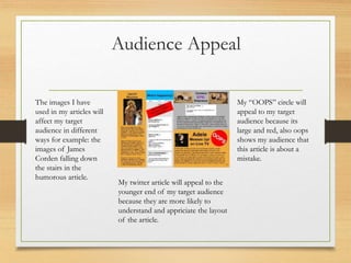
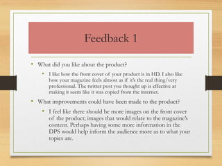
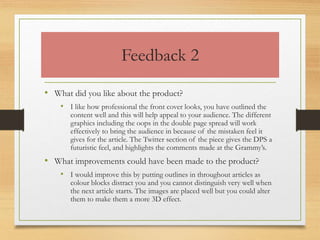
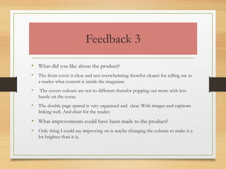
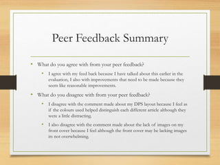
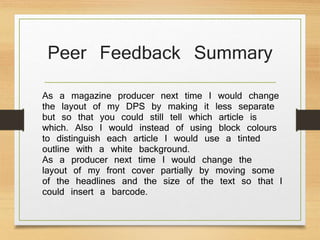
FMP Evaluation
Sydney wratten
Production Process
Evaluation
Research
• The strengths of my research is that I looked in depth at front covers
of magazines which helped me create an effective front cover. With
my research I created an eye-catching title by the way I research quite a
bit into fonts and what people find attractive.
• The weaknesses of my research was that I didn't look much into the
layout or the details/articles of a double page spread which prevented
me from making an interesting and effective double page spread. It
would have effected my product greatly by the that I would have been
educated more what would be a better layout design and what would
be underwhelming as a double page spread.
Planning
• The strengths of my planning would be that I produced strong
and effective mind maps which I fully displayed, also I worked
on my style sheet where I choose my colour schemes on the
magazine and font styles for the cover
• What effect would this have had on your product? The
weaknesses of my planning was that I didn’t plan my double
page spread properly. If I would have planned a little more on
my double page spread, it would have effected my product
greatly.
Time Management
• I managed to keep on schedule through out the
entire unit until the last 2 power points where I fell
behind. I definitely think that my project would be
improved with extra time so that could explain and
analyse my research an planning more.
• Next time I will try and complete more work at
home and try to be less distracted when it comes to
working.
Technical Qualities
My magazine cover compared to
other magazine covers I quite
similar referring too the
arrangement of the cover, having
the same sort of interesting text
which is readable and eye-
catching and by using the image
of a very famous celebrity it then
attracts all of their fans so that
they will read it.
My magazine cover also has some
differences, the colourful shapes
behind the text and some of the
text is bright and colourful to
make it stand out and eye-
catching.
The double page spread of my
magazine is similar yet different
to an existing magazine. A
similarity is that there are bold
titles and a lot of small text.
A difference of the double page
spread would be that I have a
completely different colour
background which include
more than one colour where as
in an the majority of double
page spreads have a single white
background with colourful
writing.
I compared my magazine
to this existing magazine
I used the oops to show
that this article was about
an accident, and I used red
to show to the audience
that its important.
I used this font for my
logo to make sure that it
would interest teenagers
and anyone interested in
the alternative look of the
logo, and I used white so
that it would stand out.
I used the same colour of the
cloth on the front cover as I
used as the background colour
of the related topic.
I find the colouring on the
double page spread effective
although I would change it
according to the layout of the
articles.
Next time I’ll improve the
way I layout my double
page spread and I’ll make
sure to make it look more
like an existing magazine.
I like the bubbles on the
front cover because it relates
to the articles on the double
page spread and will help
attract the audiences.
I like the space the background
which clearly shows me where I
can put my text, however I was
unable to insert a barcode due
to lack of space. Next time I
would move text around
enabling me to insert a barcode.
Audience Appeal
My logo will appeal to my audience
because it has an alternative feel,
also the word megaphone suggest
that it’s a loud magazine and my
target audience seems to prefer
loud magazines to quiet and boring
magazines. Megaphone also
symbolizes music which the
magazine focuses around.
Some of the headlines
involve popular artist
and comedians, this
will attract a variety of
fans to the magazine as
well as the regular
consumer.
My front cover image
will attract Beyoncé's
viewers as well as
Grammy viewers
because they will want to
find out what is so
important about
Beyoncé in this
magazine.
Audience Appeal
My “OOPS” circle will
appeal to my target
audience because its
large and red, also oops
shows my audience that
this article is about a
mistake.
My twitter article will appeal to the
younger end of my target audience
because they are more likely to
understand and appriciate the layout
of the article.
The images I have
used in my articles will
affect my target
audience in different
ways for example: the
images of James
Corden falling down
the stairs in the
humorous article.
Peer Feedback
Feedback 1
• What did you like about the product?
• I like how the front cover of your product is in HD. I also like
how your magazine feels almost as if it’s the real thing/very
professional. The twitter post you thought up is effective at
making it seem like it was copied from the internet.
• What improvements could have been made to the product?
• I feel like there should be more images on the front cover
of the product; images that would relate to the magazine’s
content. Perhaps having some more information in the
DPS would help inform the audience more as to what your
topics are.
Feedback 2
• What did you like about the product?
• I like how professional the front cover looks, you have outlined the
content well and this will help appeal to your audience. The different
graphics including the oops in the double page spread will work
effectively to bring the audience in because of the mistaken feel it
gives for the article. The Twitter section of the piece gives the DPS a
futuristic feel, and highlights the comments made at the Grammy’s.
• What improvements could have been made to the product?
• I would improve this by putting outlines in throughout articles as
colour blocks distract you and you cannot distinguish very well when
the next article starts. The images are placed well but you could alter
them to make them a more 3D effect.
Feedback 3
• What did you like about the product?
• The front cover is clear and not overwhelming therefor clearer for telling me as
a reader what content is inside the magazine.
• The covers colours are not to different therefor popping out more with less
hassle on the cover.
• The double page spared is very organized and clear. With images and captions
linking well. And clear for the reader.
• What improvements could have been made to the product?
• Only thing I could say improving on is maybe changing the colours to make it a
lot brighter than it is.
Peer Feedback Summary
• What do you agree with from your peer feedback?
• I agree with my feed back because I have talked about this earlier in the
evaluation, I also with improvements that need to be made because they
seem like reasonable improvements.
• What do you disagree with from your peer feedback?
• I disagree with the comment made about my DPS layout because I feel as
if the colours used helped distinguish each different article although they
were a little distracting.
• I also disagree with the comment made about the lack of images on my
front cover because I feel although the front cover may be lacking images
its not overwhelming.
Peer Feedback Summary
As a magazine producer next time I would change
the layout of my DPS by making it less separate
but so that you could still tell which article is
which. Also I would instead of using block colours
to distinguish each article I would use a tinted
outline with a white background.
As a producer next time I would change the
layout of my front cover partially by moving some
of the headlines and the size of the text so that I
could insert a barcode.

7. evaluation unit 5

  • 1.
  • 2.
  • 3.
    Research • The strengthsof my research is that I looked in depth at front covers of magazines which helped me create an effective front cover. With my research I created an eye-catching title by the way I research quite a bit into fonts and what people find attractive. • The weaknesses of my research was that I didn't look much into the layout or the details/articles of a double page spread which prevented me from making an interesting and effective double page spread. It would have effected my product greatly by the that I would have been educated more what would be a better layout design and what would be underwhelming as a double page spread.
  • 4.
    Planning • The strengthsof my planning would be that I produced strong and effective mind maps which I fully displayed, also I worked on my style sheet where I choose my colour schemes on the magazine and font styles for the cover • What effect would this have had on your product? The weaknesses of my planning was that I didn’t plan my double page spread properly. If I would have planned a little more on my double page spread, it would have effected my product greatly.
  • 5.
    Time Management • Imanaged to keep on schedule through out the entire unit until the last 2 power points where I fell behind. I definitely think that my project would be improved with extra time so that could explain and analyse my research an planning more. • Next time I will try and complete more work at home and try to be less distracted when it comes to working.
  • 6.
    Technical Qualities My magazinecover compared to other magazine covers I quite similar referring too the arrangement of the cover, having the same sort of interesting text which is readable and eye- catching and by using the image of a very famous celebrity it then attracts all of their fans so that they will read it. My magazine cover also has some differences, the colourful shapes behind the text and some of the text is bright and colourful to make it stand out and eye- catching. The double page spread of my magazine is similar yet different to an existing magazine. A similarity is that there are bold titles and a lot of small text. A difference of the double page spread would be that I have a completely different colour background which include more than one colour where as in an the majority of double page spreads have a single white background with colourful writing. I compared my magazine to this existing magazine
  • 7.
    I used theoops to show that this article was about an accident, and I used red to show to the audience that its important. I used this font for my logo to make sure that it would interest teenagers and anyone interested in the alternative look of the logo, and I used white so that it would stand out. I used the same colour of the cloth on the front cover as I used as the background colour of the related topic. I find the colouring on the double page spread effective although I would change it according to the layout of the articles. Next time I’ll improve the way I layout my double page spread and I’ll make sure to make it look more like an existing magazine. I like the bubbles on the front cover because it relates to the articles on the double page spread and will help attract the audiences. I like the space the background which clearly shows me where I can put my text, however I was unable to insert a barcode due to lack of space. Next time I would move text around enabling me to insert a barcode.
  • 8.
    Audience Appeal My logowill appeal to my audience because it has an alternative feel, also the word megaphone suggest that it’s a loud magazine and my target audience seems to prefer loud magazines to quiet and boring magazines. Megaphone also symbolizes music which the magazine focuses around. Some of the headlines involve popular artist and comedians, this will attract a variety of fans to the magazine as well as the regular consumer. My front cover image will attract Beyoncé's viewers as well as Grammy viewers because they will want to find out what is so important about Beyoncé in this magazine.
  • 9.
    Audience Appeal My “OOPS”circle will appeal to my target audience because its large and red, also oops shows my audience that this article is about a mistake. My twitter article will appeal to the younger end of my target audience because they are more likely to understand and appriciate the layout of the article. The images I have used in my articles will affect my target audience in different ways for example: the images of James Corden falling down the stairs in the humorous article.
  • 10.
  • 11.
    Feedback 1 • Whatdid you like about the product? • I like how the front cover of your product is in HD. I also like how your magazine feels almost as if it’s the real thing/very professional. The twitter post you thought up is effective at making it seem like it was copied from the internet. • What improvements could have been made to the product? • I feel like there should be more images on the front cover of the product; images that would relate to the magazine’s content. Perhaps having some more information in the DPS would help inform the audience more as to what your topics are.
  • 12.
    Feedback 2 • Whatdid you like about the product? • I like how professional the front cover looks, you have outlined the content well and this will help appeal to your audience. The different graphics including the oops in the double page spread will work effectively to bring the audience in because of the mistaken feel it gives for the article. The Twitter section of the piece gives the DPS a futuristic feel, and highlights the comments made at the Grammy’s. • What improvements could have been made to the product? • I would improve this by putting outlines in throughout articles as colour blocks distract you and you cannot distinguish very well when the next article starts. The images are placed well but you could alter them to make them a more 3D effect.
  • 13.
    Feedback 3 • Whatdid you like about the product? • The front cover is clear and not overwhelming therefor clearer for telling me as a reader what content is inside the magazine. • The covers colours are not to different therefor popping out more with less hassle on the cover. • The double page spared is very organized and clear. With images and captions linking well. And clear for the reader. • What improvements could have been made to the product? • Only thing I could say improving on is maybe changing the colours to make it a lot brighter than it is.
  • 14.
    Peer Feedback Summary •What do you agree with from your peer feedback? • I agree with my feed back because I have talked about this earlier in the evaluation, I also with improvements that need to be made because they seem like reasonable improvements. • What do you disagree with from your peer feedback? • I disagree with the comment made about my DPS layout because I feel as if the colours used helped distinguish each different article although they were a little distracting. • I also disagree with the comment made about the lack of images on my front cover because I feel although the front cover may be lacking images its not overwhelming.
  • 15.
    Peer Feedback Summary Asa magazine producer next time I would change the layout of my DPS by making it less separate but so that you could still tell which article is which. Also I would instead of using block colours to distinguish each article I would use a tinted outline with a white background. As a producer next time I would change the layout of my front cover partially by moving some of the headlines and the size of the text so that I could insert a barcode.

Editor's Notes

  • #4 What were the strengths of your research? How did your research help your product? What were the weaknesses of your research? What could you have done better/improve? What effect would this have had on your product?
  • #5 What were the strengths of your planning? How did your planning help your product? What were the weaknesses of your planning? What could you have done better/improve? What effect would this have had on your product?
  • #6 Did you manage your time well? Did you complete your project on time or would your products have improved with additional time? What would you have done if you had more time to produce your work?
  • #7 Compare your work to similar existing products and discuss the similarities and differences Put your final piece(s) in the centre of a page alongside an existing product Use text boxes and arrows
  • #8 Does your work look good? Was it creative? What aspects of your magazines visuals do you like? What would you improve? How would you improve it? Discuss the strengths and weaknesses Put your final piece(s) in the centre of a page and analyse them Use text boxes and arrows
  • #9 How have you appealed to your target audience? What specific bits of content would appeal to your target audience. Refer to your findings from your questionnaire. Put your final piece(s) in the centre of a page and analyse them Use text boxes and arrows
  • #10 How have you appealed to your target audience? What specific bits of content would appeal to your target audience. Refer to your findings from your questionnaire. Put your final piece(s) in the centre of a page and analyse them Use text boxes and arrows
  • #16 What changes would you make to your product based upon your peer feedback and why?