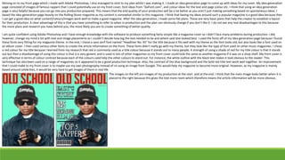
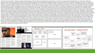
Evaluation
To begin my production, I had to first research existing magazines. I did this by researching 3 different magazines. I had to look at each magazines front cover, a double page spread from this magazine and the
magazine’s website. An advantage of doing something like this is that, as a producer, you are able to see if your magazine is of industry quality. For example, if you have a front cover that has an image and a title,
you could think back to your research and look what big companies are doing to create their magazines. I did actually look back to my research during all 3 stages of production because it helped me to envision
what my final products should look like whether it was looking at the colours, images or text.
My final products are similar to the plans I made with a few differences. For example, I changed the menu on my website. I did this because I would have had too much information to put on and would have run
out of production time. I also changed the contents within the pages from the menu. For example, I was going to have concert information and album releases but I thought of other ideas such as a page of artists
where the artists name is linked to that artists Wikipedia page. For my website, I used the same fonts as my front cover. This continuing theme of fonts will help the reader to associate the website and magazine.
This is effective because people will recognize the brand. Whilst making my website I didn’t really encounter any problems as Wix is very easy to use. By this, I mean the website has many options for the user to
choose from and it even has templates where you can just replace images and text with you own content. The only minor problem was getting the link to work so that other people can view my site. My site is
effective because it delivers the information clearly and it is easy to read/user friendly. For example, if you wanted to read up about something, you would only have to click one tab on the menu instead of going
through loads of links. The only major downside to my website is the lack of content which I will aim to improve.. A possible improvement to my website could be more content within the existing menu options or
perhaps a wider range of fonts. I have managed to include my own photography within my website. I added my own photography to meet criteria and so that at least one of my products would be original.
Obviously not all of the images on the website are my own photography. Comparing my website to my initial plans and research, I feel as if I have managed to turn my flat plans into a product. I normally change
my plans but as I based my plans on a popular magazine, I saw no need for change.
Below are images of the rolling stone magazine front cover, website and double page spread. On the right of these images is my website. I tried to make my website as similar to the Rolling Stone website as
possible because I know that this magazine sells well so the design must be very appealing to a lot of people.
Moving on to my front page which I made with Adobe Photoshop, I also managed to stick to my plan whilst I was making it. I made an idea generation page to come up with ideas for my cover. My idea generation
page consisted of images of famous rappers that I could potentially use on my front cover, font ideas from “DaFont.com”, and colour ideas for the text and page colour etc. I think that using an idea generation
page is very helpful because you can go into you production prepared. This means that the end quality of your production will be a lot better as you aren’t just making something based on spontaneous ideas. I
based the idea generation page heavily on the Rolling Stone magazine as my content is somewhat similar to this magazine. I think that basing my ideas around such a popular magazine is a good idea because then
I can get a good idea on what content/colours/images work well to make a good magazine. After the idea generation, I made some flat plans. These are very basic plans that help the creator to establish a layout
for their production. A clear advantage of this is that you have something to refer to when in production and the plan can obviously change if you don’t like it. I do not see any real disadvantages to this because
the more plans and research you have behind you, the more likely you are to create something of better quality.
I am quite confident using Adobe Photoshop and I have enough knowledge with the software to produce something fairly simple like a magazine cover so I didn’t face many problems during production. I did,
however, change my mind a lot with text and image placements as I couldn’t decide how big the text needed to be and where said text looked best. I used the fonts off of my idea generation page because I found
these fonts very fitting for my magazine theme. In the end, I chose a sans serif font named “Headliner No. 45” for the title because it fits well with my theme as the font looks old, but also looks like a font used on
an album cover. I then used various other fonts to create the article information on the front. These fonts didn’t really go with my theme, but they look like the type of font used on other music magazines. I chose
a red colour for my title because I learned from my research that red is commonly used as a title colour because it stands out to many people. A strength of using a shade of red for my title colour is that it stands
out but then a disadvantage of using this colour is that it is very generic and is used in lots of other magazines so my front cover could look the same as another magazine if it was on a shop shelf. My front cover is
very effective in terms of colour contrast because each of the colours used help the other colours to stand out. For instance, the white outline with the black text makes it look obvious to the reader. This
technique has also been used on a range of magazines so it appeared to be a good production technique. Also, the contrast of the blue background and the bold red title text work well together. An improvement
that I could make to my front cover is to maybe use my own photography instead of re-using an image from Google. This would help my magazine to become more original. However, as my magazine is mainly
based around celebrities, it would be very hard to get images of them in real life.
The images on the left are images of my production at the start and at the end. I think that the main image looks better when it is
placed to the right because this gives the text more room which therefore means the article information will be more obvious.
The final part of my production I will be analyzing is my double page spread. This was by far the trickiest part of production as I had never encountered Adobe InDesign before so I had to learn a whole new
program in order to produce something. I started this off by creating a 2 page document and adding some guidelines through the “Layout” tab. After this, I selected the “Rectangle Frame Tool”. This allows me to
plan where I can put my images and when this box has been placed in the right place, I can “File + Place” an image into this box. A strength of this is that the producer can plan perfectly where they can place the
image, but a big and very obvious weak point in this is time efficiency. The user has to go through many steps to place an image within a document. However, as I am new to this program then there will probably
be other ways that an image can be placed into a document. Having said this, I will try to learn the program more in order to become more efficient at production. After I had placed all my images (or planned
where they were going to go), I could begin to build up my text around the chosen images. I wrote up the copy before hand so that I could accelerate production for a program that I was still getting used to. I
chose a very simple sans font as I believe that it would make the copy easier to read. A strong point for using a simple sans font is that the page will look organised and formal. Contrary to this, I have a fairly young
target audience so something too formal would be boring and plain. This is why I spent time looking for good heading and title fonts as this would definitely catch the readers eye. Following this, I began to add
aesthetics to the page such as page numbers and a black bar at the bottom of the page so that it would make the red numbers stand out and so that the page wasn’t just all white. Looking back at this production,
I feel as if I have succeeded fairly well considering the program was brand new. As I had previously never used a program like this, I think that I managed to understand the basics fairly well and produce something
of decent quality. Something that I believe I have done well on within my double page spread is the balance of text and images. I think that only having 1 large image on each page would mean that the readers
would lose interest. I also think that the layout looks good. One thing I haven’t done so well or one thing that I would definitely improve would be the content in the top right corner. I feel this needs to be either
changed or made to look more aesthetically pleasing because it looks as if it doesn’t fit. On the other hand, I would rather have this here than have a blank space. The final image below is quite a lot different to
my flat plan I created. This is mainly due to my article size. For instance, my articles had to have at least 700 words in so they would not have fit on half a page. This is why I had to make my “Top 5” smaller and
include less images for it. My double page spread did actually end up following my idea generation. I had the big letter to start off an article and I also kept the article ideas the same. I think that sticking to my
plans as much as possible helped me a lot because I wasn’t just making stuff up on the spot which therefore means my quality of work could potentially be a lot better than if I didn’t follow any plans. I have not
included any of my own photography in my double page spread because my articles were based on celebrities and it would be impossible to get a picture with either one of them. Overall, I think that my double
page spread is of good quality considering the circumstances.

Evaluation for print

  • 1.
  • 2.
    To begin myproduction, I had to first research existing magazines. I did this by researching 3 different magazines. I had to look at each magazines front cover, a double page spread from this magazine and the magazine’s website. An advantage of doing something like this is that, as a producer, you are able to see if your magazine is of industry quality. For example, if you have a front cover that has an image and a title, you could think back to your research and look what big companies are doing to create their magazines. I did actually look back to my research during all 3 stages of production because it helped me to envision what my final products should look like whether it was looking at the colours, images or text. My final products are similar to the plans I made with a few differences. For example, I changed the menu on my website. I did this because I would have had too much information to put on and would have run out of production time. I also changed the contents within the pages from the menu. For example, I was going to have concert information and album releases but I thought of other ideas such as a page of artists where the artists name is linked to that artists Wikipedia page. For my website, I used the same fonts as my front cover. This continuing theme of fonts will help the reader to associate the website and magazine. This is effective because people will recognize the brand. Whilst making my website I didn’t really encounter any problems as Wix is very easy to use. By this, I mean the website has many options for the user to choose from and it even has templates where you can just replace images and text with you own content. The only minor problem was getting the link to work so that other people can view my site. My site is effective because it delivers the information clearly and it is easy to read/user friendly. For example, if you wanted to read up about something, you would only have to click one tab on the menu instead of going through loads of links. The only major downside to my website is the lack of content which I will aim to improve.. A possible improvement to my website could be more content within the existing menu options or perhaps a wider range of fonts. I have managed to include my own photography within my website. I added my own photography to meet criteria and so that at least one of my products would be original. Obviously not all of the images on the website are my own photography. Comparing my website to my initial plans and research, I feel as if I have managed to turn my flat plans into a product. I normally change my plans but as I based my plans on a popular magazine, I saw no need for change. Below are images of the rolling stone magazine front cover, website and double page spread. On the right of these images is my website. I tried to make my website as similar to the Rolling Stone website as possible because I know that this magazine sells well so the design must be very appealing to a lot of people.
  • 3.
    Moving on tomy front page which I made with Adobe Photoshop, I also managed to stick to my plan whilst I was making it. I made an idea generation page to come up with ideas for my cover. My idea generation page consisted of images of famous rappers that I could potentially use on my front cover, font ideas from “DaFont.com”, and colour ideas for the text and page colour etc. I think that using an idea generation page is very helpful because you can go into you production prepared. This means that the end quality of your production will be a lot better as you aren’t just making something based on spontaneous ideas. I based the idea generation page heavily on the Rolling Stone magazine as my content is somewhat similar to this magazine. I think that basing my ideas around such a popular magazine is a good idea because then I can get a good idea on what content/colours/images work well to make a good magazine. After the idea generation, I made some flat plans. These are very basic plans that help the creator to establish a layout for their production. A clear advantage of this is that you have something to refer to when in production and the plan can obviously change if you don’t like it. I do not see any real disadvantages to this because the more plans and research you have behind you, the more likely you are to create something of better quality. I am quite confident using Adobe Photoshop and I have enough knowledge with the software to produce something fairly simple like a magazine cover so I didn’t face many problems during production. I did, however, change my mind a lot with text and image placements as I couldn’t decide how big the text needed to be and where said text looked best. I used the fonts off of my idea generation page because I found these fonts very fitting for my magazine theme. In the end, I chose a sans serif font named “Headliner No. 45” for the title because it fits well with my theme as the font looks old, but also looks like a font used on an album cover. I then used various other fonts to create the article information on the front. These fonts didn’t really go with my theme, but they look like the type of font used on other music magazines. I chose a red colour for my title because I learned from my research that red is commonly used as a title colour because it stands out to many people. A strength of using a shade of red for my title colour is that it stands out but then a disadvantage of using this colour is that it is very generic and is used in lots of other magazines so my front cover could look the same as another magazine if it was on a shop shelf. My front cover is very effective in terms of colour contrast because each of the colours used help the other colours to stand out. For instance, the white outline with the black text makes it look obvious to the reader. This technique has also been used on a range of magazines so it appeared to be a good production technique. Also, the contrast of the blue background and the bold red title text work well together. An improvement that I could make to my front cover is to maybe use my own photography instead of re-using an image from Google. This would help my magazine to become more original. However, as my magazine is mainly based around celebrities, it would be very hard to get images of them in real life. The images on the left are images of my production at the start and at the end. I think that the main image looks better when it is placed to the right because this gives the text more room which therefore means the article information will be more obvious.
  • 4.
    The final partof my production I will be analyzing is my double page spread. This was by far the trickiest part of production as I had never encountered Adobe InDesign before so I had to learn a whole new program in order to produce something. I started this off by creating a 2 page document and adding some guidelines through the “Layout” tab. After this, I selected the “Rectangle Frame Tool”. This allows me to plan where I can put my images and when this box has been placed in the right place, I can “File + Place” an image into this box. A strength of this is that the producer can plan perfectly where they can place the image, but a big and very obvious weak point in this is time efficiency. The user has to go through many steps to place an image within a document. However, as I am new to this program then there will probably be other ways that an image can be placed into a document. Having said this, I will try to learn the program more in order to become more efficient at production. After I had placed all my images (or planned where they were going to go), I could begin to build up my text around the chosen images. I wrote up the copy before hand so that I could accelerate production for a program that I was still getting used to. I chose a very simple sans font as I believe that it would make the copy easier to read. A strong point for using a simple sans font is that the page will look organised and formal. Contrary to this, I have a fairly young target audience so something too formal would be boring and plain. This is why I spent time looking for good heading and title fonts as this would definitely catch the readers eye. Following this, I began to add aesthetics to the page such as page numbers and a black bar at the bottom of the page so that it would make the red numbers stand out and so that the page wasn’t just all white. Looking back at this production, I feel as if I have succeeded fairly well considering the program was brand new. As I had previously never used a program like this, I think that I managed to understand the basics fairly well and produce something of decent quality. Something that I believe I have done well on within my double page spread is the balance of text and images. I think that only having 1 large image on each page would mean that the readers would lose interest. I also think that the layout looks good. One thing I haven’t done so well or one thing that I would definitely improve would be the content in the top right corner. I feel this needs to be either changed or made to look more aesthetically pleasing because it looks as if it doesn’t fit. On the other hand, I would rather have this here than have a blank space. The final image below is quite a lot different to my flat plan I created. This is mainly due to my article size. For instance, my articles had to have at least 700 words in so they would not have fit on half a page. This is why I had to make my “Top 5” smaller and include less images for it. My double page spread did actually end up following my idea generation. I had the big letter to start off an article and I also kept the article ideas the same. I think that sticking to my plans as much as possible helped me a lot because I wasn’t just making stuff up on the spot which therefore means my quality of work could potentially be a lot better than if I didn’t follow any plans. I have not included any of my own photography in my double page spread because my articles were based on celebrities and it would be impossible to get a picture with either one of them. Overall, I think that my double page spread is of good quality considering the circumstances.