Ryan Tarran
 According to my questionnaire results and my research into existing rap
magazines, there are certain conventions that the magazine must reinforce
and conform with to be successful with the target audience. For example,
one of these conventions was a recurring colour scheme, I’ll go into detail
about this in a future slide, but I kept to a particular theme and set of
colours that my target audience had selected when I initially asked for it in
my questionnaire.
 Due to my target audience being predominantly male and young-aged they
would be looking for a magazine that has not just Rap but style, fashion and
when they purchased it felt a particular value. I have tried to create an
intangible value for my magazine that when the audience reads it makes
them feel significant, exclusive and more ‘upper-class’. This is because of
how I have represented the ideology's of the magazine and the design has
given it a desirable intangible value.
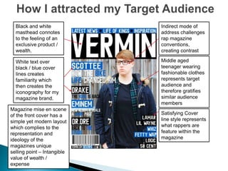
Black and white
masthead connotes
to the feeling of an
exclusive product /
wealth.
White text over
black / blue cover
lines creates
familiarity which
then creates the
iconography for my
magazine brand.
Indirect mode of
address challenges
rap magazine
conventions,
creating contrast
Middle aged
teenager wearing
fashionable clothes
represents target
audience and
therefore gratifies
similar audience
members
Satisfying Cover
line style represents
what rappers are
feature within the
magazine
Magazine mise en scene
of the front cover has a
simple yet modern layout
which complies to the
representation and
ideology of the
magazines unique
selling point – Intangible
value of wealth /
expense
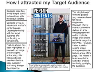
Contents page has
a very simple layout
but continues with
the colour scheme
Contents layout is
intertextual to Vibe’s
contents page.
Creating familiarity
with the target
audience and
conforming to
conventions.
Feature articles has
been highlighted in
blue with an image
previewing the
article story, this
helps audience
members find the
page quicker if
that’s why they got
the magazine
The ‘single image’
contents page is
very unconventional
for music
magazines.
However, I have
intertextualised the
style of an artist
being represented
as the contents
image of an article
within the magazine
from Vibe. However,
I have added a
second image
which previews the
feature article of the
page. This means it
is not exactly the
same but creates
familiarity, gratifying
the audience.The artist being represented is wearing modern yet
mature fashionable clothing, gratifying the more mature
target audience members.
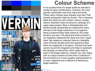
In my questionnaire my target audience selected a
variety of colour combinations. However, the most
popular combination was blue, black and white.
These colour choices were actually ones that I had
already anticipated might be chosen. This is because
black and white are very modern colours, usually
used to represent class and gives an ideology of a
upper-class product. Blue is stereotypically and
predominantly represented as a Masculine colour
and due to the target audience of my magazine
being a predominantly male audience, this made
sense to use blue. The black and white contrast in
my magazine represents the class and more ‘upper
class’ rap magazine, making it have an intangible
value of being valuable and more expensive than
other rap magazines in its genre. The blue has been
used to accent the magazine and helps to represent
the ideology of masculinity, which really helps to
draw in the target audience. Overall I am very happy
with my colour scheme and feel that it conforms to
the conventions of a more wealthy representation of
a music magazine and is effective at attracting a
target audience.
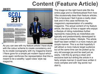
As you can see with my feature article I have stuck
with the colour scheme to create consistency and
try to create iconography with my magazine brand.
I Have gone for a simple yet modern layout which
once again reinforces the representation that this is
meant to be a wealthy ‘upper-class’ style rap
magazine.
The image on the right hand side fills the
entire page and is intertextualised from how
Vibe occasionally does their feature articles.
This is because I feel it gives a really clean
look and in this case reinforces my
magazine’s representation of a wealthy
magazine. The actual content of my feature
article, the story of how a rapper who enjoys
a lifestyle of riding motorbikes further
represents masculinity as motorbikes are
typically and predominantly stereotyped to
be a masculine hobby / lifestyle. The article
itself has been written in a more mature yet
simple manner. This is so that hopefully it
will attract a more mature target audience
but at the same time can be picked up by
any old average joe and be read just as
easily. I did this by giving a clean and
exclusive look but writing the article in a
fairly simple manner (I could have written it
more complex and with ‘big words’ but
didn’t).
 The unique selling point of my magazine is it’s intangible value. Rap
magazines are stereotypically ‘grimy’ and represented in a ‘gangster’
ideology. For my magazine I challeneged these conventions and
decided to make my magazine modern, have a good colour scheme that
represented masculinity and wealth and therefore it makes it desirable.
According to the uses and gratification theory when a member of the
audience uses a product that has a significant intangible value they will
feel better and more gratified than using a product that has no
representation of being an expensive product. A good example of this is
with Apple’s iPhone, the majority of the money is being spent on the
brand and it gratifies its audience due to the representation of its
intangible value and expensive / exclusive feeling the product connotes.
I am hoping this will be similar to my unique selling point, as there is a
gap in the Rap magazine industry for a product that is yet to challenge
these conventions and represent their magazine in this particular
fashion, which I hope my magazine will represent for it’s target audience.

Evaluation j – addressing an audience

  • 1.
  • 2.
     According tomy questionnaire results and my research into existing rap magazines, there are certain conventions that the magazine must reinforce and conform with to be successful with the target audience. For example, one of these conventions was a recurring colour scheme, I’ll go into detail about this in a future slide, but I kept to a particular theme and set of colours that my target audience had selected when I initially asked for it in my questionnaire.  Due to my target audience being predominantly male and young-aged they would be looking for a magazine that has not just Rap but style, fashion and when they purchased it felt a particular value. I have tried to create an intangible value for my magazine that when the audience reads it makes them feel significant, exclusive and more ‘upper-class’. This is because of how I have represented the ideology's of the magazine and the design has given it a desirable intangible value.
  • 3.
    Black and white mastheadconnotes to the feeling of an exclusive product / wealth. White text over black / blue cover lines creates familiarity which then creates the iconography for my magazine brand. Indirect mode of address challenges rap magazine conventions, creating contrast Middle aged teenager wearing fashionable clothes represents target audience and therefore gratifies similar audience members Satisfying Cover line style represents what rappers are feature within the magazine Magazine mise en scene of the front cover has a simple yet modern layout which complies to the representation and ideology of the magazines unique selling point – Intangible value of wealth / expense
  • 4.
    Contents page has avery simple layout but continues with the colour scheme Contents layout is intertextual to Vibe’s contents page. Creating familiarity with the target audience and conforming to conventions. Feature articles has been highlighted in blue with an image previewing the article story, this helps audience members find the page quicker if that’s why they got the magazine The ‘single image’ contents page is very unconventional for music magazines. However, I have intertextualised the style of an artist being represented as the contents image of an article within the magazine from Vibe. However, I have added a second image which previews the feature article of the page. This means it is not exactly the same but creates familiarity, gratifying the audience.The artist being represented is wearing modern yet mature fashionable clothing, gratifying the more mature target audience members.
  • 5.
    In my questionnairemy target audience selected a variety of colour combinations. However, the most popular combination was blue, black and white. These colour choices were actually ones that I had already anticipated might be chosen. This is because black and white are very modern colours, usually used to represent class and gives an ideology of a upper-class product. Blue is stereotypically and predominantly represented as a Masculine colour and due to the target audience of my magazine being a predominantly male audience, this made sense to use blue. The black and white contrast in my magazine represents the class and more ‘upper class’ rap magazine, making it have an intangible value of being valuable and more expensive than other rap magazines in its genre. The blue has been used to accent the magazine and helps to represent the ideology of masculinity, which really helps to draw in the target audience. Overall I am very happy with my colour scheme and feel that it conforms to the conventions of a more wealthy representation of a music magazine and is effective at attracting a target audience.
  • 6.
    As you cansee with my feature article I have stuck with the colour scheme to create consistency and try to create iconography with my magazine brand. I Have gone for a simple yet modern layout which once again reinforces the representation that this is meant to be a wealthy ‘upper-class’ style rap magazine. The image on the right hand side fills the entire page and is intertextualised from how Vibe occasionally does their feature articles. This is because I feel it gives a really clean look and in this case reinforces my magazine’s representation of a wealthy magazine. The actual content of my feature article, the story of how a rapper who enjoys a lifestyle of riding motorbikes further represents masculinity as motorbikes are typically and predominantly stereotyped to be a masculine hobby / lifestyle. The article itself has been written in a more mature yet simple manner. This is so that hopefully it will attract a more mature target audience but at the same time can be picked up by any old average joe and be read just as easily. I did this by giving a clean and exclusive look but writing the article in a fairly simple manner (I could have written it more complex and with ‘big words’ but didn’t).
  • 7.
     The uniqueselling point of my magazine is it’s intangible value. Rap magazines are stereotypically ‘grimy’ and represented in a ‘gangster’ ideology. For my magazine I challeneged these conventions and decided to make my magazine modern, have a good colour scheme that represented masculinity and wealth and therefore it makes it desirable. According to the uses and gratification theory when a member of the audience uses a product that has a significant intangible value they will feel better and more gratified than using a product that has no representation of being an expensive product. A good example of this is with Apple’s iPhone, the majority of the money is being spent on the brand and it gratifies its audience due to the representation of its intangible value and expensive / exclusive feeling the product connotes. I am hoping this will be similar to my unique selling point, as there is a gap in the Rap magazine industry for a product that is yet to challenge these conventions and represent their magazine in this particular fashion, which I hope my magazine will represent for it’s target audience.