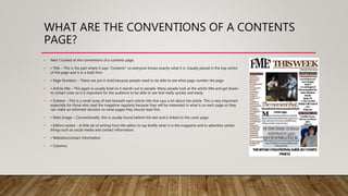
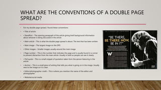
Incoming and Outgoing Shipments in 1 STEP Using Odoo 17
Question 1
1. IN WHAT WAYS DOES YOUR MEDIA
PRODUCT USE, DEVELOP OR CHALLENGE
FORMS AND CONVENTIONS OF REAL
MEDIA PRODUCTS?
2. WHAT ARE THE CONVENTIONS OF A FRONT
COVER?
• I did extensive research into the codes and conventions of music magazines. I mostly looked at folk magazines but I did look across a
variety of genres to see what is specific to my genre as well as conventions that appear to spread out across all magazines. I looked at
magazines such as fRoots and Raygun. These are some of the things that are conventional of folk magazines Cover page:
• • Main image – The largest image on the page and usually only one on the front cover. This image will most of the time be the person or
group that the main article/exclusive is about.
• • Masthead – The biggest typography on the page which should be well known or easy to remember. With Folk this is usually Sans Serif to
make it not look too formal and usually has some sort of link with either the music or nature.
• • Cover lines – These say what is in the magazine and usually states the most interesting articles
• • Date Line, Pricing and Issue number – These are usually quite small found in the corners
• • Banner – This is usually including an exclusive about the main article and can be found going across the page
• • Website – Used to try and gain popularity with people and also to try and get people more interested and see it as less “Lame”
• • Anchor – This is used to give some context to the main image and can actually give hidden meanings or clues to what is in the article.
Usually found just below the image to show the clear link.
• • Right Side Third – This is used because it allows a good amount of text without taking away from the image. This means more people
have the image as the focus which is what is conventional.
• • Barcode – This is put in the bottom corners because this way it is easy to get to for the shop keeper who is selling the magazine and
also doesn’t take away from the main image which usually has a lot of colour and is vibrant which draws people in.
3. WHAT DID THIS TEACH ME?
• This has taught me that the main image is actually the most important thing on
the front cover because everything is placed and styled around this image. The
fact that it is the first thing that the audience see shows its importance. Another
thing that is important when constructing a magazine is that it is important to
make sure nothing distracts from this image. Therefore, everything that could
possibly take away from the image such as the barcode needs to be put
somewhere where people would usually hold the magazine so won’t notice it as
much. Finally, this taught me that the size of text is really important because when
the magazine is in shops, it may not be fully visible so the text that is there has to
be big and bold to draw in the reader. I aimed to conform this stereotypical
magazine style in layout but wanted to challenge with the image. I wanted my
magazine to appeal to a young audience so used informal text and the main
image is of three young boys. I believe I achieved this because the main
conventions are all there and from feedback from my target audience, they seem
to really like the magazine front cover. The one thing they would want improving
is that the text in the Right hand third could have been a bit bigger but that is one
minor improvement. Overall I am very happy with this Front cover.
4. WHAT ARE THE CONVENTIONS OF A CONTENTS
PAGE?
• Next I looked at the conventions of a contents page:
• • Title – This is the part where it says “Contents” so everyone knows exactly what it is. Usually placed in the top centre
of the page and is in a bold font.
• • Page Numbers – These are put in bold because people need to be able to see what page number the page
• • Article title – This again is usually bold so it stands out to people. Many people look at the article title and get drawn
to certain ones so it is important for the audience to be able to see that really quickly and easily.
• • Subtext – This is a small lump of text beneath each article title that says a bit about the article. This is very important
especially for those who read the magazine regularly because they will be interested in what is on each page so they
can make an informed decision on what pages they should read first.
• • Main Image – Conventionally, this is usually found behind the text and is linked to the cover page.
• • Editors review – A little bit of writing from the editor to say briefly what is in the magazine and to advertise certain
things such as social media and contact information.
• • Websites/contact information
• • Columns
5. WHAT DID THIS TEACH ME?
• This taught me that there are certain things that are more
important than the others in a contents page. The page
numbers and article titles have to be bigger than the subtext
because of the way readers want to find their favourite
pages. I wanted to conform mostly with this genre of
magazine because I believe my audience want to see the
main conventions come through but in a way that appeals
to the younger audience. I think I did this well through my
informality of writing and kept the conventions the same. I
think I could have improved by doing more articles which
would then enable me to use columns which are very
conventional.
6. WHAT ARE THE CONVENTIONS OF A DOUBLE PAGE
SPREAD?
• For my double page spread, I found these conventions:
• • Title of article
• • Standfirst – The opening paragraph of the article giving brief background information
about whoever is being discussed in the article
• • Main article – This is what the double page spread is about. The text that has been written
• • Main image – The largest image on the DPS
• • Other images – Smaller images usually around the main image
• • Page number – This is the number that indicates the page and is usually found in a corner
to prevent distraction from the main article. Usually in bold so people can see it clearly.
• • Pull quote – This is a small snippet of quotation taken form the person featuring in the
article.
• • Anchor – This is a small piece of writing that tells you what is going on in the image. Usually
next to the image so it is clear.
• • Editor/photographer credit – This is where you mention the name of the editor and
photographer.
• • Website/social media
7. WHAT DID THIS TEACH ME?
• This taught me that in my magazine, I have to have a realistic
article which has the standfirst, main chunk of article,
editor/photographer credits and all these other things. I tried
to stick to these conventions because I want the audience to
see something professional as well as something informative
and interesting to read. I believe I achieved this because I
used all the conventions of a double page spread without
lacking in the informality of the text which will appeal to a
wide range of people. Also, the layout of using the right hand
side for the text and the rest for the image worked really well.
This is conventional as it is linked with the R2 magazine
double page spread I analysed about the female singer. To
improve this page, I would possibly have changed the line
and character spacing of the article because it seems almost
too close together.
8. WAS MY MAGAZINE CONVENTIONAL?
• Overall, I would say my magazine was very conventional as it has all the same
codes as the folk magazines I have looked at (fRoots, Raygun, FME). I believe that
my Front Cover and Double Page Spread are more conventional than my
contents page as they have more conventions that are obvious and stand out. I
tried to keep my contents page as conventional with having the left side third and
using one main image.