The document discusses the ways in which the author's media product uses and challenges conventions of real music magazines. Specifically:
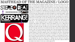
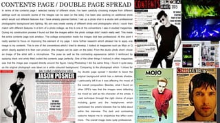
- The logo "Stereo Beat" was designed to be memorable while challenging conventions of typically one-word magazine titles. Design elements were inspired by magazines like Kerrang and Q.
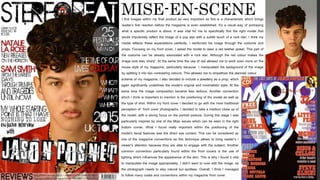
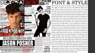
- Images on the cover and contents page were selected and styled to represent the target genres of alternative and pop music while following conventions like close-up portraits and eye contact.
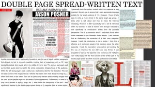
- Typography was chosen to be readable while reinforcing the vintage style, with techniques like colored text blocks used for emphasis.
- Layout of elements generally followed conventions seen in magazines like Kerrang and Q but the author
OCR – Level 3 Cambridge Introductory Diploma in Media
Unit 13: Planning and Pitching a Print based Media Product.
LO3: Be able to develop ideas by creating proposals and sample materials for two original print-based products.
Emily Thompson 6107
OCR – Level 3 Cambridge Introductory Diploma in Media
Unit 13: Planning and Pitching a Print based Media Product.
LO3: Be able to develop ideas by creating proposals and sample materials for two original print-based products.
Emily Thompson 6107
The Roman Empire A Historical Colossus.pdfkaushalkr1407
The Roman Empire, a vast and enduring power, stands as one of history's most remarkable civilizations, leaving an indelible imprint on the world. It emerged from the Roman Republic, transitioning into an imperial powerhouse under the leadership of Augustus Caesar in 27 BCE. This transformation marked the beginning of an era defined by unprecedented territorial expansion, architectural marvels, and profound cultural influence.
The empire's roots lie in the city of Rome, founded, according to legend, by Romulus in 753 BCE. Over centuries, Rome evolved from a small settlement to a formidable republic, characterized by a complex political system with elected officials and checks on power. However, internal strife, class conflicts, and military ambitions paved the way for the end of the Republic. Julius Caesar’s dictatorship and subsequent assassination in 44 BCE created a power vacuum, leading to a civil war. Octavian, later Augustus, emerged victorious, heralding the Roman Empire’s birth.
Under Augustus, the empire experienced the Pax Romana, a 200-year period of relative peace and stability. Augustus reformed the military, established efficient administrative systems, and initiated grand construction projects. The empire's borders expanded, encompassing territories from Britain to Egypt and from Spain to the Euphrates. Roman legions, renowned for their discipline and engineering prowess, secured and maintained these vast territories, building roads, fortifications, and cities that facilitated control and integration.
The Roman Empire’s society was hierarchical, with a rigid class system. At the top were the patricians, wealthy elites who held significant political power. Below them were the plebeians, free citizens with limited political influence, and the vast numbers of slaves who formed the backbone of the economy. The family unit was central, governed by the paterfamilias, the male head who held absolute authority.
Culturally, the Romans were eclectic, absorbing and adapting elements from the civilizations they encountered, particularly the Greeks. Roman art, literature, and philosophy reflected this synthesis, creating a rich cultural tapestry. Latin, the Roman language, became the lingua franca of the Western world, influencing numerous modern languages.
Roman architecture and engineering achievements were monumental. They perfected the arch, vault, and dome, constructing enduring structures like the Colosseum, Pantheon, and aqueducts. These engineering marvels not only showcased Roman ingenuity but also served practical purposes, from public entertainment to water supply.
Welcome to TechSoup New Member Orientation and Q&A (May 2024).pdfTechSoup
In this webinar you will learn how your organization can access TechSoup's wide variety of product discount and donation programs. From hardware to software, we'll give you a tour of the tools available to help your nonprofit with productivity, collaboration, financial management, donor tracking, security, and more.
How to Split Bills in the Odoo 17 POS ModuleCeline George
Bills have a main role in point of sale procedure. It will help to track sales, handling payments and giving receipts to customers. Bill splitting also has an important role in POS. For example, If some friends come together for dinner and if they want to divide the bill then it is possible by POS bill splitting. This slide will show how to split bills in odoo 17 POS.
Model Attribute Check Company Auto PropertyCeline George
In Odoo, the multi-company feature allows you to manage multiple companies within a single Odoo database instance. Each company can have its own configurations while still sharing common resources such as products, customers, and suppliers.
Ethnobotany and Ethnopharmacology:
Ethnobotany in herbal drug evaluation,
Impact of Ethnobotany in traditional medicine,
New development in herbals,
Bio-prospecting tools for drug discovery,
Role of Ethnopharmacology in drug evaluation,
Reverse Pharmacology.
The Indian economy is classified into different sectors to simplify the analysis and understanding of economic activities. For Class 10, it's essential to grasp the sectors of the Indian economy, understand their characteristics, and recognize their importance. This guide will provide detailed notes on the Sectors of the Indian Economy Class 10, using specific long-tail keywords to enhance comprehension.
For more information, visit-www.vavaclasses.com
Unit 8 - Information and Communication Technology (Paper I).pdfThiyagu K
This slides describes the basic concepts of ICT, basics of Email, Emerging Technology and Digital Initiatives in Education. This presentations aligns with the UGC Paper I syllabus.
Read| The latest issue of The Challenger is here! We are thrilled to announce that our school paper has qualified for the NATIONAL SCHOOLS PRESS CONFERENCE (NSPC) 2024. Thank you for your unwavering support and trust. Dive into the stories that made us stand out!
How to Create Map Views in the Odoo 17 ERPCeline George
The map views are useful for providing a geographical representation of data. They allow users to visualize and analyze the data in a more intuitive manner.
Operation “Blue Star” is the only event in the history of Independent India where the state went into war with its own people. Even after about 40 years it is not clear if it was culmination of states anger over people of the region, a political game of power or start of dictatorial chapter in the democratic setup.
The people of Punjab felt alienated from main stream due to denial of their just demands during a long democratic struggle since independence. As it happen all over the word, it led to militant struggle with great loss of lives of military, police and civilian personnel. Killing of Indira Gandhi and massacre of innocent Sikhs in Delhi and other India cities was also associated with this movement.
1. IN WHAT WAYS DOES YOUR
MEDIA PRODUCT USE,
DEVELOP OR CHALLENGE
FORMS AND CONVENTIONS
OF REAL MEDIA PRODUCT?
2. MASTHEAD OF THE MAGAZINE / LOGO
While I was thinking about my magazine’s masthead / logo ideas, I was focusing on coming up with a short
phrase or a title which would immediately catch reader’s attention. This is how I came up with my own title -
‘Stereo Beat’. This allowed me to shows a clear and direct link to music industry. Although the majority of
music magazines has a one word title I decided to make my own more memorable and notable through the
design. This can be considered as challenging one of the forms and conventions. I particularly looked at
magazines such as ‘Kerrang’ and ‘Q’ which demonstrated quite different but at the same time simplistic styles.
The fact that they both represent different music genres encouraged me to combine them together. I wanted
my own logo to represent the alternative music and pop music with a touch of rock. Similarly to the ‘Kerrang’
logo I decided to use contrasting and original colours of black and white. I also decided to use a similar font,
however with much thinner outline. This was also influenced by the ‘Q’ logo which seems to be much more
‘chic’ or classy. In order to enhance the idea of music even further I decided to apply a vintage vinyl within the
middle letter ‘O’. This worked particularly well as it made the logo look much more expressive and
communicative. In terms of applying the logo as a masthead of the magazine I had to look at codes and
conventions within different music magazines. I found out that magazines such as ‘Q’ or ‘NME’ place the
masthead in the left hand corner, as their logo is much shorter and it’s more likely to be less effective when
placed within the middle of the page. This differs from my own model which I wanted to be placed directly in
the centre of the page, across the top. This convention has been used in variety of other magazines including
‘Kerrang’ or ‘Mojo’. One of the last codes and conventions which I found quite interesting during construction
of my magazine is the positioning of the image, either below or on top of the masthead. I found out that this
convention depends on how well the magazine is known or how important the cover artist is. After discussing
this on my blog I decided to place my cover model on top of the masthead, as I came to a conclusion that I
want him to be seen as more important than the masthead. In conclusion, I am quite happy with my logo as I
think I managed to reflect the genre of the music within the design. The choice of colours as well as the use of
contrast empathized that even more, making the logo / masthead more eye catching for the audience.
Besides, this task was a starting point for developing my house style. My aim was to apply the vintage look
and simplistic colour scheme to my front cover, contents page and DPS.
Screen shot from my front cover
3. MISE-EN-SCENEI find images within my final product as very important as this is a characteristic which brings
reader’s first reaction before the magazine is even established. It’s a visual way of portraying
what a specific product is about. It was vital for me to specifically find the right model that
would impulsively reflect the image of a pop star with a subtle touch of a rock star. I think my
model reflects these expectations perfectly. I reinforced his image through the costume and
props. Focusing on my front cover, I asked the model to wear a red leather jacket. This part of
the costume can be already associated with a rock star. Although the red colour makes the
image look less ‘sharp’. At the same time the use of red allowed me to work even more on the
house style of my magazine, particularly because I manipulated the background of the image
by splitting it into two contrasting colours. This allowed me to empathize the planned colour
scheme of my magazine. I also decided to include a jewellery as a prop, which
again significantly underlines the model’s original and minimalistic style. At the
same time the image composition became less tedious. Another convention
which I think is important to mention is the positioning of the model as well as
the type of shot. Within my front cover I decided to go with the most traditional
perception of front cover photographs. I decided to take a medium close up of
the model, with a strong focus on the portrait posture. During this stage I was
particularly inspired by one of the Mojo issues which can be seen in the right
bottom corner. What I found really important within the positioning of the
model’s facial features was the direct eye contact. This can be considered as
one of the magazine conventions as this technique allows to bring reader’s /
viewer’s attention because they are able to engage with the subject. Another
common convention particularly found within the front covers is the use of
lighting which influences the appearance of the skin. This is why I found it vital
to manipulate the image appropriately. I didn’t want to over edit the image, as
the photograph needs to stay natural but spotless. Overall, I think I managed
to follow many codes and conventions within my magazine front cover.
4. In terms of the contents page I selected variety of different shots. I’ve been carefully choosing images from different
settings such as concerts (some of the images can be seen on the side). I’ve been also working on additional shots
which would suit different features that I have already planned before. I set up a photo shot in a studio with professional
photographic background and lighting. My aim was create variety of different shots and photographs which I could then
match with different features in a form of a photo collage, as this is one of the conventions I saw in studied magazines.
During my construction process I found out that the images within the photo collage didn’t match really well. This made
the entire contents page look amateur. The collage composition made the images look less professional. At this point I
really wanted to focus on improving this element of my page. I done further research which allowed me to apply one
image to my contents. This is one of the conventions which I tried to develop. I looked at magazines such as Mojo or Q
which clearly applied it to their own product, (the images can be seen on the side). From the studio photo shot I chose
an image of the artist with a microphone. The pose as well as the contrasting appearance (which I reinforced by
applying black and white filter) suited the contents page perfectly. One of the other things I noticed in other magazines
was that the image was cropped directly around the figure. Using Photoshop I did the same thing. I found it quite easy
as the original photograph was taken on a white coloured background. Comparing to the photograph which I chose for
my
CONTENTS PAGE / DOUBLE PAGE SPREAD
my double page spread I decided to leave the
original background which has a delicate shadow.
I particularly left it as it was affecting the mood of
the overall composition. Besides, what I found on
other DPS’s was that the images were reflecting
the mood as well as the character of the artists. I
used technique through the right choice of props
including guitar and the headphones which
symbolised the artist's interests that he talks about
within the interview. The dark and contrasting
costume helped me to empathize this effect even
more. The overall image looks quite professional.
5. FONT & STYLEAlready during my research and planning I thought a lot about typography and
how it effects the audience. My aim was to find readable font designs which
would effectively make the text stand out within the rest of the page
composition. I also wanted it to be easy to read, although through the choice of
font I also wanted to reinforce the house style of my magazine. I wanted to
create quite vintage effect which would be contrasted with strong and expressive
black and white images. In terms of my front cover I found a lot of problems with
the font design I have chosen as the ‘Aristotle Punk’ font wasn’t available on
InDesign meaning I had to use Photoshop in order to apply it. Another problem
which I found was that it wasn’t very easy to read, particularly from the distance.
This was due to the letter fillings. I tried to challenge this convention by
removing the fillings. However, if I could choose the font again I would chose a
different one. In order to underline the cover stories as well as the titles within
my double page spread, contents page and front cover I used a technique of
creating a coloured shape behind the text. This creates contrasting effect
allowing a certain phrase or title to stand out. This is partly how I constructed
my logo. Furthermore, within my double page spread and contents page I used
‘Impact’ font which worked really well for bringing up pull out quotes and
headings. Besides from that I also applied a font called ‘Bebas Neuve’ to my
contents page as well as the double page spread. This allowed me to underline
the style of my magazine throughout different pages. Another font which I used
within all three pages was the ‘Aristotle Punk’ font which is the most significant
one as this is the style that people would automatically associate with my
magazine. Overall, I think I managed to show codes and conventions associated
with typography and style as I spent a lot of time changing and making sure
every text element suits and reflects it’s meaning. This is all because I looked at
many other magazines, each representing a different style.
6. DOUBLE PAGE SPREAD-WRITTEN TEXTI personally think the written content within the magazine is very
important. My aim was to ensure that I used appropriate language
suitable for my target audience of 18+. However, I found it fairly
easy to write as I am almost in the same target age group. I
knew what to talk about and how to make the interview
interesting. However, I didn’t specifically look a lot of interviews
within my research. In order to make it even stronger I decided to
look specifically at introductions written from the journalist
perspective. This is a convention which I particularly found within
online interviews in the Guardian music section. I can consider
that as challenging the convention of a hard copy magazine,
however I used the introduction to set a scene. I think this is
effective as it reinforced people’s first reactions about the artist,
especially I made the description very positive and exciting. As
this was an interview the text didn’t see very formal. It was
enjoyable to read as the responds were humorous and intelligent.
I am really happy with the final outcome of the written part of my
double page spread as I think it sounds professional and skilled.Another convention which I particularly focused on was the use of equal, justified paragraphs
that allowed my text to be easily readable. Looking back at magazines such as ‘Q’ I also
decided to include block quote within the middle of the A4 text. This worked particularly well
as the block quote stood out within the entire composition bringing focus of the audience.
Within the left facing page I used a callout as a exploratory label for the illustration. This can
be seen in most of the magazines as it informs the reader even more about the image e.g. ;
where and when it was taken. This can be particularly relevant when showing images from
the past, as the people might not be aware of artist appearance. Furthermore, in stead of a
drop cap I decided to apply a large, red ‘J’ letter within the background of the text. I was
significantly inspired by the double page spread design in Q magazine (look at screen shots)