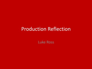
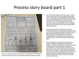
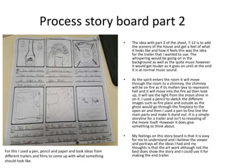
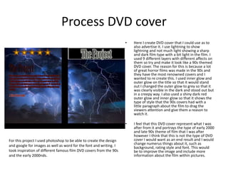
Production Reflection
Luke Ross
Process story board part 1
• This is the story board to my trailer part 1 -6 the
idea is that a spirit moves through a forest while
there is speaking in the background and whispers
as music plays quietly. As the spirit moves through
the forest it will come across on a house the
reason for this is that the place that wanted to
film was a forest area and had a house. The spirit
would enter the house and move through slowly
opening the door.
• Once that the spirit is in the house it moves
through into the main living room where there are
burn and destroyed painting barley visible this is to
add a creepy sense to the trailer. The house its
self will have broken windows and be dark,
showing that it is abandoned. I feel that this is a
good story for a trailer and I think it would work
well.
• While making this I used a pencil to sketch the
outline of what I intended to fit in each box
however I ended up drawing it in pen to make sure
that it stood out and was easy to read and
understand, it is mainly shown on the fire place
the outline of the house and the front door of the
house on part 4 and 5. I feel that this shows the
story that I am after well although not in detail it is
easy to follow and understand, I think however
that the artwork and detail could be a lot better
for the final project.
For this I used a pen, pencil and paper and took ideas from different
trailers and films to come up with what something should look like.
Process story board part 2
• The idea with part 2 of the sheet, 7-12 is to add
the scenery of the house and get a feel of what
it looks like and how it feels this was the idea
for the trailer that I wanted to use. The
whispering would be going on in the
background as well as the quite music however
it would get louder as it goes on until at the end
it is at normal music sound.
• As the spirit enters the room it will move
through the room to a chimney, the chimney
will be on fire as if its molten lava to represent
hell and it will move into the fire ad then look
up, it will see the light from the moon shine in
on it. I used a pencil to sketch the different
images such as fire place and outside as the
ghost would go through the fireplace to the
open air and then I used a pen to fine line the
main parts and make it stand out. It is a simple
storyline for a trailer and isn’t to revealing of
the movie itself. However it does give
something to think about.
• My feelings on this story board is that it is easy
for me to understand and I believe the viewer
and portrays all the ideas I had and my
thoughts is that the art work although not the
best does show the story and I could use it for
making the end trailer.
For this I used a pen, pencil and paper and took ideas from
different trailers and films to come up with what something
should look like.
Process poster part 1
• For this i decided to make it look as if there was
something surrounded it in black shapes
creating a caved in Rectangle at the top side of
the screen and the bottom half of the screen i
did this by holding control t and shrinking one
shape, i then duplicated that one shape to 12
diffrent ones and rotated them so that they
would fit into the needed format. I did this on
12 diffrent layers and added inner glow and and
outer glow to them as well as making them
darker to fit the scenery for the horror film.
• For the title I used 4 diffrent layers, for the first
layer i used a black rectangle stretched across
the middle to give something for the title to
stand out on. Then i went onto word and
copied the title with a horror type font onto my
photoshop poster. Then i added a misty
background and blood stains to cover it and
show that its a horror.
• Once all the layout was set out i outer glowed
the title and changed the size of the font to add
a creepy affect. I feel that this work went well
as it portrays the image of the movie trailer well
which what I wanted however I think that it
looks to be distorted on different parts and if I
had more time I believe that it could be greatly
improved.
For this poster I used google to find different shapes and images as
well as word for the fonts that I used, I also used inner glow on
almost all layers and I took the inspiration for the poster from
researching famous horror film posters.
Process poster part 2
• To finish off my poster i added pictures in the 2
rectangular shaped boxes i created, the pictures
i added was of somehwere similar to where i
intended to film the trailer and represened
what i was after in terms of imagry. I then
diceded to make the pictures look darker to
show that it will be a dark film trailer and will
be set in a dark place. I added a boarder around
the 2 pictures so that they fit the shape that
the previous boarder created well and looked
eye catching.
• Once i had the 2 pictures and the title right and
how i wanted it, i added diffrent styles to each
layer to experiment and see what it gave me, i
then chose the best looking one that fit with
the poster the best and look eye catching. I
changed 4 of the original 14 layers so that they
was able to stand out more and be more visible
as well as changing the lighting to make it the
entire poster more visible and easier to
see/read.
• When i had finished my postrer i asked for
diffrent peoples perspective to see how it
looked to them. I feel that the poster looks
although it advertises the film well and portrays
the image that I wanted however I think that it
doesn’t look like my standard of poster and if I
had more time I would improve this.
For this poster I used google to find different shapes and images
as well as word for the fonts that I used, I also used inner glow
and outer glow on some layers as I believe it added the best
affect, and I took the inspiration for the poster from researching
famous horror film posters from different decades.
Process DVD cover
• Here I create DVD cover that I could use as to
also advertise it. I use lightning to show
lightning and not much light showing a sharp
and dark film type with a bit light in the film. I
used 9 different layers with different affects on
them so try and make it look like a 90s themed
DVD cover. The reason for this is because a lot
of great horror films was made in the 90s and
they have the most renowned covers and I
wanted to re create this. I used inner glow and
outer glow on the title so that it would stand
out I changed the outer glow to grey so that it
was clearly visible in the dark and stood out but
in a creepy way. I also used a shiny dark red
outer glow and inner glow so that it shows the
type of style that the 90s covers had with a
little paragraph about the film to drag the
viewers attention and give them a reason to
watch it.
• I feel that this DVD cover represent what I was
after from it and portrays the type of early 2000
and late 90s theme of film that I was after
however I think that this is not the type of DVD
cover I would want as an end result and I would
change numerus things about it, such as
background, rating style and font. This would
be to improve the image and include more
information about the film within pictures.
For this project I used photoshop to be able to create the design
and google for images as well as word for the font and writing. I
took inspiration of different famous film DVD covers from the 90s
and the early 2000nds.

6. production reflection 2

  • 1.
  • 2.
    Process story boardpart 1 • This is the story board to my trailer part 1 -6 the idea is that a spirit moves through a forest while there is speaking in the background and whispers as music plays quietly. As the spirit moves through the forest it will come across on a house the reason for this is that the place that wanted to film was a forest area and had a house. The spirit would enter the house and move through slowly opening the door. • Once that the spirit is in the house it moves through into the main living room where there are burn and destroyed painting barley visible this is to add a creepy sense to the trailer. The house its self will have broken windows and be dark, showing that it is abandoned. I feel that this is a good story for a trailer and I think it would work well. • While making this I used a pencil to sketch the outline of what I intended to fit in each box however I ended up drawing it in pen to make sure that it stood out and was easy to read and understand, it is mainly shown on the fire place the outline of the house and the front door of the house on part 4 and 5. I feel that this shows the story that I am after well although not in detail it is easy to follow and understand, I think however that the artwork and detail could be a lot better for the final project. For this I used a pen, pencil and paper and took ideas from different trailers and films to come up with what something should look like.
  • 3.
    Process story boardpart 2 • The idea with part 2 of the sheet, 7-12 is to add the scenery of the house and get a feel of what it looks like and how it feels this was the idea for the trailer that I wanted to use. The whispering would be going on in the background as well as the quite music however it would get louder as it goes on until at the end it is at normal music sound. • As the spirit enters the room it will move through the room to a chimney, the chimney will be on fire as if its molten lava to represent hell and it will move into the fire ad then look up, it will see the light from the moon shine in on it. I used a pencil to sketch the different images such as fire place and outside as the ghost would go through the fireplace to the open air and then I used a pen to fine line the main parts and make it stand out. It is a simple storyline for a trailer and isn’t to revealing of the movie itself. However it does give something to think about. • My feelings on this story board is that it is easy for me to understand and I believe the viewer and portrays all the ideas I had and my thoughts is that the art work although not the best does show the story and I could use it for making the end trailer. For this I used a pen, pencil and paper and took ideas from different trailers and films to come up with what something should look like.
  • 4.
    Process poster part1 • For this i decided to make it look as if there was something surrounded it in black shapes creating a caved in Rectangle at the top side of the screen and the bottom half of the screen i did this by holding control t and shrinking one shape, i then duplicated that one shape to 12 diffrent ones and rotated them so that they would fit into the needed format. I did this on 12 diffrent layers and added inner glow and and outer glow to them as well as making them darker to fit the scenery for the horror film. • For the title I used 4 diffrent layers, for the first layer i used a black rectangle stretched across the middle to give something for the title to stand out on. Then i went onto word and copied the title with a horror type font onto my photoshop poster. Then i added a misty background and blood stains to cover it and show that its a horror. • Once all the layout was set out i outer glowed the title and changed the size of the font to add a creepy affect. I feel that this work went well as it portrays the image of the movie trailer well which what I wanted however I think that it looks to be distorted on different parts and if I had more time I believe that it could be greatly improved. For this poster I used google to find different shapes and images as well as word for the fonts that I used, I also used inner glow on almost all layers and I took the inspiration for the poster from researching famous horror film posters.
  • 5.
    Process poster part2 • To finish off my poster i added pictures in the 2 rectangular shaped boxes i created, the pictures i added was of somehwere similar to where i intended to film the trailer and represened what i was after in terms of imagry. I then diceded to make the pictures look darker to show that it will be a dark film trailer and will be set in a dark place. I added a boarder around the 2 pictures so that they fit the shape that the previous boarder created well and looked eye catching. • Once i had the 2 pictures and the title right and how i wanted it, i added diffrent styles to each layer to experiment and see what it gave me, i then chose the best looking one that fit with the poster the best and look eye catching. I changed 4 of the original 14 layers so that they was able to stand out more and be more visible as well as changing the lighting to make it the entire poster more visible and easier to see/read. • When i had finished my postrer i asked for diffrent peoples perspective to see how it looked to them. I feel that the poster looks although it advertises the film well and portrays the image that I wanted however I think that it doesn’t look like my standard of poster and if I had more time I would improve this. For this poster I used google to find different shapes and images as well as word for the fonts that I used, I also used inner glow and outer glow on some layers as I believe it added the best affect, and I took the inspiration for the poster from researching famous horror film posters from different decades.
  • 6.
    Process DVD cover •Here I create DVD cover that I could use as to also advertise it. I use lightning to show lightning and not much light showing a sharp and dark film type with a bit light in the film. I used 9 different layers with different affects on them so try and make it look like a 90s themed DVD cover. The reason for this is because a lot of great horror films was made in the 90s and they have the most renowned covers and I wanted to re create this. I used inner glow and outer glow on the title so that it would stand out I changed the outer glow to grey so that it was clearly visible in the dark and stood out but in a creepy way. I also used a shiny dark red outer glow and inner glow so that it shows the type of style that the 90s covers had with a little paragraph about the film to drag the viewers attention and give them a reason to watch it. • I feel that this DVD cover represent what I was after from it and portrays the type of early 2000 and late 90s theme of film that I was after however I think that this is not the type of DVD cover I would want as an end result and I would change numerus things about it, such as background, rating style and font. This would be to improve the image and include more information about the film within pictures. For this project I used photoshop to be able to create the design and google for images as well as word for the font and writing. I took inspiration of different famous film DVD covers from the 90s and the early 2000nds.

Editor's Notes

  • #3 Discuss the tools and processes used in your production. Log your thoughts and feelings about your work.
  • #4 Discuss the tools and processes used in your production. Log your thoughts and feelings about your work.
  • #5 Discuss the tools and processes used in your production. Log your thoughts and feelings about your work.
  • #6 Discuss the tools and processes used in your production. Log your thoughts and feelings about your work.
  • #7 Discuss the tools and processes used in your production. Log your thoughts and feelings about your work.