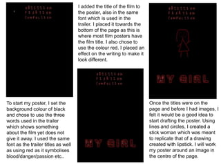
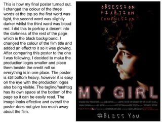
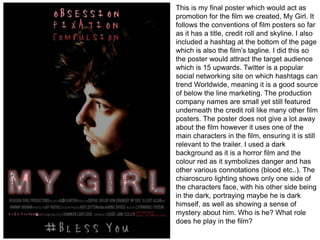
The document describes the process of creating a movie poster. The creator began with a black background and red text and titles. An outline of a stick figure was added to block out space. Photos were then taken of the male lead and edited onto the poster in different positions and effects. The final poster features the character isolated on the right side against a black background with red text and titles, production logos, and a hashtag tagline at the bottom.
Offering Services such as conductivity meter,digital process indicator,ph meter,tds meter, PH And ORP Temperature Meter, Conductivity Meter, TDS Meter, Digital Process Indicator, Data Logger, Humidity And Temperature Indicator.
Media Evaluation question 2
A2 Media Coursework
2016
examination - 27th April 2016
question 1 and 3 and 4 are on its way
...................................................................................................................................................................................................................................................................................
Model Attribute Check Company Auto PropertyCeline George
In Odoo, the multi-company feature allows you to manage multiple companies within a single Odoo database instance. Each company can have its own configurations while still sharing common resources such as products, customers, and suppliers.
Operation “Blue Star” is the only event in the history of Independent India where the state went into war with its own people. Even after about 40 years it is not clear if it was culmination of states anger over people of the region, a political game of power or start of dictatorial chapter in the democratic setup.
The people of Punjab felt alienated from main stream due to denial of their just demands during a long democratic struggle since independence. As it happen all over the word, it led to militant struggle with great loss of lives of military, police and civilian personnel. Killing of Indira Gandhi and massacre of innocent Sikhs in Delhi and other India cities was also associated with this movement.
Welcome to TechSoup New Member Orientation and Q&A (May 2024).pdfTechSoup
In this webinar you will learn how your organization can access TechSoup's wide variety of product discount and donation programs. From hardware to software, we'll give you a tour of the tools available to help your nonprofit with productivity, collaboration, financial management, donor tracking, security, and more.
Read| The latest issue of The Challenger is here! We are thrilled to announce that our school paper has qualified for the NATIONAL SCHOOLS PRESS CONFERENCE (NSPC) 2024. Thank you for your unwavering support and trust. Dive into the stories that made us stand out!
Embracing GenAI - A Strategic ImperativePeter Windle
Artificial Intelligence (AI) technologies such as Generative AI, Image Generators and Large Language Models have had a dramatic impact on teaching, learning and assessment over the past 18 months. The most immediate threat AI posed was to Academic Integrity with Higher Education Institutes (HEIs) focusing their efforts on combating the use of GenAI in assessment. Guidelines were developed for staff and students, policies put in place too. Innovative educators have forged paths in the use of Generative AI for teaching, learning and assessments leading to pockets of transformation springing up across HEIs, often with little or no top-down guidance, support or direction.
This Gasta posits a strategic approach to integrating AI into HEIs to prepare staff, students and the curriculum for an evolving world and workplace. We will highlight the advantages of working with these technologies beyond the realm of teaching, learning and assessment by considering prompt engineering skills, industry impact, curriculum changes, and the need for staff upskilling. In contrast, not engaging strategically with Generative AI poses risks, including falling behind peers, missed opportunities and failing to ensure our graduates remain employable. The rapid evolution of AI technologies necessitates a proactive and strategic approach if we are to remain relevant.
Instructions for Submissions thorugh G- Classroom.pptxJheel Barad
This presentation provides a briefing on how to upload submissions and documents in Google Classroom. It was prepared as part of an orientation for new Sainik School in-service teacher trainees. As a training officer, my goal is to ensure that you are comfortable and proficient with this essential tool for managing assignments and fostering student engagement.
Palestine last event orientationfvgnh .pptxRaedMohamed3
An EFL lesson about the current events in Palestine. It is intended to be for intermediate students who wish to increase their listening skills through a short lesson in power point.
Acetabularia Information For Class 9 .docxvaibhavrinwa19
Acetabularia acetabulum is a single-celled green alga that in its vegetative state is morphologically differentiated into a basal rhizoid and an axially elongated stalk, which bears whorls of branching hairs. The single diploid nucleus resides in the rhizoid.
Synthetic Fiber Construction in lab .pptxPavel ( NSTU)
Synthetic fiber production is a fascinating and complex field that blends chemistry, engineering, and environmental science. By understanding these aspects, students can gain a comprehensive view of synthetic fiber production, its impact on society and the environment, and the potential for future innovations. Synthetic fibers play a crucial role in modern society, impacting various aspects of daily life, industry, and the environment. ynthetic fibers are integral to modern life, offering a range of benefits from cost-effectiveness and versatility to innovative applications and performance characteristics. While they pose environmental challenges, ongoing research and development aim to create more sustainable and eco-friendly alternatives. Understanding the importance of synthetic fibers helps in appreciating their role in the economy, industry, and daily life, while also emphasizing the need for sustainable practices and innovation.
2. To start my poster, I set the
background colour of black
and chose to use the three
words used in the trailer
which shows something
about the film yet does not
give it away. I used the same
font as the trailer titles as well
as using red as it symbolises
blood/danger/passion etc..
I added the title of the film to
the poster, also in the same
font which is used in the
trailer. I placed it towards the
bottom of the page as this is
where most film posters have
the film title. I also chose to
use the colour red. I placed an
effect on the writing to make it
look different.
Once the titles were on the
page and before I had images, I
felt it would be a good idea to
start drafting the poster. Using
lines and circles, I created a
stick woman which was meant
to replicate that of a drawing
created with lipstick. I will work
my poster around an image in
the centre of the page.
3. I changed the size of the
stick woman in order to
gage an average size of
where any potential image
would go if I used one. I
was able to see if the titles
worked in their positions as
well as their sizes. I felt they
were in appropriate
positions so continued with
this layout.
I then went on to put in the
credit roll. Our group used the
same writing in the credit roll
give or take a few things. It
contains things such as
actors, producers and director
of the film. I also decided to
place a shadow effect on the
stick woman to make it look
more effective, mirroring the
image beneath.
I changed the size of the credit
roll at the bottom of the page
and added a name from the
credit roll above the title,
similarly to how existing film
posters have done before. I felt
that having the credit roll in a
different colour was effective
as it does not mix in with the
other red things on the page.
4. I went on to add the production
company logos to the bottom
of the page. We already had
‘graz productions.’ and I felt I
needed more than one
production name, therefore me
and a group member came up
with Ka$h Karton, a mixture of
our names, and another group
member made Hexagon.
The next thing I did was add the
tagline as a hashtag to the bottom
of my poster. The hashtag is a
good way to promote below the
line marketing as well as it
reaching out to our target
audience of 15+. I used white
writing and made it big in order
for it to stand out on the page.
I changed around some of the
credit roll and moved the
production logos so they were
all in line and could be easily
read on the page in the light
colours. I moved everything on
the page up, creating more
space at the bottom to have a
bigger hashtag/tagline.
5. I decided to add two social
network links to the bottom of
the poster. I did this as the
target audience would more
than likely use these social
networking sites and would
easily be able to find the film
on there if they were to look.
The two sites I used were
Facebook and Twitter,
including their logos too.
I felt because I put the social
network links in white, there was
too much white writing on the
bottom of the page. To change
this, I changed all of the
production logos to red, fitting in
with the rest of the page and
breaking the writing up slightly,
making it easier on the eyes.
After printing my poster as it was
and comparing it to existing
magazines, I felt that there was
too much writing on the bottom of
the page. Writing on posters
does tend to be bottom heavy
however I felt like I had used too
much. I deleted the social
network links as I still have the
hashtag which is linked to Twitter.
6. As I was happy with the layout of my poster, I felt it was the right time to start
taking images and trying to put them on the poster to see what it looks like. To
do this, I have decided that I want an image of the male character/villain in the
trailer. I also decided that I would like it if the character was wearing the coat
he is shown wearing in the trailer, along with dark coloured jeans and some
expensive shoes in order to look well groomed. Furthermore, the messy hair
look for boys is in nowadays therefore I think if the character’s hair looks
messy, it will add to the verisimilitude as it will portray that he is a normal
teenage boy.
Below are the images I liked the best out of the various images I shot.
7. After being happy with the layout of
the text on the page I felt it was time
to use real images. I deleted the
stick woman and took various
photos of the male character. I
started with the image shown top
right, using photoshop to roughly
remove the background of the
image to have the character alone. I
felt this looked too amateur.
I attempted this again but with a
different image of a similar shot. I again
removed the background of the image,
as well as changing the saturation of
the image, making the image darker
and more suitable for a horror film
poster. The dark lighting of the page
creates mystery as it creates a fear of
the unknown; what is behind him in the
shadows?
8. I decided I was going to
follow the structure of the film
poster for the 2013 film, The
Purge, poster pictured below.
As I based my own poster on the poster for The Purge, I felt this
image was too much like the one used in The Purge, as well as
other various posters such as Annabelle. For this reason, I
decided to try making my poster with another image. One aspect I
would try to do again would be the way the character looks like he
is lurking in the shadows too much, perhaps giving away that this
is the villain in the film. Furthermore, some of the writing overlaps
him too much and is unclear when printed.
9. I went on to try another image to see if it worked in order to
progress with my poster, deciding that I could pick which image
worked better of decide if I needed to go and get more images.
The next image I tried on the poster was the one pictured above. Similarly to before, I removed
the background of the picture and it worked very well, later changing the saturation and colour of
the image slightly. I felt the image gave off a chiaroscuro lighting effect of which I was happy with
as it has a sense of mystery to it. I placed the image onto the poster layout and it worked well
with the other colours on the page. I did not manipulate the image too much, leaving things such
as the small spot on the actors nose to add to the sense of verisimilitude, showing that the
character is normal just like normal teenagers. This is ironic when you watch the trailer and
realise he is the villain, and is not in fact ‘normal’ in any way.
10. I changed the colour of the writing at the top of the page,
making it a blood red to link to the whole horror idea.
Furthermore, I changed the colour of the title to match the
writing at the top of the page and made the effect on the
writing less visible, making it look slightly more like blood
splatters on it, again linking to the horror film idea (being
gory).
I then decided to move the image right over to the right
hand side of the page, leaving half of the page black. By
doing this I was able to isolate the writing so nothing
was overlapped in such a way it was not visible.
Furthermore, the character fades into the darkness,
creating a mysterious feel as viewers question what is in
the dark which surrounds him.
11. This is how my final poster turned out.
I changed the colour of the three
words at the top so the first word was
light, the second word was slightly
darker whilst the third word was blood
red. I did this to portray a decent into
the darkness of the rest of the page
which is the black background. I
changed the colour of the film title and
added an effect to it so it was glowing.
After comparing this poster to the one
I was following, I decided to make the
production logos smaller and place
them beside the credit roll so
everything is in one place. The poster
is still bottom heavy, however it is easy
on the eye with the production logos
also being visible. The tagline/hashtag
has its own space at the bottom of the
page so it can be easily read. The
image looks effective and overall the
poster does not give too much away
about the film.
12. This is my final poster which would act as
promotion for the film we created, My Girl. It
follows the conventions of film posters so far
as it has a title, credit roll and skyline. I also
included a hashtag at the bottom of the page
which is also the film’s tagline. I did this so
the poster would attract the target audience
which is 15 upwards. Twitter is a popular
social networking site on which hashtags can
trend Worldwide, meaning it is a good source
of below the line marketing. The production
company names are small yet still featured
underneath the credit roll like many other film
posters. The poster does not give a lot away
about the film however it uses one of the
main characters in the film, ensuring it is still
relevant to the trailer. I used a dark
background as it is a horror film and the
colour red as it symbolizes danger and has
other various connotations (blood etc..). The
chiaroscuro lighting shows only one side of
the characters face, with his other side being
in the dark, portraying maybe he is dark
himself, as well as showing a sense of
mystery about him. Who is he? What role
does he play in the film?