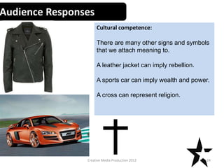
SlideShare a Scribd company logo
1 of 35
Graphic Narrative
Evaluation
Use this template to help you evaluate your project.
You should give specific details about your work.
You should provide both written and visual examples to explain your project.
You should find areas to praise in your work. Be specific about why you think they are
good or why you are proud of them.
You should also find areas that could be improved. Look for areas that you could make
better if you went back to them. Be specific about what you would improve.
Add additional slides as you need to. Don’t be restricted by what is here.
Any blank slides should be deleted before submission.
Does your final product reflect your
original intentions?
• Compare your planning/digital flat plans/ storyboards to your
final product
Well originally I was going to do a longer story but I have to shorten it because it was
going to be a lot more than 12 pages long, if I didn’t. I jumped further in the story so
that the story would happen in one day ,rather than belle having to re-enter the ocean
to find her sister.
My mind map does match my final product because it has the same characters into. In
my first mind map I had more characters. As result of my story being condensed, I had
to remove some characters which were the queen ,Ariel's friend Eugene etc.
I feel like my digital flat plans so reflect my story because they have the elements that
were on my page. It is a reflection of what content will be on the page. Despite that
the arrangement of the pages and proportions aren’t exactly right.
In regards to the final script and my final product, I changed a few minor things. I
decided to do this because I thought it fitted better in the book. For example on page
7 I was going to do like narrator was going to say some text but I decided to do it so
the sea witch said it instead-this involved changing a few words and added a few as
well.
This is a comparison
between my digital flat
plan of page 5 and the
finished product. The plan
has nearly all the content
that would be on the
actual page; the witch, the
globe and the puffer fish,
except the cupboard and
the text.
Also it is noticeable that the elements in page 5 aren’t exactly
placed like the plan; for example the puffer is to the left of the
page ,where as on the plan it is in the middle of the page. The
colours displayed on page 5 are purple and blue ,which is
slightly similar to the ones in the plan, which is more blue.
Page 8
The script in the planning
was 3rd person narration;
I wanted it to feel like it
was telling some sort of
story. However, whilst
creating page 8 I decided
that I wanted to change it
to direct speech coming
from the sea witch ,which
will be directed to the
girls. Firstly I added in
speech marks to show
someone (the sea witch)
is speaking. I changed
works like would to must
and wouldn’t to will not
so it sounds more direct.
Also I added ‘warned the
witch’ at the end because
it show that the sea witch
has spoken.
How well have you constructed your
images?
• How well have you constructed your images? You could talk about the
overall visual appearance and well as the use of texture and colour.
I feel that my page look quite simple ,although I feel they are well
constructed. I used a lot of shapes and rotoscoping ,which was sometime
really easy and sometimes challenging. Sometimes I just used kept the shade
and rotoscoped image in block colour because I thought it would stand out
more. I used gradient overlays on some pages, I used it on the rocks and sand
for example, which I think gave them a nice shadow effect to them.
Most of my pages are based in the ocean so have a blue background for the
water. I think using blue in my work gives good ocean imagery to my audience
because you would associate blue with the water, the sky and the ocean.
I used a lot of bright colours to attract the audiences attention like bright
pink, purples and blues. Considering my audience are young I needed
something which would grab their attention. I also used darker colour like
dark purple, blue and grey on the pages which features the sea witch because
I wanted to portray her as bad.I think darker colours help do this because
they are less appealing and are mysterious.
In this image I have
used bright pink,
purple and light
blue. I think these
colours are
attractive because
they are bright and
eye catching. Pink
and purple were
also chosen because
they are feminine
colours, which I
think would appeal
to young female
audience.
You can see on this
image that the sand is
yellow and orange- it
had been made using a
gradient overlay. I think
this effect a nice ombre
effect in the sand; it
looked more visually
interesting than just a
big block of colour, it
adds shadowing and
depth to the image.
To improve this image I would add and alter a couple of layers in the image. For
example I feel the back ground would benefit from a gradient overlay because the
ocean would appear darker from further away. I would add in a darker/duller blue
than the one used to create a nice shadow. I think the sand does look good but I
feel like it would make more sense if I swapped the colour around so that the
darker colour was further back rather than the lighter colour. Also I would add a
gradient overlay to the rock because it is just one block of colour.I would add it a
lighter and darker grey to the image to give the rock texture. I’m not sure which
setting I would have the gradient on-either radial because the rock is circular or
original because that works in most cases.
How well have you used text to anchor
your images
• You should talk about the combination of
words, images and text.
I feel like the text on my pages goes well with my images,a good example would be
page 11.this page features Belle,Arielle and the sea king hugging. The text reads ‘the
family hug.’ the word family relates to them realising they are in fact related and can
now be a family. ‘Hug’ links to what the image is displaying, which is a hug. There are
hearts surrounding the characters, this shows the love they feel whilst they are
hugging.
An example where I could of used text better would be page 4.The first text on the
page is ‘the sea witch ,Hydrella ,watches this on her magic globe.’ the word ‘this’
could refer to anything so therefore the audience may not know what it relates to. It
actually relates to the previous page of when the girls are getting closer. Graphics from
page 3 can be seen on the globe. ‘This’ relates to what is on the globe which is Arielle
swimming and belle sat behind a rock.To make sure they understand this more I could
say the girls instead of this ,so it would make more sense.
Page 11
The hearts
symbolises that
the family love
each other. Hearts
are commonly
used to describe
and symbolise
love. This graphic
links to the fact
that ‘they are glad
to be together
again’.
‘They are glad to be
back together again’
shows what they are
feeling when they hug.
‘after all these years’
shows that they have
been apart for long
time -16 years to be
exact.
The text says that the sea
witch ‘watches this on her
magical globe’. However
,the image doesn’t entirely
fit with the text; the sea
witch isn’t exactly looking
down at the globe. To
improve this aspect of the
image I would move her
pupils and eyes lower so
she would appear to be
staring down at the globe.
Also it says ‘watches this’ and ‘this’ could be anything. This
actually links to the previous page and the previous page is in
the globe, which relates to the girls getting closer to each other.
To avoid confusion I would add in ‘ the girls’ instead of this
because this will show that she is speaking about the girls.
Is your product suitable for your
audience?
• Reference your proposal
Yes I would say by book is suitable for my audience for a few
reasons.
I said in my proposal that my product would appeal to girls
because my story is more feminine and my main characters are
girls. On page which didn’t feature the witch ,I used girly colours
like purple and pink. Girls usually like them colours.
My audience are aged 5-10 so I feel like bright colours would
catch their attention their. I used bright colours like aqua blue,
bright purple and pink ,which are nice appealing colours.
Yes, I think my product is suitable for my audience because there
isn’t really anything inappropriate within my story. I haven’t
included any nudity or inappropriate graphics which would be
unsuitable for the children to view.
On page 3,I have used pink and purpled text.
These colour are feminine so I feel the
audience would find them visually appealing.
My main characters are female so
my audience, who are girls, can
relate to them. I made them look
pretty so that the girls would look
up to them.
I used bright blue for the ocean back
ground because it was a nice bright colour,
it stands out well on the page and makes
the graphics on top come forward. I used
bright pink in Belle's costume and the text It
wanted to portray a girly vibe on the page .
Also I used bright purple on Arielle’s tail and
text because it is a nice bold colour which
will be eye catching.
What do you like/dislike about the
techniques you have used?
• Reference specific tools you used with images
In my work I did a lot of rotoscoping, shapes and drawing. To rotoscoping I used the polygonal lasso tool to create the
graphics I wanted and then layer via copied it to create a layer. The shape I used were mainly for ellipses or rectangle; I
used the ellipses to create characters’ faces and I often used the rectangle tool to create backgrounds. I used the
drawing tool to create the characters features, markings and hair.
When creating the background I often used the feather tool to fade out the edges of the rectangular shaped
background. I repeated this on all my pages. I would make the background first with the rectangle tool and then I would
select from where I wanted it to fade out. Alot of the time I would forget to rasterize the shape so when I pressed the
backspace it would delete all of the shape than the part wanted.
I like that rotoscoping was pretty easy; I picked out/draw what I wanted and created a new layer. However it could be
time consuming when making a detail type of shape. For example Belle’s body was slightly hard to make because of the
feet.
I feel like using shapes was really easily because I would pick the shape I wanted and created a graphic. For example I
could pick the ellipse tool and create a face for my characters in a few seconds.
Using the brush tool had it’s advantages and disadvantages.one advantage is that the finish outcome of the hair would
like detailed and visually appealing but it took a while to produce; the hair was made strand by strand.
For the text I used shadows and strokes because I knew this would make the text stand out much more on the page. It
was really easy because all I had to do was click on the layer and click stroke and drop shadow and alter them to my
liking. I pasted the layer style to all the text layers to create continuity between the pages. It was really easy copy and
paste the layer style on to other pieces of text.
I used the feather
tool create to
faded out edges. I
used the
rectangle tool to
create the
original shape.
I created the
rocks , fishes
,seaweed
,her body,
using the
polygonal
lasso tool.
I used the brush
tool to create
her hair. I used
multiple shades
of brown to
create a
highlighted
appearance.
On text I used a thin black stroke and black shadow on this
text. It was really easy to add to the text, which was by double
clicking on the layer and playing with the settings. I think this
makes the text come out from the page.
I used a gradient overlay for the sand by clicking on
the layer and altering the colours. It was only a
small change but it made a difference, for the
better; It gave the sand shadows .
What do you like/dislike about how
your final product looks?
I like that my pages are quite visually appealing;
they are colourful and have a few elements within
each page.
I feel like I could of incorporated more in the
background because the background looks a bit
plain. I would add more sea life like crabs or
different types of fish.
I like how my characters look too. The twins look
pretty and the sea witch looks rather scary. I like
that my character look detailed with their faces and
hair.
I like how the sea witch looks. Her
hair is multi-tonal ,which took me a
while to create. I like how in this
image (page 4) that she looks like she
is touching the globe.
I think this page is okay but there is a few things that could be improved. I think how his right
hand looks; it looks too big and it sticks out to the left too much. I would make It smaller and
move it partially to the right.
Also the I feel the page would have looked a lot better if I had split the page horizontally in
two so that the sea king graphic would be on one half and the girls on the other. I think this
would also help with layout of the text.
Why did you include the content you
used?
• Images, fonts, effects, colours
I used some pictures from the internet to give guidance on how to create certain
graphics using the polygonal lasso tool. For example ,I found a picture of a girl
swimming so I rotoscoped the body to create the position of Belle’s body.
I used a serif font called ‘cooper std’ because I thought it would be more visually
interesting than san-serif text. It is a bold and clear font so the audience will be able to
consume it /read it easier. Also I added a thin black stroke to the text to bring it out of
the page. Furthermore I added a drop shadow to the text as I thought it make it stand
out from the background.
I used gradient and colour overlays a lot. When rotoscoping I used colour overlays to
change my graphic to the right colour. For example I used gradient overlays for the sand
because I thought it would give it depth.
I used a variety of bright colours in my work because I thought it would attract the
attention of my audience. However, I used darker colours too, to create contrast
between the good characters and the bad characters. For example on page 1 has bright
colours like pink and blue whereas the other has dark colours like dark purple and
greys.
What signs, symbols or codes have your used in your work?
Choices of colour, style, locations, character design and
tone all give additional meaning to your work.
I used a lot of pink, blue and purples in my work. I used pink because this is
a girly colour and will appeal to my target audience, who are young girls. I
used a lot of blue because I feel that it conveys connotations of the ocean;
it looks blue from far away. I used some different shades of purple because
purple is classed as a feminine colour and dark purple looks mysterious.
The locations of my story were all in the ocean, including the witches sea
cave. I needed to have my story under water because my story includes
mermaids, and they live underwater.
For my character design, I decided to create my main characters, Belle and
Arielle, with blonde and brown hair and green eyes. I decided to make them
look visually appealing therefore the audience reading will look up to and
want to be like them. I used dark colours and made the sea witch look scary
to show that she is the baddy and so the audience don’t want to be like her.
On the pages featuring the sea witch, the villain, I used darker colors. I did this
because it conveys her to be more sinister ,no bright colors are present. Using bright
colors on the pages showing the girls or sea king and darker colors on the page
featuring the witch creates contrast. I think this will show the audience that the
witch is bad and the girls are good.
Audience Responses
Cultural competence:
Media texts require us to have a certain level of cultural understanding to
be able to interpret them.
At a basic level, this could mean being able to read the language that a
magazine is written in.
At a deeper level, it means being able to interpret signs and symbols that
we use a visual shorthand to communicate ideas.
We recognise these signs in our own culture but find it harder to
understand when looking at others.
We create and attach meaning to signs and symbols in many different
forms.
22Creative Media Production 2012
Audience Responses
Cultural competence:
What is this?
This is a Norwegian Pine tree, covered in
snow and with a red ribbon on.
Our cultural understanding allows us to
interpret its meaning.
To us, in British society, it means
Christmas, presents and family.
This is because we share a cultural
knowledge.
23Creative Media Production 2012
Audience Responses
Cultural competence:
There are many other signs and symbols
that we attach meaning to.
A leather jacket can imply rebellion.
A sports car can imply wealth and power.
A cross can represent religion.
24Creative Media Production 2012
Audience Responses
Cultural competence:
Visual representations of everyday objects are often the same the world
over. A car appears as a car, no matter what country it appears in.
What that car means however, can be very different depending on your
cultural background.
25Creative Media Production 2012
What representations can be found in
your work?
How are men, women or children shown in your work? Does your work feature
different ages, races, social groups or religions? Does a lack of any variety of character
types create its own representation?
I think the sea king portrays men in my story. He is a good representation of men
because he cares about his daughters. He saves them from the evil sea witch. My book
portrays women as a couple of things: bad and good. The twins are good
representations of women but the sea witch is a bad representation. The twins
represent women as good because they don’t do anything bad in the story. However,
the sea witch portrays women as bad because she is evil, she captures the girls and
tries to cast another spell to separate the girls even more.
My work features different ages; the sea king and sea witch are middle aged and the
girls are teenagers. In my book I only feature white characters (except from the sea
witch, who is purple/grey) so I would consider featuring different races in my book like
black. My book doesn’t feature anything to do with religions.
Both my main
characters are
white-Belle and
Arielle. I think that
my book would
appeal to a wider
audience if I
included another
character but of a
different race. I
could included a
character who is
mixed race or black
to widen the
variety in my book.
I wanted the
girls to be
represent as
good so that the
girls reading the
story would look
up to them and
want to be like
them. They are
innocent and
good. They also
are pretty so
they give a good
representation
of women.
The witch has grey/lilac skin. I wanted to
make her look scary and dull, so that the
audience don’t want to be like her. She gives
a bad representation of women. By the text
you can tell that she isn’t very nice; ‘You
must bring them back to me’ shows her to
be a demanding person. It also implies that
she is evil because a nice person wouldn’t try
capture two teenagers.
The sea king is white ,like his daughters. I
think he is a good representation of men.
He is about 50 years old. By the text ‘goes
to their rescue’ you can tell he is a caring
because he is going to help them from
the sea witch. He represents a good
father figure that would do anything for
his kids.
What style have you employed in your
products?
• Discuss influences/ existing products
I researched three existing books: the three little pigs, tiddler and it’s
mine. I think tiddler influenced my book the most because it’s location
is under the sea. The layout of the pages in the book influenced by
book because I knew I needed to multiple graphics and text on each
page. However I think that my book isn’t as detailed as tiddler.See
comparison next slide.
• What visual style does your work have and why did you choose it?
My book’s visual style is non-realistic because it looks cartoon. I used
the rotoscoping technique and shapes. I choose this style because I
thought it would stand out to the audience. I thought it will take a
while to make each graphic although it is doable in the time scale we
have. Also it allows a lot of creativity in the graphic you make because
a large percentage of it is free hand.
These images have their differences but also have their similarities. The main similarity between tiddler and
page 10 from my book is the layout; both have text where there is space in the image. As you can tell
tiddler’s text has a lot more space around it than my page. I think both images have suited their text around
their image; both texts are where the image graphics aren't. I know that I suited my text to fit my image
because I added the text in last ,and I feel like image is would be more appealing to the audience. However
in tiddlers page it could be argued that the image was suited to text instead; it is quite a big chunk of text
and no graphics overlap it or are close to it.
The differences in the two pages include colour schemes, style and detail. It is noticeable that tiddler is a lot
brighter than my page; it has a rainbow of colours whereas mine has dark blues, purples and greys-but most
of my other page are brighter. The style is different between them; tiddler looks like an illustration but mine
is block colour cartoon graphics. My page compared to tiddler looks like it lacks detail;you can tell from
looking at tiddler that the illustrator has spent ages putting together each tiny detail on the page.Although I
feel like elements within my image have detail ,like the witch for example. Her hair and facial features took a
while to make; I had to do her hair strand by strand.
There is a lot less image on this page of tiddler than the previous one. However there are
four separate pictures in each of the four sections of the page. This page offers close up
images rather than a long shot image than like the other one. I think this gives variety
,which it something that I wanted to included in my book, which I feel I have succeeded in
doing.
It has a lot white space which I feel draws more attention to graphics placed inside of it.
What were the strengths and weaknesses
of the pre-production and planning
How did the planning and research help
My planning helped me a lot during production. I would say that my mind map help me the
most because it allowed me to break down my idea. My research helped because it gave
me ideas on how to set out my pages and how much text to use per page.
How well did you manage your time
I would say that I could of managed my time better because I didn’t
finish my Project on the first deadline. I feel like this is a combination
of my work speed and amount of graphics on each page I had to
create.
For page 7 I planned to create alot of graphics.A graphic of the sea
queen pregnant,a graphic of the ill sea queen and her born twins,the
sea king asking the sea witch to for help,graphic of the sea queen with
her eyes closed,the sea witch casting a spell and belle as a human
baby. I think I planned for too much,considering i had 12 pages to do in
total.
In my mind map I broke down to which characters that I would be
featuring in my book-Arielle, Belle, the sea witch and the sea king-
and their part in the story. This helped me because I could decide
the text to my book whilst making sure my script reflected this.
Historical and cultural context
• How does your work compare to what has
come before? What other similar products
have existed in the past? What current
products exist?
There is a book called Tiddler, that I researched,
which is similar to my book. The book is based
under water, like my book.
Peer Feedback
• Summarise peer feedback and discuss
– Responses you agree with
– Responses you disagree with

More Related Content

What's hot

Digital Graphics Evaluation Pro Forma
Digital Graphics Evaluation Pro FormaDigital Graphics Evaluation Pro Forma
Digital Graphics Evaluation Pro FormaChris Bailey
 
Development pro forma(3) shahs
Development pro forma(3) shahsDevelopment pro forma(3) shahs
Development pro forma(3) shahsShahzaib Yaqoob
 
Digital Graphics Evaluation Pro Forma
Digital Graphics Evaluation Pro FormaDigital Graphics Evaluation Pro Forma
Digital Graphics Evaluation Pro FormaJohnRae13
 
Development pro forma
Development pro formaDevelopment pro forma
Development pro formaJack Sullivan
 
Digital graphics evaluation pro forma
Digital graphics evaluation pro formaDigital graphics evaluation pro forma
Digital graphics evaluation pro formabobbiehaslam
 
Development pro-forma
Development pro-formaDevelopment pro-forma
Development pro-formaLibby-Wright1
 
Digital graphics evaluation pro forma
Digital graphics evaluation pro formaDigital graphics evaluation pro forma
Digital graphics evaluation pro formaJack Booth
 
Development Pro Forma
Development Pro FormaDevelopment Pro Forma
Development Pro Formajessstanton17
 
Development pro forma
Development pro formaDevelopment pro forma
Development pro formaJack Sullivan
 
Development pro forma(3)
Development pro forma(3)Development pro forma(3)
Development pro forma(3)Will NotTellYou
 
Development pro forma
Development pro formaDevelopment pro forma
Development pro formaJack Sullivan
 
Digital graphics evaluation pro forma
Digital graphics evaluation pro formaDigital graphics evaluation pro forma
Digital graphics evaluation pro formaretroflex1
 
Digital graphic narrative
Digital graphic narrativeDigital graphic narrative
Digital graphic narrativeBetty Sanders
 
Media Pitch
Media PitchMedia Pitch
Media Pitchemma_cleary
 

What's hot (15)

Digital Graphics Evaluation Pro Forma
Digital Graphics Evaluation Pro FormaDigital Graphics Evaluation Pro Forma
Digital Graphics Evaluation Pro Forma
 
Development pro forma(3) shahs
Development pro forma(3) shahsDevelopment pro forma(3) shahs
Development pro forma(3) shahs
 
Digital Graphics Evaluation Pro Forma
Digital Graphics Evaluation Pro FormaDigital Graphics Evaluation Pro Forma
Digital Graphics Evaluation Pro Forma
 
Development pro forma
Development pro formaDevelopment pro forma
Development pro forma
 
Digital graphics evaluation pro forma
Digital graphics evaluation pro formaDigital graphics evaluation pro forma
Digital graphics evaluation pro forma
 
Development pro-forma
Development pro-formaDevelopment pro-forma
Development pro-forma
 
Digital graphics evaluation pro forma
Digital graphics evaluation pro formaDigital graphics evaluation pro forma
Digital graphics evaluation pro forma
 
Development Pro Forma
Development Pro FormaDevelopment Pro Forma
Development Pro Forma
 
Pro forma
Pro formaPro forma
Pro forma
 
Development pro forma
Development pro formaDevelopment pro forma
Development pro forma
 
Development pro forma(3)
Development pro forma(3)Development pro forma(3)
Development pro forma(3)
 
Development pro forma
Development pro formaDevelopment pro forma
Development pro forma
 
Digital graphics evaluation pro forma
Digital graphics evaluation pro formaDigital graphics evaluation pro forma
Digital graphics evaluation pro forma
 
Digital graphic narrative
Digital graphic narrativeDigital graphic narrative
Digital graphic narrative
 
Media Pitch
Media PitchMedia Pitch
Media Pitch
 

Similar to GRAPHIC NARRATIVE EVALUATION

Digital graphics evaluation pro forma
Digital graphics evaluation pro formaDigital graphics evaluation pro forma
Digital graphics evaluation pro formaJake Stanyon-Carr
 
7. digital graphics evaluation pro forma (1)
7. digital graphics evaluation pro forma (1)7. digital graphics evaluation pro forma (1)
7. digital graphics evaluation pro forma (1)Sian England
 
Digital graphics evaluation pro forma2
Digital graphics evaluation pro forma2Digital graphics evaluation pro forma2
Digital graphics evaluation pro forma2Beth Geldard
 
Digital graphics evaluation pro forma (1)
Digital graphics evaluation pro forma (1)Digital graphics evaluation pro forma (1)
Digital graphics evaluation pro forma (1)Robert Ryan
 
Digital graphics evaluation pro forma (1)
Digital graphics evaluation pro forma (1)Digital graphics evaluation pro forma (1)
Digital graphics evaluation pro forma (1)Robert Ryan
 
Digital graphics evaluation pro forma (1)
Digital graphics evaluation pro forma (1)Digital graphics evaluation pro forma (1)
Digital graphics evaluation pro forma (1)Robert Ryan
 
Digital graphics evaluation pro forma (1)
Digital graphics evaluation pro forma (1)Digital graphics evaluation pro forma (1)
Digital graphics evaluation pro forma (1)Robert Ryan
 
Digital graphics evaluation pro forma
Digital graphics evaluation pro formaDigital graphics evaluation pro forma
Digital graphics evaluation pro formataygage
 
Digital graphics evaluation pro forma
Digital graphics evaluation pro formaDigital graphics evaluation pro forma
Digital graphics evaluation pro formathenamesbarnett
 
Digital graphics evaluation pro forma.pptx
Digital graphics evaluation pro forma.pptxDigital graphics evaluation pro forma.pptx
Digital graphics evaluation pro forma.pptxwillydavisj
 
Digital graphics evaluation pro forma
Digital graphics evaluation pro formaDigital graphics evaluation pro forma
Digital graphics evaluation pro formaEllie Marsh
 
Evaluation of Children's book pro forma - personal reflection
Evaluation of Children's book pro forma - personal reflectionEvaluation of Children's book pro forma - personal reflection
Evaluation of Children's book pro forma - personal reflectionEllie Marsh
 
Digital graphics evaluation pro forma copy
Digital graphics evaluation pro forma copyDigital graphics evaluation pro forma copy
Digital graphics evaluation pro forma copyKiran Crampton
 
Digital graphics evaluation pro forma
Digital graphics evaluation pro formaDigital graphics evaluation pro forma
Digital graphics evaluation pro formaOlliePull
 
Digital graphics evaluation pro forma
Digital graphics evaluation pro formaDigital graphics evaluation pro forma
Digital graphics evaluation pro formarichard barber
 
Digital graphics evaluation pro forma
Digital graphics evaluation pro formaDigital graphics evaluation pro forma
Digital graphics evaluation pro formaGeorginaWhitelock
 

Similar to GRAPHIC NARRATIVE EVALUATION (20)

Digital graphics evaluation pro forma
Digital graphics evaluation pro formaDigital graphics evaluation pro forma
Digital graphics evaluation pro forma
 
7. digital graphics evaluation pro forma (1)
7. digital graphics evaluation pro forma (1)7. digital graphics evaluation pro forma (1)
7. digital graphics evaluation pro forma (1)
 
Evalutaion
EvalutaionEvalutaion
Evalutaion
 
Evaluation
EvaluationEvaluation
Evaluation
 
Digital graphics evaluation pro forma2
Digital graphics evaluation pro forma2Digital graphics evaluation pro forma2
Digital graphics evaluation pro forma2
 
Digital graphics evaluation pro forma (1)
Digital graphics evaluation pro forma (1)Digital graphics evaluation pro forma (1)
Digital graphics evaluation pro forma (1)
 
Digital graphics evaluation pro forma (1)
Digital graphics evaluation pro forma (1)Digital graphics evaluation pro forma (1)
Digital graphics evaluation pro forma (1)
 
Digital graphics evaluation pro forma (1)
Digital graphics evaluation pro forma (1)Digital graphics evaluation pro forma (1)
Digital graphics evaluation pro forma (1)
 
Digital graphics evaluation pro forma (1)
Digital graphics evaluation pro forma (1)Digital graphics evaluation pro forma (1)
Digital graphics evaluation pro forma (1)
 
Digital graphics evaluation pro forma
Digital graphics evaluation pro formaDigital graphics evaluation pro forma
Digital graphics evaluation pro forma
 
Digital graphics evaluation pro forma
Digital graphics evaluation pro formaDigital graphics evaluation pro forma
Digital graphics evaluation pro forma
 
Digital graphics evaluation pro forma.pptx
Digital graphics evaluation pro forma.pptxDigital graphics evaluation pro forma.pptx
Digital graphics evaluation pro forma.pptx
 
Digital graphics evaluation pro forma
Digital graphics evaluation pro formaDigital graphics evaluation pro forma
Digital graphics evaluation pro forma
 
Evaluation of Children's book pro forma - personal reflection
Evaluation of Children's book pro forma - personal reflectionEvaluation of Children's book pro forma - personal reflection
Evaluation of Children's book pro forma - personal reflection
 
Digital graphics evaluation pro forma copy
Digital graphics evaluation pro forma copyDigital graphics evaluation pro forma copy
Digital graphics evaluation pro forma copy
 
12345
1234512345
12345
 
12345
1234512345
12345
 
Digital graphics evaluation pro forma
Digital graphics evaluation pro formaDigital graphics evaluation pro forma
Digital graphics evaluation pro forma
 
Digital graphics evaluation pro forma
Digital graphics evaluation pro formaDigital graphics evaluation pro forma
Digital graphics evaluation pro forma
 
Digital graphics evaluation pro forma
Digital graphics evaluation pro formaDigital graphics evaluation pro forma
Digital graphics evaluation pro forma
 

More from grace kennedy

Idea development pro forma
Idea development pro formaIdea development pro forma
Idea development pro formagrace kennedy
 
Working to a brief pro forma
Working to a brief pro formaWorking to a brief pro forma
Working to a brief pro formagrace kennedy
 
Audience theories reception theory
Audience theories reception theoryAudience theories reception theory
Audience theories reception theorygrace kennedy
 
Idea development pro forma
Idea development pro formaIdea development pro forma
Idea development pro formagrace kennedy
 
Censor ship case study
Censor ship case studyCensor ship case study
Censor ship case studygrace kennedy
 
Social issue research pp1
Social issue research pp1Social issue research pp1
Social issue research pp1grace kennedy
 
Research template SA
Research template SAResearch template SA
Research template SAgrace kennedy
 
Task4 and 5 social
Task4 and 5 socialTask4 and 5 social
Task4 and 5 socialgrace kennedy
 
Client factfile
Client factfileClient factfile
Client factfilegrace kennedy
 
Social evalution
Social evalution Social evalution
Social evalution grace kennedy
 
Social action work
Social action workSocial action work
Social action workgrace kennedy
 
Audience theories
Audience theories Audience theories
Audience theories grace kennedy
 
Audience theories
Audience theories Audience theories
Audience theories grace kennedy
 

More from grace kennedy (20)

Idea development pro forma
Idea development pro formaIdea development pro forma
Idea development pro forma
 
Genre task 6
Genre task 6Genre task 6
Genre task 6
 
Working to a brief pro forma
Working to a brief pro formaWorking to a brief pro forma
Working to a brief pro forma
 
Audience theories reception theory
Audience theories reception theoryAudience theories reception theory
Audience theories reception theory
 
Task4
Task4 Task4
Task4
 
Genre task 6
Genre task 6Genre task 6
Genre task 6
 
Idea development pro forma
Idea development pro formaIdea development pro forma
Idea development pro forma
 
Genre task 6
Genre task 6Genre task 6
Genre task 6
 
Client eval
Client evalClient eval
Client eval
 
Censor ship case study
Censor ship case studyCensor ship case study
Censor ship case study
 
Social issue research pp1
Social issue research pp1Social issue research pp1
Social issue research pp1
 
Research template SA
Research template SAResearch template SA
Research template SA
 
Task4 and 5 social
Task4 and 5 socialTask4 and 5 social
Task4 and 5 social
 
Client factfile
Client factfileClient factfile
Client factfile
 
Social evalution
Social evalution Social evalution
Social evalution
 
Social action work
Social action workSocial action work
Social action work
 
Task4 ca
Task4 caTask4 ca
Task4 ca
 
Audience theories
Audience theories Audience theories
Audience theories
 
Audience theories
Audience theories Audience theories
Audience theories
 
Book pages
Book pagesBook pages
Book pages
 

Recently uploaded

Separation of Lanthanides/ Lanthanides and Actinides
Separation of Lanthanides/ Lanthanides and ActinidesSeparation of Lanthanides/ Lanthanides and Actinides
Separation of Lanthanides/ Lanthanides and ActinidesFatimaKhan178732
 
Nutritional Needs Presentation - HLTH 104
Nutritional Needs Presentation - HLTH 104Nutritional Needs Presentation - HLTH 104
Nutritional Needs Presentation - HLTH 104misteraugie
 
Paris 2024 Olympic Geographies - an activity
Paris 2024 Olympic Geographies - an activityParis 2024 Olympic Geographies - an activity
Paris 2024 Olympic Geographies - an activityGeoBlogs
 
Web & Social Media Analytics Previous Year Question Paper.pdf
Web & Social Media Analytics Previous Year Question Paper.pdfWeb & Social Media Analytics Previous Year Question Paper.pdf
Web & Social Media Analytics Previous Year Question Paper.pdfJayanti Pande
 
The basics of sentences session 2pptx copy.pptx
The basics of sentences session 2pptx copy.pptxThe basics of sentences session 2pptx copy.pptx
The basics of sentences session 2pptx copy.pptxheathfieldcps1
 
The Most Excellent Way | 1 Corinthians 13
The Most Excellent Way | 1 Corinthians 13The Most Excellent Way | 1 Corinthians 13
The Most Excellent Way | 1 Corinthians 13Steve Thomason
 
Call Girls in Dwarka Mor Delhi Contact Us 9654467111
Call Girls in Dwarka Mor Delhi Contact Us 9654467111Call Girls in Dwarka Mor Delhi Contact Us 9654467111
Call Girls in Dwarka Mor Delhi Contact Us 9654467111Sapana Sha
 
1029-Danh muc Sach Giao Khoa khoi 6.pdf
1029-Danh muc Sach Giao Khoa khoi  6.pdf1029-Danh muc Sach Giao Khoa khoi  6.pdf
1029-Danh muc Sach Giao Khoa khoi 6.pdfQucHHunhnh
 
BAG TECHNIQUE Bag technique-a tool making use of public health bag through wh...
BAG TECHNIQUE Bag technique-a tool making use of public health bag through wh...BAG TECHNIQUE Bag technique-a tool making use of public health bag through wh...
BAG TECHNIQUE Bag technique-a tool making use of public health bag through wh...Sapna Thakur
 
Measures of Central Tendency: Mean, Median and Mode
Measures of Central Tendency: Mean, Median and ModeMeasures of Central Tendency: Mean, Median and Mode
Measures of Central Tendency: Mean, Median and ModeThiyagu K
 
JAPAN: ORGANISATION OF PMDA, PHARMACEUTICAL LAWS & REGULATIONS, TYPES OF REGI...
JAPAN: ORGANISATION OF PMDA, PHARMACEUTICAL LAWS & REGULATIONS, TYPES OF REGI...JAPAN: ORGANISATION OF PMDA, PHARMACEUTICAL LAWS & REGULATIONS, TYPES OF REGI...
JAPAN: ORGANISATION OF PMDA, PHARMACEUTICAL LAWS & REGULATIONS, TYPES OF REGI...anjaliyadav012327
 
Kisan Call Centre - To harness potential of ICT in Agriculture by answer farm...
Kisan Call Centre - To harness potential of ICT in Agriculture by answer farm...Kisan Call Centre - To harness potential of ICT in Agriculture by answer farm...
Kisan Call Centre - To harness potential of ICT in Agriculture by answer farm...Krashi Coaching
 
Disha NEET Physics Guide for classes 11 and 12.pdf
Disha NEET Physics Guide for classes 11 and 12.pdfDisha NEET Physics Guide for classes 11 and 12.pdf
Disha NEET Physics Guide for classes 11 and 12.pdfchloefrazer622
 
SOCIAL AND HISTORICAL CONTEXT - LFTVD.pptx
SOCIAL AND HISTORICAL CONTEXT - LFTVD.pptxSOCIAL AND HISTORICAL CONTEXT - LFTVD.pptx
SOCIAL AND HISTORICAL CONTEXT - LFTVD.pptxiammrhaywood
 
Mastering the Unannounced Regulatory Inspection
Mastering the Unannounced Regulatory InspectionMastering the Unannounced Regulatory Inspection
Mastering the Unannounced Regulatory InspectionSafetyChain Software
 
Sports & Fitness Value Added Course FY..
Sports & Fitness Value Added Course FY..Sports & Fitness Value Added Course FY..
Sports & Fitness Value Added Course FY..Disha Kariya
 
The byproduct of sericulture in different industries.pptx
The byproduct of sericulture in different industries.pptxThe byproduct of sericulture in different industries.pptx
The byproduct of sericulture in different industries.pptxShobhayan Kirtania
 
Russian Call Girls in Andheri Airport Mumbai WhatsApp 9167673311 💞 Full Nigh...
Russian Call Girls in Andheri Airport Mumbai WhatsApp  9167673311 💞 Full Nigh...Russian Call Girls in Andheri Airport Mumbai WhatsApp  9167673311 💞 Full Nigh...
Russian Call Girls in Andheri Airport Mumbai WhatsApp 9167673311 💞 Full Nigh...Pooja Nehwal
 
social pharmacy d-pharm 1st year by Pragati K. Mahajan
social pharmacy d-pharm 1st year by Pragati K. Mahajansocial pharmacy d-pharm 1st year by Pragati K. Mahajan
social pharmacy d-pharm 1st year by Pragati K. Mahajanpragatimahajan3
 

Recently uploaded (20)

Separation of Lanthanides/ Lanthanides and Actinides
Separation of Lanthanides/ Lanthanides and ActinidesSeparation of Lanthanides/ Lanthanides and Actinides
Separation of Lanthanides/ Lanthanides and Actinides
 
Nutritional Needs Presentation - HLTH 104
Nutritional Needs Presentation - HLTH 104Nutritional Needs Presentation - HLTH 104
Nutritional Needs Presentation - HLTH 104
 
Mattingly "AI & Prompt Design: The Basics of Prompt Design"
Mattingly "AI & Prompt Design: The Basics of Prompt Design"Mattingly "AI & Prompt Design: The Basics of Prompt Design"
Mattingly "AI & Prompt Design: The Basics of Prompt Design"
 
Paris 2024 Olympic Geographies - an activity
Paris 2024 Olympic Geographies - an activityParis 2024 Olympic Geographies - an activity
Paris 2024 Olympic Geographies - an activity
 
Web & Social Media Analytics Previous Year Question Paper.pdf
Web & Social Media Analytics Previous Year Question Paper.pdfWeb & Social Media Analytics Previous Year Question Paper.pdf
Web & Social Media Analytics Previous Year Question Paper.pdf
 
The basics of sentences session 2pptx copy.pptx
The basics of sentences session 2pptx copy.pptxThe basics of sentences session 2pptx copy.pptx
The basics of sentences session 2pptx copy.pptx
 
The Most Excellent Way | 1 Corinthians 13
The Most Excellent Way | 1 Corinthians 13The Most Excellent Way | 1 Corinthians 13
The Most Excellent Way | 1 Corinthians 13
 
Call Girls in Dwarka Mor Delhi Contact Us 9654467111
Call Girls in Dwarka Mor Delhi Contact Us 9654467111Call Girls in Dwarka Mor Delhi Contact Us 9654467111
Call Girls in Dwarka Mor Delhi Contact Us 9654467111
 
1029-Danh muc Sach Giao Khoa khoi 6.pdf
1029-Danh muc Sach Giao Khoa khoi  6.pdf1029-Danh muc Sach Giao Khoa khoi  6.pdf
1029-Danh muc Sach Giao Khoa khoi 6.pdf
 
BAG TECHNIQUE Bag technique-a tool making use of public health bag through wh...
BAG TECHNIQUE Bag technique-a tool making use of public health bag through wh...BAG TECHNIQUE Bag technique-a tool making use of public health bag through wh...
BAG TECHNIQUE Bag technique-a tool making use of public health bag through wh...
 
Measures of Central Tendency: Mean, Median and Mode
Measures of Central Tendency: Mean, Median and ModeMeasures of Central Tendency: Mean, Median and Mode
Measures of Central Tendency: Mean, Median and Mode
 
JAPAN: ORGANISATION OF PMDA, PHARMACEUTICAL LAWS & REGULATIONS, TYPES OF REGI...
JAPAN: ORGANISATION OF PMDA, PHARMACEUTICAL LAWS & REGULATIONS, TYPES OF REGI...JAPAN: ORGANISATION OF PMDA, PHARMACEUTICAL LAWS & REGULATIONS, TYPES OF REGI...
JAPAN: ORGANISATION OF PMDA, PHARMACEUTICAL LAWS & REGULATIONS, TYPES OF REGI...
 
Kisan Call Centre - To harness potential of ICT in Agriculture by answer farm...
Kisan Call Centre - To harness potential of ICT in Agriculture by answer farm...Kisan Call Centre - To harness potential of ICT in Agriculture by answer farm...
Kisan Call Centre - To harness potential of ICT in Agriculture by answer farm...
 
Disha NEET Physics Guide for classes 11 and 12.pdf
Disha NEET Physics Guide for classes 11 and 12.pdfDisha NEET Physics Guide for classes 11 and 12.pdf
Disha NEET Physics Guide for classes 11 and 12.pdf
 
SOCIAL AND HISTORICAL CONTEXT - LFTVD.pptx
SOCIAL AND HISTORICAL CONTEXT - LFTVD.pptxSOCIAL AND HISTORICAL CONTEXT - LFTVD.pptx
SOCIAL AND HISTORICAL CONTEXT - LFTVD.pptx
 
Mastering the Unannounced Regulatory Inspection
Mastering the Unannounced Regulatory InspectionMastering the Unannounced Regulatory Inspection
Mastering the Unannounced Regulatory Inspection
 
Sports & Fitness Value Added Course FY..
Sports & Fitness Value Added Course FY..Sports & Fitness Value Added Course FY..
Sports & Fitness Value Added Course FY..
 
The byproduct of sericulture in different industries.pptx
The byproduct of sericulture in different industries.pptxThe byproduct of sericulture in different industries.pptx
The byproduct of sericulture in different industries.pptx
 
Russian Call Girls in Andheri Airport Mumbai WhatsApp 9167673311 💞 Full Nigh...
Russian Call Girls in Andheri Airport Mumbai WhatsApp  9167673311 💞 Full Nigh...Russian Call Girls in Andheri Airport Mumbai WhatsApp  9167673311 💞 Full Nigh...
Russian Call Girls in Andheri Airport Mumbai WhatsApp 9167673311 💞 Full Nigh...
 
social pharmacy d-pharm 1st year by Pragati K. Mahajan
social pharmacy d-pharm 1st year by Pragati K. Mahajansocial pharmacy d-pharm 1st year by Pragati K. Mahajan
social pharmacy d-pharm 1st year by Pragati K. Mahajan
 

GRAPHIC NARRATIVE EVALUATION

  • 2. Use this template to help you evaluate your project. You should give specific details about your work. You should provide both written and visual examples to explain your project. You should find areas to praise in your work. Be specific about why you think they are good or why you are proud of them. You should also find areas that could be improved. Look for areas that you could make better if you went back to them. Be specific about what you would improve. Add additional slides as you need to. Don’t be restricted by what is here. Any blank slides should be deleted before submission.
  • 3. Does your final product reflect your original intentions? • Compare your planning/digital flat plans/ storyboards to your final product Well originally I was going to do a longer story but I have to shorten it because it was going to be a lot more than 12 pages long, if I didn’t. I jumped further in the story so that the story would happen in one day ,rather than belle having to re-enter the ocean to find her sister. My mind map does match my final product because it has the same characters into. In my first mind map I had more characters. As result of my story being condensed, I had to remove some characters which were the queen ,Ariel's friend Eugene etc. I feel like my digital flat plans so reflect my story because they have the elements that were on my page. It is a reflection of what content will be on the page. Despite that the arrangement of the pages and proportions aren’t exactly right. In regards to the final script and my final product, I changed a few minor things. I decided to do this because I thought it fitted better in the book. For example on page 7 I was going to do like narrator was going to say some text but I decided to do it so the sea witch said it instead-this involved changing a few words and added a few as well.
  • 4. This is a comparison between my digital flat plan of page 5 and the finished product. The plan has nearly all the content that would be on the actual page; the witch, the globe and the puffer fish, except the cupboard and the text. Also it is noticeable that the elements in page 5 aren’t exactly placed like the plan; for example the puffer is to the left of the page ,where as on the plan it is in the middle of the page. The colours displayed on page 5 are purple and blue ,which is slightly similar to the ones in the plan, which is more blue.
  • 5. Page 8 The script in the planning was 3rd person narration; I wanted it to feel like it was telling some sort of story. However, whilst creating page 8 I decided that I wanted to change it to direct speech coming from the sea witch ,which will be directed to the girls. Firstly I added in speech marks to show someone (the sea witch) is speaking. I changed works like would to must and wouldn’t to will not so it sounds more direct. Also I added ‘warned the witch’ at the end because it show that the sea witch has spoken.
  • 6. How well have you constructed your images? • How well have you constructed your images? You could talk about the overall visual appearance and well as the use of texture and colour. I feel that my page look quite simple ,although I feel they are well constructed. I used a lot of shapes and rotoscoping ,which was sometime really easy and sometimes challenging. Sometimes I just used kept the shade and rotoscoped image in block colour because I thought it would stand out more. I used gradient overlays on some pages, I used it on the rocks and sand for example, which I think gave them a nice shadow effect to them. Most of my pages are based in the ocean so have a blue background for the water. I think using blue in my work gives good ocean imagery to my audience because you would associate blue with the water, the sky and the ocean. I used a lot of bright colours to attract the audiences attention like bright pink, purples and blues. Considering my audience are young I needed something which would grab their attention. I also used darker colour like dark purple, blue and grey on the pages which features the sea witch because I wanted to portray her as bad.I think darker colours help do this because they are less appealing and are mysterious.
  • 7. In this image I have used bright pink, purple and light blue. I think these colours are attractive because they are bright and eye catching. Pink and purple were also chosen because they are feminine colours, which I think would appeal to young female audience. You can see on this image that the sand is yellow and orange- it had been made using a gradient overlay. I think this effect a nice ombre effect in the sand; it looked more visually interesting than just a big block of colour, it adds shadowing and depth to the image. To improve this image I would add and alter a couple of layers in the image. For example I feel the back ground would benefit from a gradient overlay because the ocean would appear darker from further away. I would add in a darker/duller blue than the one used to create a nice shadow. I think the sand does look good but I feel like it would make more sense if I swapped the colour around so that the darker colour was further back rather than the lighter colour. Also I would add a gradient overlay to the rock because it is just one block of colour.I would add it a lighter and darker grey to the image to give the rock texture. I’m not sure which setting I would have the gradient on-either radial because the rock is circular or original because that works in most cases.
  • 8. How well have you used text to anchor your images • You should talk about the combination of words, images and text. I feel like the text on my pages goes well with my images,a good example would be page 11.this page features Belle,Arielle and the sea king hugging. The text reads ‘the family hug.’ the word family relates to them realising they are in fact related and can now be a family. ‘Hug’ links to what the image is displaying, which is a hug. There are hearts surrounding the characters, this shows the love they feel whilst they are hugging. An example where I could of used text better would be page 4.The first text on the page is ‘the sea witch ,Hydrella ,watches this on her magic globe.’ the word ‘this’ could refer to anything so therefore the audience may not know what it relates to. It actually relates to the previous page of when the girls are getting closer. Graphics from page 3 can be seen on the globe. ‘This’ relates to what is on the globe which is Arielle swimming and belle sat behind a rock.To make sure they understand this more I could say the girls instead of this ,so it would make more sense.
  • 9. Page 11 The hearts symbolises that the family love each other. Hearts are commonly used to describe and symbolise love. This graphic links to the fact that ‘they are glad to be together again’. ‘They are glad to be back together again’ shows what they are feeling when they hug. ‘after all these years’ shows that they have been apart for long time -16 years to be exact.
  • 10. The text says that the sea witch ‘watches this on her magical globe’. However ,the image doesn’t entirely fit with the text; the sea witch isn’t exactly looking down at the globe. To improve this aspect of the image I would move her pupils and eyes lower so she would appear to be staring down at the globe. Also it says ‘watches this’ and ‘this’ could be anything. This actually links to the previous page and the previous page is in the globe, which relates to the girls getting closer to each other. To avoid confusion I would add in ‘ the girls’ instead of this because this will show that she is speaking about the girls.
  • 11. Is your product suitable for your audience? • Reference your proposal Yes I would say by book is suitable for my audience for a few reasons. I said in my proposal that my product would appeal to girls because my story is more feminine and my main characters are girls. On page which didn’t feature the witch ,I used girly colours like purple and pink. Girls usually like them colours. My audience are aged 5-10 so I feel like bright colours would catch their attention their. I used bright colours like aqua blue, bright purple and pink ,which are nice appealing colours. Yes, I think my product is suitable for my audience because there isn’t really anything inappropriate within my story. I haven’t included any nudity or inappropriate graphics which would be unsuitable for the children to view.
  • 12. On page 3,I have used pink and purpled text. These colour are feminine so I feel the audience would find them visually appealing. My main characters are female so my audience, who are girls, can relate to them. I made them look pretty so that the girls would look up to them. I used bright blue for the ocean back ground because it was a nice bright colour, it stands out well on the page and makes the graphics on top come forward. I used bright pink in Belle's costume and the text It wanted to portray a girly vibe on the page . Also I used bright purple on Arielle’s tail and text because it is a nice bold colour which will be eye catching.
  • 13. What do you like/dislike about the techniques you have used? • Reference specific tools you used with images In my work I did a lot of rotoscoping, shapes and drawing. To rotoscoping I used the polygonal lasso tool to create the graphics I wanted and then layer via copied it to create a layer. The shape I used were mainly for ellipses or rectangle; I used the ellipses to create characters’ faces and I often used the rectangle tool to create backgrounds. I used the drawing tool to create the characters features, markings and hair. When creating the background I often used the feather tool to fade out the edges of the rectangular shaped background. I repeated this on all my pages. I would make the background first with the rectangle tool and then I would select from where I wanted it to fade out. Alot of the time I would forget to rasterize the shape so when I pressed the backspace it would delete all of the shape than the part wanted. I like that rotoscoping was pretty easy; I picked out/draw what I wanted and created a new layer. However it could be time consuming when making a detail type of shape. For example Belle’s body was slightly hard to make because of the feet. I feel like using shapes was really easily because I would pick the shape I wanted and created a graphic. For example I could pick the ellipse tool and create a face for my characters in a few seconds. Using the brush tool had it’s advantages and disadvantages.one advantage is that the finish outcome of the hair would like detailed and visually appealing but it took a while to produce; the hair was made strand by strand. For the text I used shadows and strokes because I knew this would make the text stand out much more on the page. It was really easy because all I had to do was click on the layer and click stroke and drop shadow and alter them to my liking. I pasted the layer style to all the text layers to create continuity between the pages. It was really easy copy and paste the layer style on to other pieces of text.
  • 14. I used the feather tool create to faded out edges. I used the rectangle tool to create the original shape. I created the rocks , fishes ,seaweed ,her body, using the polygonal lasso tool. I used the brush tool to create her hair. I used multiple shades of brown to create a highlighted appearance. On text I used a thin black stroke and black shadow on this text. It was really easy to add to the text, which was by double clicking on the layer and playing with the settings. I think this makes the text come out from the page. I used a gradient overlay for the sand by clicking on the layer and altering the colours. It was only a small change but it made a difference, for the better; It gave the sand shadows .
  • 15. What do you like/dislike about how your final product looks? I like that my pages are quite visually appealing; they are colourful and have a few elements within each page. I feel like I could of incorporated more in the background because the background looks a bit plain. I would add more sea life like crabs or different types of fish. I like how my characters look too. The twins look pretty and the sea witch looks rather scary. I like that my character look detailed with their faces and hair.
  • 16. I like how the sea witch looks. Her hair is multi-tonal ,which took me a while to create. I like how in this image (page 4) that she looks like she is touching the globe.
  • 17. I think this page is okay but there is a few things that could be improved. I think how his right hand looks; it looks too big and it sticks out to the left too much. I would make It smaller and move it partially to the right. Also the I feel the page would have looked a lot better if I had split the page horizontally in two so that the sea king graphic would be on one half and the girls on the other. I think this would also help with layout of the text.
  • 18. Why did you include the content you used? • Images, fonts, effects, colours I used some pictures from the internet to give guidance on how to create certain graphics using the polygonal lasso tool. For example ,I found a picture of a girl swimming so I rotoscoped the body to create the position of Belle’s body. I used a serif font called ‘cooper std’ because I thought it would be more visually interesting than san-serif text. It is a bold and clear font so the audience will be able to consume it /read it easier. Also I added a thin black stroke to the text to bring it out of the page. Furthermore I added a drop shadow to the text as I thought it make it stand out from the background. I used gradient and colour overlays a lot. When rotoscoping I used colour overlays to change my graphic to the right colour. For example I used gradient overlays for the sand because I thought it would give it depth. I used a variety of bright colours in my work because I thought it would attract the attention of my audience. However, I used darker colours too, to create contrast between the good characters and the bad characters. For example on page 1 has bright colours like pink and blue whereas the other has dark colours like dark purple and greys.
  • 19.
  • 20. What signs, symbols or codes have your used in your work? Choices of colour, style, locations, character design and tone all give additional meaning to your work. I used a lot of pink, blue and purples in my work. I used pink because this is a girly colour and will appeal to my target audience, who are young girls. I used a lot of blue because I feel that it conveys connotations of the ocean; it looks blue from far away. I used some different shades of purple because purple is classed as a feminine colour and dark purple looks mysterious. The locations of my story were all in the ocean, including the witches sea cave. I needed to have my story under water because my story includes mermaids, and they live underwater. For my character design, I decided to create my main characters, Belle and Arielle, with blonde and brown hair and green eyes. I decided to make them look visually appealing therefore the audience reading will look up to and want to be like them. I used dark colours and made the sea witch look scary to show that she is the baddy and so the audience don’t want to be like her.
  • 21. On the pages featuring the sea witch, the villain, I used darker colors. I did this because it conveys her to be more sinister ,no bright colors are present. Using bright colors on the pages showing the girls or sea king and darker colors on the page featuring the witch creates contrast. I think this will show the audience that the witch is bad and the girls are good.
  • 22. Audience Responses Cultural competence: Media texts require us to have a certain level of cultural understanding to be able to interpret them. At a basic level, this could mean being able to read the language that a magazine is written in. At a deeper level, it means being able to interpret signs and symbols that we use a visual shorthand to communicate ideas. We recognise these signs in our own culture but find it harder to understand when looking at others. We create and attach meaning to signs and symbols in many different forms. 22Creative Media Production 2012
  • 23. Audience Responses Cultural competence: What is this? This is a Norwegian Pine tree, covered in snow and with a red ribbon on. Our cultural understanding allows us to interpret its meaning. To us, in British society, it means Christmas, presents and family. This is because we share a cultural knowledge. 23Creative Media Production 2012
  • 24. Audience Responses Cultural competence: There are many other signs and symbols that we attach meaning to. A leather jacket can imply rebellion. A sports car can imply wealth and power. A cross can represent religion. 24Creative Media Production 2012
  • 25. Audience Responses Cultural competence: Visual representations of everyday objects are often the same the world over. A car appears as a car, no matter what country it appears in. What that car means however, can be very different depending on your cultural background. 25Creative Media Production 2012
  • 26. What representations can be found in your work? How are men, women or children shown in your work? Does your work feature different ages, races, social groups or religions? Does a lack of any variety of character types create its own representation? I think the sea king portrays men in my story. He is a good representation of men because he cares about his daughters. He saves them from the evil sea witch. My book portrays women as a couple of things: bad and good. The twins are good representations of women but the sea witch is a bad representation. The twins represent women as good because they don’t do anything bad in the story. However, the sea witch portrays women as bad because she is evil, she captures the girls and tries to cast another spell to separate the girls even more. My work features different ages; the sea king and sea witch are middle aged and the girls are teenagers. In my book I only feature white characters (except from the sea witch, who is purple/grey) so I would consider featuring different races in my book like black. My book doesn’t feature anything to do with religions.
  • 27. Both my main characters are white-Belle and Arielle. I think that my book would appeal to a wider audience if I included another character but of a different race. I could included a character who is mixed race or black to widen the variety in my book. I wanted the girls to be represent as good so that the girls reading the story would look up to them and want to be like them. They are innocent and good. They also are pretty so they give a good representation of women.
  • 28. The witch has grey/lilac skin. I wanted to make her look scary and dull, so that the audience don’t want to be like her. She gives a bad representation of women. By the text you can tell that she isn’t very nice; ‘You must bring them back to me’ shows her to be a demanding person. It also implies that she is evil because a nice person wouldn’t try capture two teenagers. The sea king is white ,like his daughters. I think he is a good representation of men. He is about 50 years old. By the text ‘goes to their rescue’ you can tell he is a caring because he is going to help them from the sea witch. He represents a good father figure that would do anything for his kids.
  • 29. What style have you employed in your products? • Discuss influences/ existing products I researched three existing books: the three little pigs, tiddler and it’s mine. I think tiddler influenced my book the most because it’s location is under the sea. The layout of the pages in the book influenced by book because I knew I needed to multiple graphics and text on each page. However I think that my book isn’t as detailed as tiddler.See comparison next slide. • What visual style does your work have and why did you choose it? My book’s visual style is non-realistic because it looks cartoon. I used the rotoscoping technique and shapes. I choose this style because I thought it would stand out to the audience. I thought it will take a while to make each graphic although it is doable in the time scale we have. Also it allows a lot of creativity in the graphic you make because a large percentage of it is free hand.
  • 30. These images have their differences but also have their similarities. The main similarity between tiddler and page 10 from my book is the layout; both have text where there is space in the image. As you can tell tiddler’s text has a lot more space around it than my page. I think both images have suited their text around their image; both texts are where the image graphics aren't. I know that I suited my text to fit my image because I added the text in last ,and I feel like image is would be more appealing to the audience. However in tiddlers page it could be argued that the image was suited to text instead; it is quite a big chunk of text and no graphics overlap it or are close to it. The differences in the two pages include colour schemes, style and detail. It is noticeable that tiddler is a lot brighter than my page; it has a rainbow of colours whereas mine has dark blues, purples and greys-but most of my other page are brighter. The style is different between them; tiddler looks like an illustration but mine is block colour cartoon graphics. My page compared to tiddler looks like it lacks detail;you can tell from looking at tiddler that the illustrator has spent ages putting together each tiny detail on the page.Although I feel like elements within my image have detail ,like the witch for example. Her hair and facial features took a while to make; I had to do her hair strand by strand.
  • 31. There is a lot less image on this page of tiddler than the previous one. However there are four separate pictures in each of the four sections of the page. This page offers close up images rather than a long shot image than like the other one. I think this gives variety ,which it something that I wanted to included in my book, which I feel I have succeeded in doing. It has a lot white space which I feel draws more attention to graphics placed inside of it.
  • 32. What were the strengths and weaknesses of the pre-production and planning How did the planning and research help My planning helped me a lot during production. I would say that my mind map help me the most because it allowed me to break down my idea. My research helped because it gave me ideas on how to set out my pages and how much text to use per page. How well did you manage your time I would say that I could of managed my time better because I didn’t finish my Project on the first deadline. I feel like this is a combination of my work speed and amount of graphics on each page I had to create. For page 7 I planned to create alot of graphics.A graphic of the sea queen pregnant,a graphic of the ill sea queen and her born twins,the sea king asking the sea witch to for help,graphic of the sea queen with her eyes closed,the sea witch casting a spell and belle as a human baby. I think I planned for too much,considering i had 12 pages to do in total.
  • 33. In my mind map I broke down to which characters that I would be featuring in my book-Arielle, Belle, the sea witch and the sea king- and their part in the story. This helped me because I could decide the text to my book whilst making sure my script reflected this.
  • 34. Historical and cultural context • How does your work compare to what has come before? What other similar products have existed in the past? What current products exist? There is a book called Tiddler, that I researched, which is similar to my book. The book is based under water, like my book.
  • 35. Peer Feedback • Summarise peer feedback and discuss – Responses you agree with – Responses you disagree with