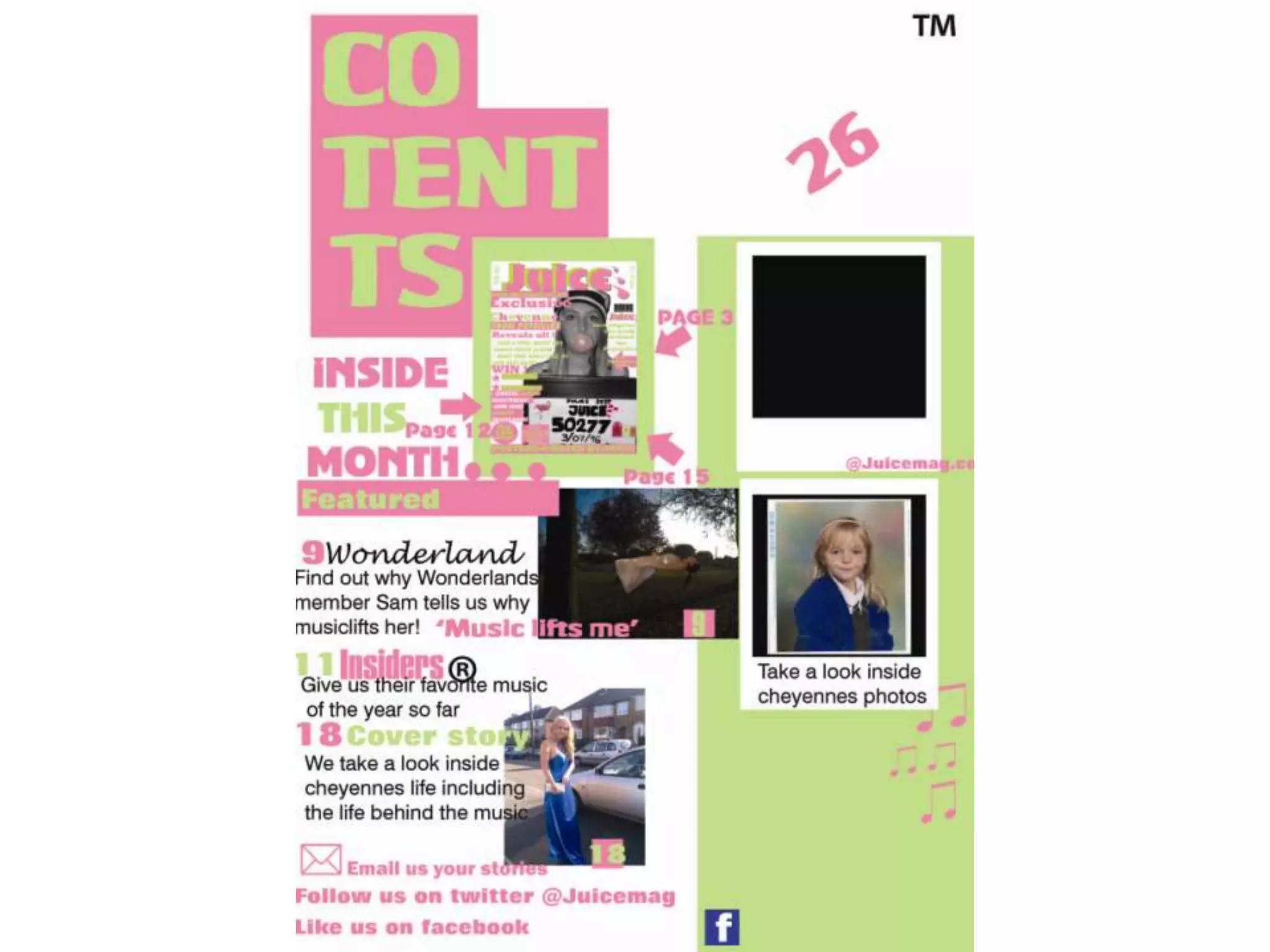
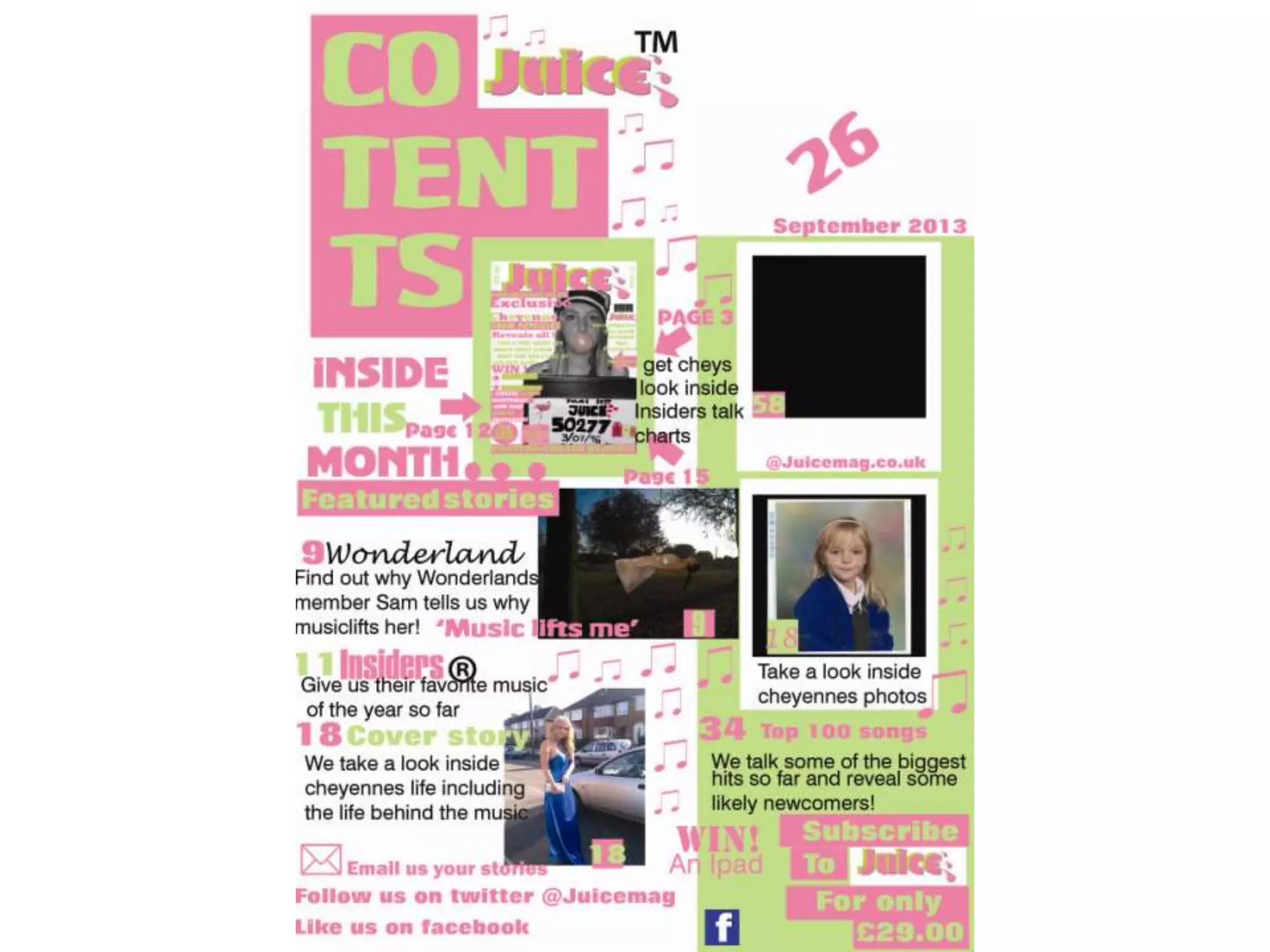
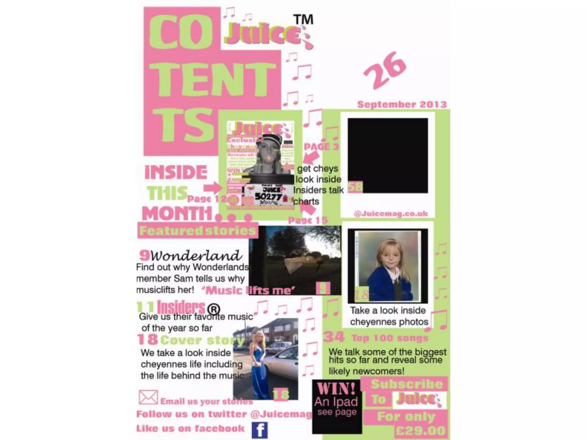
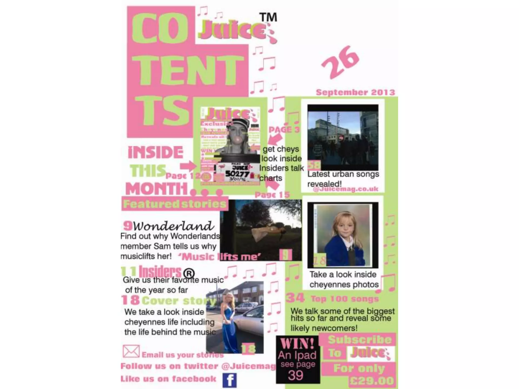
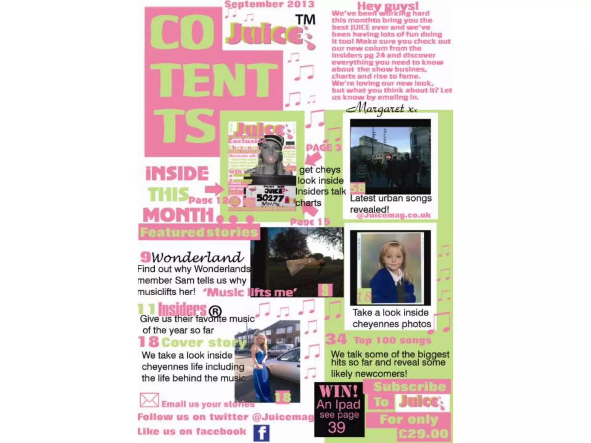
Process one
• Here I have added more text to my contents
  page and I chose the colour black to do this in
  – I wanted it to stand out and look bold. I have
  also changed the ‘wonderland’ text as before
  it matched with the main title. I changed it
  because I noticed in professional magazines
  that they would use there trademark writing
  or logo if a big band was added. Finally I
  added one more picture to my contents page
  the one at the bottom.
Process two
• Here I have added the Juice logo to the top of the
  page as I researched the contents pages I saw
  that other magazines do this and was commonly
  used – I also added a TM to make it look
  authentic. To make it straight away look like a
  music magazine I added the detailing of the
  music notes. I have also added a feature from the
  media marketing industry – a subscription
  advertising section. I expanded on the text as I
  thought it needed more content so I added text
  to the paraloid, the date and another page
  number.
Process three
• Here I was just experimenting with the ‘win’
  box I thought a black colour would go but now
  I am thinking it looks too dark against the
  other colour scheme.
Process four
• In this process I added another photo I had
  taken a very urban like photograph and I
  thought this would be good for other genres
  of music. Underneath the photo I had put
  ‘latest urban songs’ to link it to the genre.
Process five
• Before I added a number ‘26’ to the top right hand side
  of the page I was supposed to add a picture here but I
  forgot that I needed to add a editors letter. So I went
  back and researched from the start the editors letter
  and what content would be put into mine. I found that
  the language was very colloquial for example ‘hey guys’
  addressing the audience. They also added the main
  features of what would be included in the magazine
  and there opinion on the subject they are talking
  about. Another commonly used feature was the
  signature of the editor at the bottom of there piece –
  to create this I then used a curly font to make it look
  like as if it had been hand written.

2nd and 3rd contents stages on contents 28thjan

  • 2.
    Process one • HereI have added more text to my contents page and I chose the colour black to do this in – I wanted it to stand out and look bold. I have also changed the ‘wonderland’ text as before it matched with the main title. I changed it because I noticed in professional magazines that they would use there trademark writing or logo if a big band was added. Finally I added one more picture to my contents page the one at the bottom.
  • 4.
    Process two • HereI have added the Juice logo to the top of the page as I researched the contents pages I saw that other magazines do this and was commonly used – I also added a TM to make it look authentic. To make it straight away look like a music magazine I added the detailing of the music notes. I have also added a feature from the media marketing industry – a subscription advertising section. I expanded on the text as I thought it needed more content so I added text to the paraloid, the date and another page number.
  • 6.
    Process three • HereI was just experimenting with the ‘win’ box I thought a black colour would go but now I am thinking it looks too dark against the other colour scheme.
  • 8.
    Process four • Inthis process I added another photo I had taken a very urban like photograph and I thought this would be good for other genres of music. Underneath the photo I had put ‘latest urban songs’ to link it to the genre.
  • 10.
    Process five • BeforeI added a number ‘26’ to the top right hand side of the page I was supposed to add a picture here but I forgot that I needed to add a editors letter. So I went back and researched from the start the editors letter and what content would be put into mine. I found that the language was very colloquial for example ‘hey guys’ addressing the audience. They also added the main features of what would be included in the magazine and there opinion on the subject they are talking about. Another commonly used feature was the signature of the editor at the bottom of there piece – to create this I then used a curly font to make it look like as if it had been hand written.