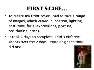
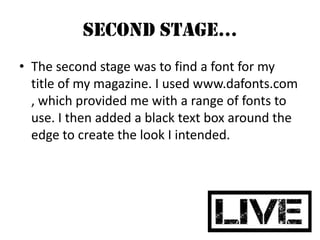
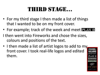
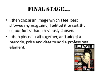
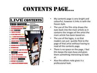
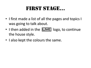
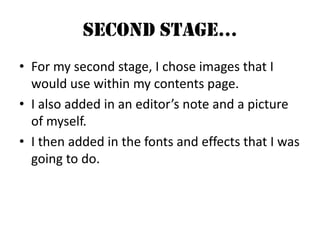
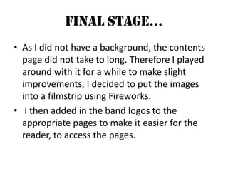
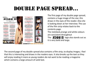
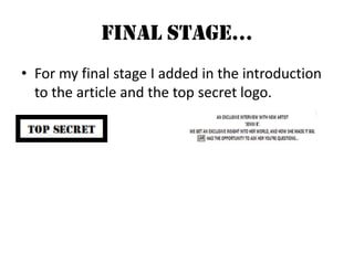
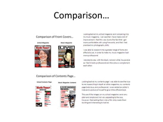
SlideShare a Scribd company logo
Evaluation	 Grace Lampard AS Media
My magazine is based on a variety of different music genres, I also wanted my mast head to reflect that, therefore I chose a font which could be classed as; rock ‘n’ roll, indie or punk, it also ties in with                     ‘s look. I chose this image to use on the front cover, as it shows                       Looking straight at her audience, it also shows her ‘rock’ side as she has a lip piercing. I also feel that the colour of the image will draw in readers as magazine pictures are not normal taken in ‘sepia’.  The variety of artists and music genres I have chosen, have all been inspired by         Magazine. I wanted to create a music magazine that appealed to all music lovers of all ages.                    The idea for the colour scheme of my magazine came from           magazine. The black, white and red colour scheme made the magazine look simple yet professional, I wanted my magazine to reflect this .
The posture of                     in my photographs shows status and attitude.  I wanted her to come across as a star with attitude to help reflect her personality.  Some photos our taken from normal height, others are taken from below the star to show status. I used an image which looked directly at the audience for the front cover, to ‘invite’ them in to read the magazine.  The facial expressions she pulls within the images, show a range of emotions, for example sometimes she smiles, sometime she shows teeth, sometimes she looks directly into the camera with a blank expression. All help to emphasise the fact that she is a ‘star with attitude’. Throughout taking the images I experimented with the lighting. Sometimes I would turn the light completely off and use the flash, however other times I would keep the light on.  The clothes which I chose for my photo shoot, where a range of; vintage, indie, festival and rock ‘n’ roll looks. I feel this also helped to show the audience that she was an artist who makes all genres of music. This also reflects how unique she is. She dresses like a typical teenager, this helps to show the audience that she is aiming her music at teenagers.
My typical reader  is a 16+ year old female, who likes a variety of music, they also love to shop in shops such as ;Topshop River Island  New Look  Zara  They listen to about 11 hours+ of music a week, and like artists such as:Drake  NickiMinaj Plan B  Paramore Eminem  They mostly listen to their music either travelling, at home or at school.They like professional yet busy magazine covers, filled with their favourite artists, with large fonts and amazing giveaways.They would spend roughly £1+ on a music magazine each week or month.There favourite colours are: Red, Black, Pink, Green, White, Yellow etc, i feel that for my magazine i will stick to : Red, Black & White in similarity to Q magazine as i feel it looks very professional and clear.My reader will go to around 4-6 concerts a year varying form gigs to festivals, they will spend most of their money on tickets, clothing, music, perfume, Dvd's and socialising.Overall my reader will be a music lover, who loves to spend most of her time either with friends or listening to music at home or at school, she will be into a range of subjects at school, and who loves to attend concerts and festivals with friends.
Front Cover… I feel that my magazine cover is very professional looking. You can clearly see the main image, and read all of the text on the front.  The logo at the top of the page, is bold and eye-catching, therefore memorable. It will also stand out on news stands.  The main image is not in a colour you would normally expect I took it in ‘sepia’ to help compliment the colours of font u used. The use of the logos throughout the page, is so that people have never read the magazine, but know the artists within will want to read it. They do not have to pick up and flick through the magazine to know that the artists are in the magazine, they can just recognize their logos.  ‘Exclusive Interview Jenni B’ is the main article of the magazine therefore it had to stand out more than the rest, I chose to do this by putting a glow effect behind the font.
First Stage… To create my front cover I had to take a range of images, which varied in location, lighting, costumes, facial expressions, posture, positioning, props.  It took 2 days to complete, I did 3 different shoots over the 2 days, improving each time I did one.
Second Stage… The second stage was to find a font for my title of my magazine. I used www.dafonts.com , which provided me with a range of fonts to use. I then added a black text box around the edge to create the look I intended.
Third Stage… For my third stage I then made a list of things that I wanted to be on my front cover.  For example; track of the week and meet I then went into Fireworks and chose the sizes, colours and positions of the text. I then made a list of artist logos to add to my front cover. I took real-life logos and edited them.
Final Stage… I then chose an image which I feel best showed my magazine, I edited it to suit the colour fonts I had previously chosen.  I then pieced it all together, and added a barcode, price and date to add a professional element.
Contents Page… My contents page is very bright and colourful, however it links in with the house style. The use of the film strip draws the eyes back into the main article as it contains the images of the artist the main article has been based on. The use of the logos, is so that readers can just  quickly flick to the page of that artist without having to read all the contents page. There is no space on the page, I feel this keeps the eyes busy and gives them something interesting to look at. Also the editors note gives it a professional look.
First Stage… I first made a list of all the pages and topics I was going to talk about. I then added in the              logo, to continue the house style.  I also kept the colours the same.
Second Stage… For my second stage, I chose images that I would use within my contents page. I also added in an editor’s note and a picture of myself. I then added in the fonts and effects that I was going to do.
Final Stage… As I did not have a background, the contents page did not take to long. Therefore I played around with it for a while to make slight improvements, I decided to put the images into a filmstrip using Fireworks.  I then added in the band logos to the appropriate pages to make it easier for the reader, to access the pages.
Double Page Spread… The first page of my double page spread, contains a huge image of the star, this draws in the eyes of the reader. Also she is looking down at her interview. The use  of the film strip relates back to the contents page. The red,black,orange and white colours are consistent throughout The                          logo also stands out as it is very bold and large. The second page of my double spread also contains a film strip, to display images, I feel that this is interesting and draws in the readers eyes. It also breaks up the text so they will enjoy reading it more as young readers do not want to be reading a magazine which contains a large amount of solid text.
First Stage… My first stage was to pick out images which I felt would be effective. I decided to use the large image down the right hand side of the first page, as she is looking down into the interview.  I then continued the house style, by using a filmstrip to put the images in, I also continued this on my last page.
Second Stage… For my second stage I started to type up my interview. This did not take long as I had inspiration from other magazines.  I then added in the             logo, which I also got from www.dafonts.com
Third Stage… For my third stage, I pieced it all together, changing the font colour and sizes.
Final Stage… For my final stage I added in the introduction to the article and the top secret logo.
Comparison…
What I Have Learnt From Creating My Product… I have learnt a range of new skills, for example how to effectively use Fireworks. Also I have learnt how to take good quality photographs and put them into a magazine and make them look professional.  I have also been introduced to new websites, such as; blogger, flickr, slideshare, dafonts, all of these have helped me to create my product and help me to create a successful blog. After researching into the magazine industry, I was able to learn facts about the industry that I never knew before, It also helped me to understand what makes a successful magazine.
Ellie Thacker: I like how consistent the house style is throughout, I also like the images and the overall look of the magazine. Jack Stieful: I love the font that has been used for the logo. I also like how busy each page is.     FEEDBACK….CLICK ON LINK TO WATCH VIDEO http://www.youtube.com/watch?v=aTFlTWIrzyYTHANKS TO JACK & NANCY FOR TAKING PART Teresa Templey: I love the images, and the use of the film strip it is very eye-catching. Also the colours used throughout are very pleasing to the eye, and go well together.  Callum Murphy: I like the use of the band logos, it makes the magazine look professional.

More Related Content

What's hot

Representations in my magazine
Representations in my magazine Representations in my magazine
Representations in my magazine lewisjupp97
 
Media Studies - In what ways does your media product use, develop or challeng...
Media Studies - In what ways does your media product use, develop or challeng...Media Studies - In what ways does your media product use, develop or challeng...
Media Studies - In what ways does your media product use, develop or challeng...Sana Khurshid
 
Media Evaluation
Media Evaluation Media Evaluation
Media Evaluation
seguramedia
 
Evaluation
EvaluationEvaluation
Evaluationellfred
 
Unit 14 lo1-l02 completed
Unit 14   lo1-l02 completedUnit 14   lo1-l02 completed
Unit 14 lo1-l02 completed
Billysimmonds3133
 
Possible names for my music magazine
Possible names for my music magazinePossible names for my music magazine
Possible names for my music magazineRachell_94
 
Question 1 evaluation
Question 1 evaluationQuestion 1 evaluation
Question 1 evaluationMikeCason
 
Evaluation q1
Evaluation q1Evaluation q1
Evaluation q1
bellaorwin
 
Possible names for my music magazine
Possible names for my music magazinePossible names for my music magazine
Possible names for my music magazineRachell_94
 
Magazine evaluation
Magazine evaluationMagazine evaluation
Magazine evaluationBef_Watson
 
Evaluation question 1
Evaluation question 1Evaluation question 1
Evaluation question 1Shayne Quiseo
 

What's hot (17)

Representations in my magazine
Representations in my magazine Representations in my magazine
Representations in my magazine
 
Media Studies - In what ways does your media product use, develop or challeng...
Media Studies - In what ways does your media product use, develop or challeng...Media Studies - In what ways does your media product use, develop or challeng...
Media Studies - In what ways does your media product use, develop or challeng...
 
Media Evaluation
Media Evaluation Media Evaluation
Media Evaluation
 
Evaluation
EvaluationEvaluation
Evaluation
 
Evaluation- one
Evaluation- one Evaluation- one
Evaluation- one
 
Planning
PlanningPlanning
Planning
 
Unit 14 lo1-l02 completed
Unit 14   lo1-l02 completedUnit 14   lo1-l02 completed
Unit 14 lo1-l02 completed
 
5
55
5
 
Planning
PlanningPlanning
Planning
 
Possible names for my music magazine
Possible names for my music magazinePossible names for my music magazine
Possible names for my music magazine
 
Planning
PlanningPlanning
Planning
 
Question 1 evaluation
Question 1 evaluationQuestion 1 evaluation
Question 1 evaluation
 
Evaluation q1
Evaluation q1Evaluation q1
Evaluation q1
 
Possible names for my music magazine
Possible names for my music magazinePossible names for my music magazine
Possible names for my music magazine
 
Magazine evaluation
Magazine evaluationMagazine evaluation
Magazine evaluation
 
Evaluation
EvaluationEvaluation
Evaluation
 
Evaluation question 1
Evaluation question 1Evaluation question 1
Evaluation question 1
 

Viewers also liked

Get A Job!
Get A Job!Get A Job!
Coordinating risk mgt and assurance march 2012
Coordinating risk mgt and assurance   march 2012Coordinating risk mgt and assurance   march 2012
Coordinating risk mgt and assurance march 2012Good Light Massage Center
 
2.1 Basics of Rapid Re-Housing
2.1 Basics of Rapid Re-Housing2.1 Basics of Rapid Re-Housing
2.1 Basics of Rapid Re-Housing
National Alliance to End Homelessness
 
MYP unit planner yr6-t2-Are you a have or have not
MYP unit planner yr6-t2-Are you a have or have notMYP unit planner yr6-t2-Are you a have or have not
MYP unit planner yr6-t2-Are you a have or have notaissaigon
 
Leadership Regulation Markets And The Law of Unintended Consequences
Leadership Regulation Markets And The Law of Unintended ConsequencesLeadership Regulation Markets And The Law of Unintended Consequences
Leadership Regulation Markets And The Law of Unintended Consequences
Barry Schachter
 
蛙大在散漫
蛙大在散漫蛙大在散漫
蛙大在散漫
Jaing Lai
 

Viewers also liked (9)

Get A Job!
Get A Job!Get A Job!
Get A Job!
 
Guide to writing a business plan
Guide to writing a business planGuide to writing a business plan
Guide to writing a business plan
 
Coordinating risk mgt and assurance march 2012
Coordinating risk mgt and assurance   march 2012Coordinating risk mgt and assurance   march 2012
Coordinating risk mgt and assurance march 2012
 
Connell b
Connell bConnell b
Connell b
 
2.1 Basics of Rapid Re-Housing
2.1 Basics of Rapid Re-Housing2.1 Basics of Rapid Re-Housing
2.1 Basics of Rapid Re-Housing
 
MYP unit planner yr6-t2-Are you a have or have not
MYP unit planner yr6-t2-Are you a have or have notMYP unit planner yr6-t2-Are you a have or have not
MYP unit planner yr6-t2-Are you a have or have not
 
Leadership Regulation Markets And The Law of Unintended Consequences
Leadership Regulation Markets And The Law of Unintended ConsequencesLeadership Regulation Markets And The Law of Unintended Consequences
Leadership Regulation Markets And The Law of Unintended Consequences
 
蛙大在散漫
蛙大在散漫蛙大在散漫
蛙大在散漫
 
Snapshot dayinfo
Snapshot dayinfoSnapshot dayinfo
Snapshot dayinfo
 

Similar to Evaluation media

Introduction
IntroductionIntroduction
Introductionpoppy
 
Unit 14 -Producing a print based Media product.
Unit 14 -Producing a print based Media product.Unit 14 -Producing a print based Media product.
Unit 14 -Producing a print based Media product.
Billysimmonds3133
 
Evaluation presentation
Evaluation presentationEvaluation presentation
Evaluation presentationSharkey1
 
Evaluation part one
Evaluation part oneEvaluation part one
Evaluation part oneheena93
 
Magazine evaluation
Magazine evaluationMagazine evaluation
Magazine evaluation
mariamamour
 
Magazine evaluation
Magazine evaluationMagazine evaluation
Magazine evaluationmariamamour
 
Magazine evaluation
Magazine evaluationMagazine evaluation
Magazine evaluationmariamamour
 
Media studies as powerpoint 2
Media studies as powerpoint 2Media studies as powerpoint 2
Media studies as powerpoint 2lucyjwalmsley
 

Similar to Evaluation media (20)

Presentation
PresentationPresentation
Presentation
 
presentation
presentationpresentation
presentation
 
Evaluation text
Evaluation textEvaluation text
Evaluation text
 
Introduction
IntroductionIntroduction
Introduction
 
Features page
Features pageFeatures page
Features page
 
Evaluation
EvaluationEvaluation
Evaluation
 
Evaluation
EvaluationEvaluation
Evaluation
 
Evaluation
EvaluationEvaluation
Evaluation
 
Unit 14 -Producing a print based Media product.
Unit 14 -Producing a print based Media product.Unit 14 -Producing a print based Media product.
Unit 14 -Producing a print based Media product.
 
Evaluation
EvaluationEvaluation
Evaluation
 
Evaluation
EvaluationEvaluation
Evaluation
 
Evaluation presentation
Evaluation presentationEvaluation presentation
Evaluation presentation
 
Evaluation part one
Evaluation part oneEvaluation part one
Evaluation part one
 
Evaluation
EvaluationEvaluation
Evaluation
 
Magazine evaluation
Magazine evaluationMagazine evaluation
Magazine evaluation
 
Magazine evaluation
Magazine evaluationMagazine evaluation
Magazine evaluation
 
Magazine evaluation
Magazine evaluationMagazine evaluation
Magazine evaluation
 
Media c.w
Media c.wMedia c.w
Media c.w
 
Evaluation
EvaluationEvaluation
Evaluation
 
Media studies as powerpoint 2
Media studies as powerpoint 2Media studies as powerpoint 2
Media studies as powerpoint 2
 

Recently uploaded

Phrasal Verbs.XXXXXXXXXXXXXXXXXXXXXXXXXX
Phrasal Verbs.XXXXXXXXXXXXXXXXXXXXXXXXXXPhrasal Verbs.XXXXXXXXXXXXXXXXXXXXXXXXXX
Phrasal Verbs.XXXXXXXXXXXXXXXXXXXXXXXXXX
MIRIAMSALINAS13
 
BÀI TẬP BỔ TRỢ TIẾNG ANH GLOBAL SUCCESS LỚP 3 - CẢ NĂM (CÓ FILE NGHE VÀ ĐÁP Á...
BÀI TẬP BỔ TRỢ TIẾNG ANH GLOBAL SUCCESS LỚP 3 - CẢ NĂM (CÓ FILE NGHE VÀ ĐÁP Á...BÀI TẬP BỔ TRỢ TIẾNG ANH GLOBAL SUCCESS LỚP 3 - CẢ NĂM (CÓ FILE NGHE VÀ ĐÁP Á...
BÀI TẬP BỔ TRỢ TIẾNG ANH GLOBAL SUCCESS LỚP 3 - CẢ NĂM (CÓ FILE NGHE VÀ ĐÁP Á...
Nguyen Thanh Tu Collection
 
Biological Screening of Herbal Drugs in detailed.
Biological Screening of Herbal Drugs in detailed.Biological Screening of Herbal Drugs in detailed.
Biological Screening of Herbal Drugs in detailed.
Ashokrao Mane college of Pharmacy Peth-Vadgaon
 
Adversarial Attention Modeling for Multi-dimensional Emotion Regression.pdf
Adversarial Attention Modeling for Multi-dimensional Emotion Regression.pdfAdversarial Attention Modeling for Multi-dimensional Emotion Regression.pdf
Adversarial Attention Modeling for Multi-dimensional Emotion Regression.pdf
Po-Chuan Chen
 
Unit 8 - Information and Communication Technology (Paper I).pdf
Unit 8 - Information and Communication Technology (Paper I).pdfUnit 8 - Information and Communication Technology (Paper I).pdf
Unit 8 - Information and Communication Technology (Paper I).pdf
Thiyagu K
 
CLASS 11 CBSE B.St Project AIDS TO TRADE - INSURANCE
CLASS 11 CBSE B.St Project AIDS TO TRADE - INSURANCECLASS 11 CBSE B.St Project AIDS TO TRADE - INSURANCE
CLASS 11 CBSE B.St Project AIDS TO TRADE - INSURANCE
BhavyaRajput3
 
Introduction to AI for Nonprofits with Tapp Network
Introduction to AI for Nonprofits with Tapp NetworkIntroduction to AI for Nonprofits with Tapp Network
Introduction to AI for Nonprofits with Tapp Network
TechSoup
 
Francesca Gottschalk - How can education support child empowerment.pptx
Francesca Gottschalk - How can education support child empowerment.pptxFrancesca Gottschalk - How can education support child empowerment.pptx
Francesca Gottschalk - How can education support child empowerment.pptx
EduSkills OECD
 
The French Revolution Class 9 Study Material pdf free download
The French Revolution Class 9 Study Material pdf free downloadThe French Revolution Class 9 Study Material pdf free download
The French Revolution Class 9 Study Material pdf free download
Vivekanand Anglo Vedic Academy
 
Honest Reviews of Tim Han LMA Course Program.pptx
Honest Reviews of Tim Han LMA Course Program.pptxHonest Reviews of Tim Han LMA Course Program.pptx
Honest Reviews of Tim Han LMA Course Program.pptx
timhan337
 
Chapter 3 - Islamic Banking Products and Services.pptx
Chapter 3 - Islamic Banking Products and Services.pptxChapter 3 - Islamic Banking Products and Services.pptx
Chapter 3 - Islamic Banking Products and Services.pptx
Mohd Adib Abd Muin, Senior Lecturer at Universiti Utara Malaysia
 
Language Across the Curriculm LAC B.Ed.
Language Across the  Curriculm LAC B.Ed.Language Across the  Curriculm LAC B.Ed.
Language Across the Curriculm LAC B.Ed.
Atul Kumar Singh
 
CACJapan - GROUP Presentation 1- Wk 4.pdf
CACJapan - GROUP Presentation 1- Wk 4.pdfCACJapan - GROUP Presentation 1- Wk 4.pdf
CACJapan - GROUP Presentation 1- Wk 4.pdf
camakaiclarkmusic
 
2024.06.01 Introducing a competency framework for languag learning materials ...
2024.06.01 Introducing a competency framework for languag learning materials ...2024.06.01 Introducing a competency framework for languag learning materials ...
2024.06.01 Introducing a competency framework for languag learning materials ...
Sandy Millin
 
How libraries can support authors with open access requirements for UKRI fund...
How libraries can support authors with open access requirements for UKRI fund...How libraries can support authors with open access requirements for UKRI fund...
How libraries can support authors with open access requirements for UKRI fund...
Jisc
 
A Strategic Approach: GenAI in Education
A Strategic Approach: GenAI in EducationA Strategic Approach: GenAI in Education
A Strategic Approach: GenAI in Education
Peter Windle
 
Home assignment II on Spectroscopy 2024 Answers.pdf
Home assignment II on Spectroscopy 2024 Answers.pdfHome assignment II on Spectroscopy 2024 Answers.pdf
Home assignment II on Spectroscopy 2024 Answers.pdf
Tamralipta Mahavidyalaya
 
678020731-Sumas-y-Restas-Para-Colorear.pdf
678020731-Sumas-y-Restas-Para-Colorear.pdf678020731-Sumas-y-Restas-Para-Colorear.pdf
678020731-Sumas-y-Restas-Para-Colorear.pdf
CarlosHernanMontoyab2
 
Synthetic Fiber Construction in lab .pptx
Synthetic Fiber Construction in lab .pptxSynthetic Fiber Construction in lab .pptx
Synthetic Fiber Construction in lab .pptx
Pavel ( NSTU)
 
The Challenger.pdf DNHS Official Publication
The Challenger.pdf DNHS Official PublicationThe Challenger.pdf DNHS Official Publication
The Challenger.pdf DNHS Official Publication
Delapenabediema
 

Recently uploaded (20)

Phrasal Verbs.XXXXXXXXXXXXXXXXXXXXXXXXXX
Phrasal Verbs.XXXXXXXXXXXXXXXXXXXXXXXXXXPhrasal Verbs.XXXXXXXXXXXXXXXXXXXXXXXXXX
Phrasal Verbs.XXXXXXXXXXXXXXXXXXXXXXXXXX
 
BÀI TẬP BỔ TRỢ TIẾNG ANH GLOBAL SUCCESS LỚP 3 - CẢ NĂM (CÓ FILE NGHE VÀ ĐÁP Á...
BÀI TẬP BỔ TRỢ TIẾNG ANH GLOBAL SUCCESS LỚP 3 - CẢ NĂM (CÓ FILE NGHE VÀ ĐÁP Á...BÀI TẬP BỔ TRỢ TIẾNG ANH GLOBAL SUCCESS LỚP 3 - CẢ NĂM (CÓ FILE NGHE VÀ ĐÁP Á...
BÀI TẬP BỔ TRỢ TIẾNG ANH GLOBAL SUCCESS LỚP 3 - CẢ NĂM (CÓ FILE NGHE VÀ ĐÁP Á...
 
Biological Screening of Herbal Drugs in detailed.
Biological Screening of Herbal Drugs in detailed.Biological Screening of Herbal Drugs in detailed.
Biological Screening of Herbal Drugs in detailed.
 
Adversarial Attention Modeling for Multi-dimensional Emotion Regression.pdf
Adversarial Attention Modeling for Multi-dimensional Emotion Regression.pdfAdversarial Attention Modeling for Multi-dimensional Emotion Regression.pdf
Adversarial Attention Modeling for Multi-dimensional Emotion Regression.pdf
 
Unit 8 - Information and Communication Technology (Paper I).pdf
Unit 8 - Information and Communication Technology (Paper I).pdfUnit 8 - Information and Communication Technology (Paper I).pdf
Unit 8 - Information and Communication Technology (Paper I).pdf
 
CLASS 11 CBSE B.St Project AIDS TO TRADE - INSURANCE
CLASS 11 CBSE B.St Project AIDS TO TRADE - INSURANCECLASS 11 CBSE B.St Project AIDS TO TRADE - INSURANCE
CLASS 11 CBSE B.St Project AIDS TO TRADE - INSURANCE
 
Introduction to AI for Nonprofits with Tapp Network
Introduction to AI for Nonprofits with Tapp NetworkIntroduction to AI for Nonprofits with Tapp Network
Introduction to AI for Nonprofits with Tapp Network
 
Francesca Gottschalk - How can education support child empowerment.pptx
Francesca Gottschalk - How can education support child empowerment.pptxFrancesca Gottschalk - How can education support child empowerment.pptx
Francesca Gottschalk - How can education support child empowerment.pptx
 
The French Revolution Class 9 Study Material pdf free download
The French Revolution Class 9 Study Material pdf free downloadThe French Revolution Class 9 Study Material pdf free download
The French Revolution Class 9 Study Material pdf free download
 
Honest Reviews of Tim Han LMA Course Program.pptx
Honest Reviews of Tim Han LMA Course Program.pptxHonest Reviews of Tim Han LMA Course Program.pptx
Honest Reviews of Tim Han LMA Course Program.pptx
 
Chapter 3 - Islamic Banking Products and Services.pptx
Chapter 3 - Islamic Banking Products and Services.pptxChapter 3 - Islamic Banking Products and Services.pptx
Chapter 3 - Islamic Banking Products and Services.pptx
 
Language Across the Curriculm LAC B.Ed.
Language Across the  Curriculm LAC B.Ed.Language Across the  Curriculm LAC B.Ed.
Language Across the Curriculm LAC B.Ed.
 
CACJapan - GROUP Presentation 1- Wk 4.pdf
CACJapan - GROUP Presentation 1- Wk 4.pdfCACJapan - GROUP Presentation 1- Wk 4.pdf
CACJapan - GROUP Presentation 1- Wk 4.pdf
 
2024.06.01 Introducing a competency framework for languag learning materials ...
2024.06.01 Introducing a competency framework for languag learning materials ...2024.06.01 Introducing a competency framework for languag learning materials ...
2024.06.01 Introducing a competency framework for languag learning materials ...
 
How libraries can support authors with open access requirements for UKRI fund...
How libraries can support authors with open access requirements for UKRI fund...How libraries can support authors with open access requirements for UKRI fund...
How libraries can support authors with open access requirements for UKRI fund...
 
A Strategic Approach: GenAI in Education
A Strategic Approach: GenAI in EducationA Strategic Approach: GenAI in Education
A Strategic Approach: GenAI in Education
 
Home assignment II on Spectroscopy 2024 Answers.pdf
Home assignment II on Spectroscopy 2024 Answers.pdfHome assignment II on Spectroscopy 2024 Answers.pdf
Home assignment II on Spectroscopy 2024 Answers.pdf
 
678020731-Sumas-y-Restas-Para-Colorear.pdf
678020731-Sumas-y-Restas-Para-Colorear.pdf678020731-Sumas-y-Restas-Para-Colorear.pdf
678020731-Sumas-y-Restas-Para-Colorear.pdf
 
Synthetic Fiber Construction in lab .pptx
Synthetic Fiber Construction in lab .pptxSynthetic Fiber Construction in lab .pptx
Synthetic Fiber Construction in lab .pptx
 
The Challenger.pdf DNHS Official Publication
The Challenger.pdf DNHS Official PublicationThe Challenger.pdf DNHS Official Publication
The Challenger.pdf DNHS Official Publication
 

Evaluation media

  • 2. My magazine is based on a variety of different music genres, I also wanted my mast head to reflect that, therefore I chose a font which could be classed as; rock ‘n’ roll, indie or punk, it also ties in with ‘s look. I chose this image to use on the front cover, as it shows Looking straight at her audience, it also shows her ‘rock’ side as she has a lip piercing. I also feel that the colour of the image will draw in readers as magazine pictures are not normal taken in ‘sepia’. The variety of artists and music genres I have chosen, have all been inspired by Magazine. I wanted to create a music magazine that appealed to all music lovers of all ages. The idea for the colour scheme of my magazine came from magazine. The black, white and red colour scheme made the magazine look simple yet professional, I wanted my magazine to reflect this .
  • 3. The posture of in my photographs shows status and attitude. I wanted her to come across as a star with attitude to help reflect her personality. Some photos our taken from normal height, others are taken from below the star to show status. I used an image which looked directly at the audience for the front cover, to ‘invite’ them in to read the magazine. The facial expressions she pulls within the images, show a range of emotions, for example sometimes she smiles, sometime she shows teeth, sometimes she looks directly into the camera with a blank expression. All help to emphasise the fact that she is a ‘star with attitude’. Throughout taking the images I experimented with the lighting. Sometimes I would turn the light completely off and use the flash, however other times I would keep the light on. The clothes which I chose for my photo shoot, where a range of; vintage, indie, festival and rock ‘n’ roll looks. I feel this also helped to show the audience that she was an artist who makes all genres of music. This also reflects how unique she is. She dresses like a typical teenager, this helps to show the audience that she is aiming her music at teenagers.
  • 4. My typical reader is a 16+ year old female, who likes a variety of music, they also love to shop in shops such as ;Topshop River Island New Look Zara They listen to about 11 hours+ of music a week, and like artists such as:Drake NickiMinaj Plan B Paramore Eminem They mostly listen to their music either travelling, at home or at school.They like professional yet busy magazine covers, filled with their favourite artists, with large fonts and amazing giveaways.They would spend roughly £1+ on a music magazine each week or month.There favourite colours are: Red, Black, Pink, Green, White, Yellow etc, i feel that for my magazine i will stick to : Red, Black & White in similarity to Q magazine as i feel it looks very professional and clear.My reader will go to around 4-6 concerts a year varying form gigs to festivals, they will spend most of their money on tickets, clothing, music, perfume, Dvd's and socialising.Overall my reader will be a music lover, who loves to spend most of her time either with friends or listening to music at home or at school, she will be into a range of subjects at school, and who loves to attend concerts and festivals with friends.
  • 5. Front Cover… I feel that my magazine cover is very professional looking. You can clearly see the main image, and read all of the text on the front. The logo at the top of the page, is bold and eye-catching, therefore memorable. It will also stand out on news stands. The main image is not in a colour you would normally expect I took it in ‘sepia’ to help compliment the colours of font u used. The use of the logos throughout the page, is so that people have never read the magazine, but know the artists within will want to read it. They do not have to pick up and flick through the magazine to know that the artists are in the magazine, they can just recognize their logos. ‘Exclusive Interview Jenni B’ is the main article of the magazine therefore it had to stand out more than the rest, I chose to do this by putting a glow effect behind the font.
  • 6. First Stage… To create my front cover I had to take a range of images, which varied in location, lighting, costumes, facial expressions, posture, positioning, props. It took 2 days to complete, I did 3 different shoots over the 2 days, improving each time I did one.
  • 7. Second Stage… The second stage was to find a font for my title of my magazine. I used www.dafonts.com , which provided me with a range of fonts to use. I then added a black text box around the edge to create the look I intended.
  • 8. Third Stage… For my third stage I then made a list of things that I wanted to be on my front cover. For example; track of the week and meet I then went into Fireworks and chose the sizes, colours and positions of the text. I then made a list of artist logos to add to my front cover. I took real-life logos and edited them.
  • 9. Final Stage… I then chose an image which I feel best showed my magazine, I edited it to suit the colour fonts I had previously chosen. I then pieced it all together, and added a barcode, price and date to add a professional element.
  • 10. Contents Page… My contents page is very bright and colourful, however it links in with the house style. The use of the film strip draws the eyes back into the main article as it contains the images of the artist the main article has been based on. The use of the logos, is so that readers can just quickly flick to the page of that artist without having to read all the contents page. There is no space on the page, I feel this keeps the eyes busy and gives them something interesting to look at. Also the editors note gives it a professional look.
  • 11. First Stage… I first made a list of all the pages and topics I was going to talk about. I then added in the logo, to continue the house style. I also kept the colours the same.
  • 12. Second Stage… For my second stage, I chose images that I would use within my contents page. I also added in an editor’s note and a picture of myself. I then added in the fonts and effects that I was going to do.
  • 13. Final Stage… As I did not have a background, the contents page did not take to long. Therefore I played around with it for a while to make slight improvements, I decided to put the images into a filmstrip using Fireworks. I then added in the band logos to the appropriate pages to make it easier for the reader, to access the pages.
  • 14. Double Page Spread… The first page of my double page spread, contains a huge image of the star, this draws in the eyes of the reader. Also she is looking down at her interview. The use of the film strip relates back to the contents page. The red,black,orange and white colours are consistent throughout The logo also stands out as it is very bold and large. The second page of my double spread also contains a film strip, to display images, I feel that this is interesting and draws in the readers eyes. It also breaks up the text so they will enjoy reading it more as young readers do not want to be reading a magazine which contains a large amount of solid text.
  • 15. First Stage… My first stage was to pick out images which I felt would be effective. I decided to use the large image down the right hand side of the first page, as she is looking down into the interview. I then continued the house style, by using a filmstrip to put the images in, I also continued this on my last page.
  • 16. Second Stage… For my second stage I started to type up my interview. This did not take long as I had inspiration from other magazines. I then added in the logo, which I also got from www.dafonts.com
  • 17. Third Stage… For my third stage, I pieced it all together, changing the font colour and sizes.
  • 18. Final Stage… For my final stage I added in the introduction to the article and the top secret logo.
  • 20. What I Have Learnt From Creating My Product… I have learnt a range of new skills, for example how to effectively use Fireworks. Also I have learnt how to take good quality photographs and put them into a magazine and make them look professional. I have also been introduced to new websites, such as; blogger, flickr, slideshare, dafonts, all of these have helped me to create my product and help me to create a successful blog. After researching into the magazine industry, I was able to learn facts about the industry that I never knew before, It also helped me to understand what makes a successful magazine.
  • 21. Ellie Thacker: I like how consistent the house style is throughout, I also like the images and the overall look of the magazine. Jack Stieful: I love the font that has been used for the logo. I also like how busy each page is. FEEDBACK….CLICK ON LINK TO WATCH VIDEO http://www.youtube.com/watch?v=aTFlTWIrzyYTHANKS TO JACK & NANCY FOR TAKING PART Teresa Templey: I love the images, and the use of the film strip it is very eye-catching. Also the colours used throughout are very pleasing to the eye, and go well together. Callum Murphy: I like the use of the band logos, it makes the magazine look professional.