Magazine draft based on drawn
draft
Lauren Fitzsimons
This is the poster that I based this
draft on because it is the same
genre and concept that I wanted
to convey. This poster was good to
base a draft on because of the
dark colours and the image which
I think is menacing and
calculating. The cover lines are
non conventional because they
are pushed in the right hand side
corner and they only include
names of the features they
haven’t really gave much away. I
do however like the conventional
features such as the circle bits of
information that are added. The
font is the thing I found the most
inspiring just the fact that the
Joker title is in different colour but
they match the colour scheme
and the letter O’s are in boxes.
Process one
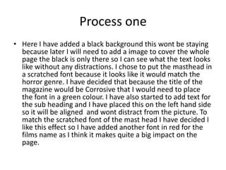
• Here I have added a black background this wont be staying
because later I will need to add a image to cover the whole
page the black is only there so I can see what the text looks
like without any distractions. I chose to put the masthead in
a scratched font because it looks like it would match the
horror genre. I have decided that because the title of the
magazine would be Corrosive that I would need to place
the font in a green colour. I have also started to add text for
the sub heading and I have placed this on the left hand side
so it will be aligned and wont distract from the picture. To
match the scratched font of the mast head I have decided I
like this effect so I have added another font in red for the
films name as I think it makes quite a big impact on the
page.
Process two
• This is my next step and here I am just
perfecting the text to the page I have added a
website small at the top as I have
conventionally been saw this done. I have also
added the green circle to match and more
cover line text – including ‘one on one with
corrosives villain’ I have decided not to put
these the same size and not align them so it
looks disjointed and draws more attention.
Here I have only added the
plug so people will be
interested by the fact that
its exclusive – the language
of exclusive is very
conventional and is the
right words for persuasive
selling. I decided to add it
in white to really stand out
against the red and green
colour scheme – this was
also important when I
thought of the text type I
was going to use so I
picked a bold chunky font.
Process three
• Here I am just defining the little details such as the date ,
issue and price all of these minor things make it look more
professional – I added these in white and I’m not sure that
this will stand out after I have added the image but this can
be changed at a later date. I have also used the inspiration
of the Empire magazine and created my own quote review
‘he is a mad calculating Trixter’ this I think is effective
because of the text used to do this again this is the
distorted font that I think links with a horror genre. The
text from the green circle is also something that I have
added onto the page – I thought very carefully about the
language here and I think alliteration works well ‘complete
collection’ makes it easier to read quickly.
Process four
• I have now thought about the tag lines and
the subject matter of what they should be
advertising at the minute the font size is a
little out but when they are all aligned and
they are all the same sized this will work quite
well. When thinking about the tag lines I tried
to keep the wording quite simple just like the
original Empire one.
This is the image that I
have chosen to go on the
page of the magazine this
image is from the internet
but I will take my own
image which is similar later
on. I like this image
because it is a mid shot
and fills up the page the
colours also match the
colours that I have put my
text in. When taking the
image I will take all these
things into consideration.
Here is my finial finished
magazine cover and I
have aligned all the cover
lines and I am happy with
the outcome I really like
the layout of Empire and I
think this is the one that I
will be using when I take
my own image.

Magazine draft based on drawn draft

  • 1.
    Magazine draft basedon drawn draft Lauren Fitzsimons
  • 2.
    This is theposter that I based this draft on because it is the same genre and concept that I wanted to convey. This poster was good to base a draft on because of the dark colours and the image which I think is menacing and calculating. The cover lines are non conventional because they are pushed in the right hand side corner and they only include names of the features they haven’t really gave much away. I do however like the conventional features such as the circle bits of information that are added. The font is the thing I found the most inspiring just the fact that the Joker title is in different colour but they match the colour scheme and the letter O’s are in boxes.
  • 4.
    Process one • HereI have added a black background this wont be staying because later I will need to add a image to cover the whole page the black is only there so I can see what the text looks like without any distractions. I chose to put the masthead in a scratched font because it looks like it would match the horror genre. I have decided that because the title of the magazine would be Corrosive that I would need to place the font in a green colour. I have also started to add text for the sub heading and I have placed this on the left hand side so it will be aligned and wont distract from the picture. To match the scratched font of the mast head I have decided I like this effect so I have added another font in red for the films name as I think it makes quite a big impact on the page.
  • 6.
    Process two • Thisis my next step and here I am just perfecting the text to the page I have added a website small at the top as I have conventionally been saw this done. I have also added the green circle to match and more cover line text – including ‘one on one with corrosives villain’ I have decided not to put these the same size and not align them so it looks disjointed and draws more attention.
  • 7.
    Here I haveonly added the plug so people will be interested by the fact that its exclusive – the language of exclusive is very conventional and is the right words for persuasive selling. I decided to add it in white to really stand out against the red and green colour scheme – this was also important when I thought of the text type I was going to use so I picked a bold chunky font.
  • 9.
    Process three • HereI am just defining the little details such as the date , issue and price all of these minor things make it look more professional – I added these in white and I’m not sure that this will stand out after I have added the image but this can be changed at a later date. I have also used the inspiration of the Empire magazine and created my own quote review ‘he is a mad calculating Trixter’ this I think is effective because of the text used to do this again this is the distorted font that I think links with a horror genre. The text from the green circle is also something that I have added onto the page – I thought very carefully about the language here and I think alliteration works well ‘complete collection’ makes it easier to read quickly.
  • 11.
    Process four • Ihave now thought about the tag lines and the subject matter of what they should be advertising at the minute the font size is a little out but when they are all aligned and they are all the same sized this will work quite well. When thinking about the tag lines I tried to keep the wording quite simple just like the original Empire one.
  • 12.
    This is theimage that I have chosen to go on the page of the magazine this image is from the internet but I will take my own image which is similar later on. I like this image because it is a mid shot and fills up the page the colours also match the colours that I have put my text in. When taking the image I will take all these things into consideration.
  • 13.
    Here is myfinial finished magazine cover and I have aligned all the cover lines and I am happy with the outcome I really like the layout of Empire and I think this is the one that I will be using when I take my own image.