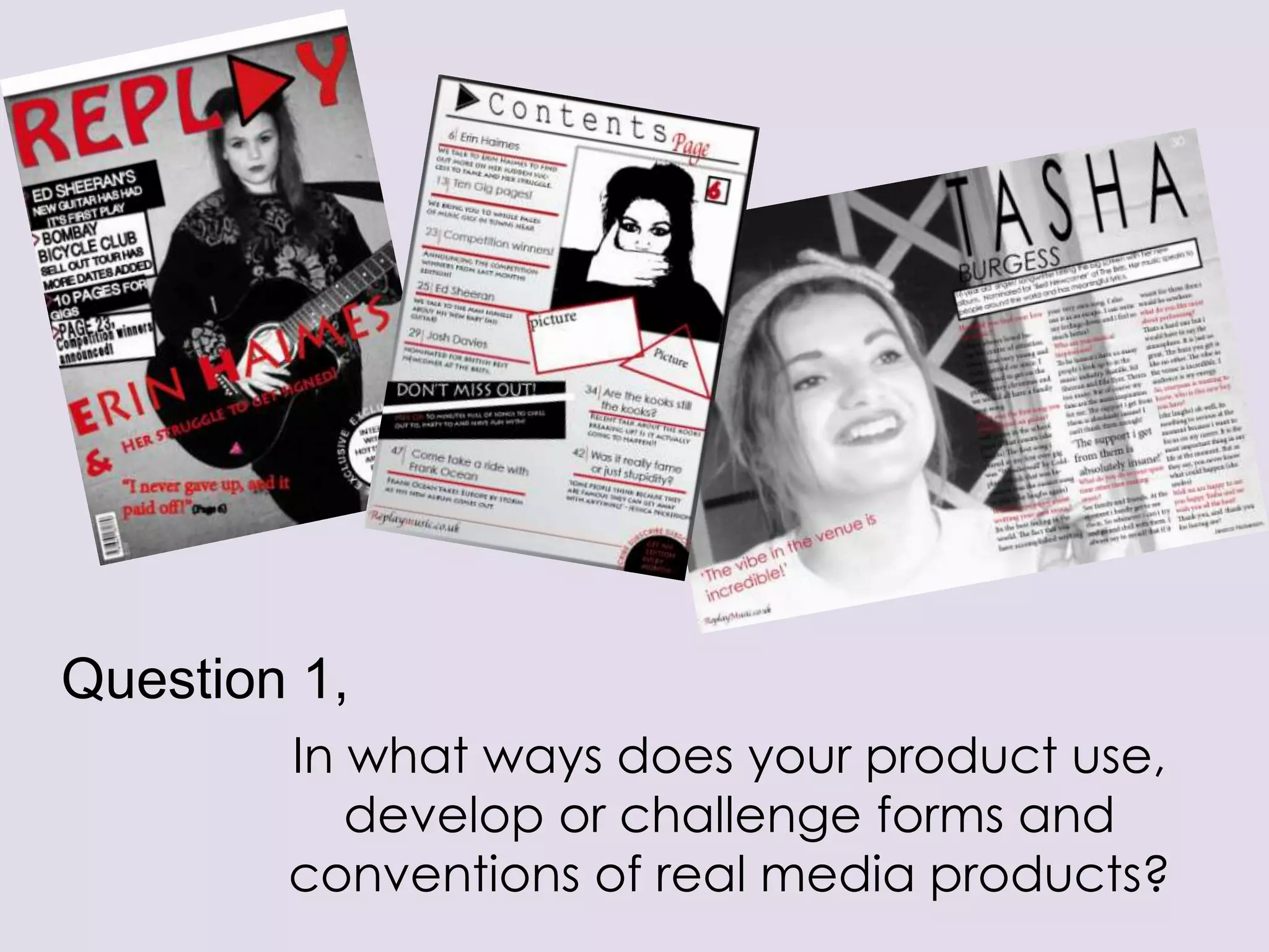
Question 1,
In what ways does your product use,
develop or challenge forms and
conventions of real media products?
Front
cover

When I started to make my music magazine,
initially I looked at some published magazines to
make sure I had included
-

-

-

-

-

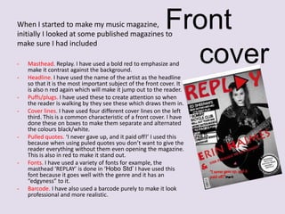
Masthead. Replay. I have used a bold red to emphasize and
make it contrast against the background.
Headline. I have used the name of the artist as the headline
so that it is the most important subject of the front cover. It
is also n red again which will make it jump out to the reader.
Puffs/plugs. I have used these to create attention so when
the reader is walking by they see these which draws them in.
Cover lines. I have used four different cover lines on the left
third. This is a common characteristic of a front cover. I have
done these on boxes to make them separate and alternated
the colours black/white.
Pulled quotes. ‘I never gave up, and it paid off!’ I used this
because when using puled quotes you don’t want to give the
reader everything without them even opening the magazine.
This is also in red to make it stand out.
Fonts. I have used a variety of fonts for example, the
masthead ‘REPLAY’ is done in ‘Hobo Std’ I have used this
font because it goes well with the genre and it has an
“edgyness” to it.
Barcode. I have also used a barcode purely to make it look
professional and more realistic.
C
o
n
t
e
n
t
s

p
a
g
e

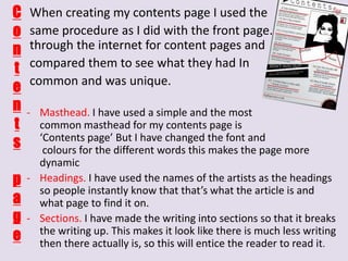
When creating my contents page I used the
same procedure as I did with the front page. I searched
through the internet for content pages and
compared them to see what they had In
common and was unique.
- Masthead. I have used a simple and the most
common masthead for my contents page is
‘Contents page’ But I have changed the font and
colours for the different words this makes the page more
dynamic
- Headings. I have used the names of the artists as the headings
so people instantly know that that’s what the article is and
what page to find it on.
- Sections. I have made the writing into sections so that it breaks
the writing up. This makes it look like there is much less writing
then there actually is, so this will entice the reader to read it.
-

-

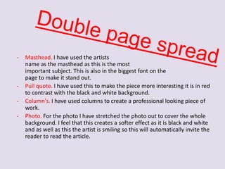
Masthead. I have used the artists
name as the masthead as this is the most
important subject. This is also in the biggest font on the
page to make it stand out.
Pull quote. I have used this to make the piece more interesting it is in red
to contrast with the black and white background.
Column's. I have used columns to create a professional looking piece of
work.
Photo. For the photo I have stretched the photo out to cover the whole
background. I feel that this creates a softer effect as it is black and white
and as well as this the artist is smiling so this will automatically invite the
reader to read the article.
I feel that I have handled the
challenges well that came with the
music magazine. I have intentionally
not stuck to some of the
conventions of a music magazine
because I wanted mine to stand out
and be different, this symbolizes the
target audience of the magazine.
My double page
spread came with
many challenges, I
found it difficult to
get the image in the
right place and
make sure the text
could be seen. I
developed the idea
of Q&A by using
two different
colours for the
question and then
for the answer.

Development
and
challenges.

With my front cover I
wanted to create a
grungy feel to it by using
a black and white image.
The problem I found with
this is that I couldn't’t
use the typical black
writing as it wouldn't’t
be seen. This is where I
came up with the colour
scheme (black, white and
red) I used red because it
is a strong, bold colour
and it would look
efficient.

With my contents page I found this quite difficult but I
came up with a plan and I created a template to work
around. I changed my mind a few times with this but I
feel I have chosen a sufficient style. I have also kept the
colour scheme going on this page as well.

Question 1

  • 1.
    Question 1, In whatways does your product use, develop or challenge forms and conventions of real media products?
  • 2.
    Front cover When I startedto make my music magazine, initially I looked at some published magazines to make sure I had included - - - - - Masthead. Replay. I have used a bold red to emphasize and make it contrast against the background. Headline. I have used the name of the artist as the headline so that it is the most important subject of the front cover. It is also n red again which will make it jump out to the reader. Puffs/plugs. I have used these to create attention so when the reader is walking by they see these which draws them in. Cover lines. I have used four different cover lines on the left third. This is a common characteristic of a front cover. I have done these on boxes to make them separate and alternated the colours black/white. Pulled quotes. ‘I never gave up, and it paid off!’ I used this because when using puled quotes you don’t want to give the reader everything without them even opening the magazine. This is also in red to make it stand out. Fonts. I have used a variety of fonts for example, the masthead ‘REPLAY’ is done in ‘Hobo Std’ I have used this font because it goes well with the genre and it has an “edgyness” to it. Barcode. I have also used a barcode purely to make it look professional and more realistic.
  • 3.
    C o n t e n t s p a g e When creating mycontents page I used the same procedure as I did with the front page. I searched through the internet for content pages and compared them to see what they had In common and was unique. - Masthead. I have used a simple and the most common masthead for my contents page is ‘Contents page’ But I have changed the font and colours for the different words this makes the page more dynamic - Headings. I have used the names of the artists as the headings so people instantly know that that’s what the article is and what page to find it on. - Sections. I have made the writing into sections so that it breaks the writing up. This makes it look like there is much less writing then there actually is, so this will entice the reader to read it.
  • 4.
    - - Masthead. I haveused the artists name as the masthead as this is the most important subject. This is also in the biggest font on the page to make it stand out. Pull quote. I have used this to make the piece more interesting it is in red to contrast with the black and white background. Column's. I have used columns to create a professional looking piece of work. Photo. For the photo I have stretched the photo out to cover the whole background. I feel that this creates a softer effect as it is black and white and as well as this the artist is smiling so this will automatically invite the reader to read the article.
  • 5.
    I feel thatI have handled the challenges well that came with the music magazine. I have intentionally not stuck to some of the conventions of a music magazine because I wanted mine to stand out and be different, this symbolizes the target audience of the magazine. My double page spread came with many challenges, I found it difficult to get the image in the right place and make sure the text could be seen. I developed the idea of Q&A by using two different colours for the question and then for the answer. Development and challenges. With my front cover I wanted to create a grungy feel to it by using a black and white image. The problem I found with this is that I couldn't’t use the typical black writing as it wouldn't’t be seen. This is where I came up with the colour scheme (black, white and red) I used red because it is a strong, bold colour and it would look efficient. With my contents page I found this quite difficult but I came up with a plan and I created a template to work around. I changed my mind a few times with this but I feel I have chosen a sufficient style. I have also kept the colour scheme going on this page as well.