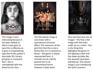
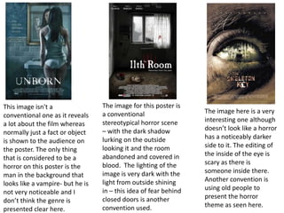
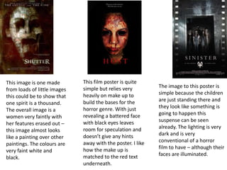
Horror text : for magazines ,
trailers and posters
Lauren Fitzsimons
The font here is very square and
looks very equal and linear. The
colours aren’t something I would
expect of a horror genre however
the illumined ‘£’ is something I
have seen before.
The font here is very
simple again with a square
look to it. It does have a
rustic feel as it goes from
bright white to a tint of
brown.
This font has a slight shaky
effect to it. The font is
quite slim and skinny but
it doesn’t particularly
stand out as a noticeable
horror genre font.
This font is placed in a red colour it
would stand out on a black
background and it does comply with
conventions. The font is very skinny
and has tails on the capital letters that
it is written it. I think all the text
blends in together because of the font
they have used different sizes.
This Is one of my favourite fonts on this
page because it has the effect of light
being dragged behind the text this is
very effective for a horror genre. I think
it should have had a capital letter at the
begging though to make it stand out
even more. The white writing makes it
stand out against the black background
this is effective.
The text to this image is simple
and in the horror colours of
red and white with the black
background. The 4 is also
replaced in stead of the ‘A’ this
is a clever way to add that into
the logo.
Everything about this text is
conventional of a horror from
the colour of red to the
scratched out effect that it has.
The letters are not all the same
size and I think this is effective
as it looks disjoined.
This font is quite a simple one with
the tails added on the letters which
are capital to stand out. The ‘D’ is also
turned the wrong way around to
show that it is a horror genre and not
to be mistaken for any other one.
This is another horror genre text this
is the typical font saw in horror film
titles which includes the tails on the
letters. Placed in white makes the
writing stand out and with the simple
writing the image would probably be
more powerful.
This text is very classic and isn’t
very fancy the text has little
tails on the letters and is in
capitals. Everything about this
title is very linear. The colour of
cream is a un conventional
horror colour.
The text is illuminated
with white behind the
text. The letters are
rounded and curving.
The words are also in
different sizes this creates
emphasis on certain
words.
This text is also simple with
tails on the writing, I am
noticing that horror titles
are often placed in capital
letters. This font is in red
which is very conventional
of a horror film title.
This title is also very different from
the other ones that I have looked at
because the main font is very small
and is quite hard to see. The main
thing seen is the ‘1920’ font which
looks drawn on with crayon – this
doesn’t look professional.
This font is faded and looks worn out
although not taking the conventional
colour of red the cream colour makes
it look like a different kind of horror
film.
This image is very
interesting because it
has been edited so
there is two pairs of
eyes this is effective as
it gives it a hypnotizing
type feel to the poster it
also looks 3D. Using a
girl gives it a innocent
feel – this is
contradicted with the
blood on her face.
This film poster image is
very linear with a
symmetrical mirrored
effect. The costumes of the
girls hint that this is not a
family film as it is covered in
blood – the genre is clearly
represented here. It
reminds me of a family
portrait this is no
conventional horror
however it does work.
Here we have two sets of
images – the first is the
image with the scary
make up on / mask – this
is the thing that
highlights the genre as
the lighting is dark and
the make up looks like
the wounds have been
stitched up. The second
image is just introducing
the other chacters.
This image is
conventional as horrors
normally include a scary
child of some sort
however they don’t
usually have the same
extent of make up on.
This image works
because she has red
eyes and scars this
presents the genre well.
This image is the
conventional horror child
image however the colour
design is interesting because
it has been tined to a red
colour. Another convention
used in images is the change
in eyes – normally they will
edit these to a different
colour to make them look
sub human.
Again this image works in
the horror genre because of
the make up use. The
change in features is a
commonly used feature and
I think I would definitely use
this convention when
designing my poster. The
costume of the girl look
innocent which is also used
a lot.
The image for this poster is
a conventional
stereotypical horror scene
– with the dark shadow
lurking on the outside
looking it and the room
abandoned and covered in
blood. The lighting of the
image is very dark with the
light from outside shining
in – this idea of fear behind
closed doors is another
convention used.
This image isn't a
conventional one as it reveals
a lot about the film whereas
normally just a fact or object
is shown to the audience on
the poster. The only thing
that is considered to be a
horror on this poster is the
man in the background that
looks like a vampire- but he is
not very noticeable and I
don’t think the genre is
presented clear here.
The image here is a very
interesting one although
doesn’t look like a horror
has a noticeably darker
side to it. The editing of
the inside of the eye is
scary as there is
someone inside there.
Another convention is
using old people to
present the horror
theme as seen here.
This image is one made
from loads of little images
this could be to show that
one spirit is a thousand.
The overall image is a
women very faintly with
her features erased out –
this image almost looks
like a painting over other
paintings. The colours are
very faint white and
black.
This film poster is quite
simple but relies very
heavily on make up to
build the bases for the
horror genre. With just
revealing a battered face
with black eyes leaves
room for speculation and
doesn’t give any hints
away with the poster. I like
how the make up is
matched to the red text
underneath.
The image to this poster is
simple because the children
are just standing there and
they look like something is
going to happen this
suspense can be seen
already. The lighting is very
dark and is very
conventional of a horror
film to have – although their
faces are illuminated.

Horror text

  • 1.
    Horror text :for magazines , trailers and posters Lauren Fitzsimons
  • 2.
    The font hereis very square and looks very equal and linear. The colours aren’t something I would expect of a horror genre however the illumined ‘£’ is something I have seen before. The font here is very simple again with a square look to it. It does have a rustic feel as it goes from bright white to a tint of brown. This font has a slight shaky effect to it. The font is quite slim and skinny but it doesn’t particularly stand out as a noticeable horror genre font. This font is placed in a red colour it would stand out on a black background and it does comply with conventions. The font is very skinny and has tails on the capital letters that it is written it. I think all the text blends in together because of the font they have used different sizes. This Is one of my favourite fonts on this page because it has the effect of light being dragged behind the text this is very effective for a horror genre. I think it should have had a capital letter at the begging though to make it stand out even more. The white writing makes it stand out against the black background this is effective.
  • 3.
    The text tothis image is simple and in the horror colours of red and white with the black background. The 4 is also replaced in stead of the ‘A’ this is a clever way to add that into the logo. Everything about this text is conventional of a horror from the colour of red to the scratched out effect that it has. The letters are not all the same size and I think this is effective as it looks disjoined. This font is quite a simple one with the tails added on the letters which are capital to stand out. The ‘D’ is also turned the wrong way around to show that it is a horror genre and not to be mistaken for any other one. This is another horror genre text this is the typical font saw in horror film titles which includes the tails on the letters. Placed in white makes the writing stand out and with the simple writing the image would probably be more powerful.
  • 4.
    This text isvery classic and isn’t very fancy the text has little tails on the letters and is in capitals. Everything about this title is very linear. The colour of cream is a un conventional horror colour. The text is illuminated with white behind the text. The letters are rounded and curving. The words are also in different sizes this creates emphasis on certain words. This text is also simple with tails on the writing, I am noticing that horror titles are often placed in capital letters. This font is in red which is very conventional of a horror film title. This title is also very different from the other ones that I have looked at because the main font is very small and is quite hard to see. The main thing seen is the ‘1920’ font which looks drawn on with crayon – this doesn’t look professional. This font is faded and looks worn out although not taking the conventional colour of red the cream colour makes it look like a different kind of horror film.
  • 5.
    This image isvery interesting because it has been edited so there is two pairs of eyes this is effective as it gives it a hypnotizing type feel to the poster it also looks 3D. Using a girl gives it a innocent feel – this is contradicted with the blood on her face. This film poster image is very linear with a symmetrical mirrored effect. The costumes of the girls hint that this is not a family film as it is covered in blood – the genre is clearly represented here. It reminds me of a family portrait this is no conventional horror however it does work. Here we have two sets of images – the first is the image with the scary make up on / mask – this is the thing that highlights the genre as the lighting is dark and the make up looks like the wounds have been stitched up. The second image is just introducing the other chacters.
  • 6.
    This image is conventionalas horrors normally include a scary child of some sort however they don’t usually have the same extent of make up on. This image works because she has red eyes and scars this presents the genre well. This image is the conventional horror child image however the colour design is interesting because it has been tined to a red colour. Another convention used in images is the change in eyes – normally they will edit these to a different colour to make them look sub human. Again this image works in the horror genre because of the make up use. The change in features is a commonly used feature and I think I would definitely use this convention when designing my poster. The costume of the girl look innocent which is also used a lot.
  • 7.
    The image forthis poster is a conventional stereotypical horror scene – with the dark shadow lurking on the outside looking it and the room abandoned and covered in blood. The lighting of the image is very dark with the light from outside shining in – this idea of fear behind closed doors is another convention used. This image isn't a conventional one as it reveals a lot about the film whereas normally just a fact or object is shown to the audience on the poster. The only thing that is considered to be a horror on this poster is the man in the background that looks like a vampire- but he is not very noticeable and I don’t think the genre is presented clear here. The image here is a very interesting one although doesn’t look like a horror has a noticeably darker side to it. The editing of the inside of the eye is scary as there is someone inside there. Another convention is using old people to present the horror theme as seen here.
  • 8.
    This image isone made from loads of little images this could be to show that one spirit is a thousand. The overall image is a women very faintly with her features erased out – this image almost looks like a painting over other paintings. The colours are very faint white and black. This film poster is quite simple but relies very heavily on make up to build the bases for the horror genre. With just revealing a battered face with black eyes leaves room for speculation and doesn’t give any hints away with the poster. I like how the make up is matched to the red text underneath. The image to this poster is simple because the children are just standing there and they look like something is going to happen this suspense can be seen already. The lighting is very dark and is very conventional of a horror film to have – although their faces are illuminated.